 By
By Chapter 4:
Visualise your spending
In this final chapter, we’ll build a user interface to visualise your spending. The user interface will display a bar chart of spending by category, with a dropdown to filter by time period.
Step 1: Create 'SpendingTrends' Form
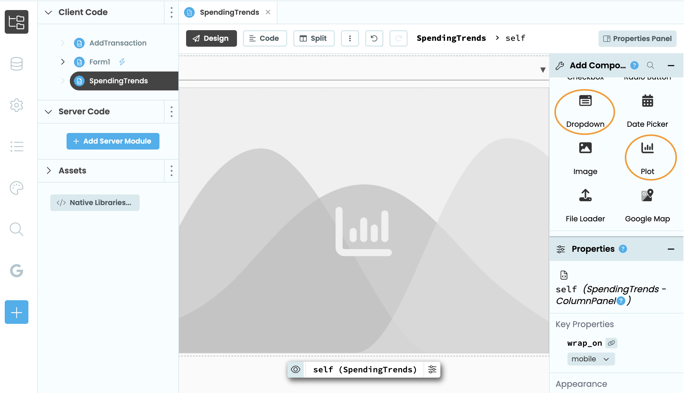
In the Anvil Editor, create a new Blank Form and name it SpendingTrends.
Drag a DropDown named period_dropdown onto the form.
Then, drag a Plot below it. The Plot component renders interactive charts in your app using Plotly. We’ll use it to display our spending data as a bar chart.
Step 2: Connect to the Sheet
Switch to the Code view of SpendingTrends.
Then update the __init__ method to connect to the Sheets file:
def __init__(self, **properties):
    self.init_components(**properties)
    tracker = app_files.my_finance_tracker
self.worksheet = tracker[0]Step 3: Populate Dropdown
To filter spending by time period, we populate the dropdown in code using a list of tuples. Each tuple contains a display label and the corresponding cutoff date. timedelta represents a duration of time, so today - timedelta(days=7) gives us the date 7 days ago. For All time we use None as the cutoff, which means all rows are included.
Update your imports and __init__ method:
from collections import defaultdict
from datetime import date, timedelta

def __init__(self, **properties):
    # ...Existing code
    today = date.today()
    self.period_dropdown.items = [
        ('Last 7 days', today - timedelta(days=7)),
        ('Last 30 days', today - timedelta(days=30)),
        ('All time', None)
]Step 4: Calculate spending totals
Next, we want to loop through the Sheet rows to calculate a total per category. defaultdict(float) is a dictionary where every new key automatically starts at 0.0, so we can add to a category total without checking whether the key exists first.
For each row, we resolve the date and check whether it falls on or after the cutoff. If it does, we add the row’s amount to the running total for that category.
Add an update_chart method:
def update_chart(self, **event_args):
  cutoff = self.period_dropdown.selected_value

  totals = defaultdict(float)  # Running total per category
  for row in self.worksheet.rows:
    row_date = row['Date'] if hasattr(row['Date'], 'strftime') else date.fromisoformat(row['Date'])
    if cutoff is None or row_date >= cutoff:  # Include row if it falls within the period
      totals[row['Category']] += float(row['Amount'])
Now that we’ve defined update_chart, call it at the end of __init__ so the chart loads when the form opens:
def __init__(self, **properties):
  # ...Existing code
self.update_chart()Step 5: Build the Chart
We want to display the spending totals as a bar chart using Plots. In Anvil, Plots are configured using the data and layout properties. self.plot_1.data takes a list of traces, where each trace defines the chart type and the data it should display. We use go.Bar to create a bar chart, passing the category names as x and the spending totals as y.
self.plot_1.layout is a dictionary that controls the appearance of the chart. Here we use it to set the y-axis label so it is clear the values represent pounds.
Still inside update_chart, add the chart code after the loop:
self.plot_1.data = [
    go.Bar(
        x=list(totals.keys()),
        y=list(totals.values())
    )
]

self.plot_1.layout = {
    'yaxis': {
        'title': {'text': 'Amount (£)'}
    }
}Step 6: Handle Spending Period Changes
Our dropdown has three options: Last 7 days, Last 30 days, and All time. Whenever a different option is selected, we want update_chart to fire automatically so the bar chart reflects the selected spending period.
Add the @handle decorator to update_chart:
@handle("period_dropdown", "change")
def update_chart(self, **event_args):
...Step 7: Add Spending Trends Button
Switch to the Design view of Form1.
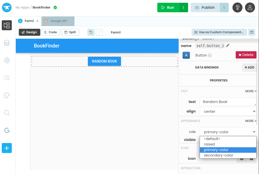
Drag a Button into the app header. Give it the text View Spending Trends and the name spending_btn. This button will open the SpendingTrends Form when clicked.
Then, click on the on click event button to create an event handler.
Step 8: Display the Spending Chart
Switch to the Code view of Form1 and add this import at the top of the file:
from ..SpendingTrends import SpendingTrendsThen add a click handler for spending_btn that opens the SpendingTrends Form in a modal:
@handle("spending_btn", "click")
def spending_btn_click(self, **event_args):
alert(SpendingTrends(), large=True, dismissible=True)Step 9: Try it Out
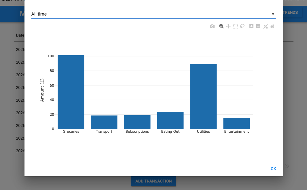
Click Run and try out the View Spending Trends button. You should see a bar chart of spending by category. Try switching between the three period options and check that the chart updates accordingly.
That’s it! You’ve built a finance tracker that reads from and writes to a Google Sheet, and displays an interactive chart for visualising your spending.
View the finished app here:
New to Anvil?
If you’re new here, welcome! Anvil is a platform for building full-stack web apps with nothing but Python. No need to wrestle with JS, HTML, CSS, Python, SQL and all their frameworks – just build it all in Python.
Yes – Python that runs in the browser. Python that runs on the server. Python that builds your UI. A drag-and-drop UI editor. We even have a built-in Python database, in case you don’t have your own.
Build Database-Backed Apps
Build a Simple Feedback Form
Build a Simple Feedback Form
Build a data-entry app, and learn the techniques fundamental to building any Anvil app. In this tutorial, you will:
- Build your User Interface
- Write client-side Python
- Write server-side Python
- Store data in a database
- Deploy your app