
The Form Editor
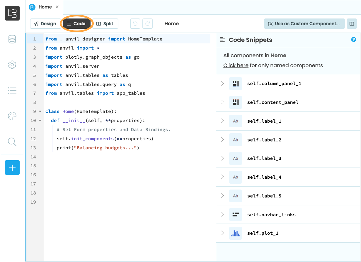
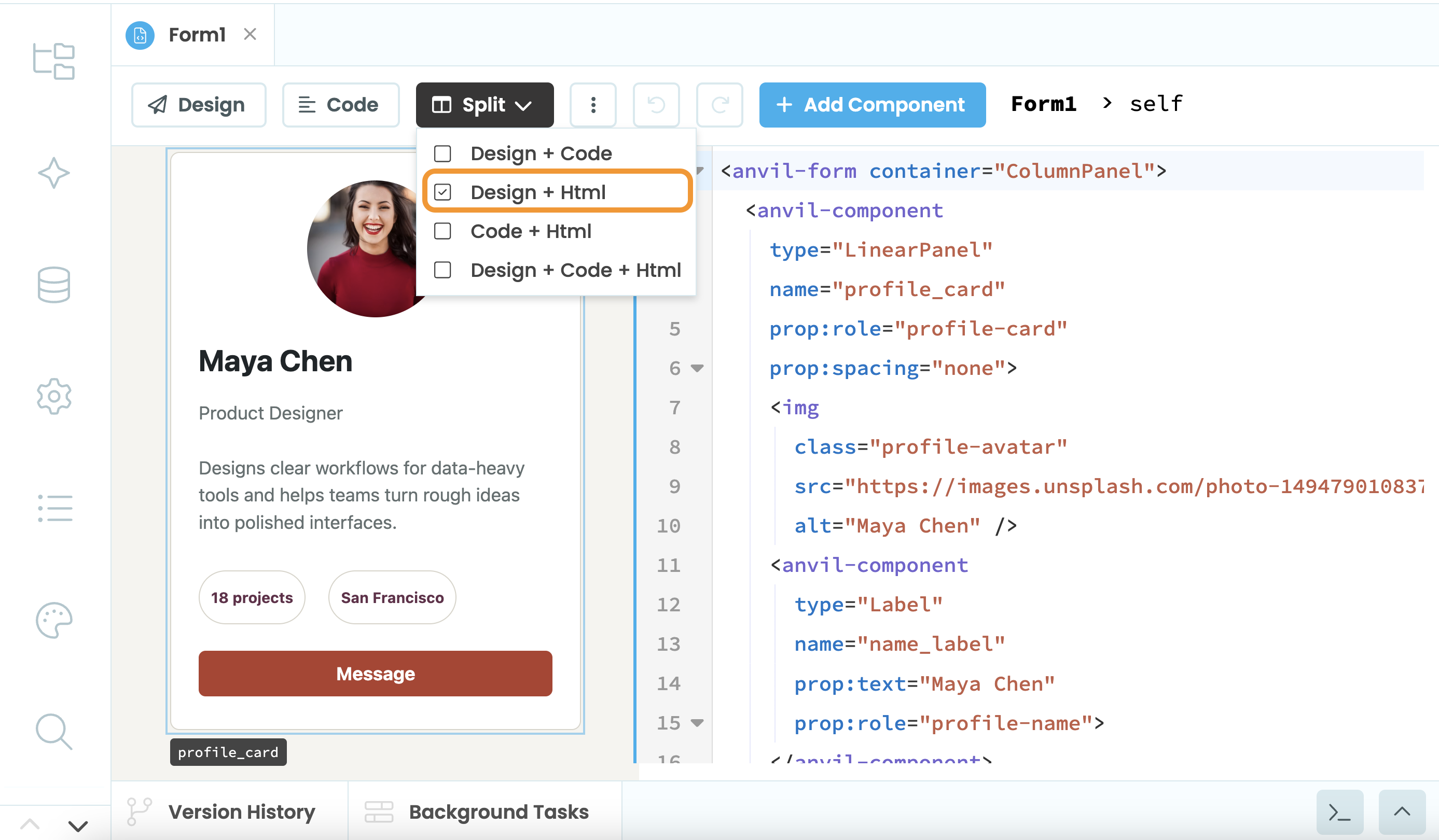
The Form Editor is where you build your app’s UI by dragging-and-dropping components and writing Python code. It has four modes: Design View, HTML View, Code View and Split View. You choose your view using the buttons at the top of the Form Editor:
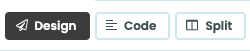
Choosing the view of the Form Editor
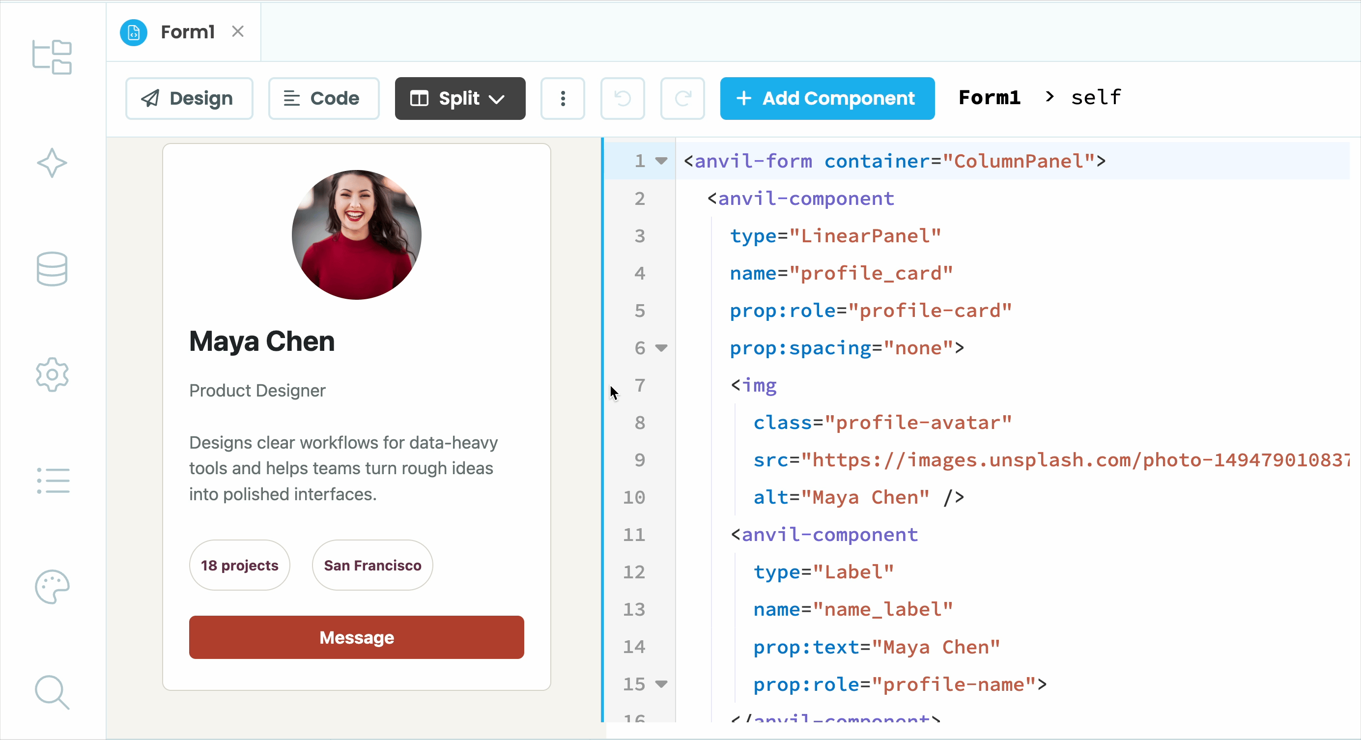
Design view
Design view shows you how your Form will look when your app is running. This is where you drag and drop components to create your UI. It also displays the Object Palette, Toolbox, Properties Panel and Component Tree.
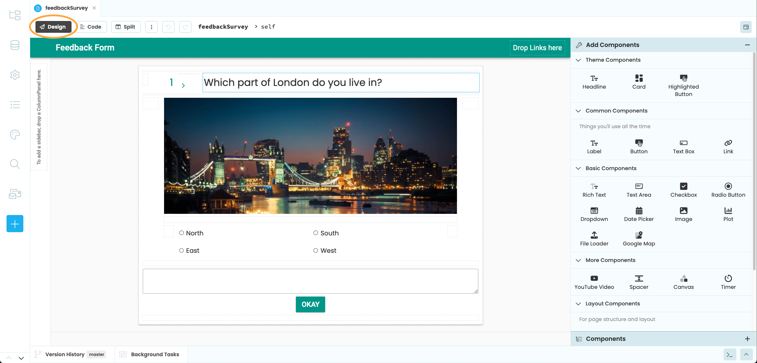
Design view of the Form Editor.
Toolbox
The Toolbox is where you will find Anvil’s drag-and-drop Components, which you can use to build your UI.
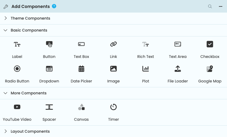
The Toolbox.
These are the components you will find in every Anvil app:
Label
Link
Button
TextBox
TextArea
CheckBox
RadioButton
DropDown
DatePicker
Image
Plot
Data Grid
DataRowPanel
FileLoader
Spacer
ColumnPanel
FlowPanel
RepeatingPanel
GoogleMap
YouTube
Canvas
Timer
GridPanel
LinearPanel
XYPanel
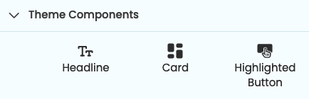
The Theme Elements part of the Toolbox contains components whose style is particular to the current app’s Theme. (This is not the complete list of theme-specific styles that can be applied to components. The Roles view shows you all of them.)
Properties Panel
The Properties Panel is where you can find and edit all the properties and events for a selected component.
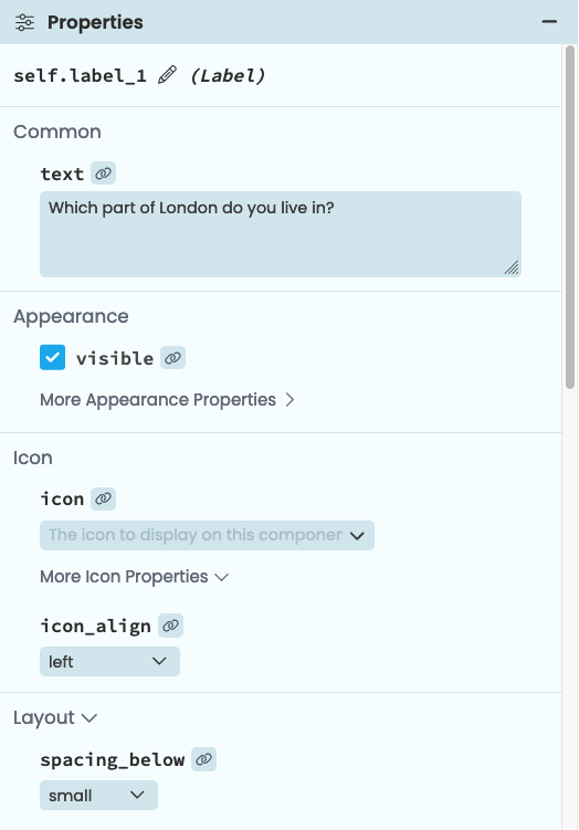
The top part of the Properties Panel for a Label.
The Properties Panel is split into subsections; many properties are not shown until you click the ‘more’ button for the relevant subsection. This keeps the Properties Panel a manageable length.
Properties
Properties let you edit the styling and behaviour of your components, such as what text a component displays, the spacing around it or its tooltip text. You can also set properties from code. For more detailed information about component properties, see the Anvil Components docs.
To modify what the component is called in your app’s Python code, use the edit button next to the name property at the top of the Properties Panel (or edit the name in the Object Palette).
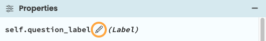
Renaming a component.
Events
You can also set up event handlers for your components in the Properties Panel.
Each component’s events are shown at the bottom of the Properties Panel. You can enter the name of a Python method in the box, and that method will run when the event fires. This method must be a method of the Form that the component is on.
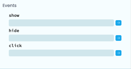
Events can be defined at the
bottom of the Properties Panel.
If you click the  button next to the event, an empty method is automatically written for you:
def button_refresh_click(self, **event_args):
  """This method is called when the button is clicked"""
  pass
You can also set up event handlers in code using self.my_component.set_event_handler.
See Anvil Components for more detail on events.
Object Palette
When you drop or select a component into a Form, you will see the Object Palette above the component.
The Object Palette
This lets you quickly and easily edit your component’s most commonly edited properties:
- Alignment:
- Bold, italic and underline:
- Toggle visibility and toggle disabled:
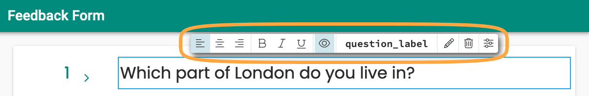
- Component name:
question_label - Edit text:
- Delete component:
- Open Properties Panel:
- Toggle
checkedorselectedproperty (in Checkboxes and RadioButtons):
To edit the full list of properties for a selected component you can go to the Properties Panel or you can set them in code.
You can also use the Object Palette to set up event handlers. For components that have events, you’ll see a button that allows you to set up the event handler for the component’s most common event. For example, you can set up a click event for a Button component from the Object Palette.
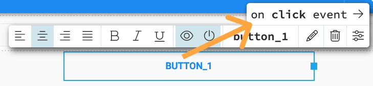
You can set up a click event
for a Button component using the Object Palette.
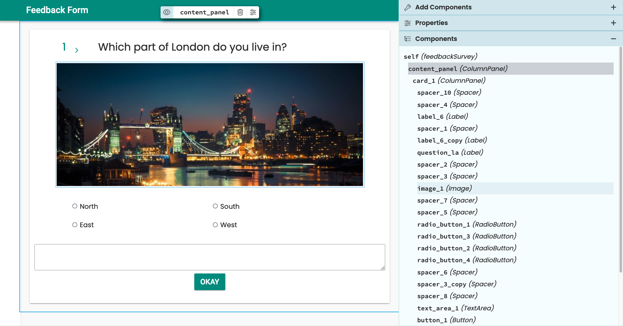
Component Tree
Here you can find all the components on your Form. Selecting a component from the tree will also select the component on the Form and bring up its Object Palette.
Component Tree for a form.
You can drag and drop components in the Component Tree to affect their placement on the Form. When dragging a component, blue lines will appear indicating where you can move the component to. You can also drag and drop components from the Toolbox into the Component Tree.
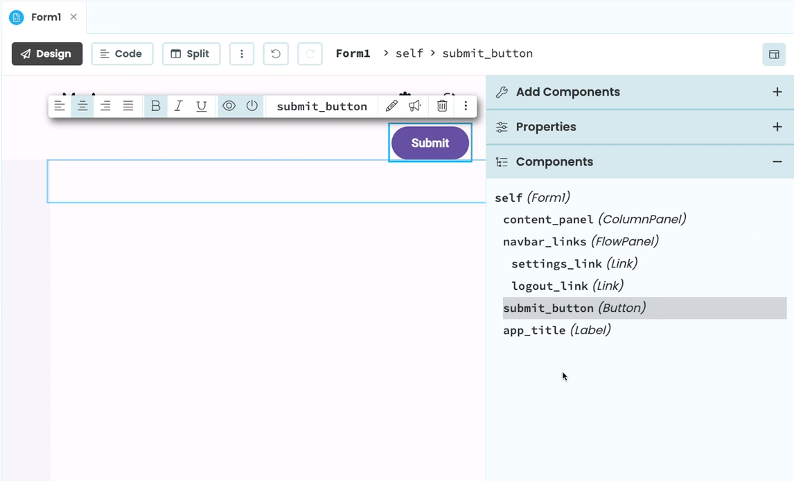
Dragging a Button component into a ColumnPanel from the Component Tree
Code view
Code view shows you the Python class that describes how your Form behaves. This is where you write your client-side Python code that runs in the browser. It also displays the Code Snippets Panel.
Code view of the Form Editor.
Code Snippets
The Code Snippets Panel lists all the components on the current Form. It is visible in the Code View.
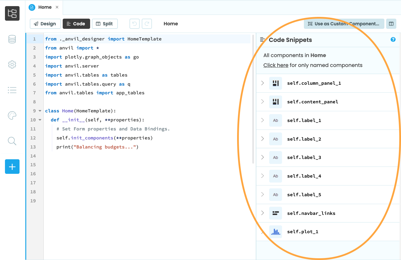
Code Snippets lists all the components in this Form.
Clicking on the arrow next to a component will open a list of all the component’s properties.
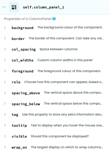
The properties of this
ColumnPanel.
Clicking on the question mark will take you to that component’s documentation.
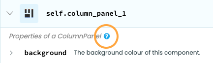
Click this question mark for
component docs.
HTML view
HTML view shows you the underlying HTML code the represents your Form’s UI. The Form’s HTML can be made up of both native HTML elements and Anvil components. Any changes you make here are reflected in Design view, and vice versa.
You can open HTML view as a split view with Design view, Code view, or both:
HTML view in the Form Editor.
When HTML view is split with Design view, selecting a component in the designer highlights its HTML, and clicking an HTML tag highlights the corresponding component in Design view.
Selecting components in HTML view.
To learn more about your Form’s HTML, see Forms as HTML.
Split view
Split view shows you a combination of Design, Code and HTML views, which you can choose from the dropdown. You can resize each view by dragging where two views meet.
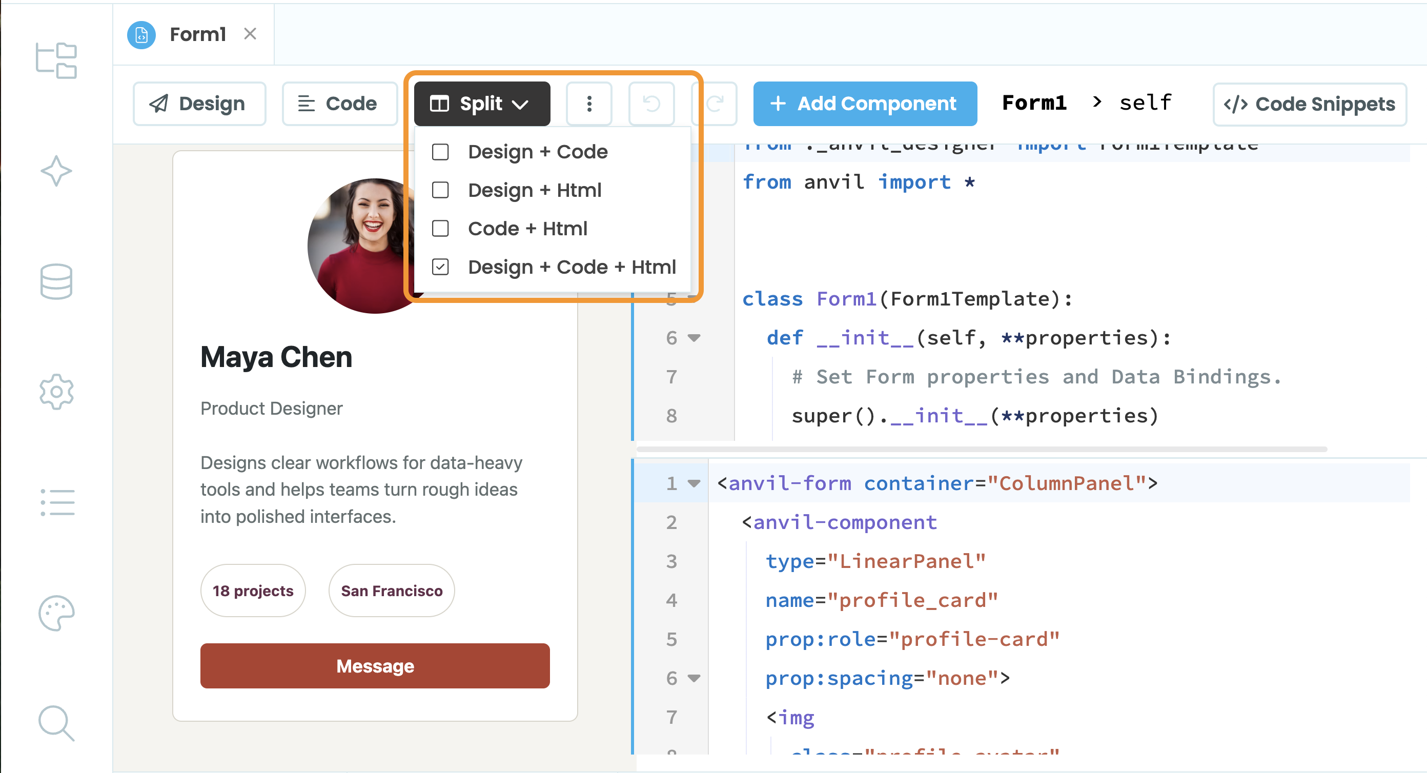
Split view of the Form Editor.
You can add components into your Form by clicking on the + Add Component button. This will open the Toolbox as an overlay, from which you can drag-and-drop components.
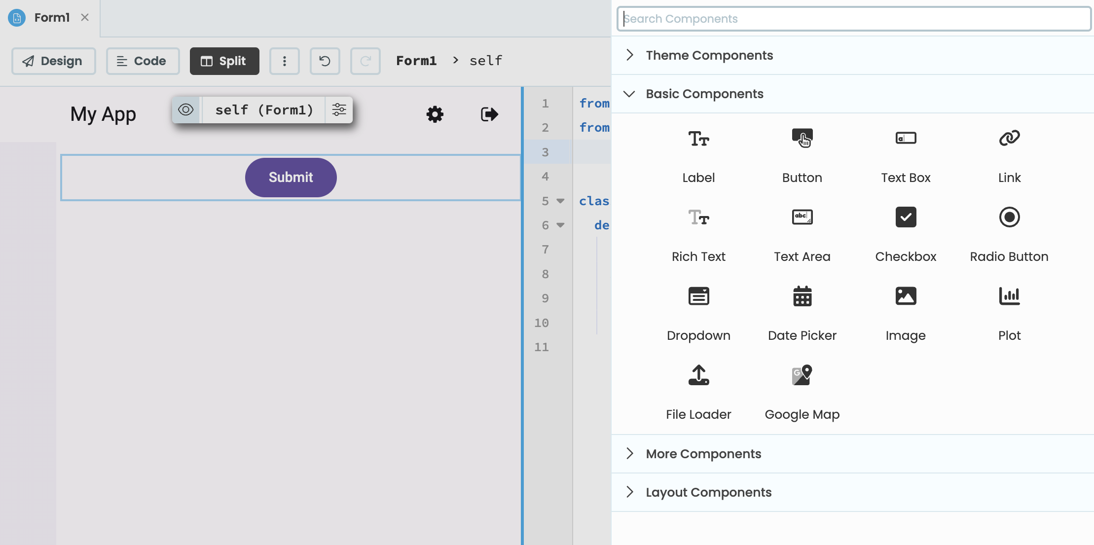
The Toolbox open as an overlay.
Clicking on the Code Snippets button will also open the Code Snippet panel as an overlay.
Do you still have questions?
Our Community Forum is full of helpful information and Anvil experts.