 By
By Build an interactive dashboard from a CSV dataset
In this tutorial, we’re going to build an interactive dashboard to display insights from a CSV dataset. We’re going to be using a dataset of Uber pickups in New York City. We’ll use Anvil’s Data Files service to upload and store our CSV file, so that it is easily accessible from our app’s code. We will also be using pandas to read our data and Plotly to turn our data into interactive plots.
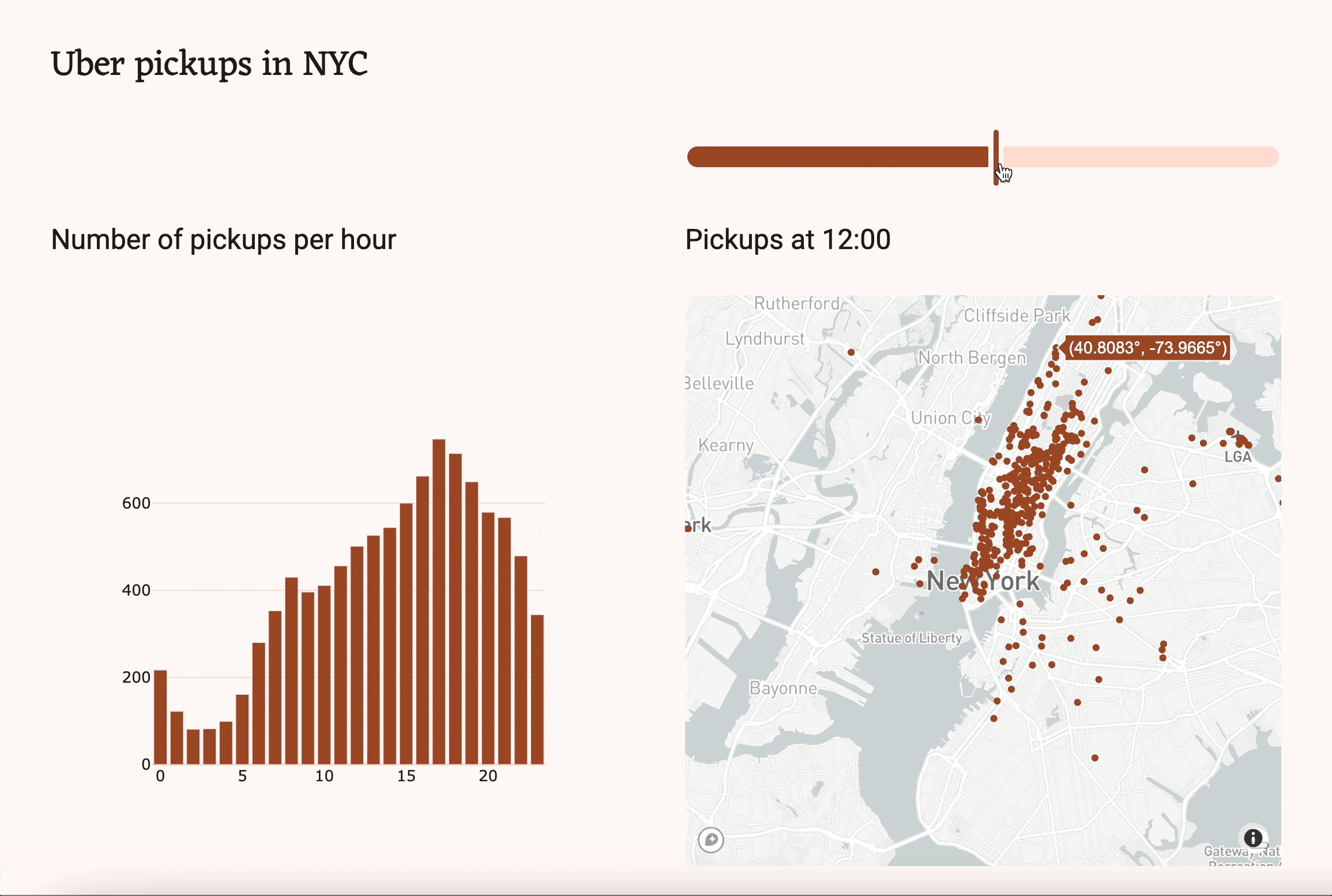
The final app will look something like this:
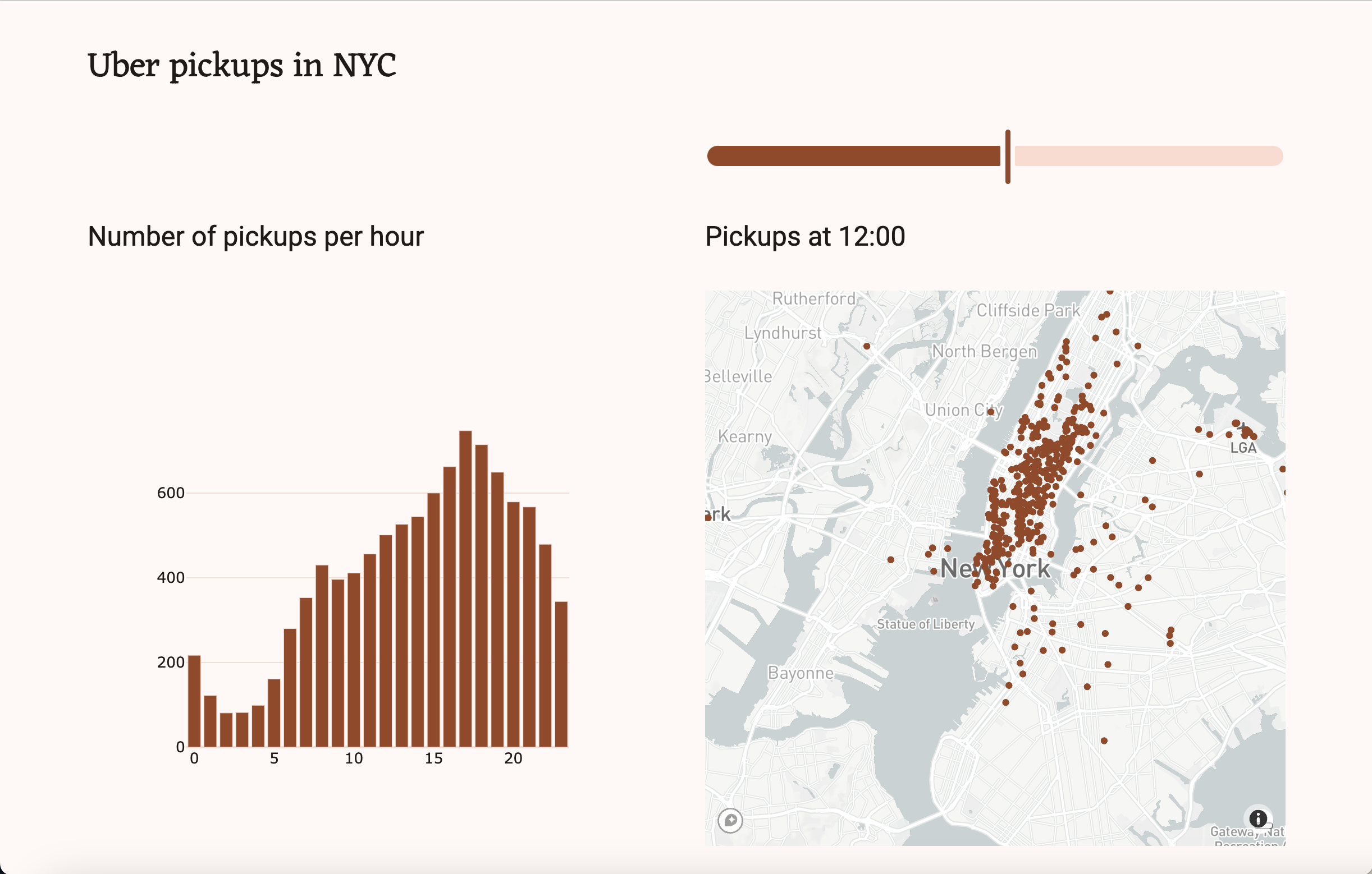
You can test it out here: uber-pickups-dashboard.anvil.app
We’ll build the app in 7 quick steps:
- We’ll first import the dataset and Python packages we need.
- Second, we’ll create the app’s UI with Anvil’s drag-and-drop designer.
- Next, we’ll examine our data to better understand how to use it.
- We’ll then use
numpyand Plotly to create and plot a histogram of all pickups per hour. - We’ll next plot the location data onto an interactive map using Mapbox and Plotly.
- To finish the app, we’ll allow users to filter the data displayed on the map.
- Finally, we’ll publish our app and share it with the world!
You can download the source code for the finished app here:
Step 1: Import the dataset and packages
1.1 Download the dataset
The first thing we need to do is download our dataset, which you can find here: https://www.kaggle.com/datasets/fivethirtyeight/uber-pickups-in-new-york-city. In this tutorial, I’m using the uber-raw-data-sep14.csv dataset, which includes time and location data of Uber pickups in New York City during September 2014.
1.2 Create an app and add the data
Once we have the dataset downloaded, we can create a new Anvil app. Go to Anvil, create a new blank app and choose the New M3 Theme. Start with a Blank Panel.
In the top left, you’ll see the name of your app. Click on this to open your app’s settings. Change your app’s name to “Uber Pickups in NYC”.
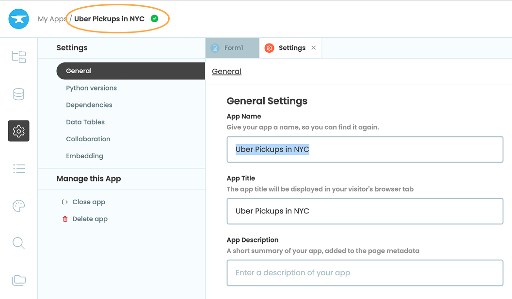
Click on the name of your app in the top left to change it.
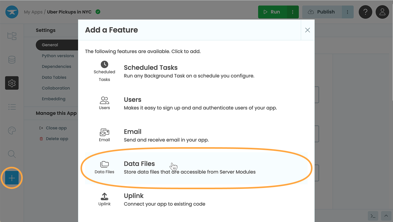
Next, add the Data Files service by choosing the blue plus button in the Sidebar Menu then selecting Data Files.
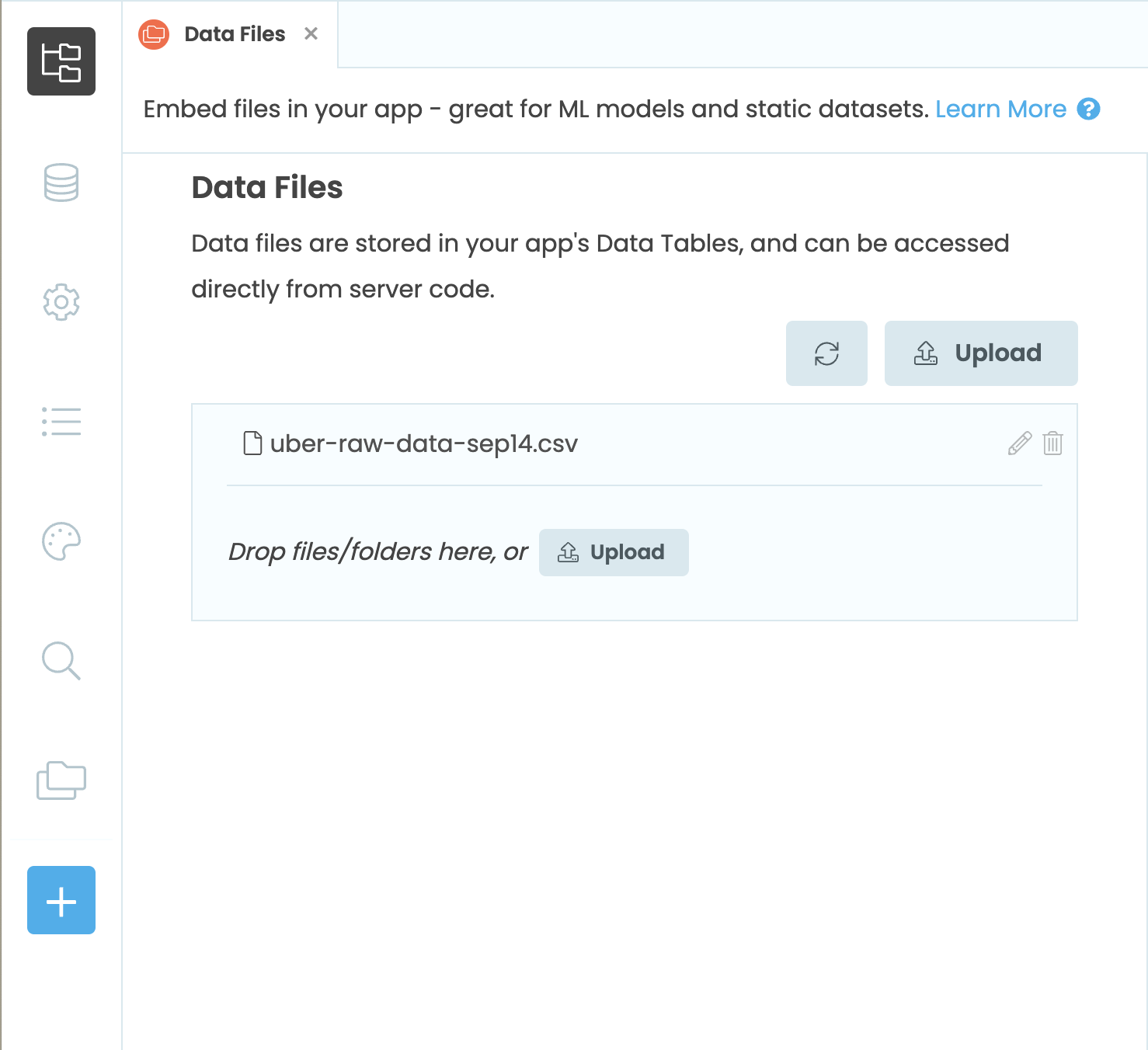
Now we can upload our dataset to our Anvil app. Click the Upload button and select the dataset we just downloaded. You can also drag and drop the file in order to add it to the app. When the upload is complete, you will see the file listed.
1.3 Configure the Python environment
We’ll be using pandas and numpy to build our app, so we’ll need to modify the Python environment that is running our app. Choose Settings from the Sidebar Menu, then Python Versions. Switch the app to Python 3.10, then choose the Data Science base package. This will have the libraries we need pre-installed.
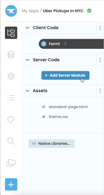
Step 2: Build the User Interface
Now that we have our data added to our app and the Python environment is configured, we can actually start building our app.
2.1 Add a title
Navigate to ‘App’ in the sidebar menu, then choose Form1. Here we can see the Design view of our app. Drag and drop a Heading component from the Toolbox and add it to the top of the app. In the Properties Panel, change the its text to “Uber Pickups in NYC”.
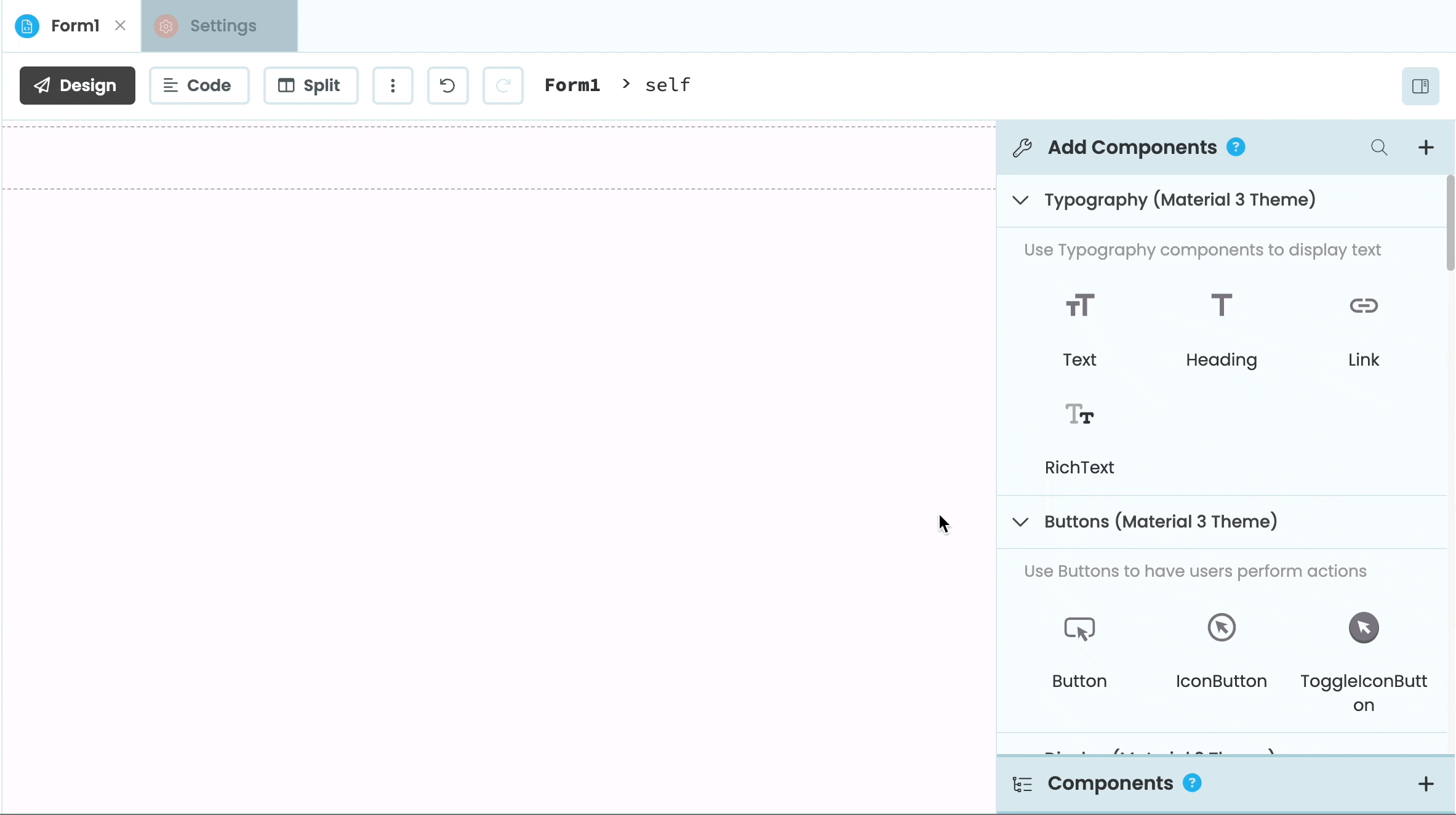
2.2 Add the plots
Our dashboard is going to have two plots: a histogram of the number of pickups per hour and a map of the pickup locations. Drag and drop two Plot components to the Form and two Headings to act as titles for the plots. Change the name property of one plot to be bar_chart and the other to be mapbox_map.
Change the Heading above the bar_chart to be “Number of pickups per hour” and change its style to ’title’ and it’s scale to ’large’. We’ll set the other Heading’s text property in code, so we can leave that blank. Change its name to mapbox_title, style to ’title’ and scale to ’large’.
We’re going to want users to be able to filter the map data based on the hour of pickup. Add a Slider component above mapbox_title and rename it to time_slider. From the Properties Panel, set the max of the Slider to be 23 (equivalent to 11pm) and the min to be 0 (equivalent to midnight). Set the value to be 12 to initialise the slider at noon.
(You can add some top margin to the Heading above the bar_chart to make the UI look more even)
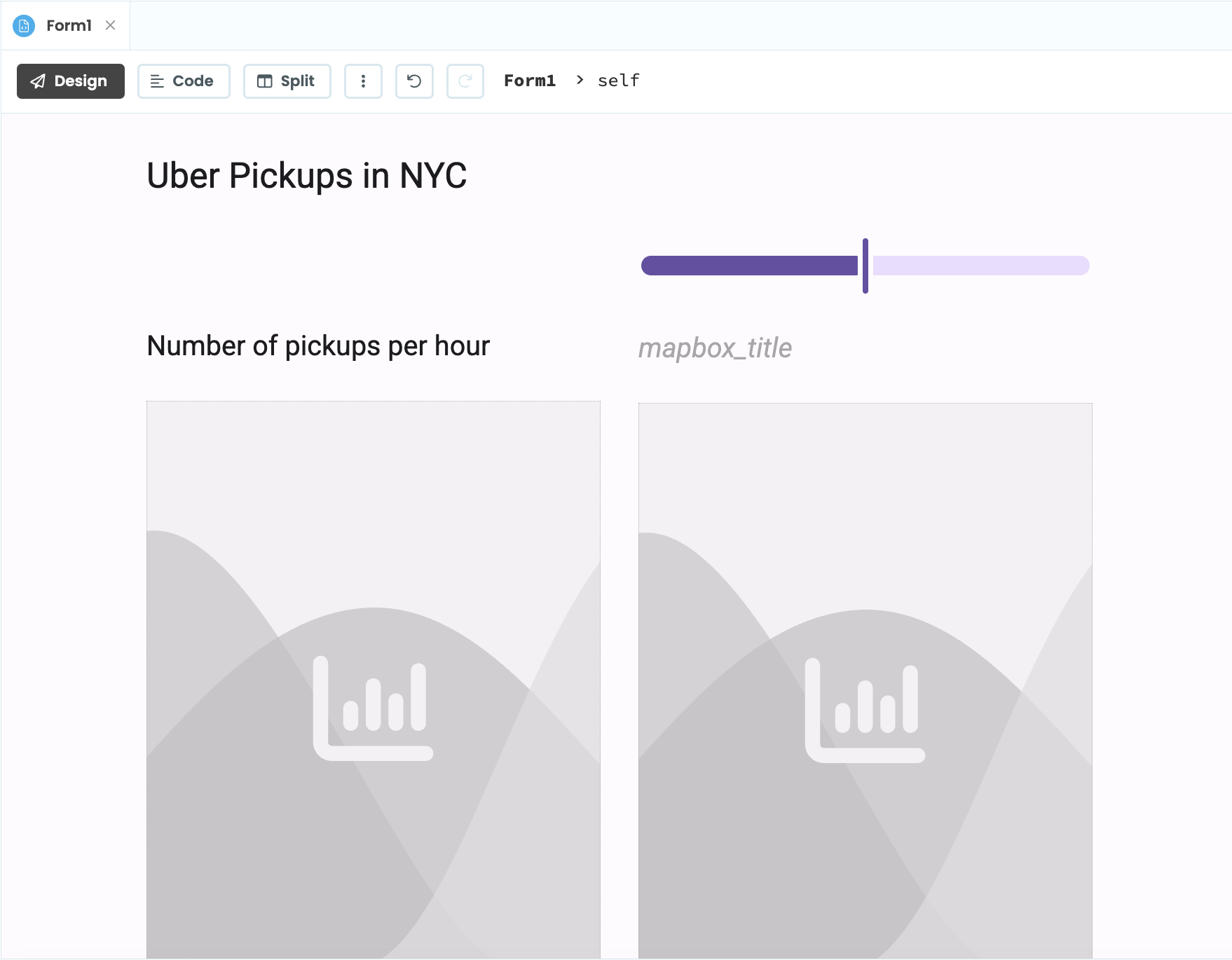
Our Form should now look something like this:
2.3 Customise the look and feel (optional)
In this optional step, we’ll make some quick changes to our app’s appearance.
First, let’s change its colour scheme. In the sidebar menu, click on Theme then choose “Colour Scheme”. Then from the dropdown menu, choose a colour scheme. For my app, I chose manarola_light.
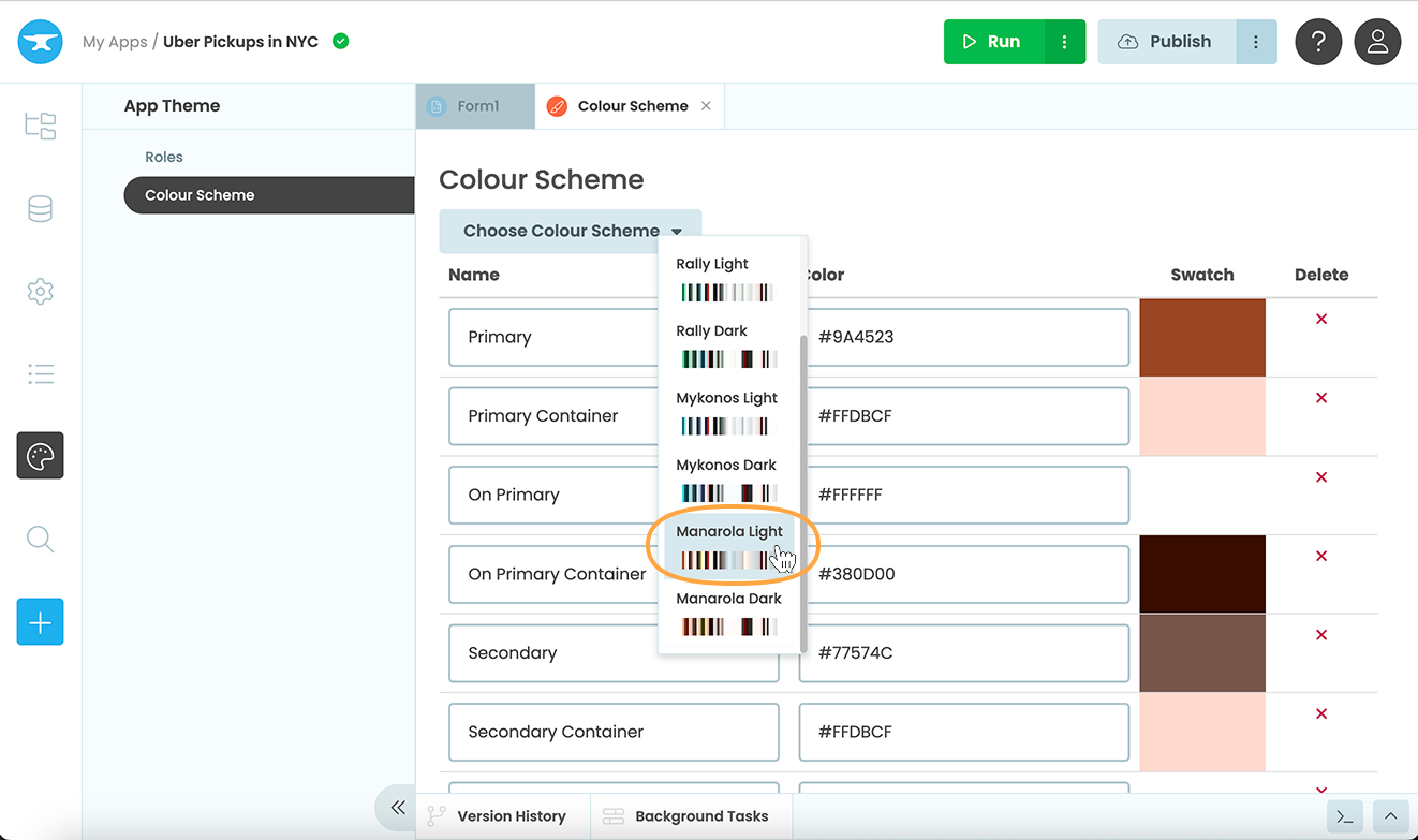
Changing the app’s colour scheme.
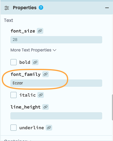
We can also use a different font for the app’s title. I decide to go for ‘Eczar’. From the App Browser, click on ‘ Native Libraries’ and add this line:
<link href="https://fonts.googleapis.com/css2?family=Eczar:wght@400;600&family=Roboto+Condensed:wght@300;400;700&display=swap" rel="stylesheet" rel="preload" as="font" crossorigin="anonymous">Then go back to the Anvil Editor, click on the title and in the Properties Panel, set the component’s font_family to be ‘Eczar’. For more help on adding fonts to your apps, see our how-to guide.
Step 3: Examine the Data
We now have a UI built for our dashboard, but before we actually create our plots, let’s explore our dataset. Our dataset is stored in our app’s Data Files, which we can only access from server code.
In the App Browser, add a new Server Module.
Add the following import statements to the module:
import pandas as pd
import numpy as np
import plotly.graph_objects as go
Let’s add a function to read our CSV file and print out the first few rows using pandas. We can access our CSV file with data_files['uber-raw-data-sep14.csv']:
@anvil.server.callable
def get_uber_data():
    #read in 10000 rows of data
    df = pd.read_csv(data_files['uber-raw-data-sep14.csv'], nrows=10000)
    #print the first 5 rows of the dataframe
    print(df.head())
Decorating the function with @anvil.server.callable means we can call the function from our client Form.
Switch back to Form1 then switch to Code view. Call the server function we just wrote in Form1’s __init__ method:
class Form1(Form1Template):

  def __init__(self, **properties):
    # Set Form properties and Data Bindings.
    super().__init__(**properties)
    #call the server function
    anvil.server.call("get_uber_data")
Click the green Run button at the top of the Anvil Editor to run the app. You should see output that looks like this in the App Console:
          Date/Time      Lat      Lon    Base
0  9/1/2014 0:01:00  40.2201 -74.0021  B02512
1  9/1/2014 0:01:00  40.7500 -74.0027  B02512
2  9/1/2014 0:03:00  40.7559 -73.9864  B02512
3  9/1/2014 0:06:00  40.7450 -73.9889  B02512
4  9/1/2014 0:11:00  40.8145 -73.9444  B02512
We can see that we have Date/Time, Lat, Lon and Base columns. We won’t need the Base column but we’ll use the Lat and Lon columns when plotting our map data and the Date/Time column for both the histogram and map plots.
Step 4: Create a histogram
Let’s now write a function that creates a histogram of the hours in the Date/Time column that we can then plot on our self.bar_chart.
4.1 Return the dataframe from get_uber_data
First, we need to modify the get_uber_data function to return the dataframe instead of just the head. We also need to convert the values in the Date/Time column to be datetime objects. We can also remove @anvil.server.callable from the function since we won’t need to call it from the client. The function should now look like this:
def get_uber_data():
  #read in 10000 rows of data
  df = pd.read_csv(data_files['uber-raw-data-sep14.csv'], nrows=10000)
  df['Date/Time'] = pd.to_datetime(df['Date/Time'])
  return df
Next, we need to call the function from the server module:
DATA = get_uber_data()4.2 Create a numpy histogram
Let’s now add a function to create a histogram of the values in the Date/Time column. We’ll make this function callable from our client Form. We can use numpy’s histogram method to count the number of entries in our dataset per hour. This method returns two arrays, but we only care about the first, which is an array of the histogram values.
@anvil.server.callable
def create_histogram():
  histogram = np.histogram(DATA['Date/Time'].dt.hour, bins=24)[0]
  return histogram
4.3 Add data to self.bar_chart
Finally, we need to switch back to our Form code and in the Form’s __init__ method, set the data of the bar_chart plot to be a Plotly go.Bar object where the y-axis values are the histogram values. Remove anvil.server.call("get_uber_data") and replace it with:
self.bar_chart.data = go.Bar(y=anvil.server.call('create_histogram'))Run the app again. If we’ve done everything correctly, the app should look like this:
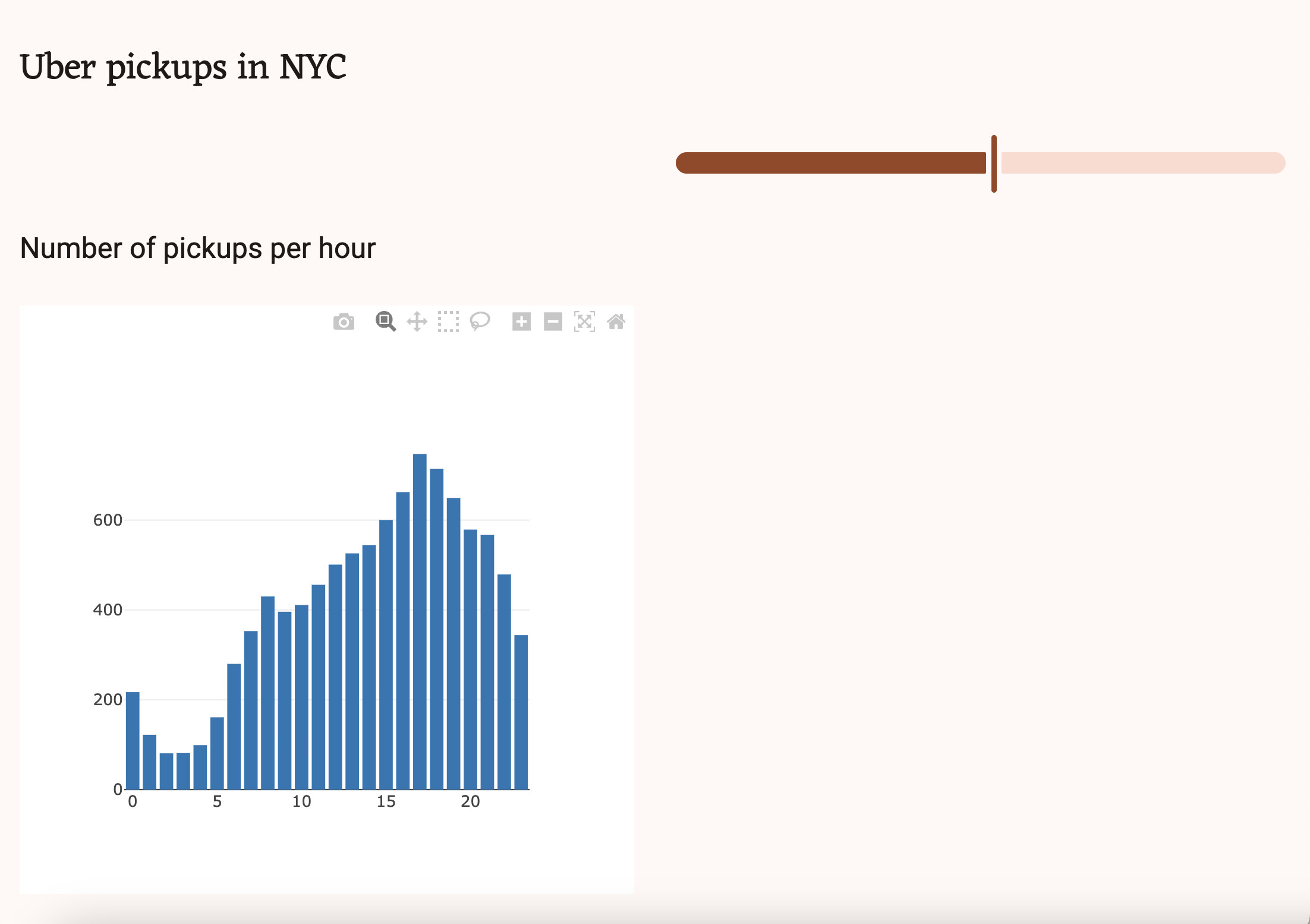
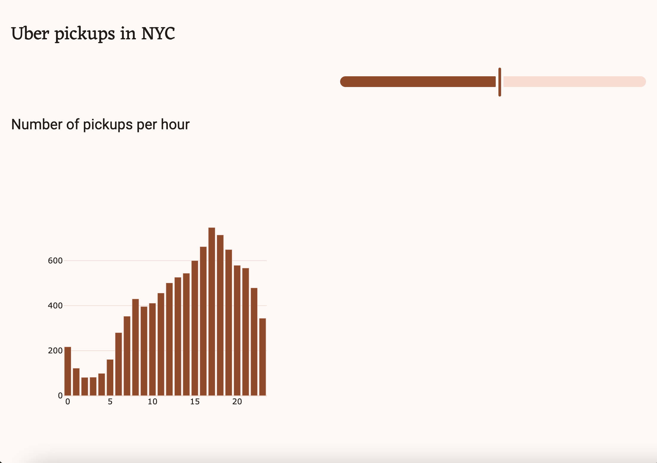
The plot is right, but it looks…wrong. Go back to the Form code and add Plot.templates.default = 'manarola_light' (or whatever colour scheme you chose) to the __init__ function. This will give all Plots in our app the manarola_light color scheme. Run the app again, and it should look much better:
Step 5: Plot the map data
Now let’s use the Lat and Lon columns of our CSV file to plot the location data on a map. We’ll use the Scattermapbox Plotly plot to do this, but we’ll first need a Mapbox access token.
5.1 Get a Mapbox access token
If you don’t already have a Mapbox account, go to mapbox.com to sign up for free and generate a public access token. Add this token to the __init__ method of Form1:
token = '<your-access-token>'5.2 Return the map data
Back in our Anvil app, we’ll add another function to the Server Module which will generate the map data. Create a client-callable function called get_map_data that takes one argument called hour. Let’s set it so that it defaults to 0 if no argument is given. We’ll filter the dataframe based on the hour passed into the function and plot the data onto a map.
@anvil.server.callable
def get_map_data(hour=0):
  filtered_data = DATA[DATA['Date/Time'].dt.hour == hour]
  map_data = go.Scattermapbox(lat=filtered_data['Lat'], lon=filtered_data['Lon'], mode='markers')
  return map_data
5.3 Add data to self.mapbox_map
We can now switch back to Form1 and add the map data to the self.mapbox_map plot we added in Step 2. We’ll also need to add our access token and modify the map’s layout slightly. The __init__ method of the Form should look something like this:
class Form1(Form1Template):
def __init__(self, **properties):
# Set Form properties and Data Bindings.
super().__init__(**properties)
Plot.templates.default = 'manarola_light'
#create the histogram of uber pickups per hour
self.bar_chart.data = go.Bar(y=anvil.server.call('create_histogram'))
#create the map of pickup locations
token = "<your-token-here>"
self.mapbox_map.data = anvil.server.call('get_map_data')
#add the access token and center the map on NYC
self.mapbox_map.layout.mapbox = dict(accesstoken=token, center=dict(lat=40.7128, lon=-74.0060), zoom=10)
#remove padding from map
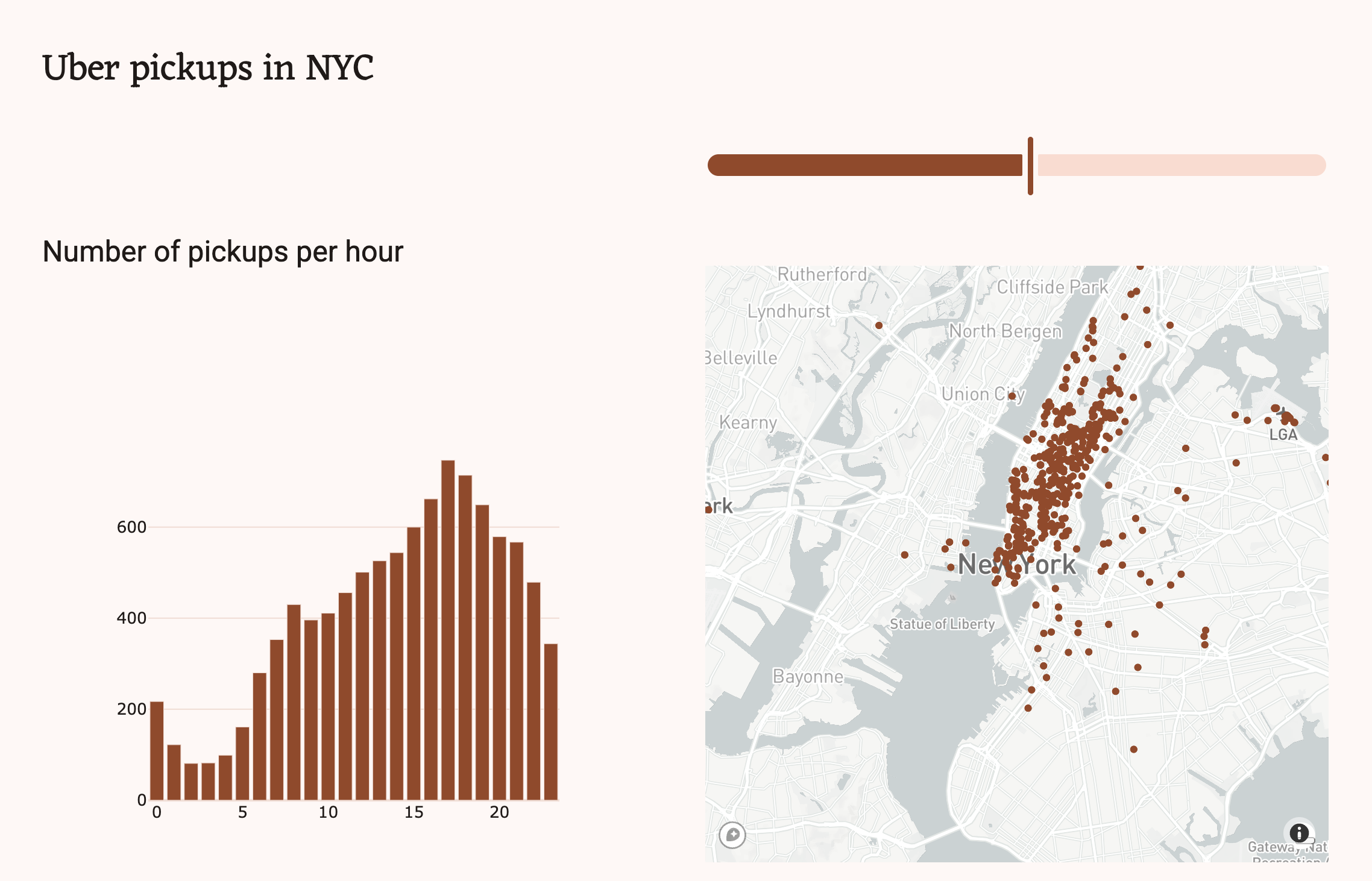
self.mapbox_map.layout.margin = dict(t=0, b=0, l=0, r=0)Run the app and both plots should now be populated with data
Step 6: Respond to user input
The last thing we need to do is make our dashboard respond to user input. We’ll modify our app so that users can choose an hour from the Slider to filter and reload the map data.
6.1 Set up an event handler
Switch to the Design view of the Form and select the Slider. Scroll to the bottom of the Properties Panel and click the arrows next to change_end under Events. This will open the Code view and create a function that will run when after the user drags and releases the Slider. When this function is called, we want to reload the map data and set the text property of the self.mapbox_title Heading to reflect the data we’re viewing:
@handle("time_slider", "change_end")
def time_slider_change_end(self, **event_args):
    """This method is called when the Slider is no longer being dragged"""
    time = self.time_slider.value
    self.mapbox_title.text = f'Pickups at {int(time)}:00'
    self.mapbox_map.data = anvil.server.call('get_map_data', time)
6.2 Initialise the Slider and map
In the Form’s __init__, replace self.mapbox_map.data = anvil.server.call('get_map_data') with a call to the function we just wrote. The __init__ function should now look something like this:
class Form1(Form1Template):
  def __init__(self, **properties):
    # Set Form properties and Data Bindings.
    super().__init__(**properties)
    Plot.templates.default = 'manarola_light'

    #create the histogram of uber pickups per hour
    self.bar_chart.data = go.Bar(y=anvil.server.call('create_histogram'))

    #add the access token and center the map on NYC
    token = "<your-token-here>"
    self.mapbox_map.layout.mapbox = dict(accesstoken=token, center=dict(lat=40.7128, lon=-74.0060), zoom=10)
    self.mapbox_map.layout.margin = dict(t=0, b=0, l=0, r=0)

    #call the function we just wrote
    self.time_slider_change_end()
We can now test out our app. Run the app and move the Slider. Make sure the map changes when you release the Slider.
Step 7: Publish your app
That’s it! You’ve just built an interactive dashboard with Anvil. We’ve seen how to store a CSV dataset in our app’s Data Files, create a UI with the drag-and-drop designer and create interactive plots using pandas and Plotly.
The only thing left to do is to publish your app. Anvil takes care of deployment and hosting for you. All you need to do is click the Publish button at the top of the Anvil Editor, then select ‘Publish this app’. You can use the public URL provided or enter your own, or, if you want to share your app privately, you can switch to a private URL

Want to dig into how this app works? Our tutorials show you all the pieces these apps are made from and more.
New to Anvil?
If you’re new here, welcome! Anvil is a platform for building full-stack web apps with nothing but Python. No need to wrestle with JS, HTML, CSS, Python, SQL and all their frameworks – just build it all in Python.
Yes – Python that runs in the browser. Python that runs on the server. Python that builds your UI. A drag-and-drop UI editor. We even have a built-in Python database, in case you don’t have your own.
Why not have a play with the app builder? It’s free! Click here to get started:
Check out the dashboard gallery
Would you like to see some examples of dashboards built with Anvil? Check out our dashboard gallery: