
Building the Front-End
You can build your front-end in the Anvil Editor. You create your user interface by dragging and dropping built-in or custom components onto Forms in Design view, editing your UI as text in HTML view, or defining components directly in Code view. You then write client-side code to control how your interface behaves and responds to user interaction.
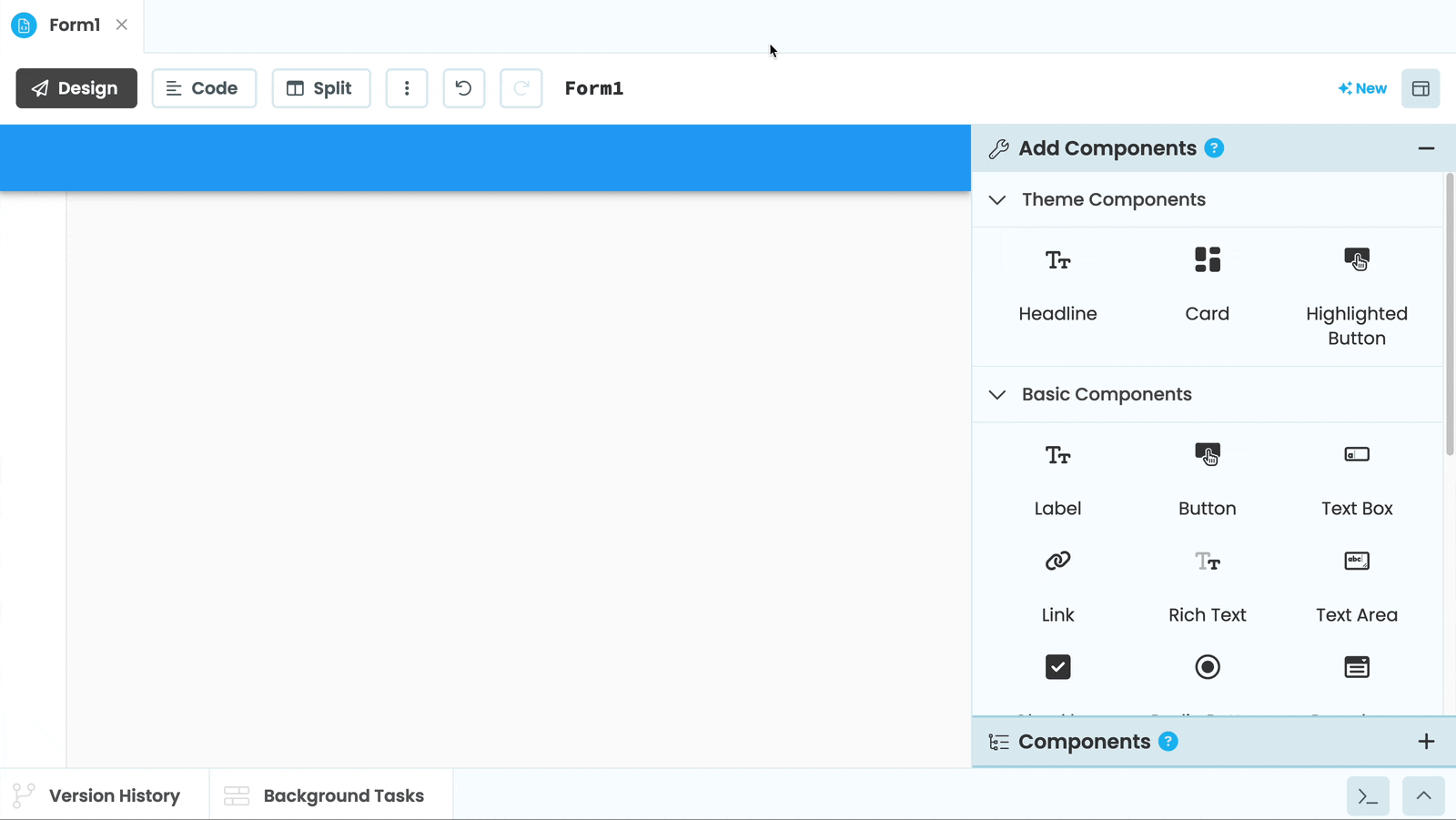
Dragging and dropping components to make the UI of an Anvil app
Forms
Forms are the pages of your Anvil app. Each Form has a visual layout that defines how it looks, and a Python class that defines how it behaves. You build your user interface by placing components onto Forms in the Form Editor, editing the Form’s structure as text in HTML view, and writing Python code to control them.
Forms are themselves components, which means they can be nested inside other Forms to build more complex interfaces.
Adding UI Elements
Components are the visual elements you add to a Form, such as buttons and text boxes. You can add components visually in the Form Editor, define them in HTML, or create them in code.
Component Properties
Every component has properties that control how it looks and behaves. You can set properties in the Properties Panel or change them dynamically in your Form’s code. Component properties can also be bound to Python expressions using Data Bindings, keeping them in sync with the underlying data.
Events
Components raise events when users interact with them, such as clicking a button or changing the value of an input. You can write Python functions called event handlers to respond to these events.
Client-Side Code
Client-side code is Python code that runs in the user’s browser. It controls how your interface behaves, updates components dynamically, responds to user interactions, and can call server-side functions or code outside of Anvil. Client code is mainly written in your Form code and Modules.
Navigation
Navigation in an Anvil app is handled by switching between Forms. You can switch between Forms programmatically using open_form(), or implement URL-based navigation with routing so that different pages of your app correspond to different URLs.
Customisation
Anvil components can be customised in several ways. You can change colour schemes, create custom components from Forms, build components from scratch with HTML, apply CSS styling, or extend functionality with JavaScript.
Do you still have questions?
Our Community Forum is full of helpful information and Anvil experts.