 By
By Chapter 5:
Plot the map data
Now let’s use the Lat and Lon columns of our CSV file to plot the location data on a map. We’ll use the Scattermapbox Plotly plot to do this, but we’ll first need a Mapbox access token.
Step 1: Get a Mapbox access token
If you don’t already have a Mapbox account, go to mapbox.com to sign up for free and generate a public access token. Add this token to the __init__ method of Form1:
token = '<your-access-token>'Step 2: Return the map data
Back in our Anvil app, we’ll add another function to the Server Module which will generate the map data.
Create a client-callable function called get_map_data that takes one argument called hour. Let’s set it so that it defaults to 0 if no argument is given. We’ll filter the dataframe based on the hour passed into the function and plot the data onto a map.
@anvil.server.callable
def get_map_data(hour=0):
  filtered_data = DATA[DATA['Date/Time'].dt.hour == hour]
  map_data = go.Scattermapbox(lat=filtered_data['Lat'], lon=filtered_data['Lon'], mode='markers')
return map_dataStep 3: Add data to `self.mapbox_map`
We can now switch back to Form1 and add the map data to the self.mapbox_map plot we added in Step 2. Because the function We’ll also need to add our access token and modify the map’s layout slightly. The __init__ method of the Form should look something like this:
class Form1(Form1Template):
def __init__(self, **properties):
# Set Form properties and Data Bindings.
self.init_components(**properties)
Plot.templates.default = "rally"
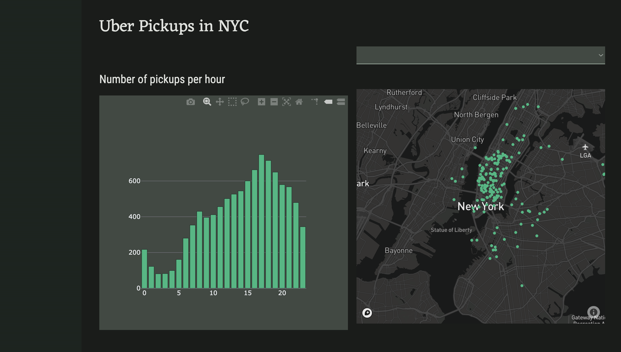
#create the histogram of uber pickups per hour
self.bar_chart.data = go.Bar(y=anvil.server.call('create_histogram'))
#create the map of pickup locations
token = "<your-token-here>"
self.mapbox_map.data = anvil.server.call('get_map_data')
#add the access token and center the map on NYC
self.mapbox_map.layout.mapbox = dict(accesstoken=token, center=dict(lat=40.7128, lon=-74.0060), zoom=10)
#remove padding from map
self.mapbox_map.layout.margin = dict(t=0, b=0, l=0, r=0)Run the app and both plots should now be populated with data
We now have a static dashboard to display our data. Let’s now modify our code so that the map updates according to user input.