Chapter 4:
Create a histogram
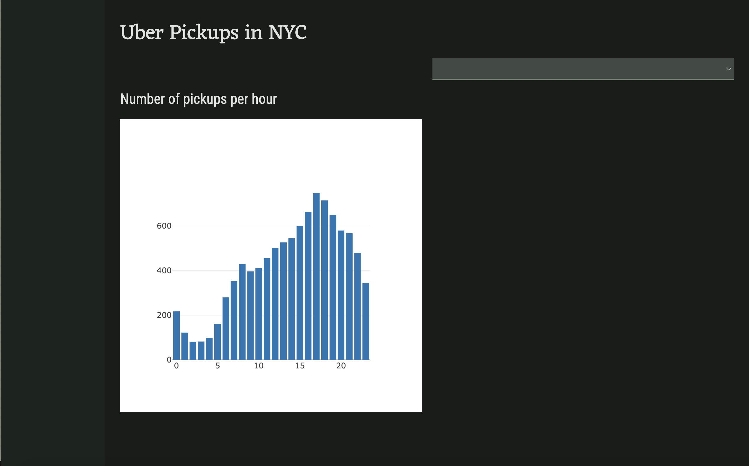
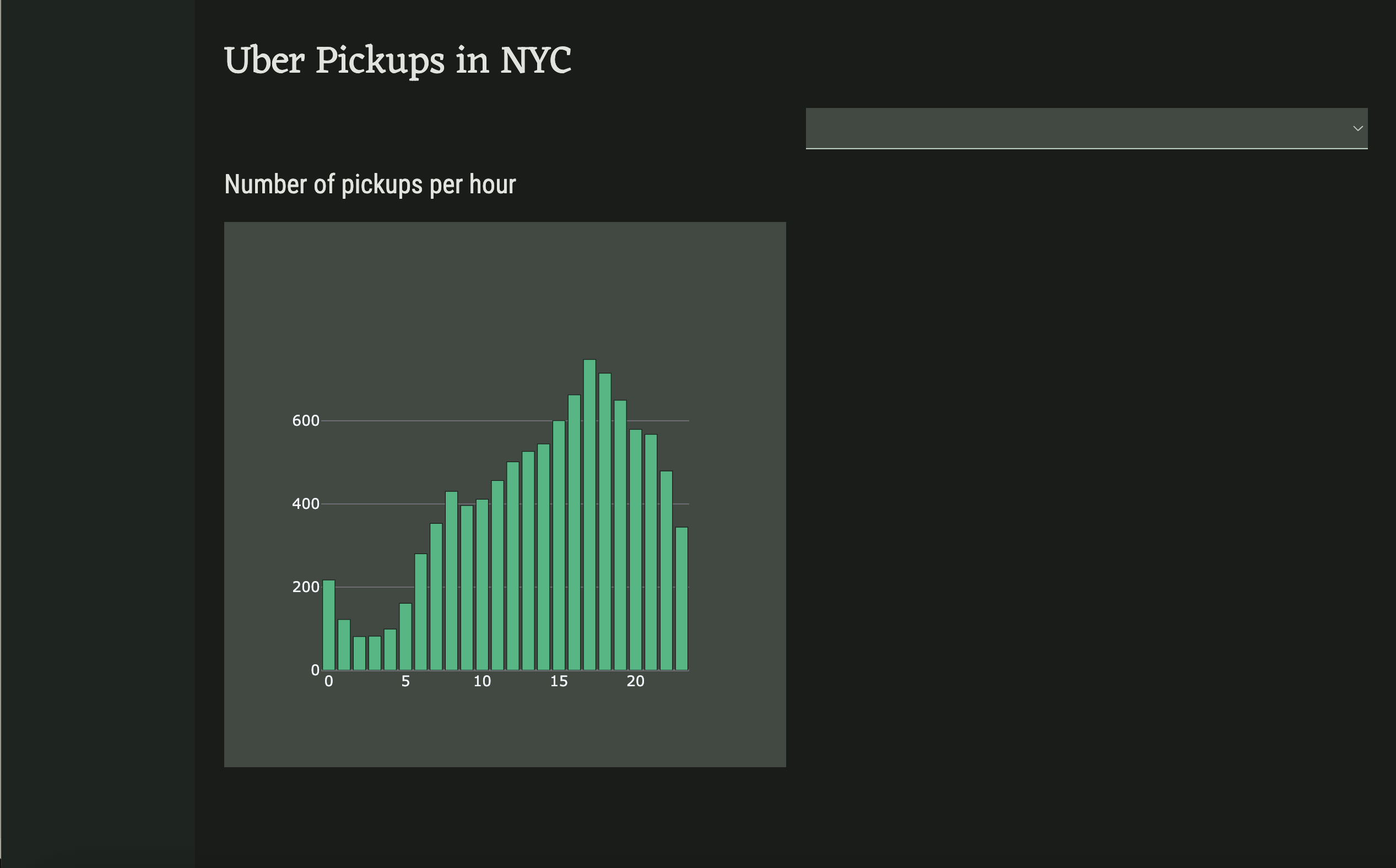
Let’s now write a function that creates a histogram of the hours in the Date/Time column that we can then plot on our self.bar_chart.
Step 1: Return the dataframe from get_uber_data
First, we need to modify the get_uber_data function to return the dataframe instead of just the head. We also need to convert the values in the Date/Time column to be datetime objects. We can also remove @anvil.server.callable from the function since we won’t need to call it from the client. The function should now look like this:
def get_uber_data():
  #read in 10000 rows of data
  df = pd.read_csv(data_files['uber-raw-data-sep14.csv'], nrows=10000)
  df['Date/Time'] = pd.to_datetime(df['Date/Time'])
  return df
Next, we need to call the function from the server module:
DATA = get_uber_data()Step 2: Create a numpy histogram
Let’s now add a function to create a histogram of the values in the Date/Time column. We’ll make this function callable from our client Form.
We can use numpy’s histogram method to count the number of entries in our dataset per hour. This method returns two arrays, but we only care about the first, which is an array of the histogram values.
@anvil.server.callable
def create_histogram():
  histogram = np.histogram(DATA['Date/Time'].dt.hour, bins=24)[0]
return histogramIn the next chapter, we’ll use Plotly to plot the location data onto a Mapbox map.
 By
By 
