Build an interactive dashboard from a CSV dataset
In this tutorial, we’re going to build an interactive dashboard to display insights from a CSV dataset. We’re going to be using a dataset of Uber pickups in New York City. We’ll use Anvil’s Data Files service to upload and store our CSV file, so that it is easily accessible from our app’s code. We will also be using pandas to read our data and Plotly to turn our data into interactive plots.
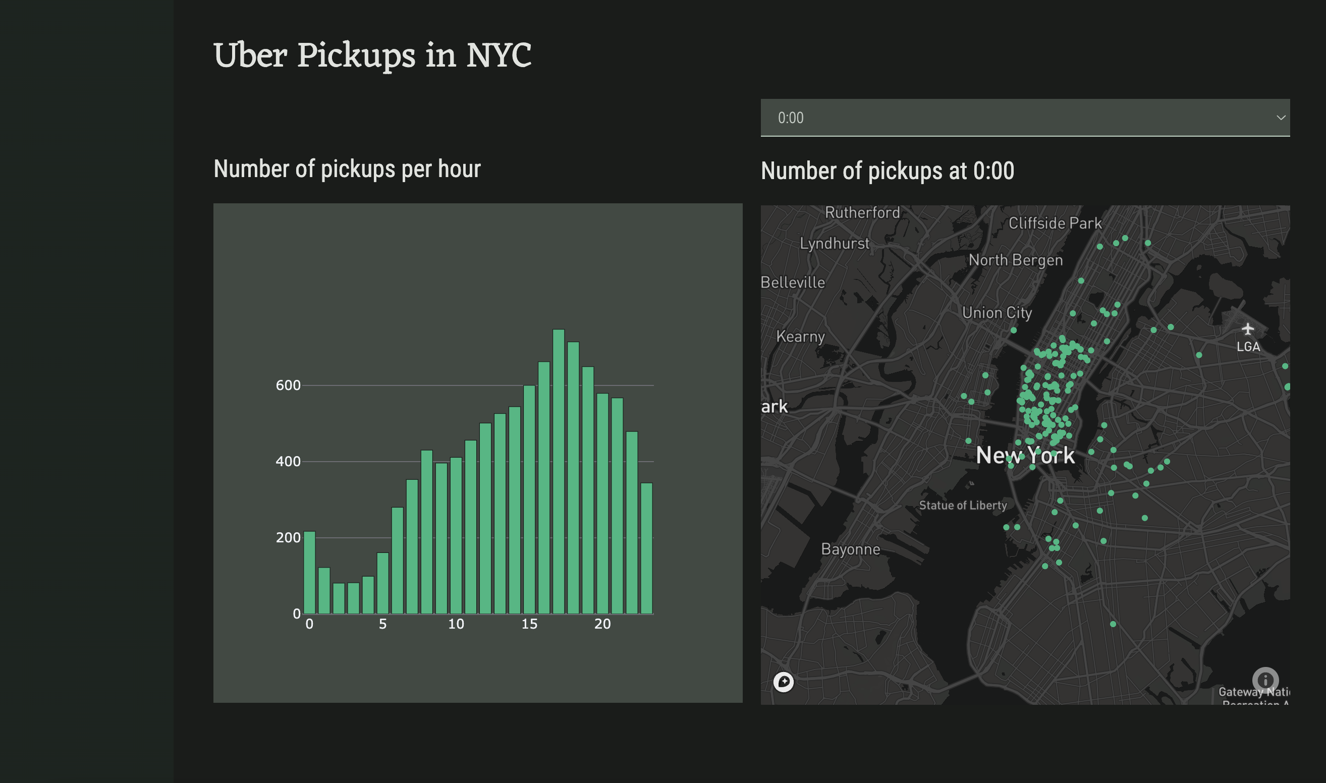
The final app will look something like this:
You can test it out here: uber-pickups-example.anvil.app
We’ll build the app in 7 quick steps:
- We’ll first import the dataset and Python packages we need.
- Second, we’ll create the app’s UI with Anvil’s drag-and-drop designer.
- Next, we’ll examine our data to better understand how to use it.
- We’ll then use
numpyand Plotly to create and plot a histogram of all pickups per hour. - We’ll next plot the location data onto an interactive map using Mapbox and Plotly.
- To finish the app, we’ll allow users to filter the data displayed on the map.
- Finally, we’ll publish our app and share it with the world!
Chapters
In this tutorial, you'll:Import the dataset and packages
Import the CSV data and Python packages.
Build the user interface
Drag and drop components to create the app’s user interface.
Create a histogram
Use numpy to create a histogram out of the data/time data.
Plot the map data
Plot the location data onto a Scattermapbox Plotly plot.
Respond to user input
Modify the app so that it updates based on user input.