 By
By Chapter 3:
Create the forecast plot
Step 1: Get the 5-day forecast data
Let’s get the temperature data for the next 5 days from the JSON object we printed out in the last chapter. We’ll plot the data using Plotly.
Go back to your Server Module and import datetime at the top. We’ll be pulling temperature and time data from the API response, and we need datetime to transform the time data into a format Plotly will understand.
from datetime import datetimeNow, go down to get_forecast_data and add the lines below to the function. We’re no longer returning the response, but instead times and temps.
@anvil.server.callable
def get_forecast_data(location):
  API_URL = f"http://api.openweathermap.org/data/2.5/forecast?lat={location['lat']}&lon={location['lon']}&appid={anvil.secrets.get_secret('api_key')}&units=metric"
  response = anvil.http.request(API_URL,json=True)
  # Extract forecast data
  times = [datetime.fromtimestamp(i['dt']) for i in response['list']]
  temps = [i['main']['temp'] for i in response['list']]
return times, tempsStep 2: Create your plot
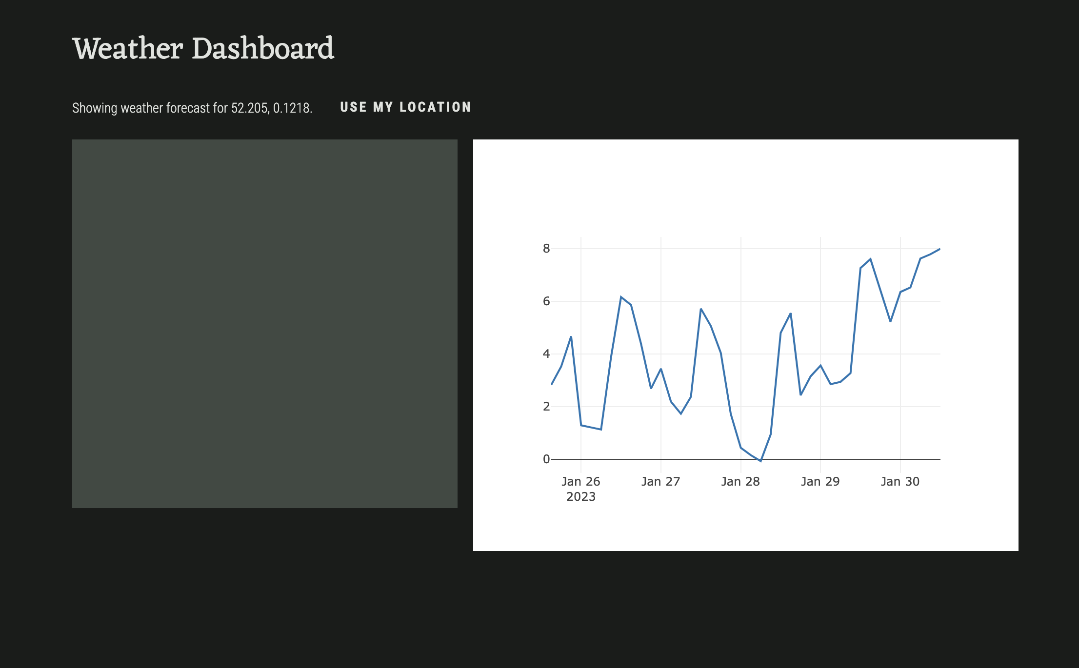
Back in our Form1, we’re going to create the refresh function, where we’ll call our server function and build our plot. We’ll use a Plotly go.Scatter object to plot the times and temps returned from our server function. Add the following function to Form1’s code:
  def refresh(self):
    times, temps = anvil.server.call('get_forecast_data', self.location)
    self.plot_1.data = go.Scatter(x=times, y=temps)
We’re also going to call this function from set_location, so that every time a location is set, the plot refreshes. This will be useful later, when we display the forecast for the user’s location.
  def set_location(self, lat, lon):
    self.location = {"lat": lat, "lon": lon}
    self.location_label.text = f"Showing weather forecast for {lat}, {lon}."
    self.refresh()
If we run our app, this is how it looks so far:
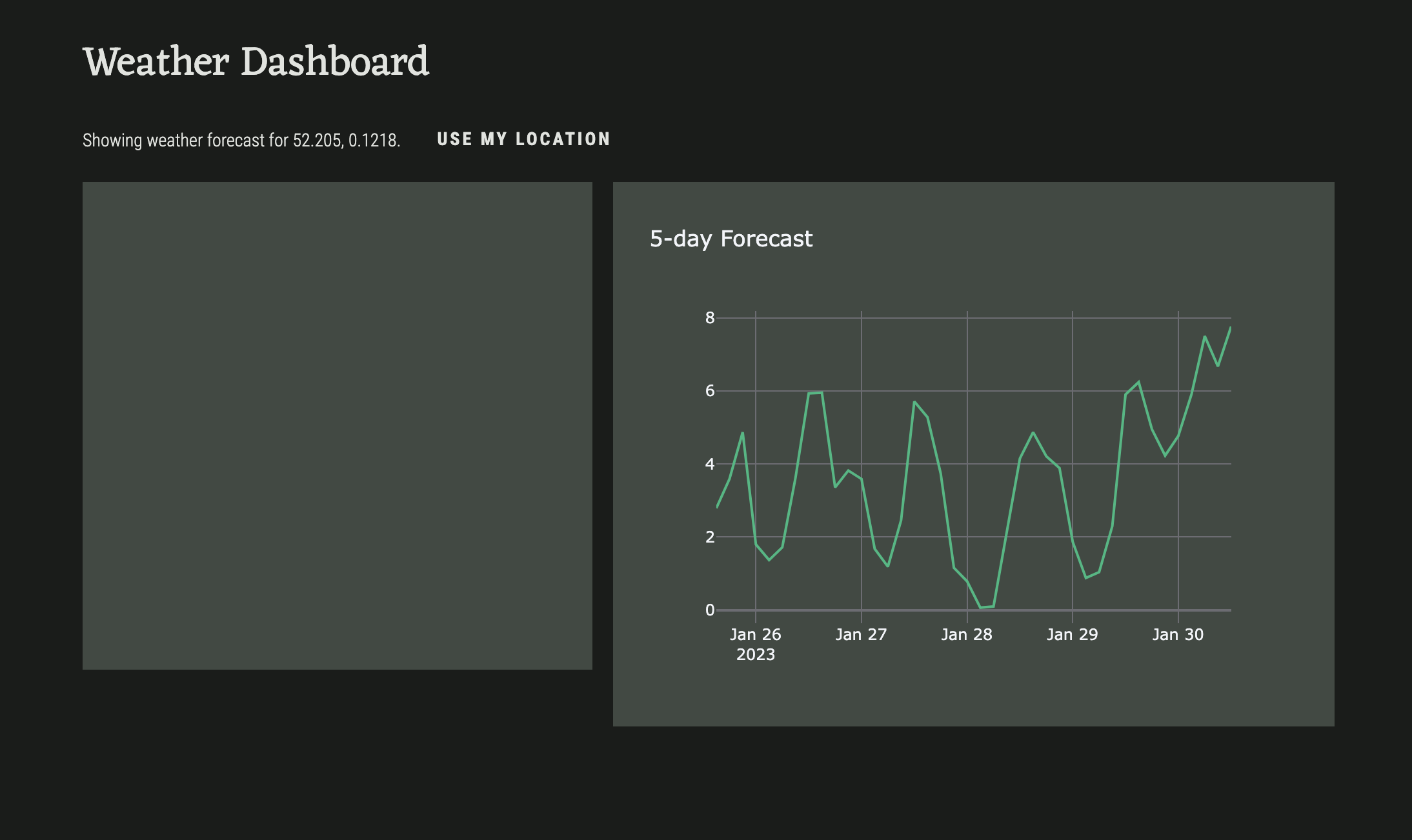
Step 3: Make it pretty
Let’s change the plot theme so that it matches the app theme. At the top of our Form, right under our import statements, let’s set our default plot template to ‘rally’:
Plot.templates.default = "rally"We’ll also add a title to our figure. Add this line to your refresh function:
  def refresh(self):
    times, temps = anvil.server.call('get_forecast_data', self.location)
    self.plot_1.data = go.Scatter(x=times, y=temps)
    self.plot_1.layout.title = "5-day Forecast"
Run the app. The plot should now look like this: