 By
By Chapter 6:
Plot data from a REST API
We’ve seen how to plot data from an external SQL database, and a private external database.
Next, we’ll plot real-time weather data for Cambridge from a REST API.
Step 1: Get the data
Let’s say we’re receiving real-time data from an external analytics provider via their REST API. Keeping track of this data is something we want to do with our dashboard.
We can integrate against REST APIs using Anvil’s http module. Let’s plot some real-time weather data for Cambridge!
To make a GET request, we run:
anvil.http.request("https://your-url-here")Alternatively, we could use the standard python requests library from our Server Module, like so:
import requests
requests.get("https://your-url-here")
Note: A paid plan is required to use the requests module (here’s why)
For illustrative purposes, we’ll get our data from the OpenWeatherMap API. This gives real-time weather data in JSON format.
First, let’s import Anvil’s http module. Add this line to the top of your Server Module:
import anvil.httpAdd this function to your Server Module. It takes in latitude and longitude parameters and returns data from the API:
@anvil.server.callable
def get_weather_data(latitude, longitude):
  resp = anvil.http.request("https://api.openweathermap.org/data/2.5/onecall?lat=%s&lon=%s&exclude=hourly,daily&appid=%s&units=imperial"
        % (latitude, longitude, "43eda1fbcf0b07043eeeac93ae54e1e0"),
        json=True)
  # convert timestamp to datetime object
  time = datetime.fromtimestamp(resp['current']['dt'])
  # return time and temperature data
  return {
    'time':time,
    'temp':resp['current']['temp']
  }
The OpenWeatherMap API key that we use for the tutorial has a limit on API requests per month. If you see a 403 'daily usage limit exceeded' error, this means our quota has been exceeded.
You can sign up for your own free API key by creating an account with OpenWeatherMap here.
Step 2: Plot the data
We’re returning real-time temperature data from the API, so let’s store these values as we retrieve them.
Go back to Form1, and create a local variable in the __init__ method:
    # Initialise an empty list to store incoming temperature data
    self.temp_data = []
Next, add this function to plot the data:
  def build_weather_graph(self):
    # Retrieve data from API. We'll use latitude and longitude for Cambridge for this example.
    weather_data = anvil.server.call('get_weather_data', 52.2053, 0.1218)
    # Add time and temperature data to our temp_data variable.
    self.temp_data.append({'time':weather_data['time'], 'temp':weather_data['temp']})
    # Create a Scatter plot with this data, and change the colour of the line
    self.plot_4.data = go.Scatter(y=[x['temp'] for x in self.temp_data],
                                  x=[x['time'] for x in self.temp_data],
                                  line=dict(color='#2196f3'))
We want to plot this data when our app is opened, so let’s call it from the __init__ method of Form1. Your temp_data variable is used in the build_weather_graph function, so make sure you initialise the variable before you call self.build_weather_graph.
Your __init__ method should look like this:
    # Any code you write here will run before the form opens.
    self.temp_data = []
    self.build_revenue_graph()
    self.build_signups_graph()
    self.build_marketing_graph()
self.build_weather_graph()Step 3: Make it real-time
Since we’re getting real-time data from our weather API, let’s update our weather graph regularly to see how the temperature is changing during the day.
Go to ‘Design’ view in the Form Editor and drop a ‘Timer’ ![]() component onto the page.
component onto the page.
We can set the interval property of our timer - that’s how often our Timer will ‘tick’. We’ll then call our get_weather_data function each time the Timer ‘ticks’.
The default interval is 0.5 seconds – let’s slow that down to 2 seconds. Click on the Timer, and in the Properties panel on the right, change the interval from 0.5 to 2 seconds.
Next, we want to call our get_weather_data server function each time our Timer ticks.
We’ll use Events for this.
Set up an event handler
Anvil components can raise events. For example, when a Timer ticks, it raises the ‘tick’ event.
Click on your Timer, and scroll to the bottom of the Properties Panel. You’ll see a list of events for the Timer.
Click the blue arrows next to ‘tick’.
You’ll see a timer_1_tick method. Edit it to look like this:
  def timer_1_tick(self, **event_args):
    """This method is called every [interval] seconds. Does not trigger if [interval] is 0."""
    with anvil.server.no_loading_indicator:
      self.build_weather_graph()
Run your app
Click the Run button, and you’ll see that your temperature graph is displaying real-time data from OpenWeatherMap’s REST API. Fabulous!
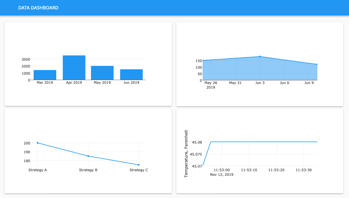
We’ve built a dashboard with data from four different sources and displayed on the web, all with nothing but Python.
Brilliant! All four plots are complete. Our app now displays data from three external data sources as well as Anvil’s built-in database. And one of the plots updates in real time!
By this point you’re well versed in the fundamentals of Anvil - building UIs, storing data, fetching data in several ways, getting the data into your UI, and using Plotly to visualise data.
Next we’ll make the dashboard look a bit nicer - we’ll customise the plot layout.