 By
By Cryptocurrency Exchange Rate dashboard
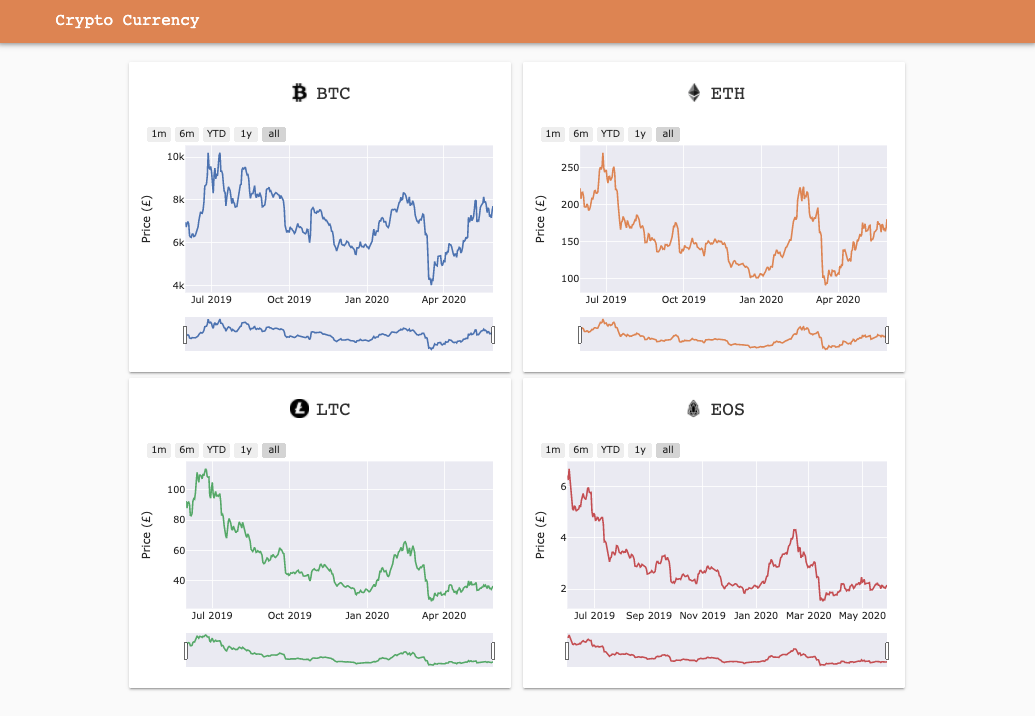
Being able to compare a currency’s exchange rate is key to understanding its value. Comparing historical data can also tell you how stable one currency is compared to another.
This dashboard template shows exchange rate history for four prominent cryptocurrencies. You can use this template to create your own custom cryptocurrency dashboard.
These charts are built using Plotly. With Anvil you can build custom dashboards using your favourite frameworks. Once your charts are built, you can deploy them online with one-click deployment, a drag and drop UI and nothing but Python. No HTML, CSS, JavaScript or DevOps required!
This dashboard template uses the CoinBase API and Anvil’s HTTP module to get the data. It’s Python, so getting data from external APIs is really easy. If Pythons extensive standard library isn’t enough, you can install your favourite packages, such as Numpy, Pandas, Scipy and many more.
Click the following link to clone the example and explore it yourself:
To get started building your own dashboards in Anvil, read our tutorial on building dashboards with Python: