 By
By How do I make plots in Python?
This question used to have a simple answer: Matplotlib was the only way. Nowadays, Python is the language of Data Science and there’s a lot more choice. Which should you use?
This guide will help you decide. We’ll show you how to use each of the four most popular Python plotting libraries, plus a couple of great up-and-comers.
The most popular Python plotting libraries are Matplotlib, Plotly, Seaborn, and Bokeh. We’ve also included some underrated gems that you should definitely consider: Altair, with its expressive API, and Pygal, with its beautiful SVG output. We’ll also look at the very convenient plotting API provided by Pandas.
Our Example Plot
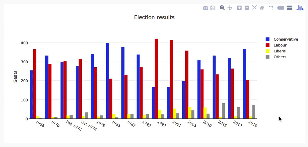
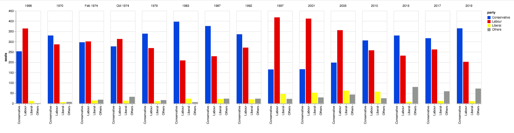
Each of these libraries takes a slightly different approach. To compare them, we’re going to make the same plot with each library, and show you the source code. I’ve chosen a grouped bar chart of British election results since 1966. Here it is:
We’ll be recreating this bar chart using each of the biggest Python plotting libraries.
All of these libraries are available in Anvil’s Server Modules (and Plotly works directly in Anvil’s front-end Python code too) – so I’ve packaged an example for each library as an Anvil app you can copy and use yourself.
I compiled a dataset of British election history from Wikipedia: the number of seats in the UK parliament won by the Conservative, Labour, and Liberal parties (broadly defined) in each election from 1966 to 2019, plus the number of seats won by ‘others’. You can download it as a CSV file here.
Matplotlib
Matplotlib is the oldest Python plotting library, and it’s still the most popular. It was created in 2003 as part of the SciPy Stack, an open-source scientific computing library similar to Matlab.
Matplotlib gives you precise control over your plots – for example, you can define the individual x-position of each bar in your barplot. I’ve written a more detailed guide to Matplotlib, and you can find it here:
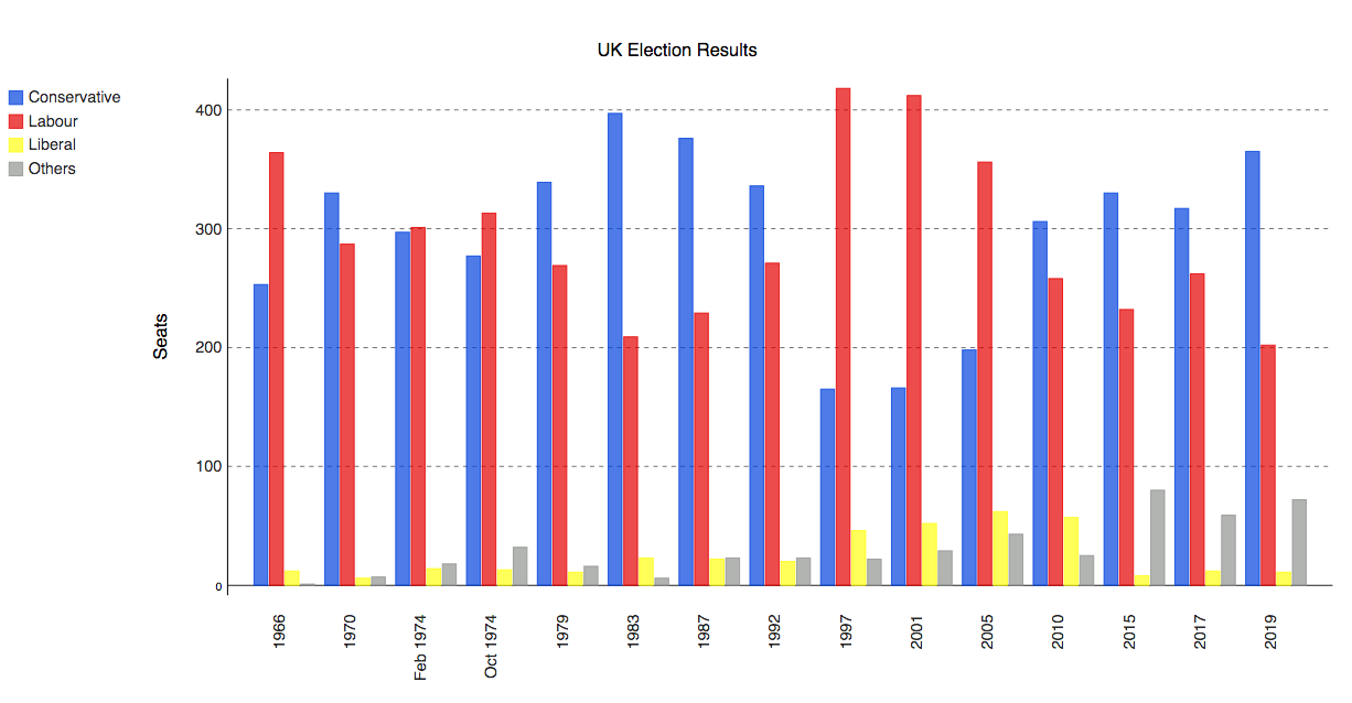
Here are those election results, plotted in Matplotlib. Click the tab to see the Python code that produces it, or head over to our Matplotlib guide to dig into how it works:

    import matplotlib.pyplot as plt
    import numpy as np
    from votes import wide as df

    # Initialise a figure. subplots() with no args gives one plot.
    fig, ax = plt.subplots()

    # A little data preparation
    years = df['year']
    x = np.arange(len(years))

    # Plot each bar plot. Note: manually calculating the 'dodges' of the bars
    ax.bar(x - 3*width/2, df['conservative'], width, label='Conservative', color='#0343df')
    ax.bar(x - width/2, df['labour'], width, label='Labour', color='#e50000')
    ax.bar(x + width/2, df['liberal'], width, label='Liberal', color='#ffff14')
    ax.bar(x + 3*width/2, df['others'], width, label='Others', color='#929591')

    # Customise some display properties
    ax.set_ylabel('Seats')
    ax.set_title('UK election results')
    ax.set_xticks(x)    # This ensures we have one tick per year, otherwise we get fewer
    ax.set_xticklabels(years.astype(str).values, rotation='vertical')
    ax.legend()

    # Ask Matplotlib to show the plot
    plt.show()
Seaborn
Seaborn is an abstraction layer on top of Matplotlib - it gives you a really neat interface to make a wide range of useful plot types very easily.
It doesn’t compromise on power, though! Seaborn gives you escape hatches to access the underlying Matplotlib objects, so you still have complete control. You can check out a more detailed guide to Seaborn here:
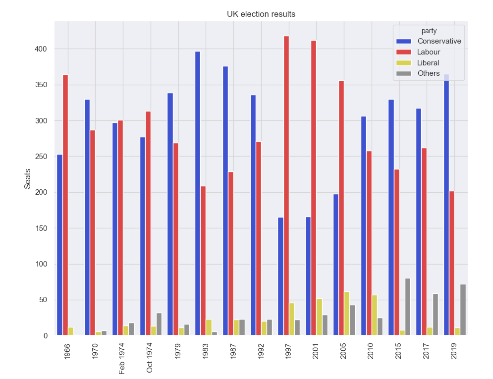
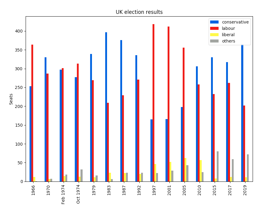
Here’s our election-results plot in Seaborn. If you click to the code, you’ll see it’s a lot simpler than the raw Matplotlib:
    import seaborn as sns
    from votes import long as df

    # Some boilerplate to initialise things
    sns.set()
    plt.figure()

    # This is where the actual plot gets made
    ax = sns.barplot(data=df, x="year", y="seats", hue="party", palette=['blue', 'red', 'yellow', 'grey'], saturation=0.6)

    # Customise some display properties
    ax.set_title('UK election results')
    ax.grid(color='#cccccc')
    ax.set_ylabel('Seats')
    ax.set_xlabel(None)
    ax.set_xticklabels(df["year"].unique().astype(str), rotation='vertical')

    # Ask Matplotlib to show it
    plt.show()
Plotly
Plotly is a plotting ecosystem that includes a Python plotting library. There are three different interfaces to it:
- an object-oriented interface
- an imperative interface that allows you to specify your plot using JSON-like data structures
- and a high-level interface similar to Seaborn called Plotly Express.
Plotly plots are designed to be embedded in web apps. At its core, Plotly is actually a JavaScript library! It uses D3 and stack.gl to draw the plots.
You can build Plotly libraries in other languages by passing JSON to the JavaScript library. The official Python and R libraries do just that. At Anvil, we ported the Python Plotly API to run in the web browser.
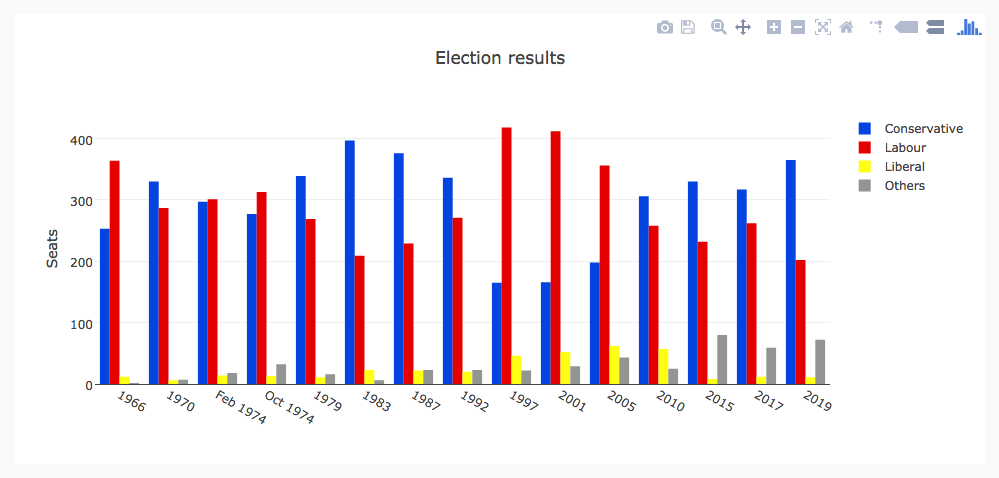
Here’s the election results plot in Plotly:
The election plot on the web, using Anvil’s client-side-Python and Plotly.
    import plotly.graph_objects as go
    from votes import wide as df

    #  Get a convenient list of x-values
    years = df['year']
    x = list(range(len(years)))

    # Specify the plots
    bar_plots = [
        go.Bar(x=x, y=df['conservative'], name='Conservative', marker=go.bar.Marker(color='#0343df')),
        go.Bar(x=x, y=df['labour'], name='Labour', marker=go.bar.Marker(color='#e50000')),
        go.Bar(x=x, y=df['liberal'], name='Liberal', marker=go.bar.Marker(color='#ffff14')),
        go.Bar(x=x, y=df['others'], name='Others', marker=go.bar.Marker(color='#929591')),
    ]

    # Customise some display properties
    layout = go.Layout(
        title=go.layout.Title(text="Election results", x=0.5),
        yaxis_title="Seats",
        xaxis_tickmode="array",
        xaxis_tickvals=list(range(27)),
        xaxis_ticktext=tuple(df['year'].values),
    )

    # Make the multi-bar plot
    fig = go.Figure(data=bar_plots, layout=layout)

    # Tell Plotly to render it
    fig.show()
Bokeh
Bokeh (pronounced “BOE-kay”) specialises in building interactive plots, so our standard example doesn’t show it off to its best. Check out our extended guide to Bokeh, where we add some custom tooltips! Like Plotly, Bokeh’s plots are designed to be embedded in web apps - it outputs its plots as HTML files.
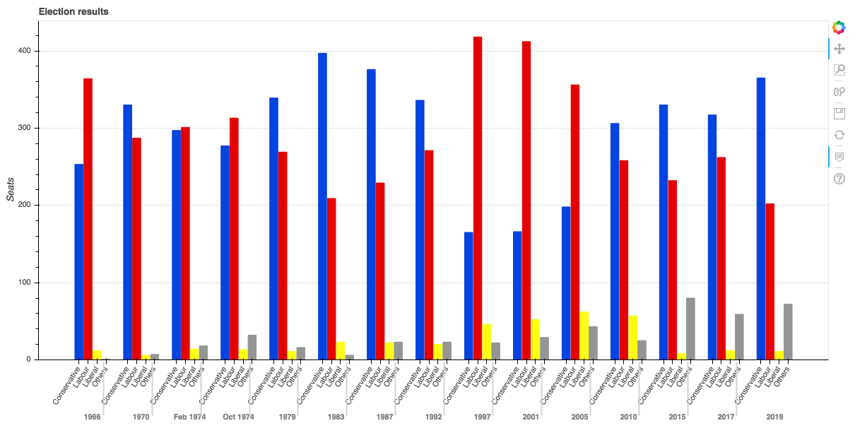
Here’s the election-results plot in Bokeh:
    from bokeh.io import show, output_file
    from bokeh.models import ColumnDataSource, FactorRange, HoverTool
    from bokeh.plotting import figure
    from bokeh.transform import factor_cmap
    from votes import long as df

    # Specify a file to write the plot to
    output_file("elections.html")

    # Tuples of groups (year, party)
    x = [(str(r[1]['year']), r[1]['party']) for r in df.iterrows()]
    y = df['seats']

    # Bokeh wraps your data in its own objects to support interactivity
    source = ColumnDataSource(data=dict(x=x, y=y))

    # Create a colourmap
    cmap = {
        'Conservative': '#0343df',
        'Labour': '#e50000',
        'Liberal': '#ffff14',
        'Others': '#929591',
    }
    fill_color = factor_cmap('x', palette=list(cmap.values()), factors=list(cmap.keys()), start=1, end=2)

    # Make the plot
    p = figure(x_range=FactorRange(*x), width=1200, title="Election results")
    p.vbar(x='x', top='y', width=0.9, source=source, fill_color=fill_color, line_color=fill_color)

    # Customise some display properties
    p.y_range.start = 0
    p.x_range.range_padding = 0.1
    p.yaxis.axis_label = 'Seats'
    p.xaxis.major_label_orientation = 1
    p.xgrid.grid_line_color = None
Altair
Altair is based on a declarative plotting language (or ‘visualisation grammar’) called Vega. This means a well-thought-through API that scales well for complex plots, saving you from getting lost in nested-for-loop hell.
As with Bokeh, Altair outputs its plots as HTML files. We’ve got an extended guide to Altair too:
Here’s how our election results plot looks in Altair. Note how expressively the actual plot is specified, with just six lines of Python:
    import altair as alt
    from votes import long as df

    # Set up the colourmap
    cmap = {
        'Conservative': '#0343df',
        'Labour': '#e50000',
        'Liberal': '#ffff14',
        'Others': '#929591',
    }

    # Cast years to strings
    df['year'] = df['year'].astype(str)

    # Here's where we make the plot
    chart = alt.Chart(df).mark_bar().encode(
        x=alt.X('party', title=None),
        y='seats',
        column=alt.Column('year', sort=list(df['year']), title=None),
        color=alt.Color('party', scale=alt.Scale(domain=list(cmap.keys()), range=list(cmap.values())))
    )

    # Save it as an HTML file.
    chart.save('altair-elections.html')
Pygal
Pygal focuses on visual appearance. It produces SVG plots by default, so you can zoom them forever – or print them out – without them getting pixellated. Pygal plots also come with some good interactivity features built-in, making Pygal another underrated candidate if you’re looking to embed plots in a web app.
Here’s the election results plot in Pygal:
    import pygal
    from pygal.style import Style
    from votes import wide as df

    # Define the style
    custom_style = Style(
        colors=('#0343df', '#e50000', '#ffff14', '#929591')
        font_family='Roboto,Helvetica,Arial,sans-serif',
        background='transparent',
        label_font_size=14,
    )

    # Set up the bar plot, ready for data
    c = pygal.Bar(
        title="UK Election Results",
        style=custom_style,
        y_title='Seats',
        width=1200,
        x_label_rotation=270,
    )

    # Add four data sets to the bar plot
    c.add('Conservative', df['conservative'])
    c.add('Labour', df['labour'])
    c.add('Liberal', df['liberal'])
    c.add('Others', df['others'])

    # Define the X-labels
    c.x_labels = df['year']

    # Write this to an SVG file
    c.render_to_file('pygal.svg')
Pandas
Pandas is an extremely popular Data Science library for Python. It allows you to do all sorts of data manipulation scalably, but it also has a convenient plotting API. Because it operates directly on data frames, our Pandas example is the most concise code snippet in this article – even shorter than the Seaborn one!
The Pandas API is a wrapper around Matplotlib, so you can also use the underlying Matplotlib API to get fine-grained control of your plots.
Here’s the election results plot in Pandas. The code is beautifully concise!
    from matplotlib.colors import ListedColormap
    from votes import wide as df

    cmap = ListedColormap(['#0343df', '#e50000', '#ffff14', '#929591'])

    ax = df.plot.bar(x='year', colormap=cmap)

    ax.set_xlabel(None)
    ax.set_ylabel('Seats')
    ax.set_title('UK election results')

    plt.show()
Plotting with Anvil
Anvil is a system for building full-stack web apps with nothing but Python – no JavaScript required!
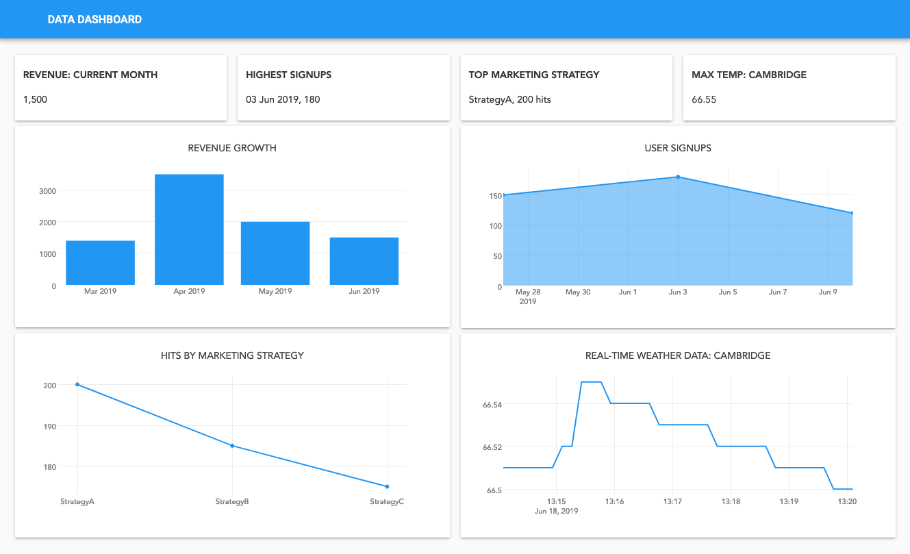
You can use any of the libraries I’ve talked about in this article to make plots in Anvil, and display them in the web browser. It’s great for building dashboards:
You can build this dashboard yourself, with Build a Dashboard with Anvil tutorial
In each of our in-depth guides, to Matplotlib, Plotly, Seaborn, Bokeh, Altair, and Pygal, you’ll find an example web application you can open and edit in Anvil, showing you how to use each of these Python plotting libraries.
We’ve also collected all our Anvil-specific advice in our Anvil plotting guide. It tells you how to use plots from each of the libraries mentioned in this article in your Anvil app, including our fully front-end Python version of Plotly.
Check out the guide: