 By
By Plotting in Python
We're making the same plot in a range of Python plotting libraries.
Each library has a different strength - click the buttons below to learn more!
How to make plots using Altair
Plotting in Altair is a breeze. It has an elegant interface thanks to Vega, the declarative plotting language that allows you to define what your plots should look like, rather than writing loops and conditionals to construct them.
Fluent in plotting
We’re comparing Python plotting libraries by plotting the same multi-bar plot in each one. It shows UK election results from 1966 to 2020.
This is the plot we made in Matplotlib:

The Matplotlib plot took 16 lines of code to create, including manually calculating the positions of each bar.
Here’s how to make a similar plot in Altair:
    import altair as alt
    from votes import long as df

    chart = alt.Chart(df).mark_bar().encode(
        x='party',
        y='seats',
        column='year',
        color='party',
    )

    chart.save('altair-elections.html')
Much more concise! Just like Seaborn, Altair works with data that has one column per variable
(Long Form). This allows you to map each variable onto an aspect of the plot - Altair calls these
aspects ‘Channels’. In our case, we want one bar per party on the x-axis, we want the seats each party won on the y-axis,
and we want to group the bars into columns by year. We also want to color the bars by party. That’s how you would
describe it in words, and it’s exactly what the code says!
Here’s what the plot looks like:
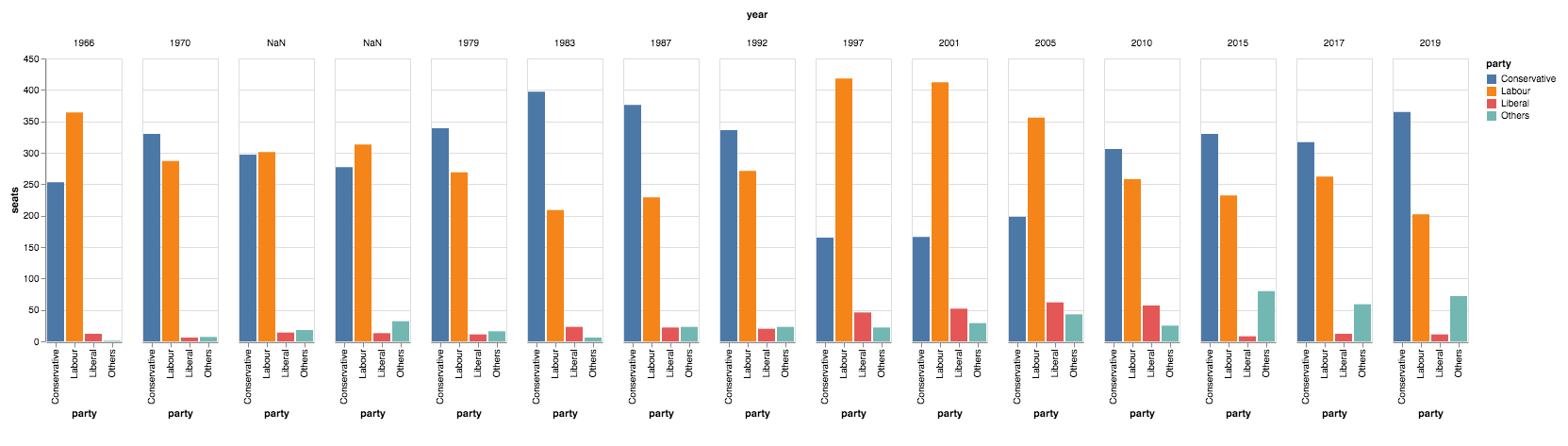
The Altair plot with default styling.
Tweaking the style
That’s not too far from what we want. The main difference from the Matplotlib plot is that each year group is displayed
with a little whitespace in between - this is just a feature of Altair’s multi-bar plots and it’s not a problem.
There are a few other little style improvements that we do want to make.
Non-integer values
The two non-integer year names
(Feb 1974 and Oct 1974) are displayed as NaN. We can fix these by casting our year values to strings:
df['year'] = df['year'].astype(str)Specifying sort order
We then also need to tell Altair how to sort the data. Altair allows us to specify more details about the
column Channel by passing it a Column object. So we tell it to sort in the order that the data appears in the DataFrame:
    chart = alt.Chart(df).mark_bar().encode(
        # ...
        column=alt.Column('year', sort=list(df['year']), title=None),
        # ...
    )
Removing axis titles
We have removed the ‘year’ label from the top of the plot by setting title=None. Let’s also remove the ‘party’
labels from each column:
    chart = alt.Chart(df).mark_bar().encode(
        x=alt.X('party', title=None),
        # ...
    )
Specifying a colourmap
Finally, we want to specify our own colours to use for the bars. Altair lets us specify a mapping between
values in a domain and colours in a range, which is exactly what we need:
    cmap = {
        'Conservative': '#0343df',
        'Labour': '#e50000',
        'Liberal': '#ffff14',
        'Others': '#929591',
    }

    chart = alt.Chart(df).mark_bar().encode(
        # ...
        color=alt.Color('party', scale=alt.Scale(domain=list(cmap.keys()), range=list(cmap.values())))
    )
Final code with style tweaks
After applying these styling tweaks, our code is a little less pleasing to the eye, but it still uses the declarative
approach that makes Altair so scalable. We’re still assigning independent variables from our data to separate aspects
of our plot, rather than performing complex data manipulations as we often need to do in Matplotlib.
The only difference is that our variable names are now wrapped in objects such as alt.X() that let us tweak how they appear:
    import altair as alt
    from votes import long as df

    cmap = {
        'Conservative': '#0343df',
        'Labour': '#e50000',
        'Liberal': '#ffff14',
        'Others': '#929591',
    }

    df['year'] = df['year'].astype(str)

    # We're still assigning, e.g. 'party' to x, but now we've wrapped it
    # in alt.X in order to specify its styling
    chart = alt.Chart(df).mark_bar().encode(
        x=alt.X('party', title=None),
        y='seats',
        column=alt.Column('year', sort=list(df['year']), title=None),
        color=alt.Color('party', scale=alt.Scale(domain=list(cmap.keys()), range=list(cmap.values())))
    )

    chart.save('altair-elections.html')
In fairness to Matplotlib, we’ve now reached the same number of lines of code (16) as we used there!
Here’s the Altair plot with our styling tweaks applied:
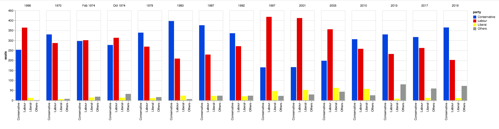
The Altair plot with our custom styling.
You can copy this example as an Anvil app here:
Style as standard
We’ve been comparing plotting libraries in Python by making the same plot in each library.
We’ve just seen how Altair has a really clean interface when defining where to display data, but we had to work a bit harder to customise the styling. The next library we’re looking at is designed with style in mind, producing pretty SVG graphs and making it easy to customise styling. It’s called PyGal:
Plotting in Python
We're making the same plot in a range of Python plotting libraries.
Each library has a different strength - click the buttons below to learn more!