
Adding HTML Elements
In addition to Anvil components, you can also build your user interface with native HTML elements.
Every Form in Anvil is represented by HTML under the hood. You can access this HTML from the HTML view in the Form Editor. Here, you can add your own HTML to truly customise your app’s user interface.
Native HTML elements that you add to your Form are represented in Anvil as HtmlComponents. You can interact with these HTMLComponents from the drag-and-drop designer and from Python code.
Writing HTML in your Form
Switch to HTML view in the Form Editor to see your Form’s underlying HTML. You can write HTML here, and changes you make are reflected in Design view, and vice versa.
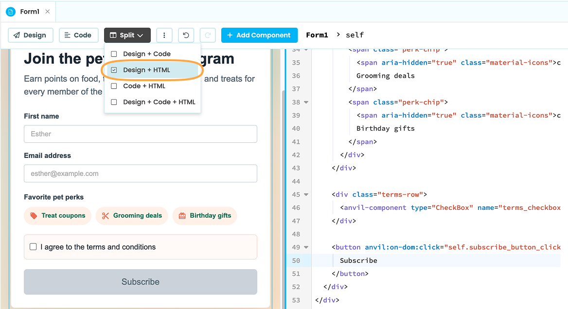
HTML view in the Form Editor showing the Form’s underlying HTML.
You can use a mixture of Anvil components and native HTML components, and you can even add Anvil components inside your HTML elements:
<div class="terms-row">
  <anvil-component type="CheckBox" name="terms_checkbox" prop:text="I agree to the terms and conditions" prop:checked="false"></anvil-component>
</div>
If you give an HTML element the anvil:name attribute, you can reference the HTMLComponent in Python code using the name you set. For example, the <button> below can be referenced in Python code as self.html_button:
<button anvil:name="html_button">Subscribe</button>Styling HTML elements
From HTML view, you can style HTML elements by adding class and style attributes just like any normal HTML element. Classes can be written in your app’s theme.css file.
<button class="subscribe-button disabled" style="font-weight:normal; border-radius: 8px" anvil:name="html_button">Subscribe</button>Native HTML elements are represented as HTMLComponents in Anvil. From Design view, you can add classes and styles to the HTMLComponent via the classes and style properties. This effectively does the same thing as using the HTML elements class and style attributes.
This can be done from the Properties Panel for static styling.
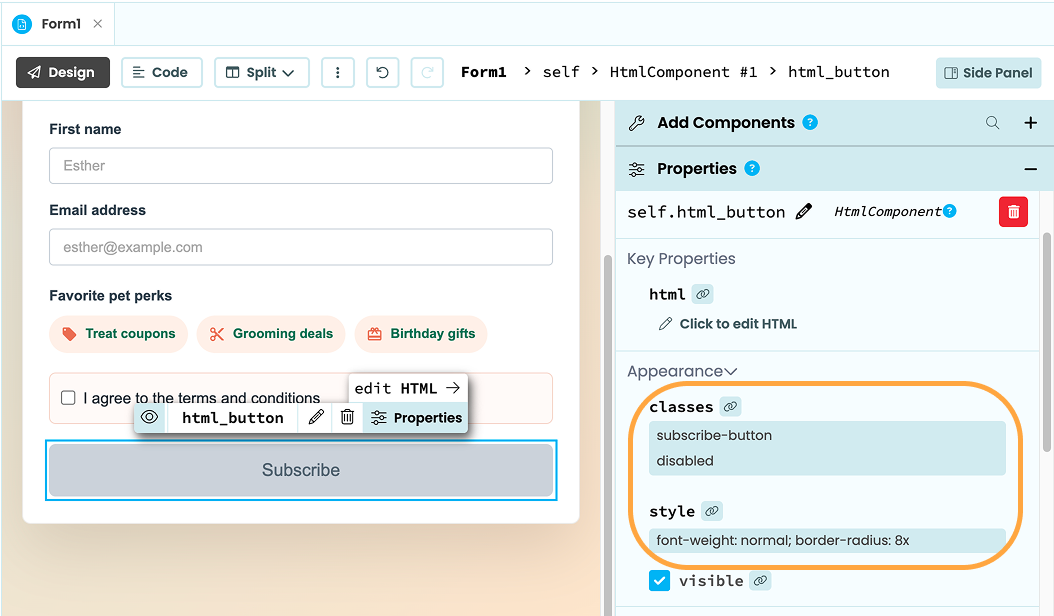
An HTMLComponent with classes and style properties
To dynamically update the component’s styling as users interact with your app, you can set the classes and style properties from Python code. The element will first need to have a anvil:name set
For example, in the code below, when self.terms_checkbox is ticked, the enabled class is added to the HTML button element and its font-weight is set to bold:
    @handle("terms_checkbox", "change")
    def terms_checkbox_change(self, **event_args):
        """This method is called when the component is checked or unchecked"""
        self.html_button.classes = ["enabled"]
        self.html_button.style['font-weight'] = "bold"
See the documentation on HTMLComponents for more information on using the classes and style properties: Anvil Docs | HTMLComponent
Handling events
You can use the anvil:on-dom attribute to add event handlers in Python that will run when specified events are fired.
For example, if you have a function called self.handle_click defined in Python code that you want to run when an HTML button is clicked, you can use anvil:on-dom:click="self.handle_click"
<button anvil:on-dom:click="self.handle_click">Submit</button>Accessing the DOM API
anvil:name makes an element referenceable as a Python object with Anvil properties, but it doesn’t give you access to the underlying DOM element’s full JavaScript API. Use the anvil:dom-node attribute to give an HTML component a name and expose it in your Form’s dom_nodes dictionary. This gives you access to the full JavaScript DOM API from your Form’s code:
<button anvil:dom-node="submit_button">Submit</h1>You can then access and manipulate the element from Python:
self.dom_nodes["submit_button"].disabled = TrueReusing HTML
Rather than reusing the same HTML across several Forms, turn it into a reusable custom component you can drop into any Form like an Anvil component or into a Layout you can use across Forms.
Do you still have questions?
Our Community Forum is full of helpful information and Anvil experts.