
Forms as HTML
Under the hood, the user interface of every Form in Anvil is represented by HTML, including any Anvil Components on the Form. HTML is the markup language used to write ordinary web pages.
You can inspect and edit a Form’s HTML from the Anvil Editor in HTML view. Changes made to a Form through the drag-and-drop designer are reflected in the Form’s HTML and vice versa.
The structure of a Form’s HTML
In most cases, the root of a Form’s HTML is the <anvil-form> element. This element defines whether the Form is structured with a container component or a Layout Form. The root of a Form’s HTML can also be native HTML or an Anvil component. See Form Templates for more details on the different Form types.
Form showing its HTML
Each Anvil component in a Form is represented by an <anvil-component> tag, specifying the type of component, its properties and data:
- The
typeattribute specifies the type of Anvil component, e.g."Button","TextBox" - The
nameattribute is its Python name, used to reference it in your Form’s code - The component properties are set using the
prop:prefix, e.g.prop:text="Maya Chen". - Data Bindings are set using
bind:along with the property and data, e.g.bind:text="self.item['name']". If writeback is enabled, thewritebackattribute is used, e.g.writeback:text="self.item['name']".
Container components can contain other components between their opening and closing <anvil-component> tags. For example, in the image below, the FlowPanel contains two Labels for projects and location:
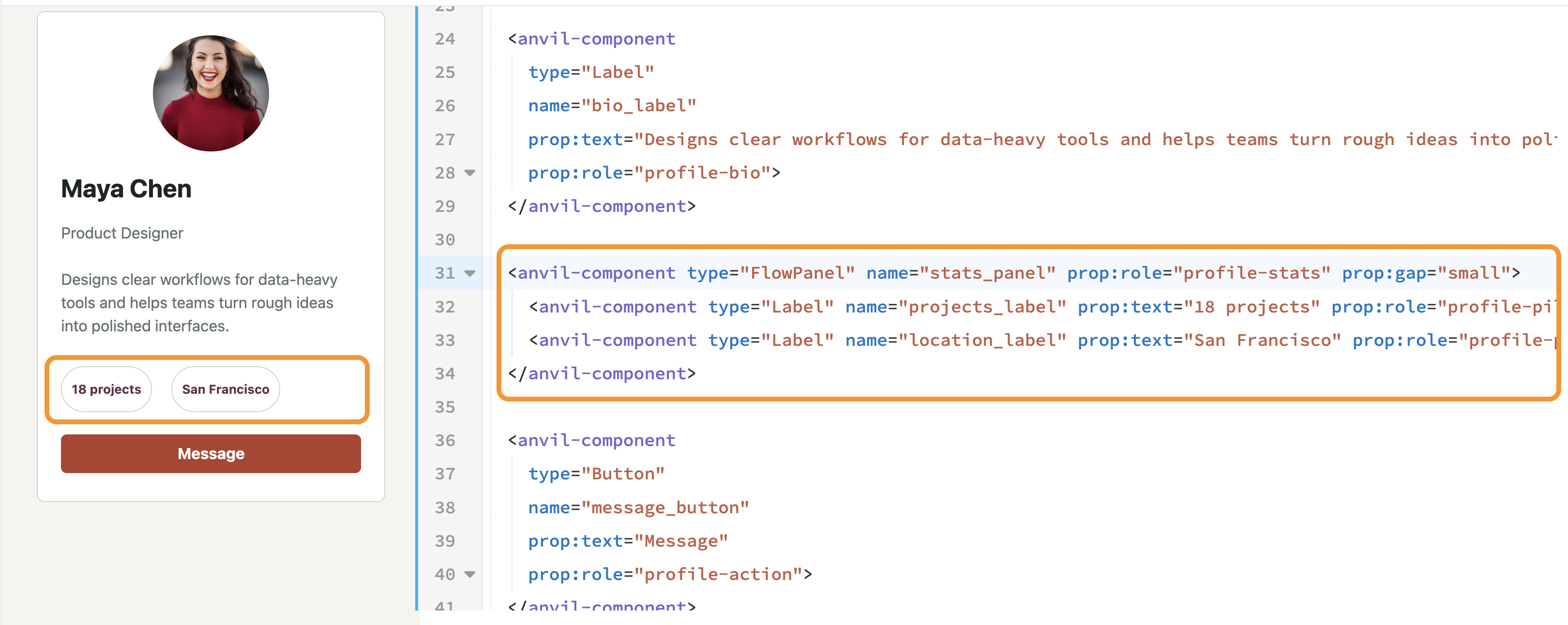
A FlowPanel containing two Label components
When components are placed in a slot they are wrapped in an <anvil-block> element. The slot attribute specifies the name of the slot it fills:
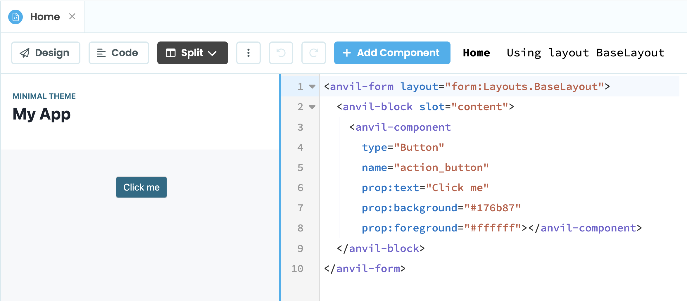
Form using the content slot in its Layout
Combining HTML and Anvil components
A Form can consist of native HTML elements as well as Anvil components.
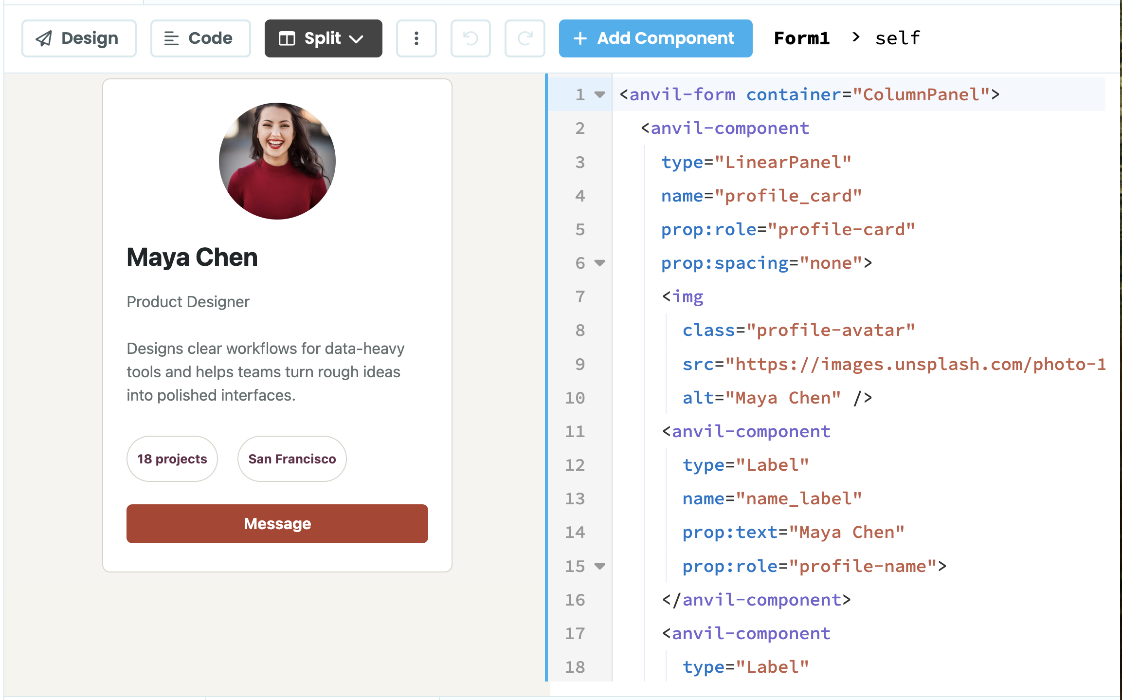
For example, this profile card uses a native HTML image element alongside Anvil components:
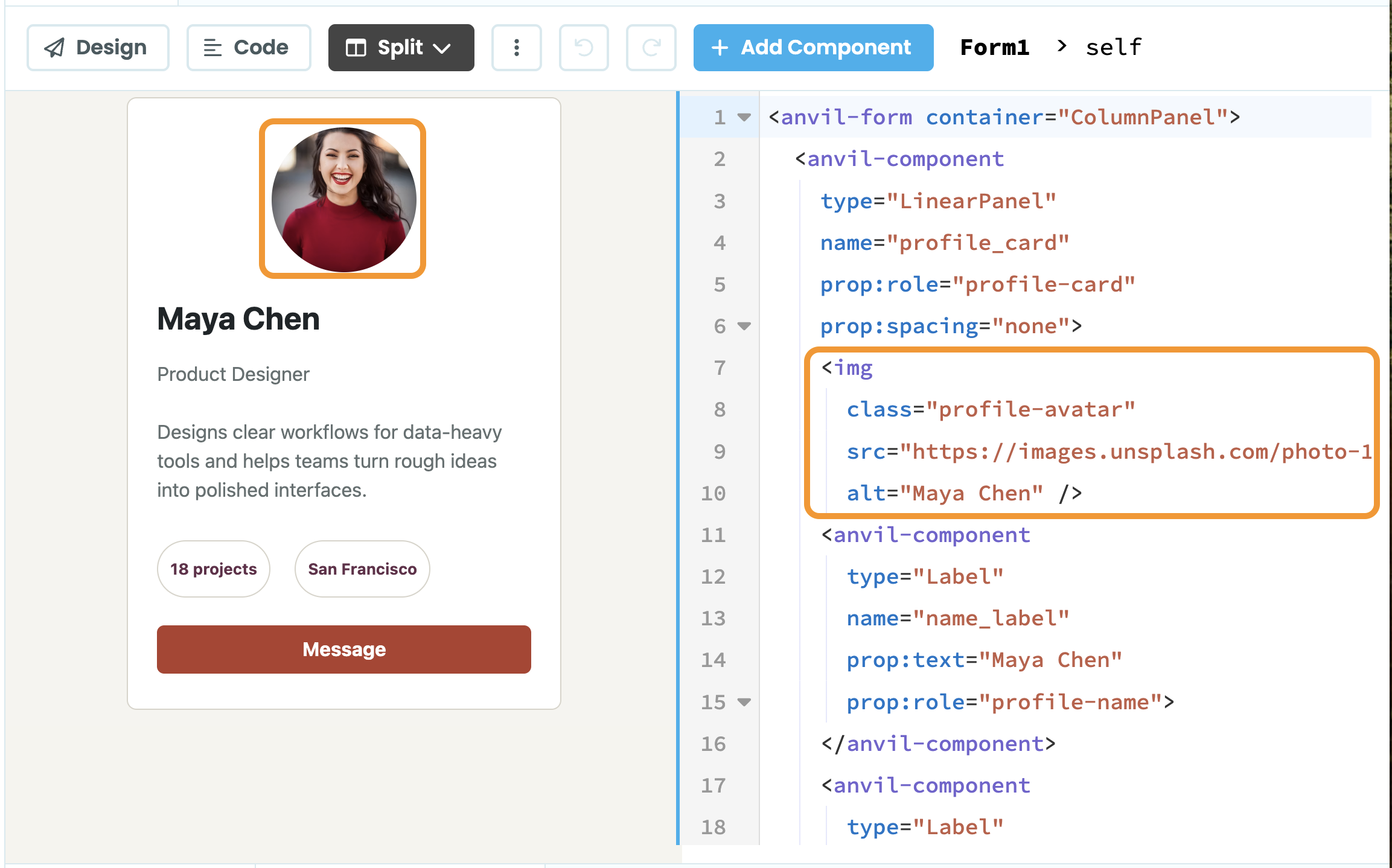
Form showing HTML and Anvil components
The <img> element is ordinary HTML that uses the profile-avatar CSS class. The LinearPanel and Label elements are Anvil components. They are all in an <anvil-form> whose container is a Column Panel.
For more details on using native HTML elements in your Anvil Forms, see Adding HTML Elements.
Do you still have questions?
Our Community Forum is full of helpful information and Anvil experts.