 By
By Plotting in Python
We're making the same plot in a range of Python plotting libraries.
Each library has a different strength - click the buttons below to learn more!
How to make plots using Plotly
Plotly is a plotting ecosystem that allows you to make plots in Python, as well as JavaScript and R. This is a Python blog, so we’re focusing on the Python libraries.
Plotly has three different Python APIs, giving you a choice of how to drive it:
- an object-oriented API that feels similar to Matplotlib,
- a data-driven API that specifies plots by constructing dictionaries of JSON-like data,
- and a ‘Plotly Express’ API that gives you high-level plotting functions similar to Seaborn.
We’ll explore each of these APIs by making the same plot in each one: a grouped bar plot of historical UK election results.
Making plots using Graph Objects
Plotly’s object-oriented API is named graph_objects. It’s somewhat similar to Matplotlib’s object-oriented API.
To create our multi-bar plot, we can construct a Figure object containing four Bar plots:
    # Import Plotly and our data
    import plotly.graph_objects as go
    from votes import wide as df

    # Get a convenient list of x-values
    years = df['year']
    x = list(range(len(years)))

    # Specify the plots
    bar_plots = [
      go.Bar(x=x, y=df['conservative'], name='Conservative', marker=dict(color='#0343df')),
      go.Bar(x=x, y=df['labour'], name='Labour', marker=dict(color='#e50000')),
      go.Bar(x=x, y=df['liberal'], name='Liberal', marker=dict(color='#ffff14')),
      go.Bar(x=x, y=df['others'], name='Others', marker=dict(color='#929591')),
    ]

    # Specify the layout
    layout = go.Layout(
      title=go.layout.Title(text="Election results", x=0.5),
      yaxis_title="Seats",
      xaxis_tickmode="array",
      xaxis_tickvals=list(range(27)),
      xaxis_ticktext=tuple(df['year'].values),
    )

    # Make the multi-bar plot
    fig = go.Figure(data=bar_plots, layout=layout)

    # Tell Plotly to render it
    fig.show()
Unlike in Matplotlib, there’s no need to calculate the x-positions of the bars manually; Plotly takes care of that for us.
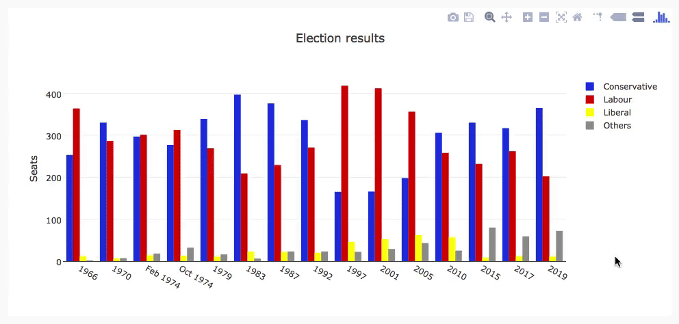
Here’s the final plot:
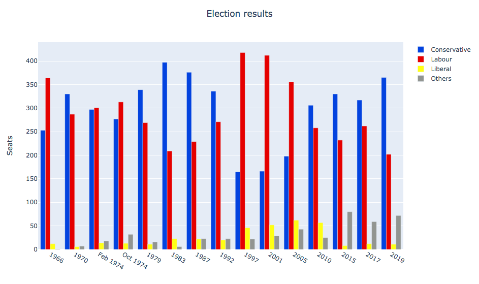
Our multibar plot made using Graph Objects.
Making plots using Python data structures
You can also specify your plot using basic Python data structures with the same structure as the object-oriented API. This corresponds directly to the JSON API for Plotly’s Javascript implementation.
    # Specify the plots
    fig = {
        'data': [
            {'type': 'bar', 'x': x, 'y': df['conservative'], 'name': 'Conservative', 'marker': {'color': '#0343df'}},
            {'type': 'bar', 'x': x, 'y': df['labour'], 'name': 'Labour', 'marker': {'color': '#e50000'}},
            {'type': 'bar', 'x': x, 'y': df['liberal'], 'name': 'Liberal', 'marker': {'color': '#ffff14'}},
            {'type': 'bar', 'x': x, 'y': df['others'], 'name': 'Others', 'marker': {'color': '#929591'}},
        ],
        'layout': {
            'title': {'text': 'Election results', 'x': 0.5},
            'yaxis': {'title': 'Seats'},
            'xaxis': {
                'tickmode': 'array',
                'tickvals': list(range(27)),
                'ticktext': tuple(df['year'].values),
            }
        }
    }

    # Tell Plotly to render it
    pio.show(fig)
The final plot looks exactly the same as our previous plot:
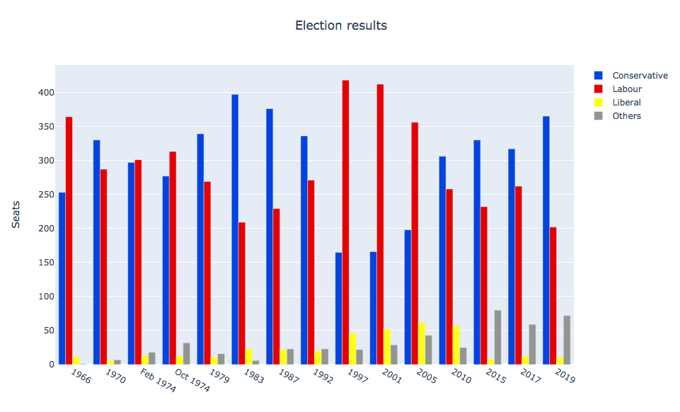
Our multibar plot made using JSON-like data structures.
Making plots using Plotly Express
Plotly Express is a high-level API that wraps Graph Objects.
You can make a multi-bar plot in Plotly Express using (almost) a single line:
    # Import Plotly and our data
    import plotly.express as px
    from votes import long as df

    # Define the colourmap to get custom bar colours
    cmap = {
        'Conservative': '#0343df',
        'Labour': '#e50000',
        'Liberal': '#ffff14',
        'Others': '#929591',
    }

    # Make the plot!
    fig = px.bar(df, x="year", y="seats", color="party", barmode="group", color_discrete_map=cmap)
This makes use of the data in Long Form, also known as ’tidy data’. The columns are ‘year’, ‘seats’ and ‘party’ rather than being split by party. It’s very similar to making a multibar plot in Seaborn.
>> print(long)
     year         party  seats
0    1922  Conservative    344
1    1923  Conservative    258
2    1924  Conservative    412
3    1929  Conservative    260
4    1931  Conservative    470
..    ...           ...    ...
103  2005        Others     30
104  2010        Others     29
105  2015        Others     80
106  2017        Others     59
107  2019        Others     72

[108 rows x 3 columns]
We can access the underlying Graph Objects API to make detailed tweaks. Let’s add a title and y-axis label:
    # Use the Graph Objects API to tweak our plot
    import plotly.graph_objects as go
    fig.layout = go.Layout(
        title=go.layout.Title(text="Election results", x=0.5),
        yaxis_title="Seats",
    )
And finally, ask Plotly to show it to us:
    # Tell Plotly to render it
    fig.show()
This runs a temporary web server on an unused port, and opens the default web browser to view the plot (the web server is immediately torn down).
Unfortunately, the result is not perfect. The x-axis is treated as an integer, so the groups are far apart and small. This makes it quite difficult to see trends.
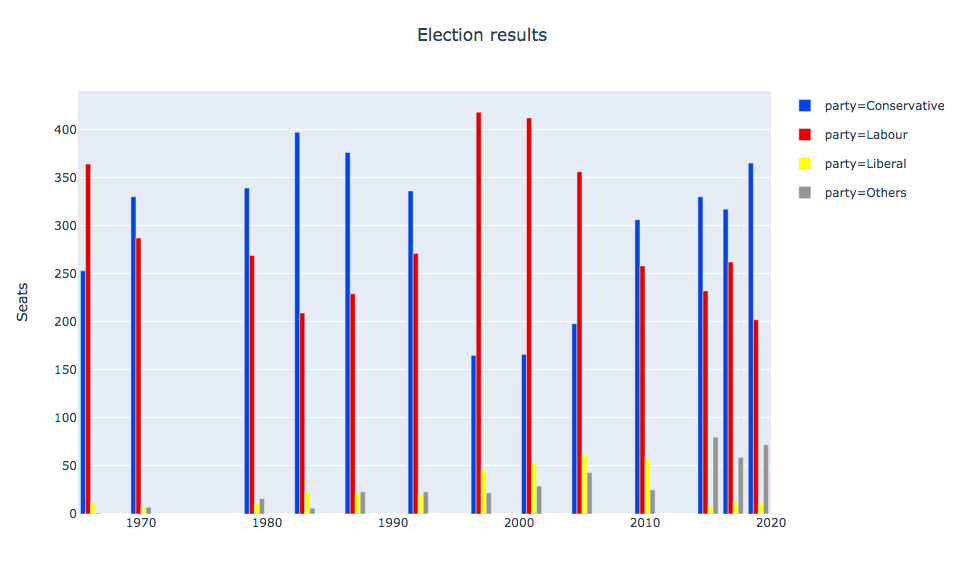
Our multibar plot made using Plotly express.
You might try to attempt to encourage Plotly Express to treat the x-values as strings by casting them to strings.
You might expect this to result in them being plotted with even spacing and lexical ordering. Unfortunately, you still
get them helpfully spaced numerically. Setting the xaxis_tickvals does not work as it did in graph_objects either.
Unlike the similar example in Seaborn, in this case the abstraction did not appear to provide sufficient escape hatches to let us get things exactly how we wanted. But perhaps we could write our own API?
Building your own Plotly API
Not happy with how Plotly does something? Build your own Plotly API!
At its core, Plotly is a JavaScript library that makes plots using D3 and stack.gl. The JavaScript library has an interface that consumes JSON structures that specify plots. So you just need to output JSON structures that the JavaScript library likes to consume.
We did just that to create a Python Plotly API that works entirely in the browser.
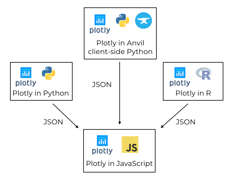
Plotly uses a JavaScript library to create plots, driven by libraries in other languages via JSON.
In the Anvil version, you can use both the Graph Objects API and the Python data structure approach explained above.
You run exactly the same commands, assigning the data and layout to a Plot component
in your Anvil app.
Here’s the multi-bar plot written in Anvil’s client-side Python API:
# Import Anvil libraries
from ._anvil_designer import EntrypointTemplate
from anvil import *
import anvil.server

# Import client-side Plotly
import plotly.graph_objects as go


# This is an Anvil Form
class Entrypoint(EntrypointTemplate):
  def __init__(self, **properties):
    # Set Form properties and Data Bindings.
    self.init_components(**properties)

    # Fetch the data from the server
    data = anvil.server.call('get_election_data')

    #  Get a convenient list of x-values
    years = data['year']
    x = list(range(len(years)))

    # Specify the plots
    bar_plots = [
      go.Bar(x=x, y=data['conservative'], name='Conservative', marker=dict(color='#0343df')),
      go.Bar(x=x, y=data['labour'], name='Labour', marker=dict(color='#e50000')),
      go.Bar(x=x, y=data['liberal'], name='Liberal', marker=dict(color='#ffff14')),
      go.Bar(x=x, y=data['others'], name='Others', marker=dict(color='#929591')),
    ]
    # Specify the layout
    layout = {
      'title': 'Election results',
      'yaxis': {'title': 'Seats'},
      'xaxis': {
        'tickmode': 'array',
        'tickvals': list(range(27)),
        'ticktext': data['year'],
      },
    }

    # Make the multi-bar plot
    self.plot_1.data = bar_plots
    self.plot_1.layout = layout
The plotting logic is the same as above, but it’s running entirely in the web browser - the plot is created by the Plotly JavaScript library on the user’s machine! This is a big advantage over all the other libraries in our rundown of Python plotting libraries. All the other Python libraries need to run on a server.
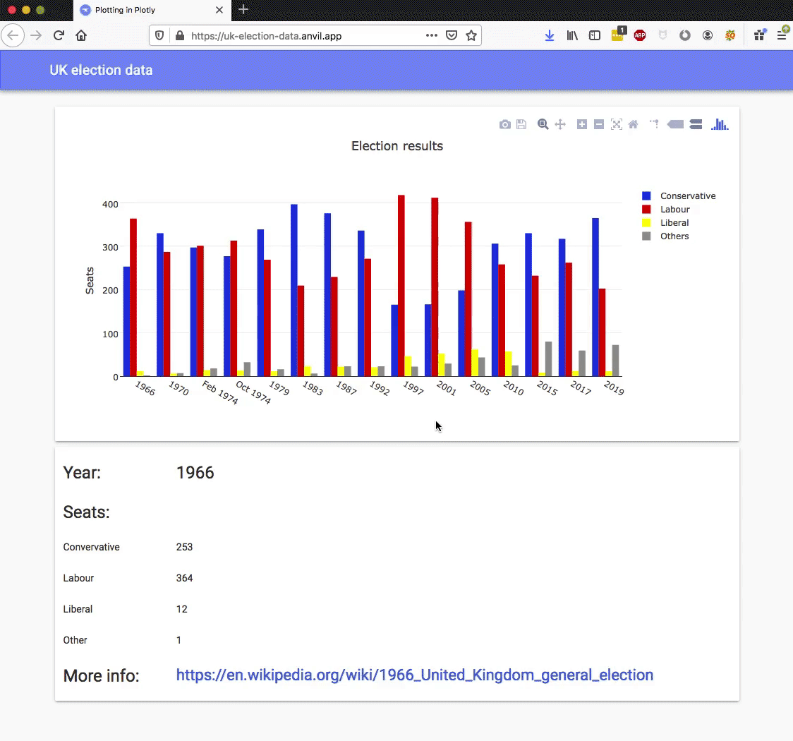
Here’s the interactive Plotly plot running in an Anvil app:
The election plot on the web using Anvil’s client-side-Python Plotly library.
You can copy this example as an Anvil app here:
Running Plotly in the front-end has another advantage: it opens up many more options for customising interactive behaviour.
Customising interactivity in Plotly
Plotly plots aren’t just dynamic, you can customise their interactive behaviour. For example, you can customise the format
of tooltips using hovertemplate in each bar plot:
    go.Bar(
      x=x,
      y=df['others'],
      name='others',
      marker=dict(color='#929591'),
      hovertemplate='Seats: <b>%{y}</b>',
    ),
Here’s what we get when we apply this to each bar plot:
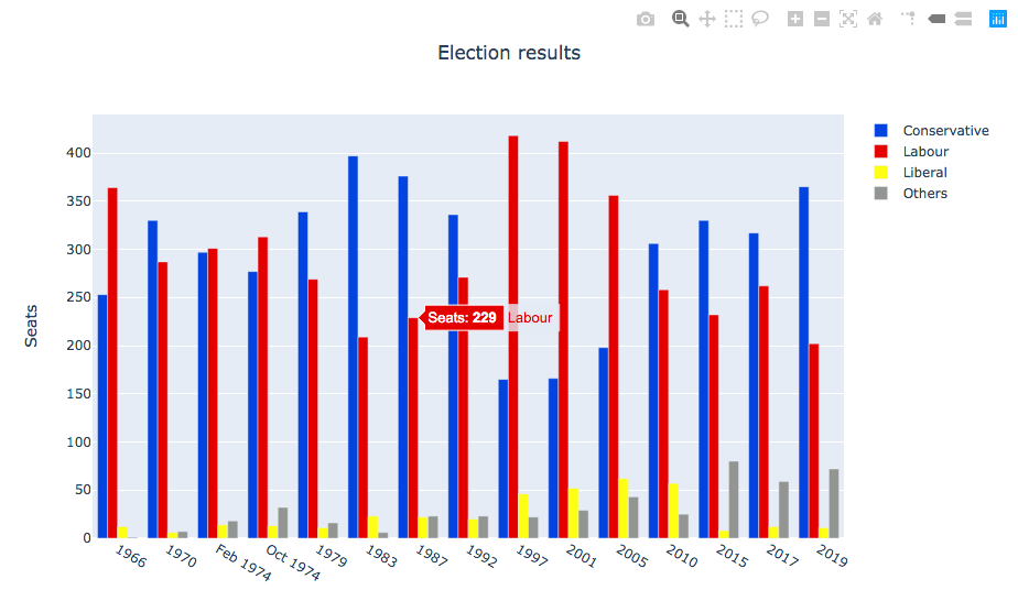
Our multibar plot with custom tooltips.
We’ll see a similar approach when we look at Bokeh.
This is useful, but it would be even better if we could execute any code we wanted when certain events happen -
let’s say a user hovers over the bar and we want to display an information box about the relevant election.
In Anvil’s Plotly library, you can bind event handlers to events such as hover, which makes that sort of
complex interactivity possible!
Our multibar plot with a hover event handler.
We achieve this by binding a method to the plot’s hover event:
  def plot_1_hover(self, points, **event_args):
    """This method is called when a data point is hovered."""
    i = points[0]['point_number']
    self.label_year.text = self.data['year'][i]
    self.label_con.text = self.data['conservative'][i]
    self.label_lab.text = self.data['labour'][i]
    self.label_lib.text = self.data['liberal'][i]
    self.label_oth.text = self.data['others'][i]
    url = f"https://en.wikipedia.org/wiki/{self.data['year'][i]}_United_Kingdom_general_election"
    self.link_more_info.text = url
    self.link_more_info.url = url
This is a rather extreme level of interactivity, and from the developer’s point of view, an extreme level of customisability. It’s all thanks to Plotly’s architecture - Plotly gives you a clean interface that is explicitly designed to allow you to build your own APIs. We would like to see this kind of great design everywhere!
Next up: custom interactivity using Bokeh
We’ve seen how Plotly uses JavaScript to create dynamic plots, and you can edit them live in the browser using Anvil’s client-side Python code.
We’ll continue our rundown of Python plotting libraries with Bokeh, which outputs an HTML document you can embed in a web app and get similar dynamic features to those provided by Plotly:
(That’s “BOE-kay”, if you’re wondering how to pronouce it.)
Plotting in Python
We're making the same plot in a range of Python plotting libraries.
Each library has a different strength - click the buttons below to learn more!