Data Grids are a way to easily display data in tables. Pagination and just-in-time loading comes for free, and customising their appearance and behaviour is as straightforward as anything in Anvil.
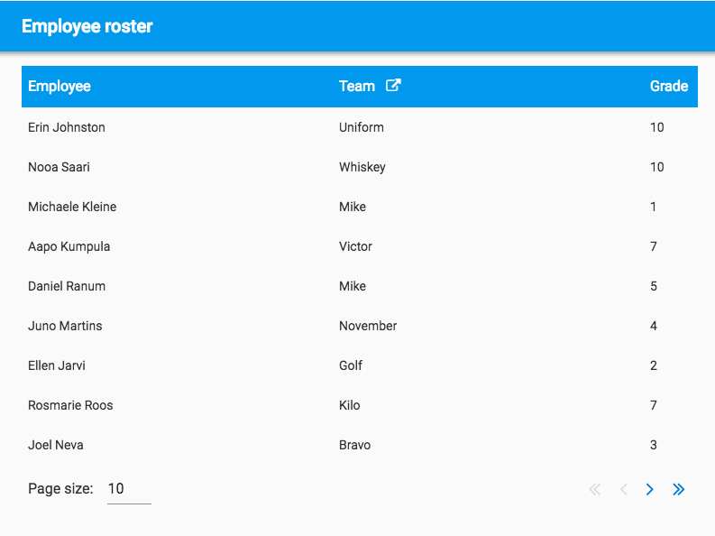
An example of a Data Grid
We’ll explore the use of Data Grids by creating an app to display a paginated table of employees, and tweak it to get it looking how we want.
A paginated table
Our data is a table of employees. We’ve got their first and last names, pay grades, and what team they are in. The data is stored in a standard Anvil Data Table, generated by a server module named RandomEmployeeGenerator:
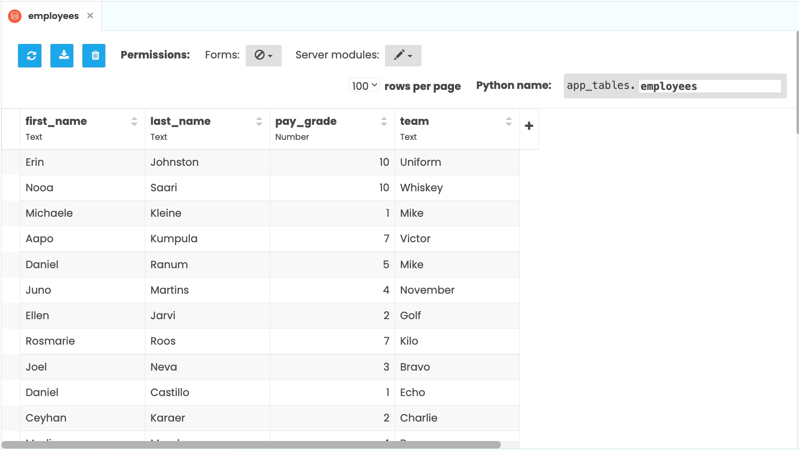
Let’s display them all in a paginated table.
Drag and drop a Data Grid onto the page.

Add a Data Grid to the page
It contains a Repeating Panel that you can hook up to your Data Table in the usual way - an accessor in a Server Module:
@anvil.server.callable
def get_employees():
  return app_tables.employees.search()
which is called from the Form’s __init__ method:
class Form1(Form1Template):
  def __init__(self, **properties):
    # ...
    self.repeating_panel_employees.items = anvil.server.call('get_employees')
Data grids don’t have to be populated from a Data Tables search.
The RepeatingPanel’s items could be a list of dictionaries instead -
the column keys would then be the keys of the dictionaries.
More generally, the items should be an iterable of objects that
have a __getitem__ method.
Next, you need to configure the Data Grid’s columns in the Properties panel:
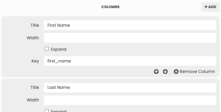
The Key parameter defines which database column goes into this Data Grid column. The Title parameter is the text that goes at the top of the Data Grid column on the page.
Let’s set up columns for first_name, last_name, team and pay_grade. You can do this by adding the columns one by one, or clicking “Add Columns from Data Table” and then choosing the ’employees’ table.
The page length is controlled by rows_per_page; 10 should keep it nice and short.
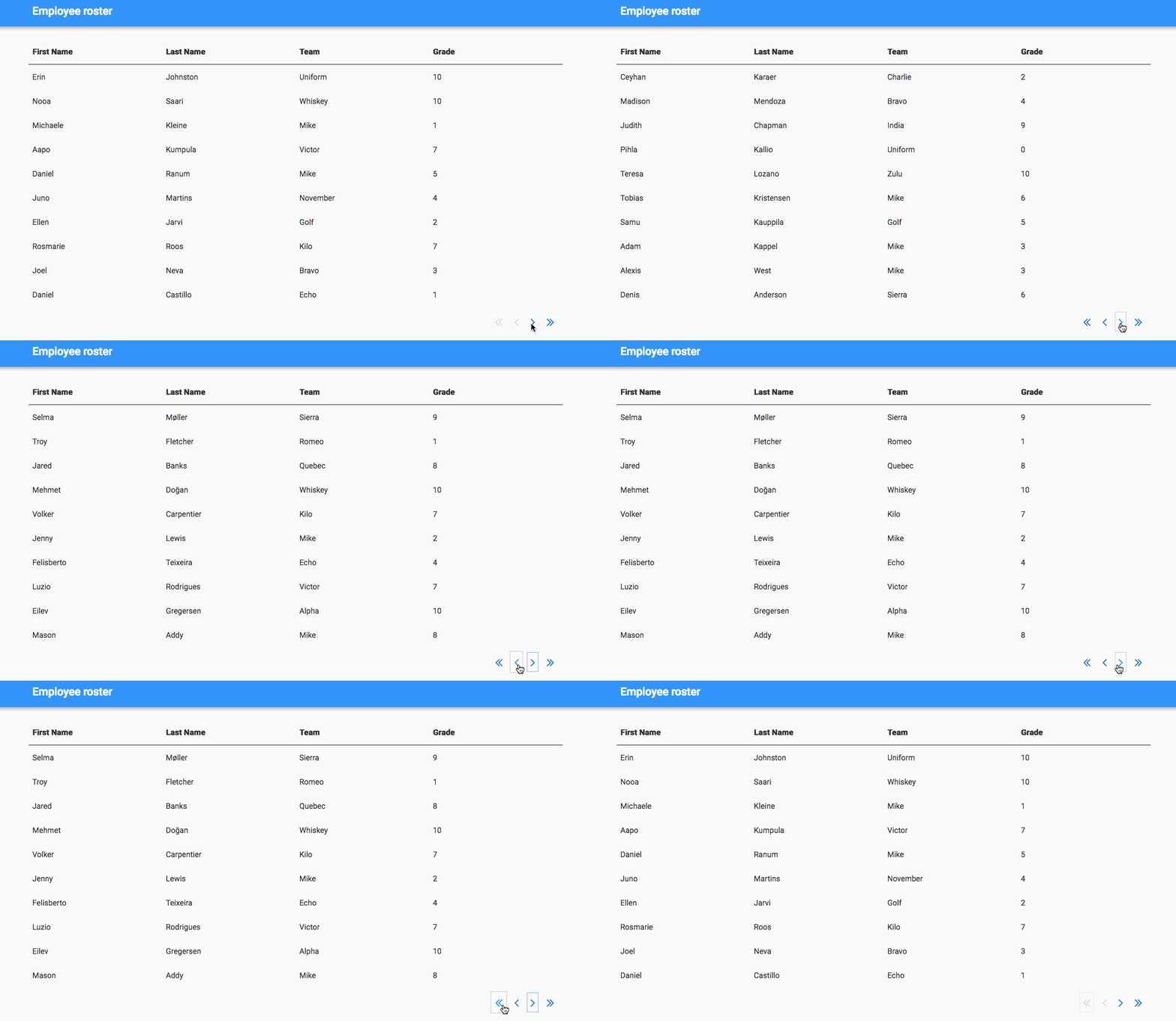
Now we have a table we can page through, showing all the info about our employees:
Configure the column widths
The Grade column is a bit wider than it really needs to be; it’s only displaying a number, after all.
You can drag the column edges to change the column size. Dragging a column edge changes the size of the column to its left, so in this case you want to drag the rightmost edge of the table.
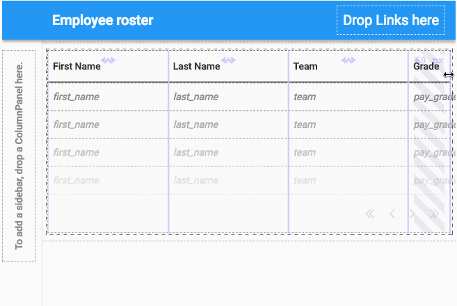
Now the Grade column is fixed at 60px wide. All the other columns are in ‘flex’ mode; they will all be equal width, once the widths of the ‘fixed’ columns have been taken into account. To set the Grade column back to ‘flex’ mode, you just need to double-click the edge that you used to change its width.
If you don’t like dragging things with the mouse, you can set the column widths with pixel precision by entering the desired
width in pixels in the width box for each column in the Properties panel. Emptying this box puts the column back into
‘flex’ mode.

To set a minimum width for a column, tick the ‘Expand’ box. The column will be in ‘flex’ mode, but it will never get smaller
than the width you’ve set for it.
Custom column headings and page size selector
What if I want the column headings to be a different colour?
And I want the Team column heading to link to an internal wiki page!
You can set up the heading of a Data Grid however you like.
You can drag-and-drop anything you like into the Data Grid. To create a header and footer, simply drag-and-drop something either above or below the Repeating Panel.
All you need to do is uncheck the auto_header setting in the Data Grid’s properties panel, then drag-and-drop a Data Row Panel into the top of the Data Grid. A Data Row Panel is a container that automatically has a slot per column, so you can put your custom column headings in each of its slots.

Be sure to set the pinned property on any header or footer. This ensures it doesn’t disappear when the page is turned!
You can also drop things into the space to the left of the paging arrows. In our example, we’ve added a box to choose how many employees to display per page. It’s simply a TextBox and a Label, inside a FlowPanel:
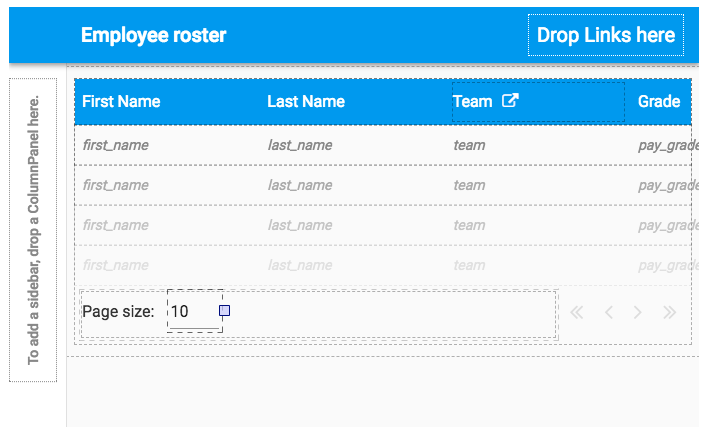
To make the page size selector work, the TextBox’s lost_focus handler should update the Data Grid’s rows_per_page:
  def text_box_1_lost_focus(self, **event_args):
    """This method is called when the TextBox loses focus"""
    self.data_grid_employees.rows_per_page = int(self.text_box_1.text) + 1
The Data Grid automatically updates when its rows_per_page property is changed, so this is enough to make the
page respond as soon as the user clicks the button. The +1 here is to account for the custom column headings; the
Data Row Panel we added to the top is counted in the row count.
Display the data however you like
In the database, we have the employees’ first and last names separately. Let’s imagine we want to display each employee’s whole name in a single column.
Delete the First Name and Last Name columns and replace them with a single column called Employee.
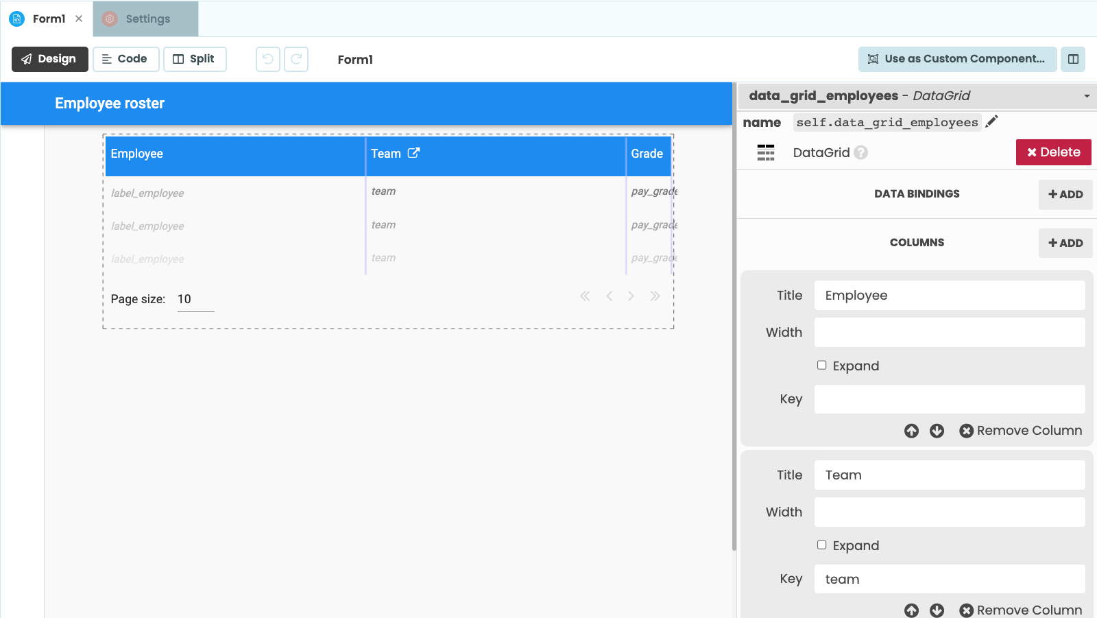
You can put a Label in that column and set the Label’s contents to be whatever you wish.
A Data Row Panel makes things line up with the columns of the Data Grid. There’s one slot for each column. You can double-click on the table in the design view to modify what’s in each column - just drag anything you like in from the Toolbox as normal. So, let’s add a Label to the Employee column:
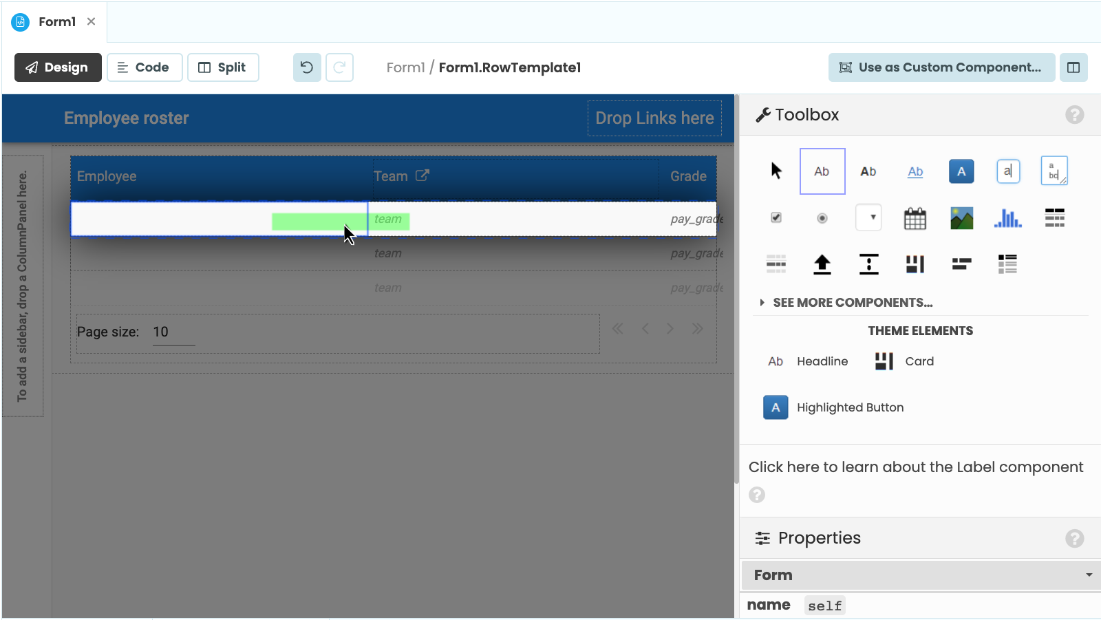
If you leave the Label like this, it will be empty. How do you make it display the employee’s full name?
Because this is a row in a Repeating Panel, it has an item
attribute, which is one of the elements of self.repeating_panel_employees.items. So you can set up a
Data Binding to fix the text of the Label to
a string giving an employee’s full name:

That’s all you need to do to populate a Data Grid column with some custom data.
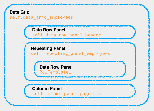
Data Grid Structure
It might help to understand exactly how Data Grids are structured. Inside each Data Grid is a Repeating Panel, and
inside that are Data Row Panels. In our employee management app, we have self.data_grid_employees, which contains
self.repeating_panel_employees, whose template (RowTemplate1) inherits from a Data Row Panel.
There we have it!
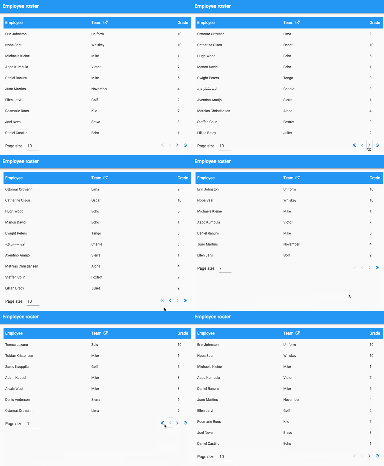
Here’s our final table with page turning, custom headers, page size selector and customised data presentation.
Click on this clone link to copy the app and take a look:
Feel free to use it and share it - our code examples are open-source under the Apache License.
Data Grids are pretty powerful and there’s much more you can do with them. Perhaps you’ll be interested in our tutorials on:
- Adding a search box to a Data Grid
- Grouping data into categories within a Data Grid
- Creating a row for adding new entries
- Making rows editable/deletable
 By
By