 By
By Chapter 8:
Display headline figures
So far, we’ve built a dashboard that plots data from four different data sources.
Let’s add some headline numerical statistics to the top of our dashboard.
Step 1: Construct the UI
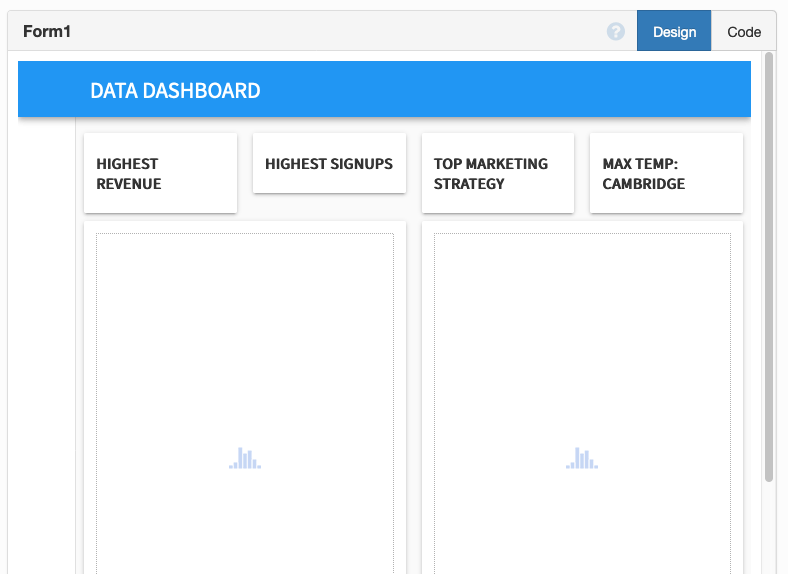
Drag and drop four Cards  along the top of your dashboard, and set the container property of each of these to
 full_width_row.
Drop a Label ![]() into each of the four cards. In the Properties Panel, make each of your labels
into each of the four cards. In the Properties Panel, make each of your labels bold, and change the text of each Label to the following:
- Highest revenue
- Highest signups
- Top marketing strategy
- Max temp: Cambridge
Your dashboard should look something like this:
Then, drop another label into each card, and give each label a name:
revenue_labelsignups_labelmarketing_labelweather_label

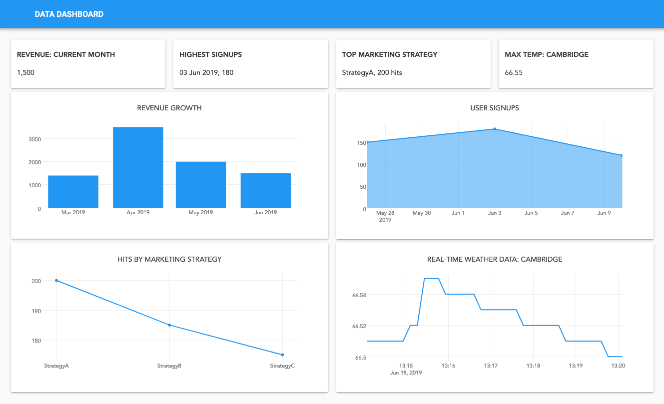
Step 2: Populate the Labels
Now, let’s populate those labels with our headline numerical statistics. We’ll amend each of our build_x_graph functions to populate our headline statistics.
First, add these lines to your build_revenue_graph function:
max_revenue = sorted(db_data, key=lambda x: x['amount'], reverse=True)[0]
self.revenue_label.text = f"{max_revenue['date']:%d %b %Y}, {max_revenue['amount']:,}"
Add these lines to your build_signups_graph function:
max_signups = sorted(signups, key=lambda x: x['signups'], reverse=True)[0]
self.signups_label.text = f"{max_signups['date']:%d %b %Y}, {max_signups['signups']}"
Add these lines to your build_marketing_graph function:
max_hits = sorted(marketing_data, key=lambda x: x['count'], reverse=True)[0]
self.marketing_label.text = f"{max_hits['strategy']}, {max_hits['count']} hits"
And finally, add these lines to your build_weather_graph function:
max_temp = sorted(self.temp_data, key=lambda x: x['temp'], reverse=True)[0]
self.weather_label.text = f"{max_temp['temp']:.1f}"
Click run and you’ll see your headline numerical statistics populated along the top of your dashboard!
Congratulations! You’ve built and deployed a dashboard using data from inside Anvil and from external sources.
You now have a solid foundation in Anvil.
Your app is already live on the internet. Go to Publish App in the Gear Menu ![]() for details.
for details.
You can also use the following link to clone the finished app and explore it yourself:
What next?
Head to the Anvil Learning Centre for more tutorials, or head to our examples page to see how to build some complex apps in Anvil.