 By
By Chapter 4:
Plot data from an external SQL database
We’ve seen how to construct the UI and plot data from an Anvil Data Table. Now let’s look at plotting data from data sources outside Anvil.
We’ll start with data from an external SQL database (PostgreSQL in this example.)
Step 1: Get the data
Let’s say one of our primary business concerns is user acquisition. But our user records live in an SQL database. We want to connect to this database, query it, and display this data in our dashboard.
We want to display data from our external database when our app is opened. Anvil apps are just Python, so we can use the standard Python tools to query our database!
In this case, our database is PostgreSQL, so we’ll use the Psycopg2 library.
Go to your Server Module, and add this line at the top:
import psycopg2If you’re using the free plan, you’ll need to use psycopg2 from an Uplink script instead (here’s why).
Follow the next chapter to see how to make queries from an Uplink script, then come back here and follow this chapter using your Uplink script instead of a Server Module.
Now write a function in your Server Module to query the database, and return the results. Here’s an example query you might perform to track user acquisition, if your database has a users table with a signup_date field:
@anvil.server.callable
def get_user_signups():
  # Connect and retrieve data from your existing database - example code below
  conn = psycopg2.connect("host=db.myapp.com dbname=my_app user=postgres password=secret")
  cur = conn.cursor()
  cur.execute("""
     SELECT COUNT(${html`*`}), DATE_TRUNC('week', signup_date) AS d
          FROM users
          WHERE signup_date > NOW() - INTERVAL '3 months'
          GROUP BY DATE_TRUNC('week', signup_date)
          ORDER BY d;
  """)
  return list(cur)
For more information on using SQL databases with Anvil, click here.
If you don’t have a database available, you can use some dummy data instead. Remove the import psycopg2 statement, and add this function to your Server Module instead:
@anvil.server.callable
def get_user_signups():
# Here's some dummy data that you might return from your database, as an example
  return [{'signups': 120, 'date':datetime(2019, 6, 10, 0, 0)},
          {'signups': 180, 'date':datetime(2019, 6, 3, 0, 0)},
          {'signups': 150, 'date':datetime(2019, 5, 27, 0, 0)}]
We’re using the datetime library to create datetime objects, so you’ll also need to import the datetime class at the top of your Server Module:
from datetime import datetimeStep 2: Plot the data
All that’s left is to display this data in our dashboard. We’ll call the get_user_signups function from client code
and put the data into a plot just as we did in Chapter 3.
Go to Form1’s ‘Code’ view and add this build_signups_graph function:
  def build_signups_graph(self):
    # Get the data from our external database, and store it as 'signups'
    signups = anvil.server.call('get_user_signups')
    # Create a Scatter plot with this data, and change the colour of the line
    scatter = go.Scatter(x = [x['date'] for x in signups],
                         y = [x['signups'] for x in signups],
                         fill='tozeroy',
                         line=dict(color='#2196f3'))
    self.plot_2.data = scatter
We want to plot this data when our app runs, so let’s call it from the __init__ method of Form1:
self.build_signups_graph()Run your app
Click run and your dashboard should look something like this:
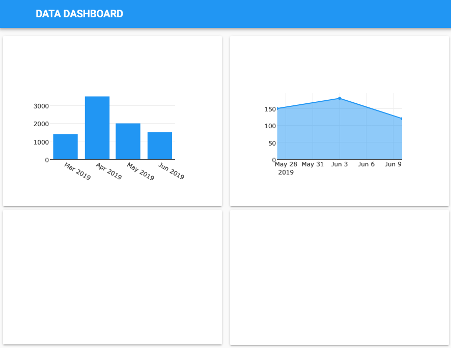
That’s great, our app now displays data from an external data source as well as Anvil’s built-in database.
Next, we’ll plot data from a private database.