 By
By Build Your Own Custom Component From Scratch
Are you looking to turn your HTML and CSS into a shareable Anvil component that other developers can configure? Then you’re in the right place!
In this tutorial, we’re going to create a minimalist-style textbox input component from HTML and CSS. It will be reusable, and you’ll be able to drag and drop it into your Anvil Forms.
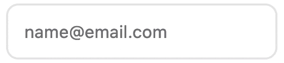
The finished input component
The HTML and CSS isn’t the focus of this tutorial. Instead, we’ll focus on using HTML and CSS in Anvil to build a reusable component. To learn more about writing HTML and CSS, see the MDN docs or check out our a guide to styling app’s with CSS.
What is a custom component?
If you’ve never heard of custom components in Anvil before, here’s are very quick introduction:
- You can create custom components by using Anvil’s built-in components and/or by creating components from scratch (like we will in this tutorial).
- An Anvil Form is already a component.
- Custom components are Forms that appear in the toolbox.
- Custom components can be configured to have properties and events just like standard Anvil components.
- Custom components can be used as a dependency. Which allows other developers to use the components in other apps.
Tutorial Prerequisites
To follow along this tutorial you will need to know basic Python and you should know the basics of Anvil. If you’re new to Anvil, why not try our introductory Feedback Form tutorial?
Contents
These are the steps that we will cover:
- Step 1 - Create your Anvil app
- Step 2 - Add your HTML
- Step 3 - Add your CSS
- Step 4 - Creating the component’s properties
- Step 5 - Setting and getting the property values in Python
- Step 6 - Set the component’s unique ID
- Step 7 - Adding events
- Step 8 - Using our component
Step 1 - Create your Anvil app
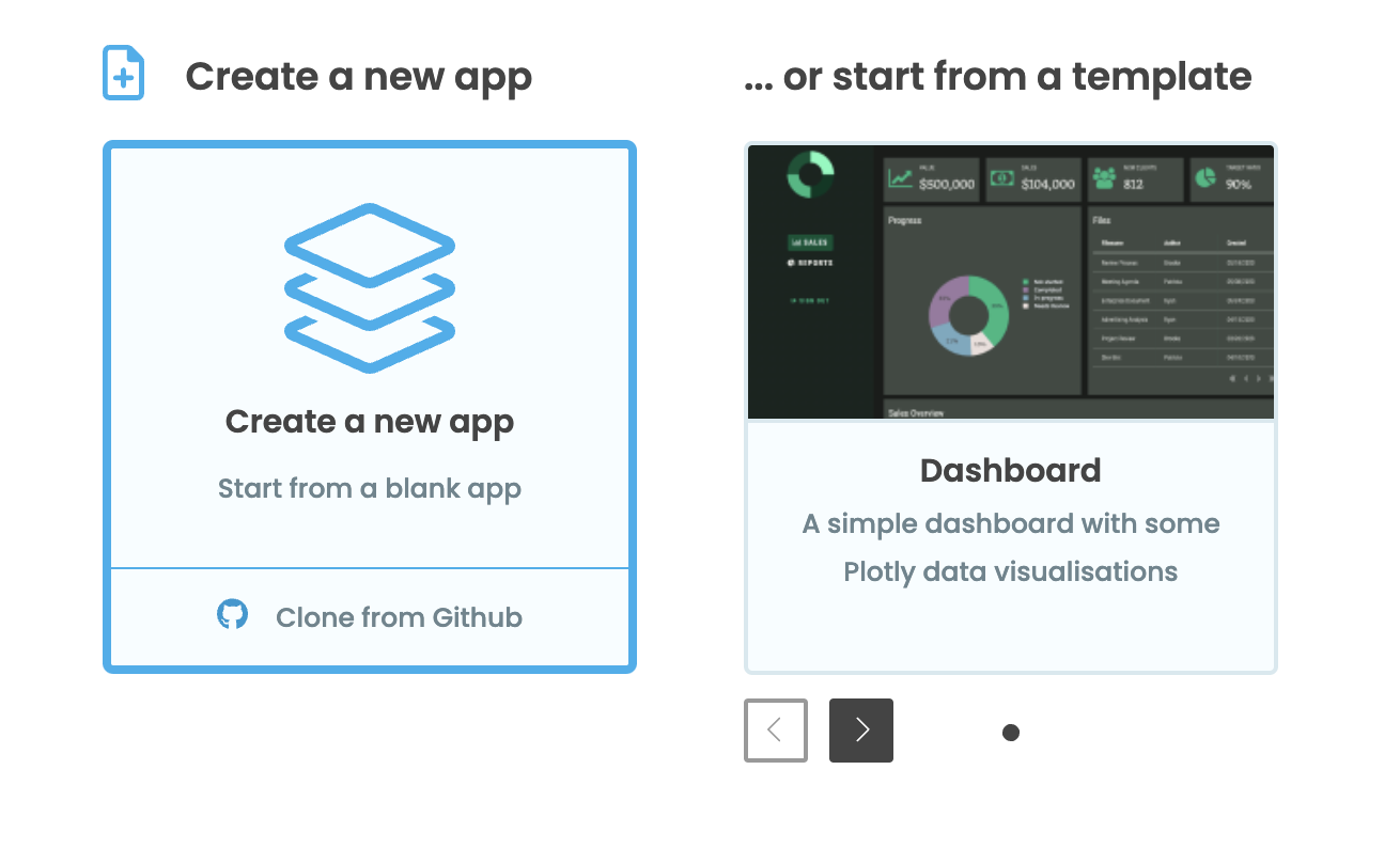
Log in to Anvil and click ‘Blank App’.
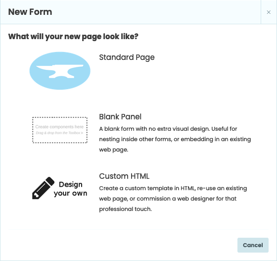
Choose Custom HTML and, when you’re asked what you’d like your page to look like, select Custom HTML:
Click on the name at the top of the screen and give your app a name.
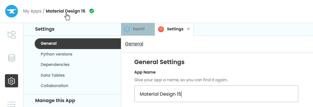
Rename your app by clicking on the title
Step 2 - Add your HTML
For this tutorial, we’re going to build a textbox input component with a simple design. I’ll provide the HTML and CSS in the coming steps as we need them.
The HTML will provide the structure for our component, so let’s start by adding the HTML.
Our app already has a Form added called Form1, which we’ll turn into our custom component. Let’s change the name of the Form since this is the name that will appear in the Toolbox. For our example, let’s call it MinimalistInput.
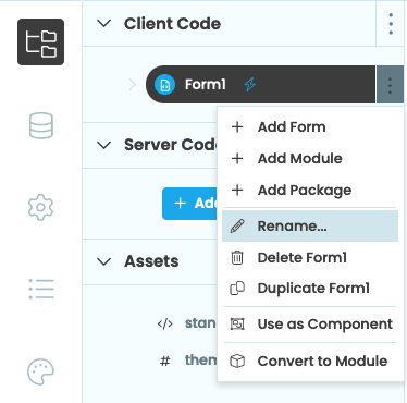
Rename Form1
Open the Form and edit the custom HTML by selecting the three dots menu at the top of the Form:
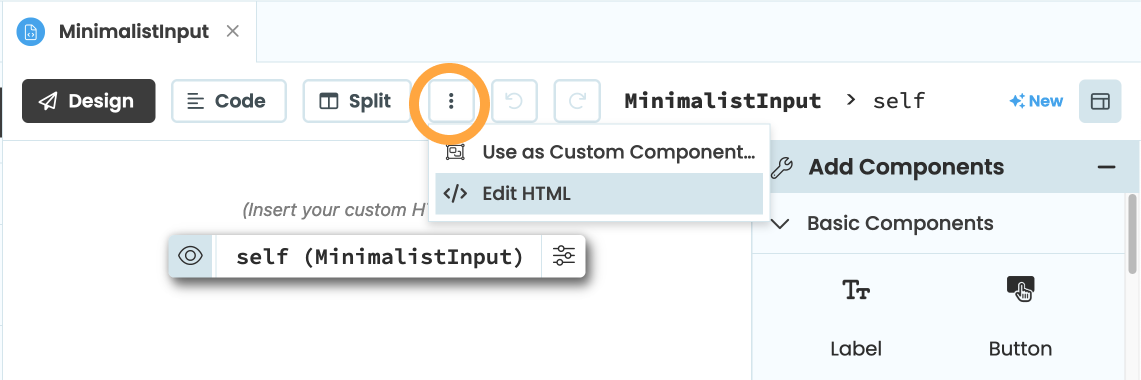
Button to edit the custom HTML
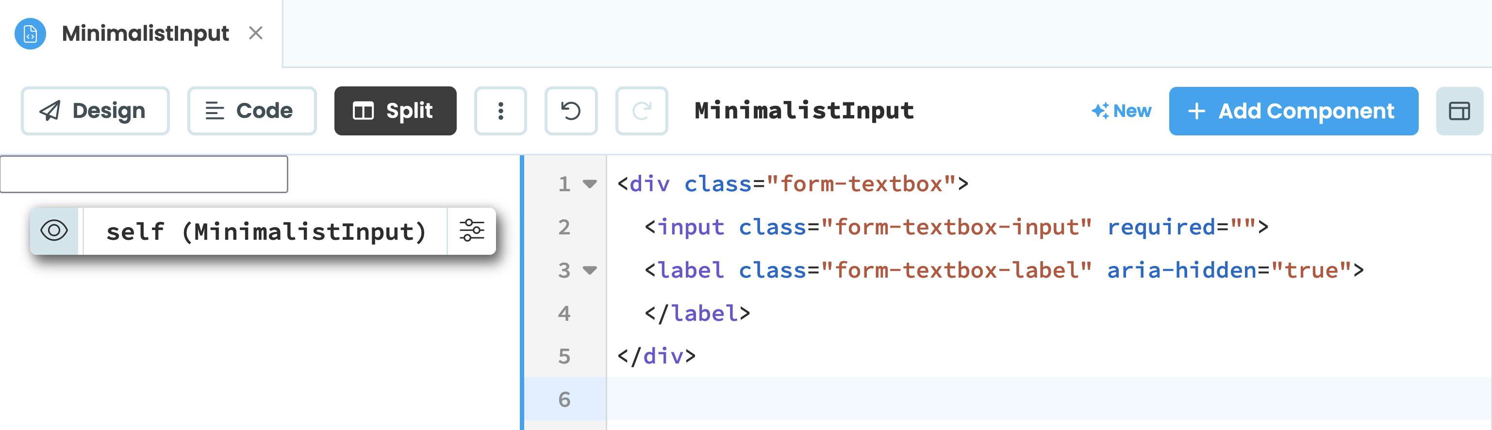
Below is the HTML we’ll use for our component. How this HTML works is beyond the scope of this tutorial but if you’d like more information, check out MDN’s Input documentation.
Copy the below HTML:
<div class="form-textbox">
  <input class="form-textbox-input" required="">
  <label class="form-textbox-label" aria-hidden="true">
  </label>
</div>
Then, paste it into your Form’s HTML, and it should look something like this:
We’ve now built the structure of our component with HTML. Let’s now style it with CSS.
Step 3 - Add your CSS
With our HTML in place, it’s time to style it by adding our CSS. Let’s start by opening our app’s theme.css file. As our app is a custom HTML Anvil app, the file will be empty.
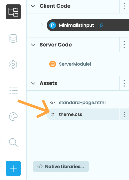
Next, copy the CSS below and paste it into the theme.css file (Again, how this CSS works is beyond the scope of this tutorial but if you’d like more information, check out our guide to styling apps with CSS).
html {
  font-size: 106.25%;
}

.form-textbox-input {
  font-size: 17px;
  font-weight: 400;
  height: 3.294rem;
  line-height: 1.235;
  border-radius: 12px;
  padding: 1.0588rem 0.9412rem 0;
  border-style: solid;
}

.form-textbox-input::placeholder,
.form-textbox-label {
  color: #6e6e73;
}

.form-textbox .form-textbox-input {
  color: #1d1d1f;
}

.form-textbox {
  margin-top: 0.2rem;
}

.form-textbox-label {
  left: 1rem;
  font-size: 17px;
  font-weight: 400;
  line-height: 1.235;
  max-width: calc(100% - 32px);
  overflow: hidden;
  pointer-events: none;
  position: absolute;
  top: 1.0588rem;
  white-space: nowrap;
  transition: 0.125s ease-in;
  padding: 0 0.9412rem;
}

.form-textbox-input:focus-within {
  border-color: #0071e3;
  border-width: 2px;
  outline: none;
}

.form-textbox-input:focus-within + .form-textbox-label,
.form-textbox-input:focus + .form-textbox-label {
  font-size: 12px;
  font-weight: 400;
  line-height: 1.333;
  top: 0.5882rem;
  color: #6e6e73;
}

.form-textbox input:not(:invalid) + .form-textbox-label {
  font-size: 12px;
  font-weight: 400;
  line-height: 1.333;
  top: 0.5882rem;
}
If we want to let other people use this input as a dependency, it’s a good idea to rename our theme.css to stop it clashing with the dependent app’s theme.css. We’ll rename our CSS file to minimal-input.css in the App Browser. Then, we’ll edit the native libraries in the App Browser and link to our stylesheet by adding:
<link rel="stylesheet" href="_/theme/minimal-input.css">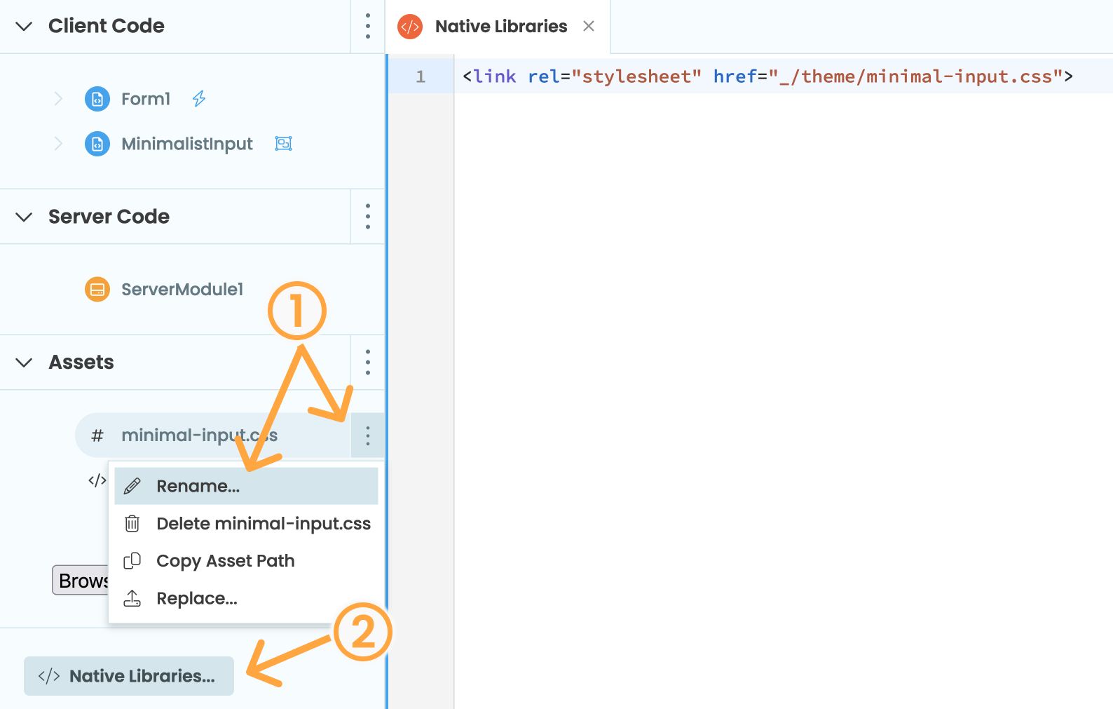
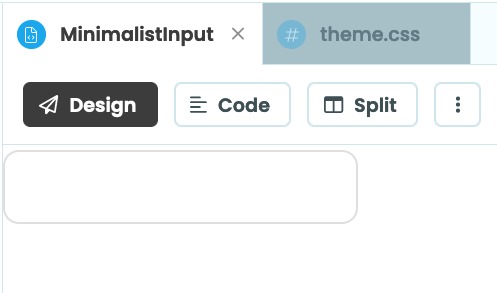
Now, if we open our MinimalistInput form again, our input component will look like this:
Now that adding the HTML and CSS is complete, we need to start defining the properties of our component.
Step 4 - Creating the component’s properties
Our input component is almost complete, but to finish we’ll want to give it some properties. Properties are the aspects of a component developers can change to determine how the component looks or behaves.
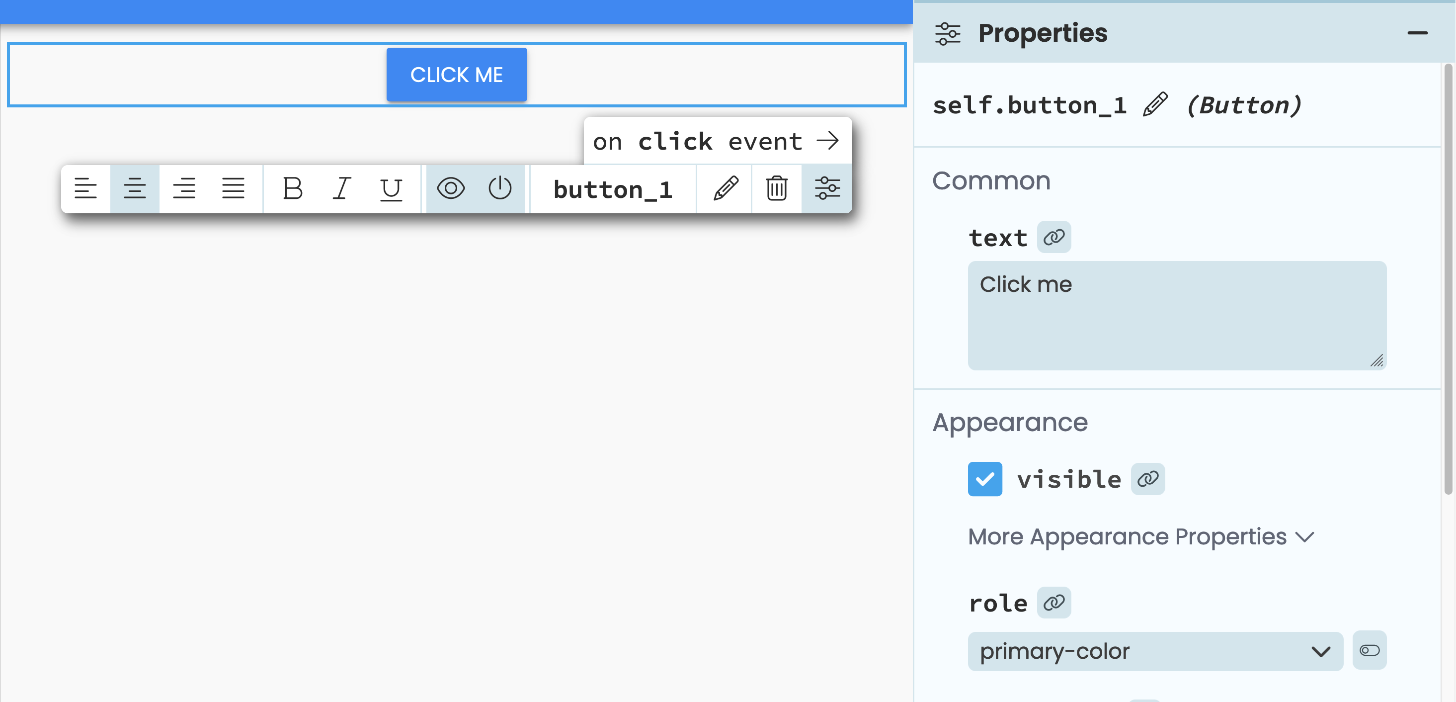
An example of a Button component’s properties on the right of the editor
We’re going to give our component three properties:
- Placeholder text - the text displayed inside the input before a user interacts with it
- Input type - defines how the input should behave i.e. a
numbertype should restrict the input to only accepting numbers - Value - what is currently entered in the input
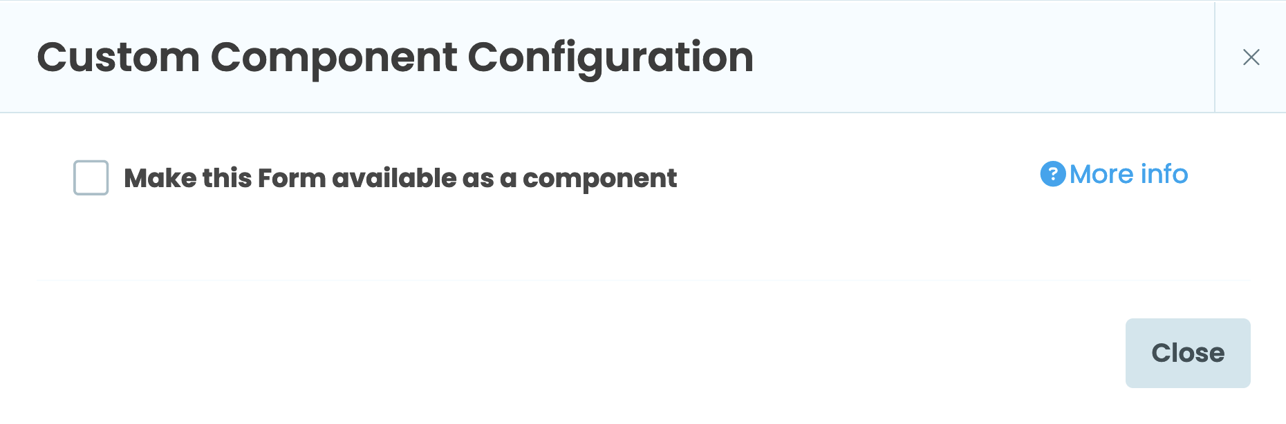
We’ll start by making our component a custom component. In the sidebar on the left hand side, select the three dot menu next to our form and click “Use as custom component…”:
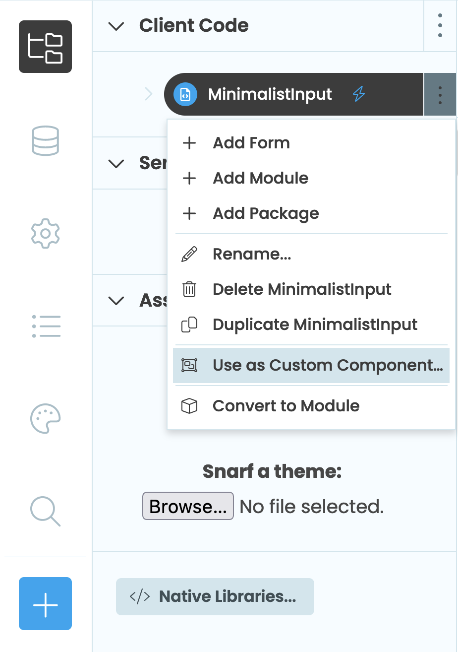
Turn our form into a custom component
Then, tick “Make this Form available as a component”. If you check the Toolbox, you’ll now be able to see the component.
Now we can begin defining the properties for our input.
Placeholder text
We’ll start with placeholder text. Click “Add property”, which will automatically create a property for us. Change the property’s name to “placeholder_text” and set its type to “String”.
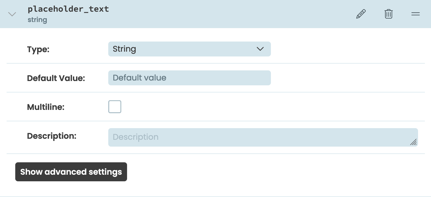
Create the placeholder_text property
Input type
The HTML input element varies in functionality depending on the value of its type attribute, so it would be handy for the developers using our component to be able to set it.
We will add another property to our component with the name “input_type”, we’ll set its type to “enum”, and add the below list of types as the available options:
- number
- tel
- text
- url
Then, set the default value to be “text”.
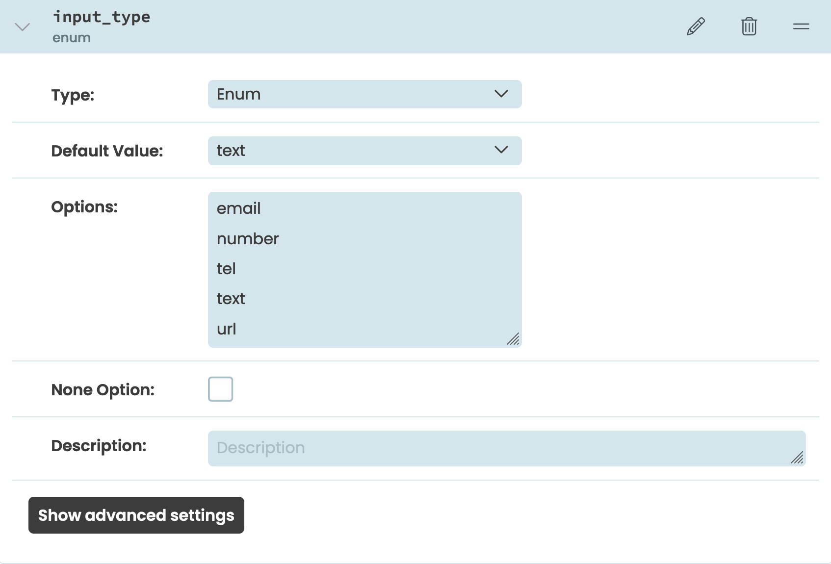
Create the input_type property
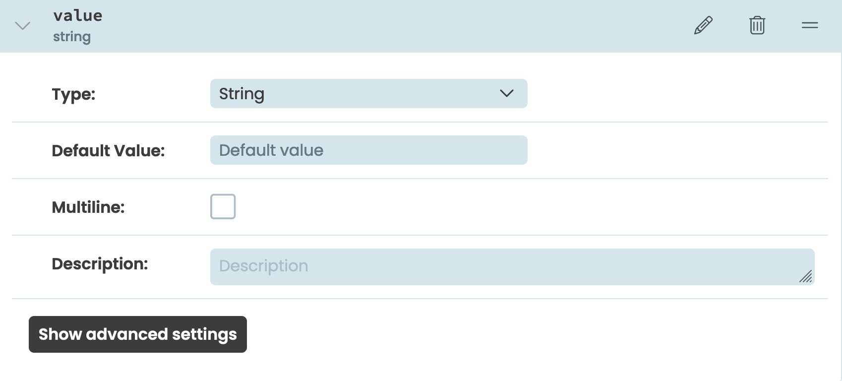
Value
The value is what is entered in the input. It will be useful for developers using our component to be able to set the initial value and get whatever value has been entered by a user.
Let’s add a property called “value” and set its type to “string”:
Create the input_type property
Step 5 - Setting and getting property values
Lastly, we need to write some Python code so that the properties actually do something when they are set. To do this, we’ll use Python’s standard Property Descriptors to write our own getter and setter methods for the properties.
Placeholder text
Getter
We need to write a getter function that gets the placeholder text.
We’ll decorate the function with the @property decorator, so that it runs when anyone gets that attribute from an instance of our component. We’ll call the function placeholder_text to match the name we used when defining the property. Since the placeholder text is the textContent of our component’s label, we just need to access the label using the DOM nodes API and return its textContent property:
@property
def placeholder_text(self):
    return self.dom_nodes["form-textbox-label"].textContent
For the self.dom_nodes["form-textbox-label"] to work in our function, we need to add the anvil-name attribute to our components HTML. Go back to the HTML for the input component, which we added in step two. In the label element, add an anvil-name attribute with a value of "form-textbox-input".
<label anvil-name="form-textbox-label" class="form-textbox-label" aria-hidden="true"></label>The value you give to the “anvil-name” attribute is added as a key in your form’s self.dom_nodes and maps to the relevant DOM node. If you’d like to read more about accessing HTML elements in Python code, check out our documentation
Setter
We have a function to get the placeholder text’s value. Now we need a function to set the value when the attribute is set.
Our function will have a decorator of our property plus .setter, and we’ll set the element’s textContent property to the value provided. Note that the function’s name is still placeholder_text to match the property name.
@placeholder_text.setter
def placeholder_text(self, value):
    self.dom_nodes["form-textbox-label"].textContent = value
That’s it, our placeholder text property is ready to go.
Input type
Now, let’s repeat the process for our component’s input type property.
Getter
We’ll write a similar getter function as before but instead of using the textContent property, we’ll get the type attribute:
@property
def input_type(self):
    return self.dom_nodes["form-textbox-input"].getAttribute("type")
Again, we’ll add the anvil-name attribute to our HTML but this time it will be added to our input element. We’ll give it a value of "form-textbox-input":
<input anvil-name="form-textbox-input" class="form-textbox-input" required="">The finished HTML for our component should now look like:
<div class="form-textbox">
  <input anvil-name="form-textbox-input" class="form-textbox-input" required="">
  <label anvil-name="form-textbox-label" class="form-textbox-label" aria-hidden="true">
  </label>
</div>
Setter
For the setter function we’ll use setAtttribute() to set the type attribute to the value provided:
@input_type.setter
def input_type(self, value):
    self.dom_nodes["form-textbox-input"].setAttribute("type", value)
Value
Last but not least, we should allow developers to get and set the input’s value.
Getter
We’ll write a getter function that is very similar to the two we wrote earlier. The difference will be in us simply returning the value property of our element:
@property
def value(self):
  return self.dom_nodes["form-textbox-input"].value
Setter
For the setter, we can write a function which assigns the value property to the value passed to the function:
@value.setter
def value(self, value):
self.dom_nodes["form-textbox-input"].value = valueWe’ve got one more piece of Python code to write and then our component is ready to use.
Step 6 - Set the component’s unique ID
We need to associate the label and input elements in our component’s HTML by setting the label’s for attribute and the input’s ID attribute to the same value. The ID is a global attribute that needs to be unique in the DOM, so we need to set it dynamically in our Form’s code.
In our Form’s code, we’ll start by setting a global variable next_id to 1. Then, in our Form’s init method, we’ll get the global next_id, set a local self.id value to the global next_id value and iterate the next_id value up. This means if another instance of our input is added to the same app, its ID will be unique. With a unique ID created, all we need to do is set the input’s ID attribute and label’s for attribute to the unique id after the form’s components are initialised.
next_id = 1

class MinimalistInput(MinimalistInputTemplate):
  def __init__(self, **properties):
    # Set Form properties and Data Bindings.
    global next_id
    self.id = next_id
    next_id += 1
With a unique ID created, all we need to do is set the input’s id attribute and label’s for attribute to the unique id after the form’s components are initialised.
input_id = f"input-{self.id}"

super().__init__(**properties)

# Any code you write here will run before the form opens.
self.dom_nodes["form-textbox-input"].setAttribute("id", input_id)
self.dom_nodes["form-textbox-label"].setAttribute("for", input_id)
Now we’ve written code for our component’s properties and code to set the unique ID our component needs, let’s move on to adding event functionality.
Step 7 - Adding component events
On top of giving our component custom properties, we can also add custom events to our custom components. We’ll do this by:
- Choosing an event to capture based on the list of events that can occur in the browser
- Deciding what name our component’s event will have in the Anvil editor
- Adding an event listener to our component’s code to capture the event we want
- Writing code to tell the form using our component that the event has occurred
For our input, let’s add an event which will let developers using our component capture when the input has lost focus.
Choosing an event to capture
There are a lot of events we could listen for, you can find a full list here, but we’ll listen for the blur event. This fires when an element has lost focus.
Giving the event a name
When adding an event to our component, we want to name it clearly so it’s easy for developers to use in the editor and code.
Where the name of our event displays in the editor
Let’s go to the Custom Component Configuration menu by clicking “Configure Component” in the Form’s three dots menu.
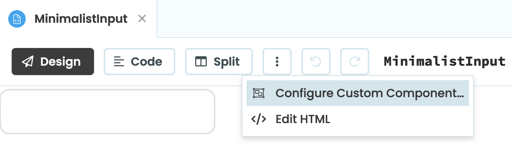
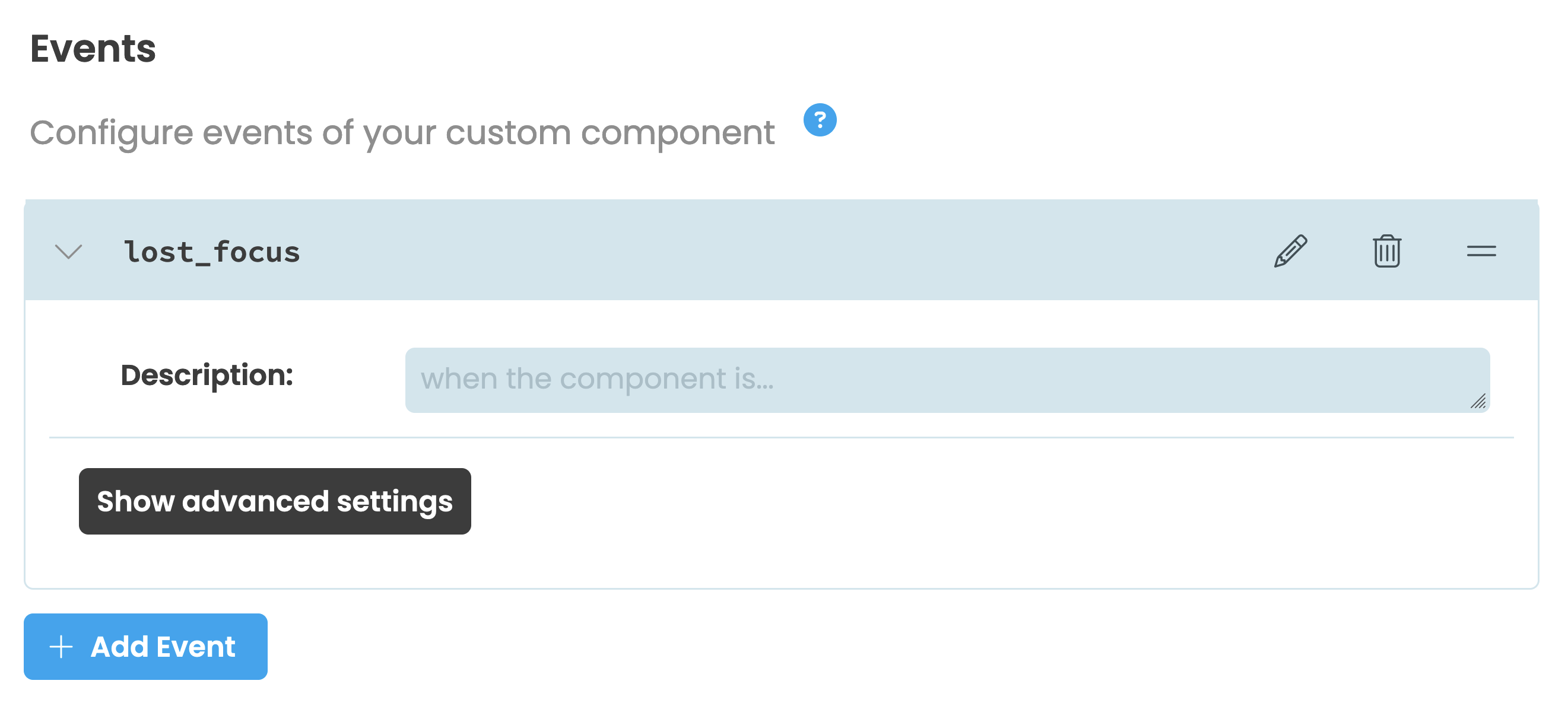
Open the menu to configure our compnent’s events
Click ‘+ Add Event’ and rename the event to lost_focus.
Now our input component’s event is named, let’s add the event listener.
Adding an event listener
The blur event fires when an element has lost focus, so we’ll listen for this event on our input element. We’ll add the listener in the init function of our input. When the blur event occurs, we’ll call a function named _lost_focus.
class MinimalistInput(MinimalistInputTemplate):
  def __init__(self, **properties):
    ...
    self.dom_nodes["form-textbox-input"].addEventListener('blur', self._lost_focus)
Writing a to raise the event to our component’s form
The _lost_focus function is going to raise the event we named in the Custom Component Configuration menu.
def _lost_focus(self, e):
    self.raise_event("lost_focus")
When self.raise_event is called, our custom component raises an event which the developer using our component can use. The developer can then write a function and control what happens from there.
All our Python code is now written for our component. The fully finished client-code is:
from ._anvil_designer import MinimalistInputTemplate
from anvil import *
import anvil.server

next_id = 1

class MinimalistInput(MinimalistInputTemplate):
  def __init__(self, **properties):
    global next_id
    self.id = next_id
    next_id += 1
    input_id = f"input-{self.id}"

    super().__init__(**properties)

    self.dom_nodes["form-textbox-input"].setAttribute("id", input_id)
    self.dom_nodes["form-textbox-label"].setAttribute("for", input_id)

    self.dom_nodes["form-textbox-input"].addEventListener('blur', self._lost_focus)

  @property
  def placeholder_text(self):
    return self.dom_nodes["form-textbox-label"].textContent

  @placeholder_text.setter
  def placeholder_text(self, value):
    self.dom_nodes["form-textbox-label"].textContent = value

  @property
  def input_type(self):
    return self.dom_nodes["form-textbox-input"].getAttribute("type")

  @input_type.setter
  def input_type(self, value):
    self.dom_nodes["form-textbox-input"].setAttribute("type", value)

  @property
  def value(self):
    return self.dom_nodes["form-textbox-input"].value

  @value.setter
  def value(self, value):
    self.dom_nodes["form-textbox-input"].value = value

  def _lost_focus(self, e):
    self.raise_event("lost_focus")
Now we’re ready to use our custom component.
Step 8 - Using our component
Let’s now test out our component by adding it to another Form, setting its properties, getting its value and using the lost_focus event.
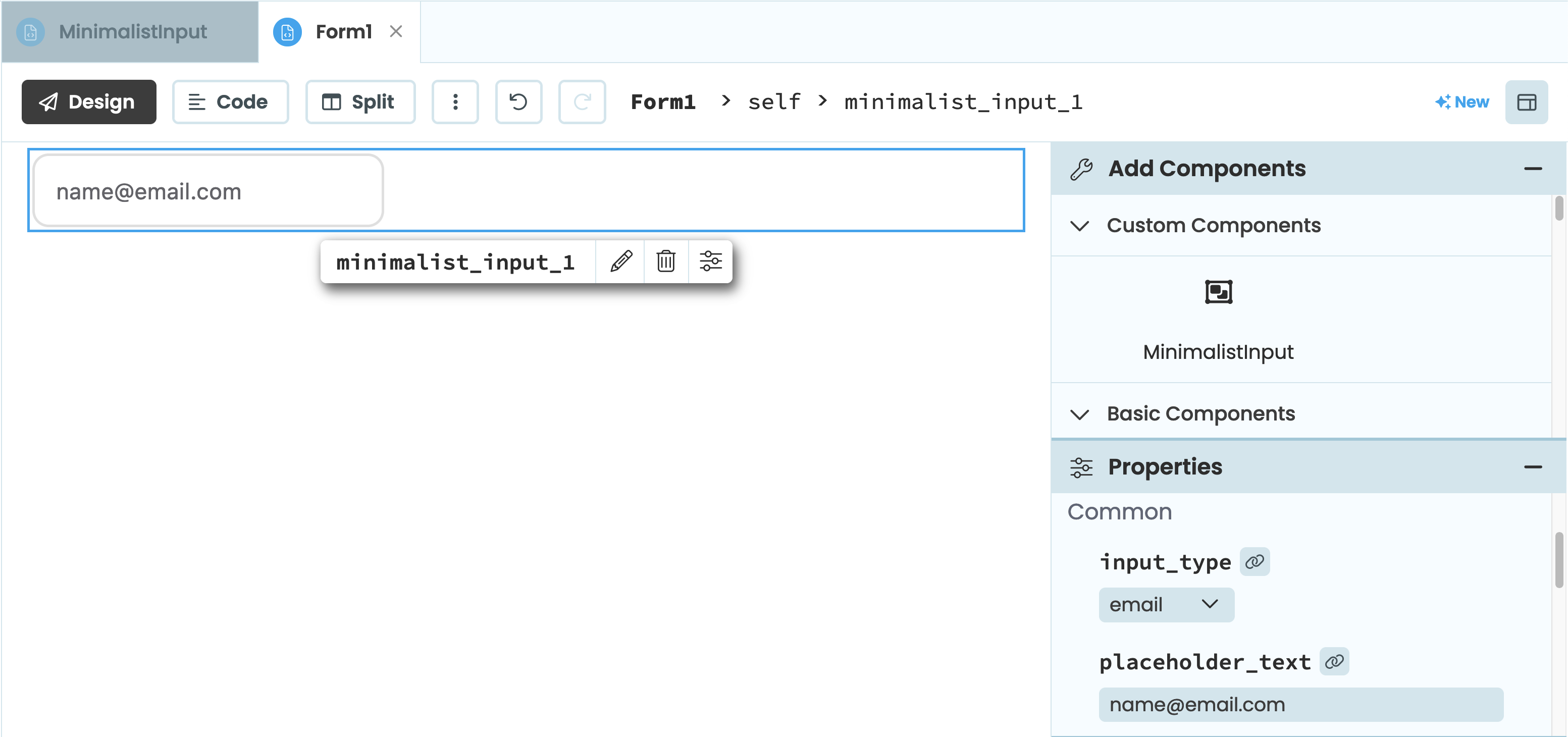
Create a new Form in your app, set it as the startup form and drag and drop a new minamilistInput component from the Toolbox. Then, edit its placeholder_text property:
Using the component in a form
Next, add a Button below the input component and change the Button’s text to “Click me”.
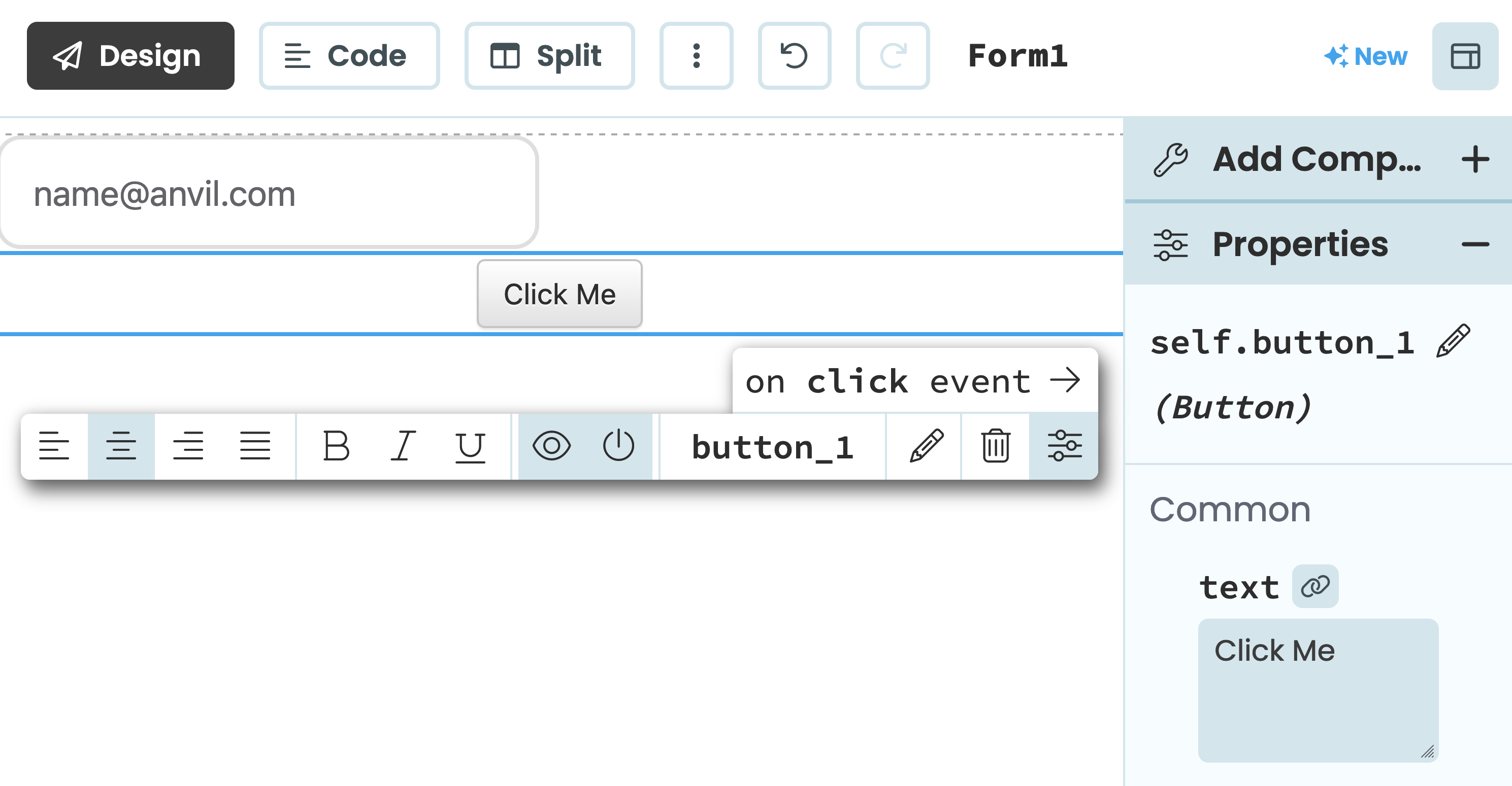
Using the component in a form
Then, select “on click event” from the Object Palette. We’ll edit the onclick function to return the minamilistInput component’s value as an alert. That way, we can test that we’ve set up the value property correctly
def button_1_click(self, **event_args):
    """This method is called when the button is clicked"""
    alert(self.minimalist_input_1.value)
Let’s now run the app:
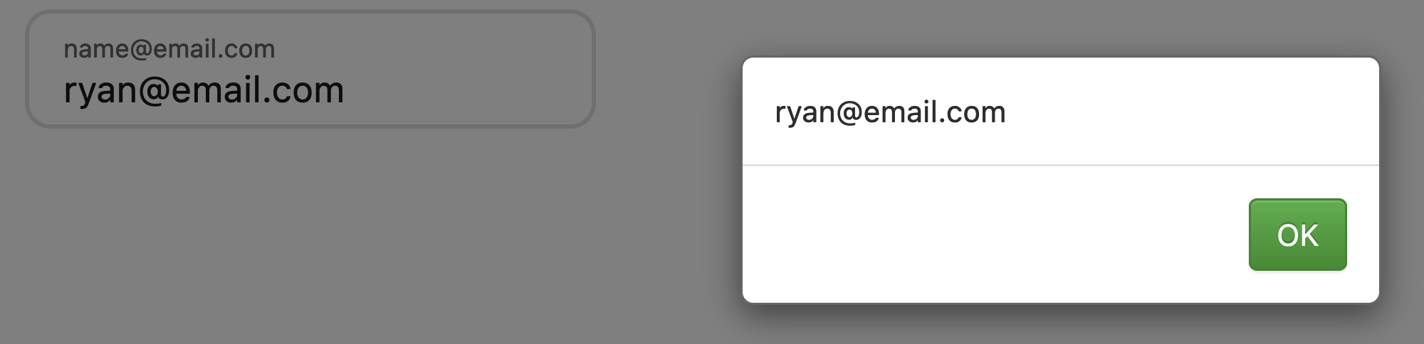
An alert showing the input’s value
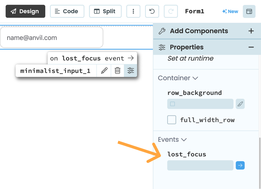
Now we know the properties and value is working as expected. In the form editor, select the minimal_input component we added to our form and select the on lost_focus event from the Object Palette.
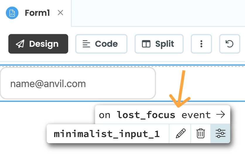
This will create an event handler function for us. As we’re only testing the event, we’ll simply print a message to our app’s logs:
def minimalist_input_1_lost_focus(self, **event_args):
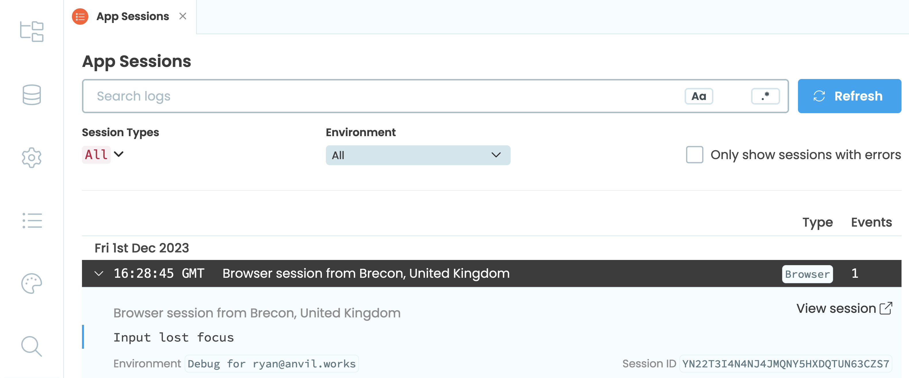
print("Input lost focus")Run the app again and select the input box. Unselect the box and then check the app’s logs in the editor, you should see something like this:
And that’s it! We have created our own Anvil component with nothing but HTML and CSS. Now developers can begin using our component like they would any other Anvil component. Hopefully this tutorial has taught you everything you need to know to begin created a myriad of cool components in Anvil!
Clone the App
You can open the source code for the finished Anvil app here:
More about Anvil
If you’re new here, welcome! Anvil is a platform for building full-stack web apps with nothing but Python. No need to wrestle with JS, HTML, CSS, Python, SQL and all their frameworks – just build it all in Python.
Want to build an app of your own? Get started with one of our tutorials:
Build Database-Backed Apps
Build a Simple Feedback Form
Build a Simple Feedback Form
Build a data-entry app, and learn the techniques fundamental to building any Anvil app. In this tutorial, you will:
- Build your User Interface
- Write client-side Python
- Write server-side Python
- Store data in a database
- Deploy your app