
Creating a custom Material Design 3 colour scheme
Anvil’s Material Design 3 theme is based on Google’s latest version of Material Design (also called M3), which is all about personalization and flexibility. The Anvil theme uses M3’s default light colour scheme, but allows you to pick from a number of predefined colour schemes.
If you want to build a custom colour scheme for your M3 app that works seamlessly with the M3 theme, you can use Google’s Material Theme Builder. They have a web version and a Figma plugin.
This guide will show you how to:
- Use the Material Theme Builder to create a custom colour scheme
- Apply the colour scheme to an Anvil app
Colour schemes in M3
M3 defines a colour system that is designed to handle different colour schemes. The colour system defines how the colours should be applied to different components in an app. The M3 colour system is based on 5 key colour roles: Primary, Secondary, Tertiary, Neutral and Neutral Variant. These colours are separated into tones to create an entire colour scheme.
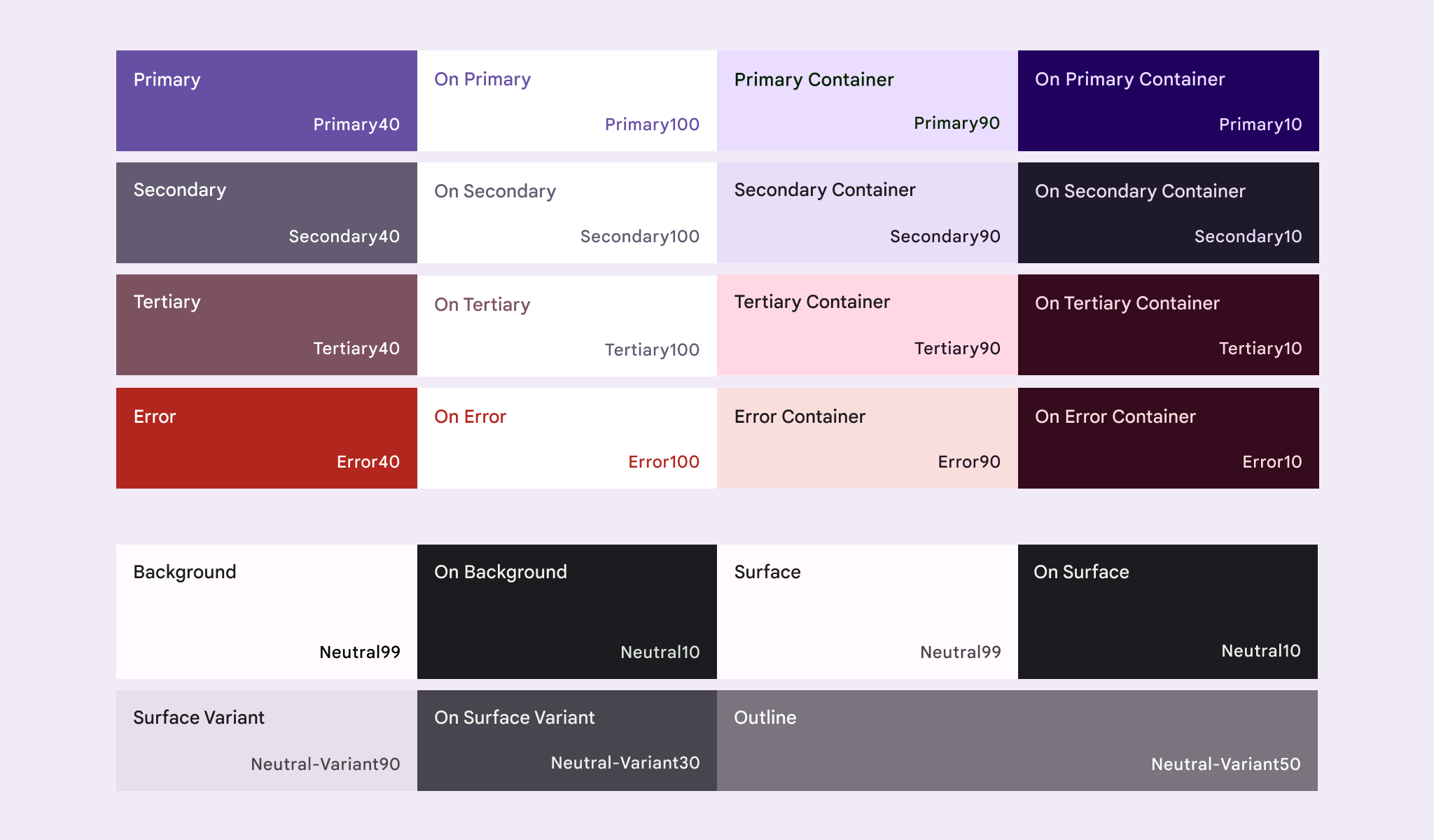
The Material Design 3 colour scheme using the baseline colours
The new Anvil Material Design 3 Theme is based on this colour system and uses M3’s baseline colours. The Anvil theme’s colour scheme defines 29 colours, not all of which are used by default in the theme. For example, the Tertiary colours are not used by the new Material Design theme, but you can always choose these colours from the Properties Panel or in code.
In order to generate custom M3 colour schemes that you can then apply to your Anvil apps, you can use the Material Theme Builder. There are two versions of the Theme Builder: a web version and a Figma plugin.
Using the Material Theme Builder - Web version
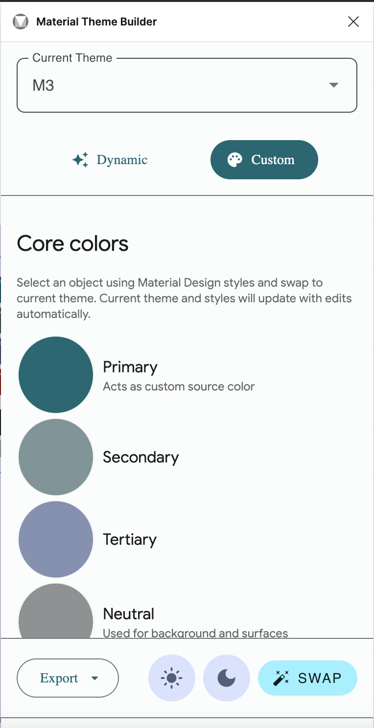
Google has an online Material Theme Builder that generates a colour scheme for you using their pre-defined colour system. Click on “Primary” under “Core Colors” to choose a primary color for your app.
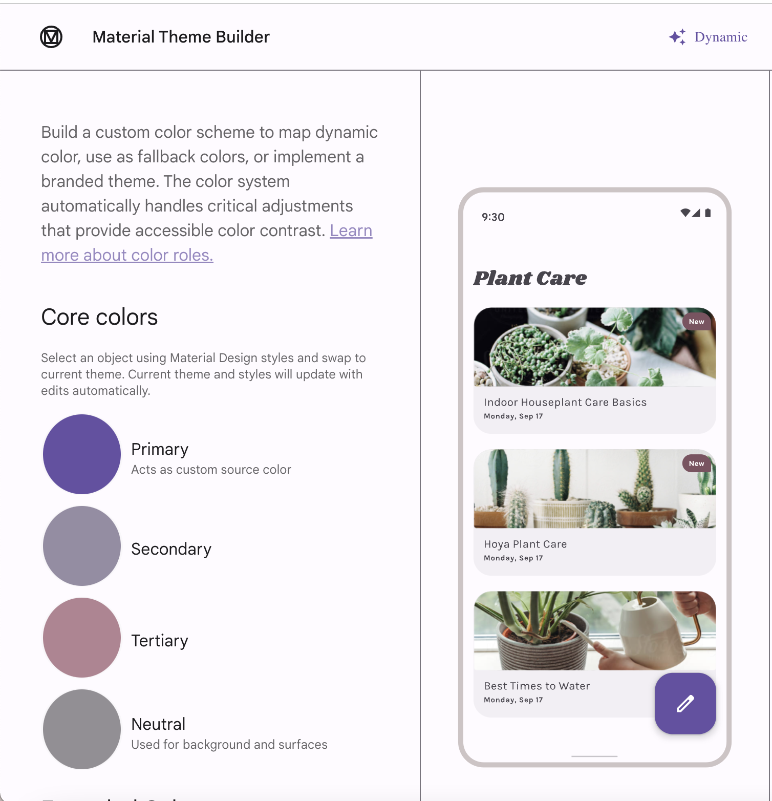
Click on Primary to choose a new primary colour for the colour scheme
Colour selector for changing the primary color
The theme builder will then generate the rest of the colour scheme for you. Clicking on the colours in the generated colour scheme will copy the hex code for each colour so you can easily paste these into your Anvil app’s colour scheme.
The generated colour scheme based on the chosen primary colour
There are a few colours that appear in Anvil’s M3 colour scheme that you won’t see in the Material Theme Builder. See the the final section of this guide for how to get those colours.
Using the Material Theme Builder - Figma plugin
You can also use the Material Theme Builder as a Figma Plugin to create your colour schemes. Click here to install the plugin to your Figma account. The easiest way to get started with the plugin is to duplicate the Material 3 Design Kit in Figma. The kit will give you a breakdown of the colour system as well as the look and feel of the UI components.
Open the Material 3 Design Kit file and choose “Styles” in the left-hand menu. On this page, you will find details on the typography, colour scheme and other elements of M3. Of relevance to us is the “Color Guidance” frame, which shows the colours and tones making up the M3 colour scheme for both a light and dark mode. We can use the Material Theme Builder plugin in this file to build a new colour scheme and instantly restyle the Material 3 Design Kit Figma file.
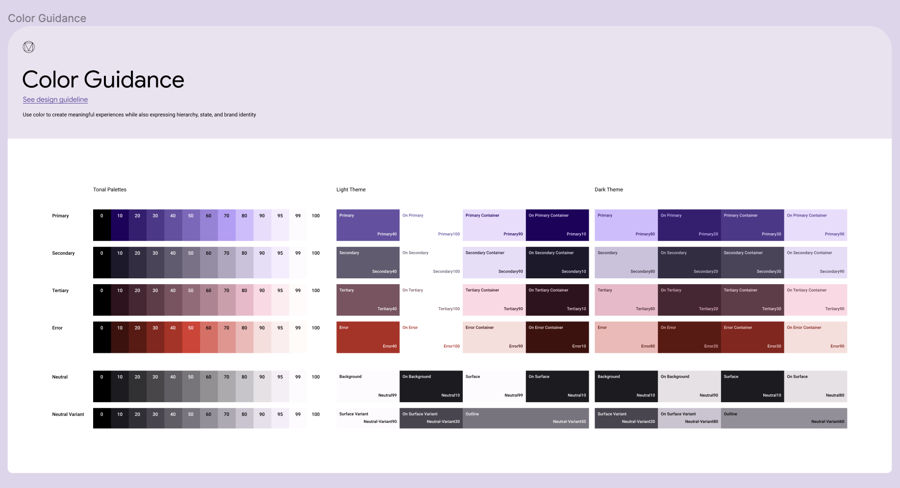
The color guidance frame in the Material 3 Design Kit Figma file
To get started, right click anywhere in the file and choose Plugins > Material Theme Builder > Open Plugin. This will bring up the Material Theme Builder.
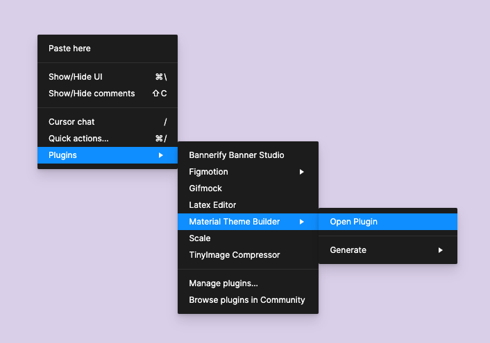
Opening the Material Theme Builder in a Figma file
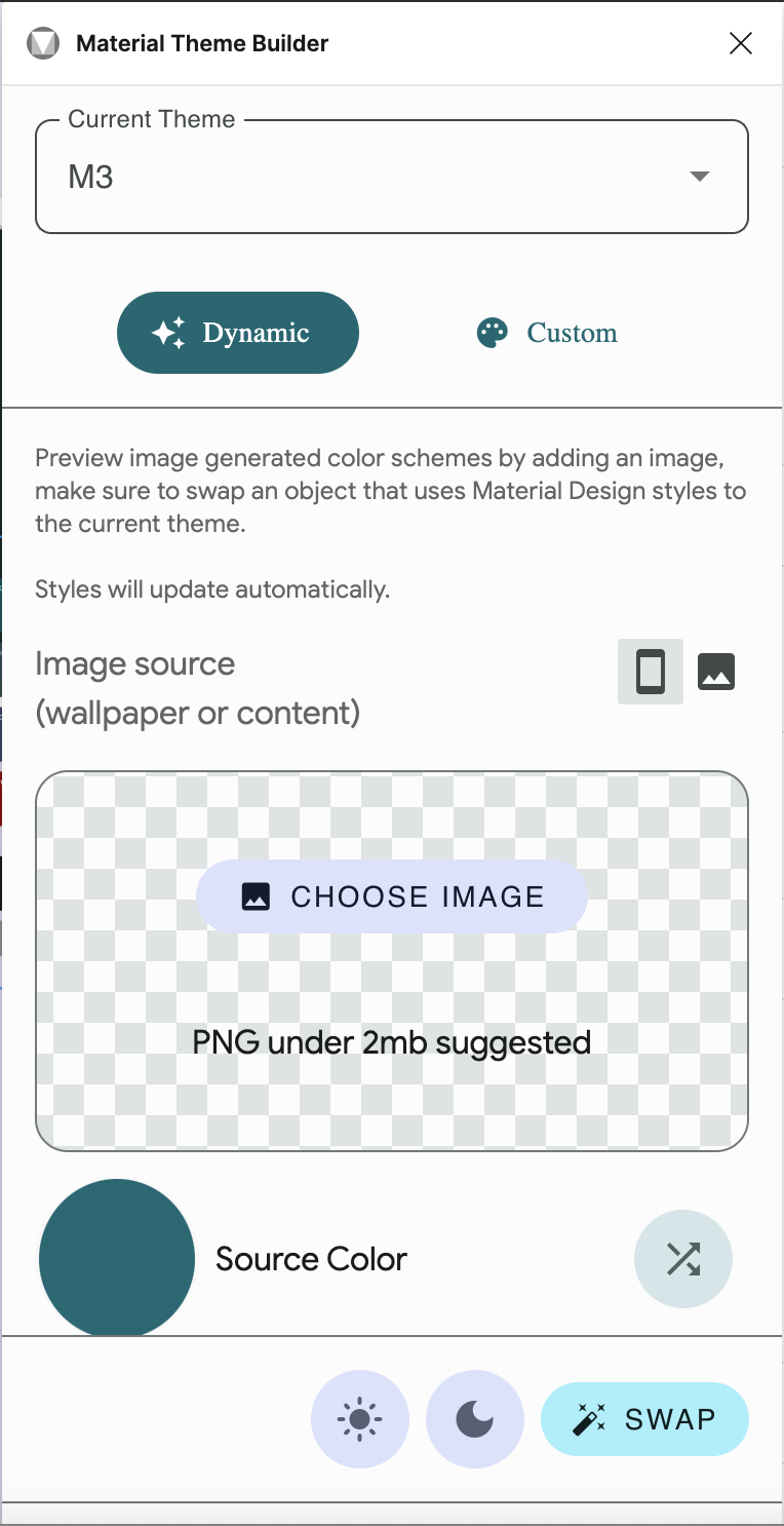
The Material Theme Builder
Figma Plugin
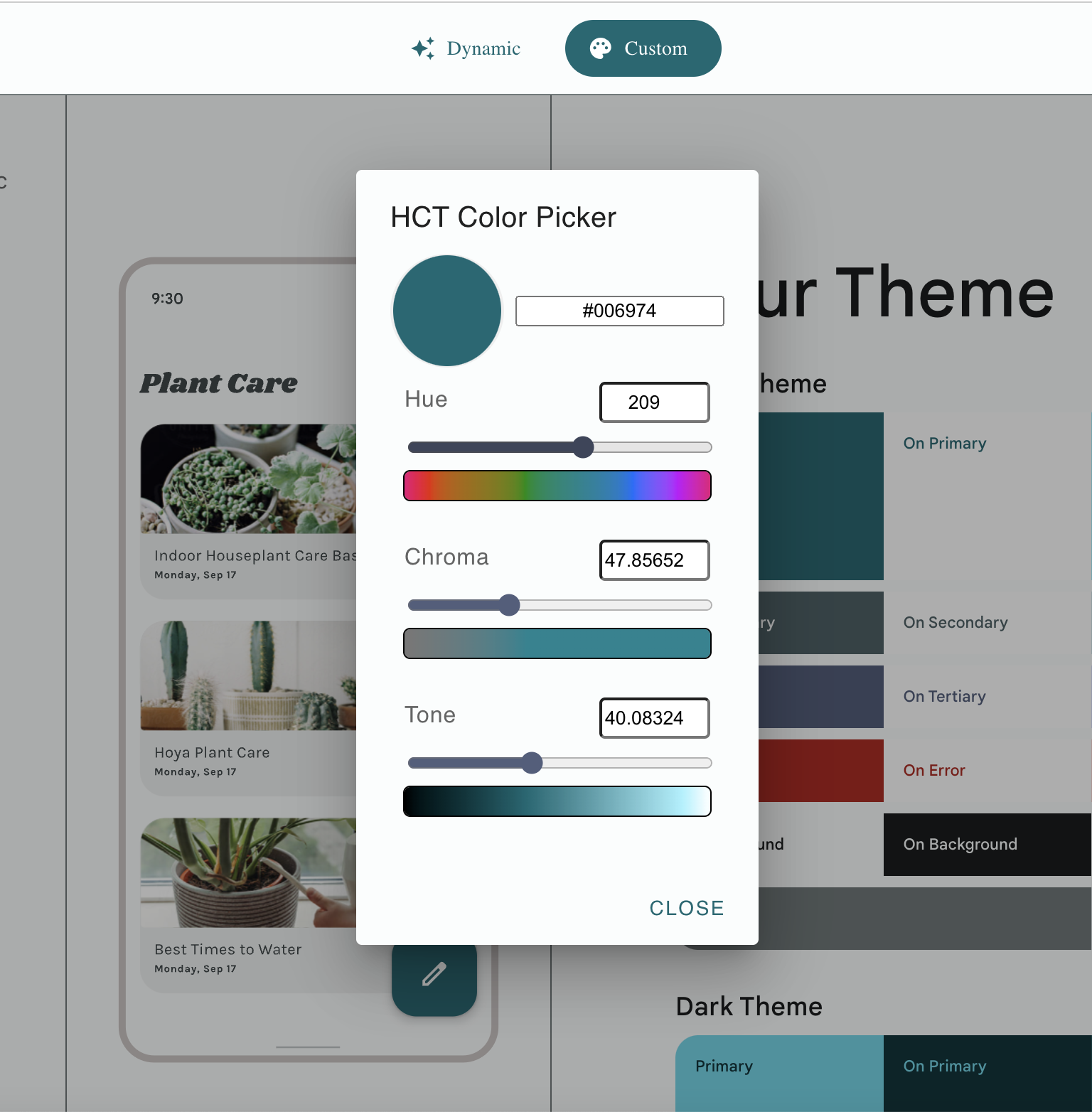
Clicking on the “Source Color” will bring up a colour picker. Choosing a colour will automatically change the colour scheme of the Figma file. You can also click on the arrows next to “Source Color” to cycle through random colours. Clicking on “Choose Image” allows you to upload an image, and the Material Theme Builder will then generate a colour scheme to complement the image.
A generated color scheme using the Material Theme Builder Figma plugin
If you want more control over your generated color scheme, you can switch to the “Custom” tab in the Theme Builder. This allows you to not only pick the primary colour for your colour scheme, but the secondary, tertiary and neutral colours as well. You can also add custom colours and the plugin will separate that colour into four tones to be used in the colour scheme.
The ‘Custom’ tab lets you further
customise the colour scheme
If you switch to the Components tab on the left-hand menu of the Figma file, you’ll be able to see what the M3 components will look like with the chosen colour scheme. Note: The Anvil M3 theme is based on the official M3 theme, but it is not a perfect reproduction. Not all the components defined in the Material 3 Design Figma Kit are pre-built in Anvil, and those that are, may appear slightly differently in the Anvil implementation of the theme.
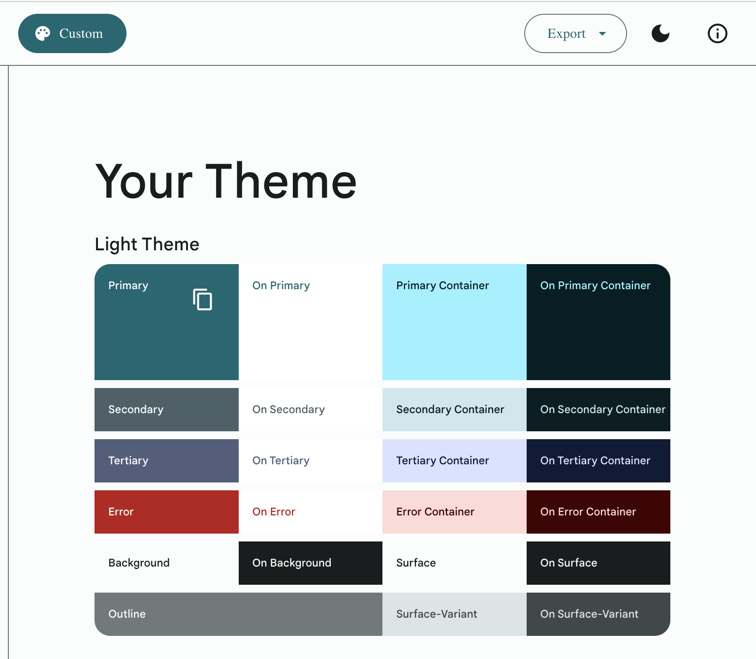
Once you are satisfied with the generated colour scheme, you’ll need to copy these colours to your Anvil app. In the menu on the right-hand side, under Color Styles, click on the dropdown arrow next to “M3”, then “sys”, then “light” or “dark” depending on which theme you want to use. Hover over a colour to bring up the “Edit Style” menu option. Click this to bring up the “Edit Style” menu. Here you can find the hex code for the color.
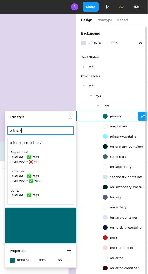
Copy and paste this hex code into the colour scheme of your app for each colour that is defined in Anvil. Some colours in the Material 3 Design Kit will not be defined in the Anvil M3 colour scheme. There are also colours defined in the Anvil theme that are not defined by Google’s M3. See the next section to learn how to determine what those colours should be.
Copying the Colours into Anvil
You can find the colour scheme for your Anvil app under “Theme” in the Sidebar Menu. All of the colours from the Material Theme Builder should be copied into the corresponding text boxes in the app’s colour scheme.
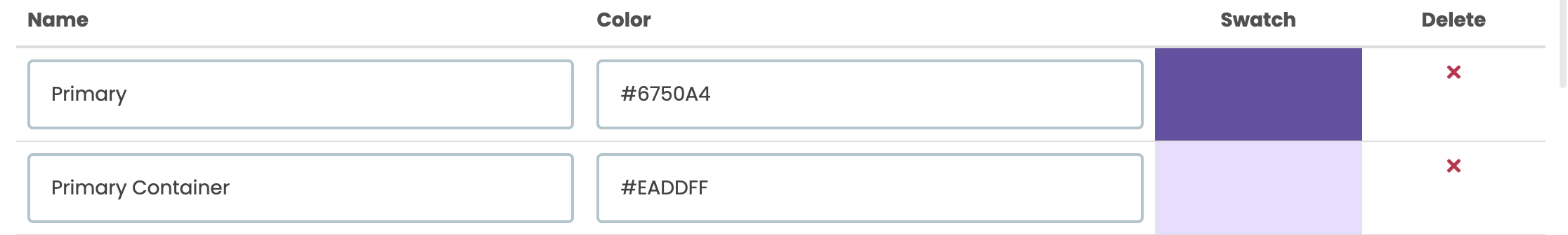
Example of colours in Anvil’s M3 colour scheme
There are a few colours that appear in Anvil’s Material Design colour scheme that won’t be generated from the Material Theme Builder. This is because some colours in M3 are built by adding a semi-transparent overlay of one colour overtop another colour. The best way to do this with Anvil’s colour scheme is to define the semi-transparent overlays as separate colours.
These overlays are defined as rgba colours instead of hex codes. You can convert hex to rgba online. This is easy to do in Figma, for example. Just add an element to Figma (like a rectangle), give it a fill colour using the hex code you copied from the Material Theme Builder, then, in the fill colour modal, use the drop down to change the type to rgb.
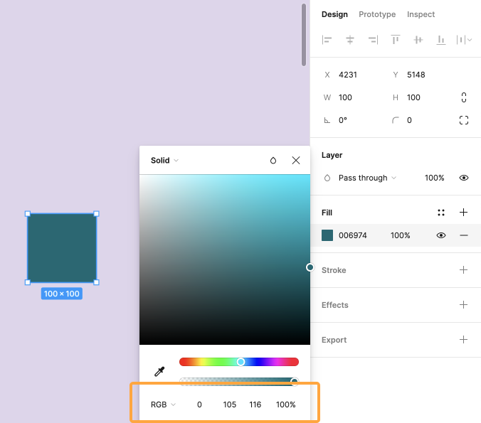
Using Figma to convert a hex code to rgb
Copy this rgb colour and paste it into the corresponding text box in your app’s colour scheme. The alpha (a) value defines the transparency of the colour and should be added according to the rules below.
For example, the colour Primary Overlay 1 is defined in the Anvil M3 theme, but not in the Material Theme Builder. Primary Overlay 1 is the Primary colour at 5% opacity. If the hex code for the Primary colour were #006974, then the rgb value would be (0, 105, 116). Because the colour should be at 5% opacity, the resulting rgba value is (0, 105, 116, 0.05).
The overlay colours that you will need to complete the colour scheme in your Anvil app abide by the following rules:
- In all themes:
- Primary Overlay 1: Primary at 5% opacity
- Primary Overlay 2: Primary at 8% opacity
- Primary Overlay 3: Primary at 11% opacity
- Disabled Container: On Background at 12% opacity
- On Disabled: On Background at 38% opacity
- In light themes:
- Light Overlay 1: White at 8% opacity
- Light Overlay 2: White at 12% opacity
- Dark Overlay 1: On Secondary Container at 8% opacity
- Dark Overlay 2: On Secondary Container at 12% opacity
- In dark themes, light and dark overlays are the same:
- Light Overlay 1: On Secondary Container at 8% opacity
- Light Overlay 2: On Secondary Container at 12% opacity
- Dark Overlay 1: On Secondary Container at 8% opacity
- Dark Overlay 2: On Secondary Container at 12% opacity
Do you still have questions?
Our Community Forum is full of helpful information and Anvil experts.