
Forms as Components
Forms are themselves components, which means you can place a Form inside another Form. This lets you build your UI in a modular way, breaking your interface into smaller, reusable pieces and combining them together.
Adding a Form to another Form in Design view
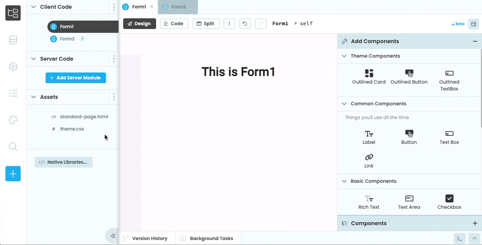
To add a Form to another Form in the designer, click the Form’s name in the App Browser and drag it into the Design view of the Form you want to add it to.

Form2 in the Design View
Dropping Form2 from the App Browser into Form1 in the Designer
You can also designate a Form as a Custom Component if you want it to appear in the Toolbox.
Adding a Form to another Form in code
As well as dragging and dropping Forms onto other Forms, you can also combine them in code using add_component(). In the section above, we added an instance of Form2 into the self.card_1 component of Form1 using drag-and-drop. Here’s how you would do that in code:
from anvil import *

# Import Form2 so we can create instances of it
from .Form2 import Form2

class Form1(Form1Template):

  def __init__(self, **properties):
    # Set Form properties and Data Bindings.
    super().__init__(**properties)

    # Add Form2 to self.card_1
    self.card_1.add_component(Form2())
Adding a Form to another Form in HTML
You can add a Form as a component to your Form’s HTML using the <anvil-component> tag. You just need to give the <anvil-component> tag an type attribute with the name of your Form. If your Form is inside another Form or Package, you’ll need to use the path to your Form starting from the top-level package.
For example, if your app has a Form called ContactForm that’s inside a package called Pages, you can add it to another Form in HTML like so:
<anvil-component type="form:Pages.ContactForm"></anvil-component>Similarly, if you want to add a Form from a dependency app, you’ll need to include the dependency app as the top-level package name.
<anvil-component type="form:Another_App.Pages.ContactForm"></anvil-component>form:dep_abc123xyz789.Do you still have questions?
Our Community Forum is full of helpful information and Anvil experts.