
Data Grids 
The DataGrid component is great for displaying tabular data from any source. Create a DataGrid by dragging and dropping it into the the Form Editor from the Toolbox.

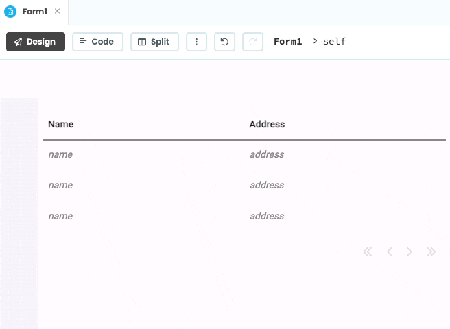
A DataGrid with default configuration
Or you can create one in code.
Get hands-on practice with Data Grids in our Data Grid Tutorial.
Default Data Grid structure
When you drag and drop a Data Grid onto your Form, Anvil creates several components for you. Inside your DataGrid is a RepeatingPanel, and inside that are DataRowPanels - one for each item in the RepeatingPanel.
For example, if you create a new app and drop a DataGrid into Form1, you will have self.data_grid_1, which contains self.repeating_panel_1, whose template (RowTemplate1) inherits from DataRowPanel:

Dropping a Data Grid into your app creates this component structure.
- The outer DataGrid is where you define the columns.
- The RepeatingPanel inside the DataGrid is where you display rows of data.
- The DataRowPanel is where you define the components that make up each row of your DataGrid.
We’re going to build this up step by step, and see what each component does.
The DataGrid component
The DataGrid is a container for displaying tabular data. It specifies a set of columns, allocates space for each column, and has the option of displaying column headers. The DataGrid will expand vertically to fit its contents. If the data exceeds the number of rows that can fit on one page, the DataGrid will automatically add pagination, and links for navigating between pages.
Creating a Data Grid
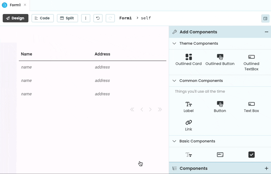
You can drag and drop a Data Grid onto your Form from the Design View of the Form Editor. This will create the default structure for you, including the inner RepeatingPanel and DataRowPanels.
A DataGrid with default configuration
You can also create DataGrids in code.
Columns
To add new columns to your DataGrid component, selecting it and click on the + icon in the inline editing menu.

Clicking on the + icon will add
a new column to the DataGrid
You can select columns to modify them from the Properties Panel:

Use the Properties Panel to
configure DataGrid columns
The Expand property is used to create a column that can expand, but that will never get smaller than the width specified. The width becomes a fixed minimum width if Expand is selected.
You can also define the columns in code.
The RepeatingPanel component
Dragging and dropping a Data Grid onto a Form creates a RepeatingPanel inside that Data Grid by default. You can also add RepeatingPanel(s) to an existing Data Grid.
The RepeatingPanel allows you to display one row in your table for each entry in a list (or other iterable object). This is done by setting the RepeatingPanel’s items property:
self.repeating_panel_1.items = [
    {'name': 'Alice', 'address': '1 Road Street'},
    {'name': 'Bob', 'address': '2 City Town'}
]
DataGrid with a RepeatingPanel.
Each dictionary is a row in your table.
The items don’t have to be dictionaries, they can be anything with a __getitem__ (that is, anything that you can
use square brackets on in this way: item['address']. This could be a row from your Data Tables.)
The RepeatingPanel uses a template
For each entry in the items property, the RepeatingPanel renders a template. The template is a Form that is
automatically created for you and called something like RowTemplate1.

Editing the template of a RepeatingPanel inside a Data Grid.
Each instance of the template is passed one of the entries of the RepeatingPanel’s items property.
You can access this in code as self.item within the row template.
If the keys of the RepeatingPanel’s items property match the Keys of your Data Grid’s columns (set in the Anvil Editor using
the Properties Panel), then the values in self.item will go into the columns with a matching Key:
DataGrid with a RepeatingPanel.
Each dictionary is a row in your table.
For precise details on how to display things inside the row template, follow the display rules that apply to DataRowPanels (see below for the rules).
DataRowPanel so the way you configure their display behaviour is the same as for DataRowPanels.To see a worked example, see below or read our Data Grids Tutorial
Efficient Pagination
RepeatingPanels also contain special logic that cooperates with DataGrids to support lazy pagination: The RepeatingPanel will only iterate as far in its items property as it needs to display the current page. This allows you to load data on-demand as you browse a DataGrid.
The DataRowPanel component 
The DataRowPanel component is a special container, designed to work with the DataGrid component. In particular, DataRowPanels understand the column-based layout of their parent DataGrids, so they can arrange their child components appropriately.
In the default Data Grid structure
The DataRowPanel is part of the default structure of a Data Grid. The RepeatingPanel’s template (RowTemplate1 here)
inherits from DataRowPanel, so it behaves as one. All the rules in this section apply to row templates.
See the section on the default Data Grid structure
for a full explanation.
You can access the template by double-clicking on a row in your Data Grid:
Double click on your Data Grid to access the RowTemplate.
It behaves as a DataRowPanel.
Display Rules
There are three ways to display things on a DataRowPanel:
1. Default display
Data is automatically displayed in DataRowPanels based on the column keys. For example, if your RepeatingPanel’s items are set to:
self.repeating_panel_1.items = [
    {'name': 'Alice', 'address': '1 Road Street'},
    {'name': 'Bob', 'address': '2 City Town'}
]
And you have two columns with their respective data_key properties set to name and address, then here’s what the Data Grid looks like at runtime:
The name and address values are displayed by default.
Each column gets the value that corresponds to its Key. In the example above, the 'name' is
displayed in the column whose Key is name, and the 'address' is displayed in the column whose
Key is address.
If you use a non-string value in the dictionary, the DataRowPanel calls str() on it before displaying it. For example,
if your dictionary contains an integer, the string representation of that integer will be displayed.
If you don’t want your data automatically displayed in this way, you can set the DataRowPanel’s auto_display_data property to False.
If you want to automatically display data for some columns but not others, you can use display options 2) or 3) below to customise your DataRowPanel.
2. Add components to columns
You can also add components to the columns of a DataRowPanel using drag and drop.
For example, if your RepeatingPanel’s items are set to:
self.repeating_panel_1.items = [
    {'name': 'Alice', 'address': '1 Road Street'},
    {'name': 'Bob', 'address': '2 City Town'}
]
You have two columns with their respective data_key properties set to name and address, and you drop a TextBox component called text_box_1 into your ‘Name’ column:
Adding a component to your DataRowPanel
You can use self.item from within RowTemplate1 (which is an entry from the RepeatingPanel’s items property) to display data in the TextBox:
class RowTemplate1(RowTemplate1Template):

  def __init__(self, **properties):
    # Set Form properties and Data Bindings.
    super().__init__(**properties)

    # Display names in text_box_1
self.text_box_1.text = self.item['name']self.item to display data in the TextBoxes in the example above to demonstrate using self.item from code. In practice, the best way to link components to data is using Data Bindings.
This is shown in the example below.And your Data Grid will look like this at runtime:

TextBoxes in a Data Grid
3. Add full-width components
You can add full-width components to a DataRowPanel in Design View of the Form Editor:
Adding a full width component to a DataRowPanel

Displaying a full-width title in a Data Grid
If you add both column and full-width components to the same DataRowPanel, the column components will appear above the full-width components.
Controlling pagination
Data Grids are paginated by default, meaning they will only display some of their rows at one time. Use the page controls in the bottom right of the Data Grid to navigate between pages of data. Edit the rows_per_page property to adjust how many rows to display at once. Setting it to 0 or None will disable pagination and display all rows.

A Data Grid with rows_per_page set to 5.

rows_per_page in the
Properties Panel.
Pinning rows
If you want to keep a particular row or rows visible when the page is turned, you can use the DataRowPanel’s pinned property.
The pinned property can be found in the “Container Properties” section of the Properties Panel.

At the bottom of the
Properties Panel
This will cause the DataRowPanel to be displayed on all pages of data, which is useful for creating headers or summary rows. Pinned rows will still contribute to the row count, so if you have 1 pinned row and you want to display 5 non-pinned rows, you must set rows_per_page to 6.
Displaying a Data Table in a Data Grid
Data Grids combine particularly well with Data Tables. You can display a Data Table in a Data Grid by assigning the items property of a RepeatingPanel to a Data Table search().
For example, if you have a Data Table called ‘people’:
self.repeating_panel_1.items = app_tables.people.search()This works because a Data Tables search() returns an iterable object of dictionary-like rows, which is exactly what the RepeatingPanel needs.
Each row of the Data Table will be a row of the Data Grid, and each column will go into the Data Grid column whose Key has the same name (the name column in your Data Table will be displayed in the the Data Grid column whose Key is name, etc.).
Make sure you set the columns up to have the correct names - you can automatically link a Data Grid to your Data Table from the object palette. Click on the downward arrow next to the + button and select “+ Columns from <name-of-data-table>”:

Simple example
Here is a simple example:
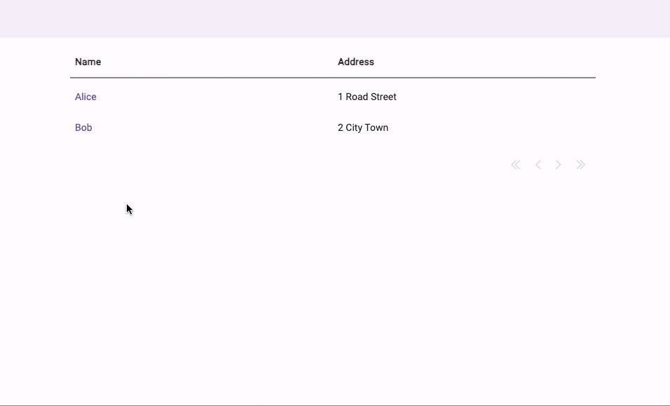
- We start by using a RepeatingPanel in a Data Grid to display data from a Data Table.
Displaying data in a Data Grid
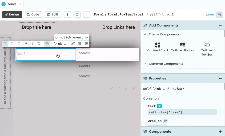
- We then customise the DataRowPanel (the template of the RepeatingPanel, called RowTemplate1 ), placing a
Linkcomponent in the “Name” column, and setting itstextproperty with a Data Binding:

Customising the DataRowPanel
- We then make the DataRowPanel interactive, by adding code to pop up a dialog box when you click the link.
Making the DataRowPanel link interactive
- Finally, we can run the app to test it. This is how the app works:
How the app works when running
For more examples, read the Data Grid tutorial.
Manipulating Data Grids using code
1. Default display
You can also create your Data Grid using code:
# Create your Data Grid
grid = DataGrid()
# Add the Data Grid to your Form
self.add_component(grid)In Code view of the Form Editor, you define the columns of the DataGrid by setting the columns property of the DataGrid. The columns property should be set to a list of Python dictionaries containing a unique ID, a data key (for use by DataRowPanels), and a title for the column header:
# Add two columns to your Data Grid
grid.columns = [
  { "id": "A", "title": "Name", "data_key": "name" },
  { "id": "B", "title": "Address", "data_key": "address" },
]
The DataGrid updates its columns when the columns property is set. If you change the columns list in-place, you’ll need to trigger a refresh (e.g. by setting grid.columns = grid.columns).
Data Grids do not create a RepeatingPanel by default if created from code. First, create a RepeatingPanel and set its item_template to a DataRowPanel. Then, set the items property of your RepeatingPanel to your list (or other iterable). Finally, add the RepeatingPanel to your Data Grid:
rp = RepeatingPanel(item_template=DataRowPanel)
# Set its items property
rp.items = [
    {'name': 'Alice', 'address': '1 Road Street'},
    {'name': 'Bob', 'address': '2 City Town'}
]
# Add the repeating panel to your data grid
grid.add_component(rp)
You can also add rows to your Data Grid using a DataRowPanel. The item property of the DataRowPanel component specifies the data to display:
row = DataRowPanel(item={'name': 'Samantha', 'address': '3 Green Lane'})
grid.add_component(row)
If item is a dictionary, each column gets the value that corresponds to its data_key. In the example above, the 'name' is
displayed in the column whose data_key is name, and the 'address' is displayed in the column whose
data_key is address.
You can also set the item property to objects other than dictionaries. The DataRowPanel looks up the data_key for each column using using __getitem__() (aka square-bracket lookup, e.g. item['key']).
So the item can be anything that you can use square brackets on, for example a Data Table row.
2. Add components to columns
You can also add components to columns with code. You specify which column you want to display your component in by passing the column’s id as the column= parameter to add_component:
row = DataRowPanel()
textbox = TextBox(text="Alice")
# Add the textbox to the column with id "A"
row.add_component(textbox, column="A")
grid.add_component(row)
3. Add full-width components
You can also add full-width components to your Data Grid from code. If you do not specify a column parameter to add_component() (or if you specify column=None), the component will occupy the full width of the container. This is great for section headers:
# First add a full-width header
title_row = DataRowPanel()
title_row.add_component(Label(text="My Favourite People",
                              background='#dddddd',
                              bold=True,
                              align='center'))
grid.add_component(title_row)
Pagination
You can set the rows_per_page property of your Data Grid to manage pagination with code:
# Display two rows per page
grid.rows_per_page = 2
Pinning rows
If you want to keep a particular row or rows visible when the page is turned, you can use the DataRowPanel’s pinned property. You do this from code by passing pinned=True to add_component() when adding the DataRowPanel to the Data Grid:
title_row = DataRowPanel()
title_row.add_component(Label(text="My Favourite People", ...))

grid.add_component(title_row, pinned=True)
Show and hide rows and columns
Data Grid rows and columns can be shown and hidden programmatically:

Rows
Hiding/showing a row is simply done by setting the visible property of the row in question.
rows = self.repeating_panel_stocks.get_components()
rows[row_number].visible = False
Columns
Hiding columns is done by modifying the Data Grid’s columns property. This is a list of columns; each column is represented as a dictionary. So to hide a column, remove a column from the list. Add it back to the list to show it again.
To make the change live, you must run the assignment (=) operator for the columns property.
Here’s how you hide a column:
# Filter the column with title 'Stock Price' out of the columns list.
column = [c for c in self.data_grid_1.columns if c['title'] == 'Stock Price'][0]

# Remember the details of the hidden column
self.hidden_columns.append(column)

# Remove it from the Data Grid's column list
self.data_grid_stocks.columns.remove(column)

# Make the change live
self.data_grid_stocks.columns = self.data_grid_stocks.columns
And to show it again, you do the reverse:
# Filter the column with title 'Stock Price' out of the hidden columns list.
column = [c for c in self.hidden_columns if c['title'] == 'Stock Price'][0]

# Remove it from the hidden columns list
self.hidden_columns.remove(column)

# Add it to the Data Grid's column list
self.data_grid_stocks.columns.append(column)

# Make the change live
self.data_grid_stocks.columns = self.data_grid_stocks.columns
Do you still have questions?
Our Community Forum is full of helpful information and Anvil experts.