
Containers
Some components can contain other components. We call these containers. (A Form is also a container.)
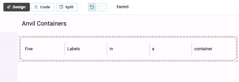
Label components in a ColumnPanel with the
Material Design 3 Theme’s outlined-card Role applied.
The best way to see how each container behaves is to experiment - drop a container into a Form and drop several TextAreas into it. Play around and see how many ways you can arrange things.
Controlling Containers from code
You can add any component to a container in Python by calling the method
add_component(component, container_properties…).
For example, the following code sets up an XYPanel that is 400x400 pixels, adds it to the current Form, and then adds two components to it:
xyp = XYPanel(width=400, height=400)
self.add_component(xyp)

lbl = Label(text="Hello")
xyp.add_component(lbl, x=10, y=10)

btn = Button(text="Click me!")
xyp.add_component(btn, x=10, y=100)
Every container as an index parameter that allows you to insert a component at a specific position. Index 0 is the first element in the container, 1 is the second, etc. By default, components are added to the end of the container. Setting the index to -1 will insert the component at the second to last position.
lp = LinearPanel()

world_label = Label(text="World")
lp.add_component(world_label)

hello_label = Label(text="Hello")
#add the hello_label as the first component in the Linear Panel
lp.add_component(hello_label, index=0)
To remove a component from its parent container, call its remove_from_parent() method.
btn.remove_from_parent()Alternatively, you can remove all components from a particular container by calling clear() on the container:
my_container.clear()To get a list of all components currently in the container, call get_components():
components = my_container.get_components()
print(f"{len(components)} components")
To raise an event on all children of a component without referencing the children directly, call raise_event_on_children():
my_container.raise_event_on_children("x-custom-event", foo=42)For more on adding, removing and getting components within containers, see the Containers overview.
Container Properties
Container Properties are properties that control the relationship between a component and the container it is in; the argument names and their meanings are specific to the type of container. They are visible in the Properties panel in the Anvil Editor.

Container Properties are visible at the bottom
of the Properties Panel.
They can also be passed as keyword arguments to add_component. For example, Data Row Panels inside a Data Grid have a pinned property that determines whether the Data Row Panel is visible on every page of a paginated Data Grid:
self.data_grid_1.add_component(DataRowPanel(), pinned=True)ColumnPanel 
This container allows you to drag and drop components into rows and columns. The ColumnPanel is the default layout for Anvil Forms.
Components added at runtime using the add_component method will each be added to their own row.
In this respect, the ColumnPanel behaves the same as the LinearPanel at runtime. There are no special arguments
to pass to add_component.
Like the LinearPanel, the ColumnPanel will expand to fit its contents.
Components in a ColumnPanel have several container properties, which can be set in the Properties dialog:
full_width_row: WhenTrue, this row of components will stretch to the full width of the screen. (Default:False)row_background: Set to a CSS color for the background of this row. Note that the background stretches to the full with of the browser. (Default:None)
cp = ColumnPanel(background='yellow')

# Add a TextBox to the Column Panel and give it the full_width_row container property
cp.add_component(TextBox(text='enter some text', full_width_row=True))
RichText 
RichText components are containers for other components, which can also display text in one of three formats:
- Markdown (
format='markdown'): Full Markdown syntax is supported. - Plain text (
format='plain_text'): Content will be presented as-is without any formatting. - HTML (
format='restricted_html'): A safe subset of HTML is supported (the input is sanitised, so it is safe to display user-supplied data here). See below for details.
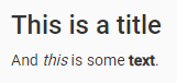
c = RichText(content="## This is a title\n\nAnd _this_ is some **text**.")You can enable language specific code highlighting by including highlight.js from CDN in your native libraries.
RichText components can also hold other components. Define named slots in the RichText content property by adding the slot name in curly braces; for example, {slot_name}. Slot names can only contain alphanumeric characters, dashes, underscores or spaces.
Other components can then be placed into these slots using the drag-and-drop Designer:
Named slots can be used with the drag and drop editor.
Or add components in code, by passing the slot’s name as the slot container property.
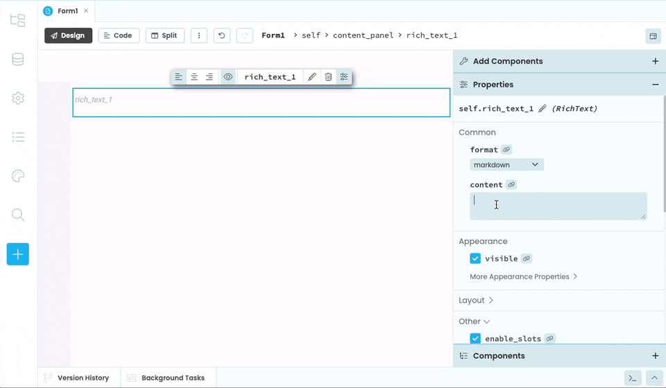
rt = RichText(content="Enter your name: {name} {go}")
rt.add_component(TextBox(), slot="name")
rt.add_component(Button(), slot="go")
Slots can also be populated by setting the data property of the RichText component to a dict with keys corresponding to the slots.
The items in this dict will then be inserted into the named slots appropriately. Anvil Components will be displayed in their slots, and other Python objects will be subject to f-string formatting.
rt = RichText(content="Personal details: {name} {age:.1f} {submit}")
rt.data = {"name": "Zaphod Beeblebrox", "age": 42, "submit": Button(text="Submit")}
Named slots work in all three format modes - markdown, restricted_html, and plain_text.
To display a literal { or } in a RichText component, use {{ and }}, respectively.

rt = RichText(content="This is a {slot}. This is some text in {{curly braces}}.")Alternately, set the enable_slots property of the RichText container to False, and curly braces will be displayed as-is. It’s recommended that enable_slots be set to False whenever a RichText component will display untrusted input, to prevent curly braces from being omitted.

RichText HTML Sanitisation
When a Richtext’s format property is restricted_html, its content is sanitised by restricting it only to certain tags and attributes.
The only permissible tags are
<h1>,<h2>,<h3>,<h4>,<h5>,<h6>,<hgroup><col>,<colgroup><table>,<tbody>,<td>,<tfoot>,<th>,<thead>,<tr><b>,<i>,<s>,<u><footer>,<header><main><a><abbr><address><article><aside><bdi><bdo><blockquote><br><caption><cite><code><data><dd><dfn><div><dl><dt><em><figcaption><figure><hr><kbd><li><mark><nav><ol><p><pre><q><rb><rp><rt><rtc><ruby><samp><section><small><span><strong><sub><sup><time><ul><var><wbr>
There’s also only a few permissible attributes. First, href in <a> tags, and src attribute in <img> tags. Both of these then have their arguments restricted to safe targets:
- relative URLs starting with
/or_/theme - absolute URLs starting with
http://orhttps://
The style attribute is available for all permissible tags, but can only be used with a restricted list of safe arguments. These are:
margin,margin-left,margin-top,margin-bottom,margin-rightpadding,padding-left,padding-top,padding-bottom,padding-rightfont-size,font-family,font-weight,font-styleborderbackground-colorcolor
FlowPanel 
This container allows you to display components in lines with wrapping.

Example of Cards in a FlowPanel. The width of each Card is set to ‘300px’.
Each component will only take up the horizontal space that it needs unless it has a width set. Like many other containers, the FlowPanel will expand vertically to fit its contents. You can use the vertical_align property to determine how the compnents within the FlowPanel should be aligned.
fp = FlowPanel(vertical_align="middle")

fp.add_component(Label(text="Click here:"))
fp.add_component(Button(text="Button"))
Behaviour of components inside the FlowPanel
Some components, like Buttons, dictate their own width based on their content. Other components, like TextBoxes, don’t have a width specified by their content. For these components, you can set the width explicitly as a property on the FlowPanel, or you can drag the handle in the Form Editor to set the width you require.
fp = FlowPanel()
# You can set the width of a TextBox explicitly
fp.add_component(TextBox(), width=100)
You can also set the width of a TextBox from the Form Editor
For all types of components, you can instead set them to fill up the available width of the FlowPanel. To do this, select the component and set its expand property to True. This will cause the component to shrink as more components are added to the FlowPanel or as the screen size shrinks. By default, expand is set to False which means the component will wrap if it can’t fit on one line.
fp = FlowPanel()
# Setting expand to True means the component will take up available space
fp.add_component(TextBox(), expand=True)
The FlowPanel’s gap property controls how much space there is between components. The available values are “none”, “tiny”, “small”, “medium”, “large” and “huge”.
fp = FlowPanel(gap="small")

fp.add_component(Label(text="Click here:"))
fp.add_component(Button())
DataRowPanel 
For full documentation on the DataRowPanel, see the section on Data Grids
The DataRowPanel is a special Anvil container, designed to work inside the DataGrid component. In particular, DataRowPanels inherit the column-based layout of their parent DataGrids, so they can arrange their child components appropriately. There are two main features of DataRowPanels that differentiate them from other Anvil containers:
- DataRowPanels have a ‘slot’ for each column of their parent Data Grid, meaning other Anvil components can be dropped into particular columns. They also behave like LinearPanels, in that components placed outside the column-specific slots will take up the full width of the container. This is useful for section headers and other advanced layouts.
- DataRowPanels can automatically display data in the column-based layout of their parent DataGrid. This is done by setting the
itemproperty of the DataRowPanel to a dictionary with the same keys as thedata_keysof the Data Grid columns.
For more information, see the documentation for the DataGrid component, or our DataGrid Tutorials
LinearPanel 
This container arranges its child components vertically, each filling the whole width of the panel by default.
It doesn’t require any extra arguments for add_component: each component is added to the bottom of the LinearPanel.
lp = LinearPanel()
lp.add_component(Label(text="Hello"))
lp.add_component(Button(text="Click me"))
The LinearPanel will expand vertically to fit its contents.
# self.linear_panel_1 is a LinearPanel
lp.add_component(Button(text="Button"))

# This label will be added above the Button.
lp.add_component(Label(text="Label"), index=0)
XYPanel 
This container allows its child components to be placed at a specific position inside the container. Positions are measured in pixels from the top-left of the panel. To help with positioning components, you can get the width of an XYPanel by calling the get_width() function.
Arguments to add_component:
x: How far across the component is from the left-hand edgey: How far down the component is from the top edgewidth: Optional, the width of the component
xy_panel = XYPanel(width=400, height=400)

btn = Button(text="Click me!")
xy_panel.add_component(btn, x=10, y=100)
GridPanel 
This container lays out components on a grid. Each row has twelve columns, and a component can span multiple columns. Components occupying the same columns in different rows will be aligned.
gp = GridPanel()

gp.add_component(Label(text="Name:"),
                 row="MyRow", col_xs=0, width_xs=2)

gp.add_component(TextBox(),
                 row="MyRow", col_xs=2, width_xs=6)

gp.add_component(Button(text="Submit"),
                 row="MyOtherRow", col_xs=3, width_xs=2)
Arguments to add_component:
row: The name of the row to which this component will be added. If this is the first component with this row name, a new row will be created at the bottom of the GridPanel.col_xs: What’s the first column this component occupies? (0-11, default 0)width_xs: How many columns does this component occupy? (1-12, default 12)
Do you still have questions?
Our Community Forum is full of helpful information and Anvil experts.