 By
By Workshop: data dashboard
We’re going to build a data dashboard with Anvil, and publish it on the Web, using nothing but Python.
It will display weather data over time for a chosen day in Cambridge, UK.
To follow along, you need to be able to access the Anvil Editor. Create a free account using the following link:
Step 1: Create a control panel
Open the Anvil Editor to get started.
Click the ‘Create New App’ button and select the Material Design theme.
You are now in the Anvil Editor.
First, name the app. Click on the name at the top of the screen and type in a name like ‘Data Dashboard’.
Now we’ll build a User Interface. The toolbox on the right contains components that you can drag-and-drop onto the Design view in the centre.
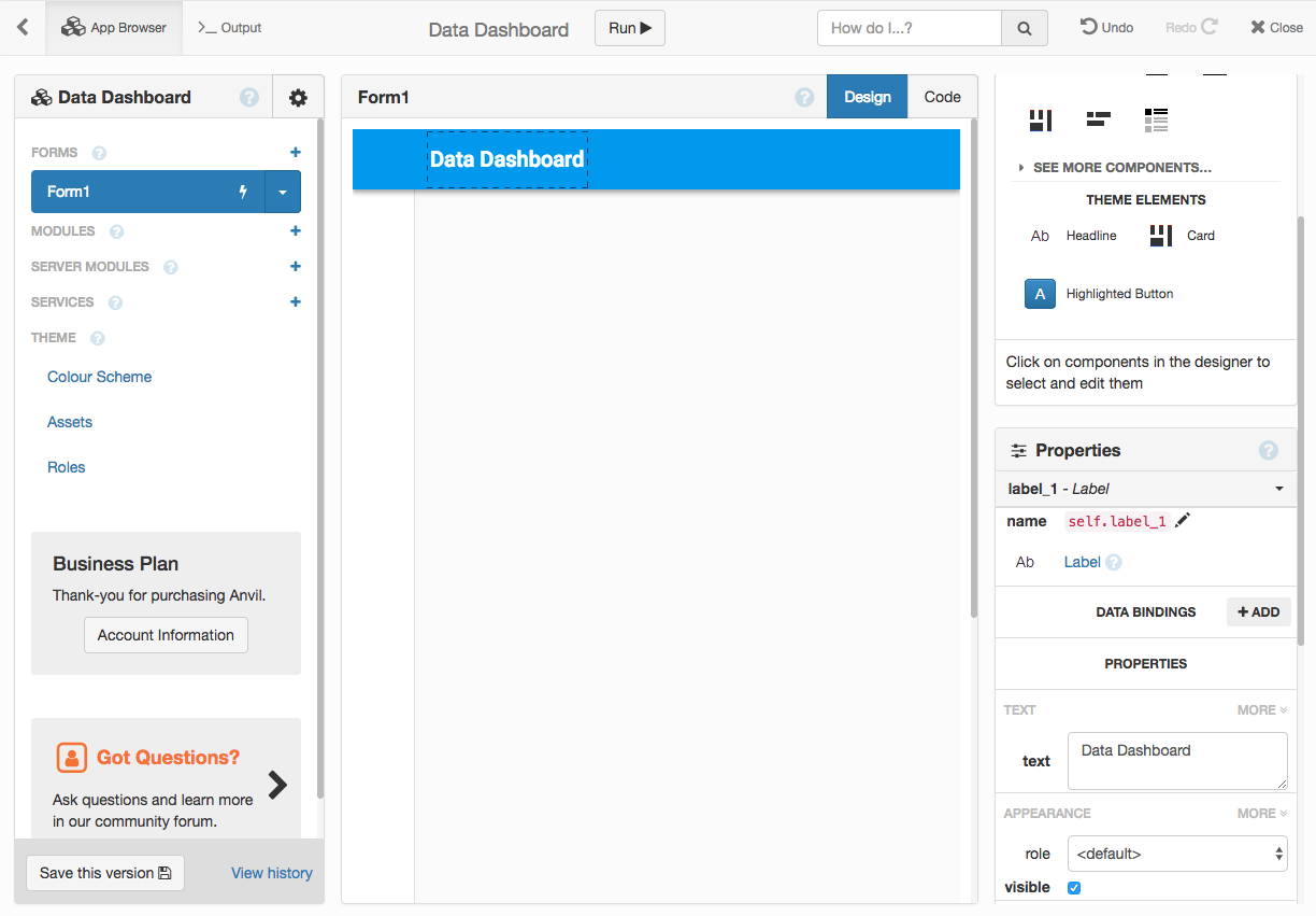
Drop a Label into the blue bar at the top, where it says ‘Drop title here’. In the Properties panel on the right, enter a title into the text section.
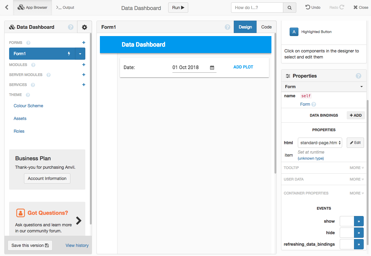
Add a Card to the page. Inside the card, put a Label, a DatePicker, and a Button.
Set the Label’s text to say Date: and set its role to input-prompt.
Click the DatePicker and set its date property to now. In its format box, enter %d %b %Y (this uses the standard Python date format syntax).
Rename the Button to add_btn and set its text to ‘Add plot’.
We’ve just designed a UI for adding plots to the dashboard.
Now to make the button do something.
At the bottom of the Properties panel for the Button is a list of events that we can bind methods to. Click the arrow next to the click event:

You should see some code that looks like this:
def add_btn_click(self, **event_args):
  """This method is called when the button is clicked"""
  pass
Remove the pass and add a call to the built-in alert function:
def add_btn_click(self, **event_args):
  """This method is called when the button is clicked"""
  alert(str(self.date_picker_1.date), title="New plot")
When you click the button, you’ll get a dialog box displaying the date selected in the DatePicker.
Step 2: Adding plots
We’ve built the basis of our control panel and made it do something. Currently it just pops up an alert. Let’s make it actually create some plots and display them on the page.
We’ll use Plotly to create the plots.
Go to the Code view and add this import statement at the very top:
from plotly import graph_objects as goDelete the call to alert you added in step 1 and put this in its place:
new_plot = Plot(
data=go.Scattergl(
x=[0, 1, 2, 3, 4],
y=[0, 1, 4, 9, 16],
)
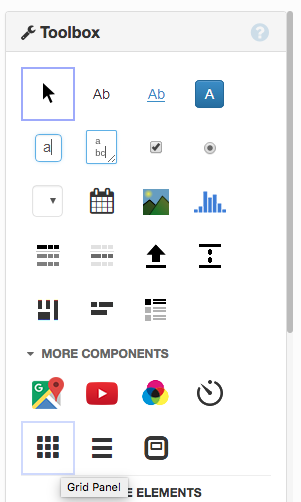
)Now drag-and-drop a GridPanel onto the Form. (GridPanels can be found under ‘See more components…’ in the toolbox):
Write this line below the lines you just wrote. It adds the plot to the GridPanel, taking up half the width (6 out of 12 columns):
self.grid_panel_1.add_component(new_plot, width_xs=6)When you click the add button in the live app, you should see plots appearing on the screen.
Step 3: Get the data
Now we’re making plots, but it would be nice to have some meaningful data to put in them.
We’re going to use the data from the Cambridge University Digital Technology Group’s weather station.
Daily tab-separated value files are available at URLs such as:
https://www.cl.cam.ac.uk/research/dtg/weather/daily-text.cgi?2018-09-26
Step 3a: Request the data
Click on the + next to ‘Server Modules’ in the panel on the left. You’ll see some code with a yellow background.
This function requests data from the weather API. Copy-paste it into the Server Module:
import anvil.http

@anvil.server.callable
def get_weather_for_day(dt):
  # Construct a URL based on the datetime object we've been given.
  url = dt.strftime('https://www.cl.cam.ac.uk/research/dtg/weather/daily-text.cgi?%Y-%m-%d')

  # Get the raw data by making an HTTP request.
  raw_data = anvil.http.request(url).get_bytes()

  print(raw_data)
Go back to Form1 and write this line at the top of add_btn_click:
anvil.server.call('get_weather_for_day', self.date_picker_1.date)Run the app. When you click the ‘add’ button, you should now see the data printed on the Output console.
Step 3b: Parse the data
At present, the data is a string containing the tab-separated values. It needs to be parsed and cleaned to get it into a good format for plotting.
Given that we’re running in a real Python server environment, the range of possibilities for analysing this data is huge. In order to focus on using Anvil, we’ll just wrangle the existing data into a useful data structure, and we’ll give you that function verbatim:
from datetime import datetime

def parse_data(data, dt):
  """Parse the raw weather data string into a list of times, and a dict of lists of meterological variables."""
  # First, split the data into columns
  all_rows = data.split('\n')
  all_rows = [r.strip() for r in all_rows if r.strip()]

  # Then, exclude every row starting with '#'
  data_rows = [r for r in all_rows if not r.startswith('#')]

  # Then split rows on tab character.
  data_rows = [r.split('\t') for r in data_rows]

  # The headers are the penultimate commented line.
  headers = [r.split('\t') for r in all_rows if r.startswith('#')][-2]
  # Clean the headers a bit
  headers = [h.strip('#').strip() for h in headers]

  # The units are the final commented line.
  units = [r.split('\t') for r in all_rows if r.startswith('#')][-1]
  # Clean the units a bit
  units = [u.strip('#').strip() for u in units]

  # Parse out the date time
  time_data = [datetime.strptime(x[0], '%H:%M').replace(year=dt.year, month=dt.month, day=dt.day) for x in data_rows]

  # Construct the dictionary of y-axis variables
  y_data = {
    '{} ({})'.format(header, units[x+1]): [r[x+1] for r in data_rows]
    for x, header in enumerate(headers[1:])
  }

  # These two variables don't scatter plot very well, so let's discard them.
  del y_data['Start ()']
  del y_data['WindDr ()']

  return time_data, y_data
The return values are:
time_data: a list of datetimes.y_data: a dictionary with one key per weather variable (one for the rainfall, one for windspeed, etc.)
So if you wanted to plot hours of sunlight against time, you would do: go.Scattergl(x=time_data, y=y_data['Sun (hours)']).
Copy-paste the parse_data function from above into your Server Module.
Now modify get_weather_for_day to return parse_data(raw_data, dt).
return parse_data(raw_data, dt)Step 4: Plot the data
Time to plot the data.
Go to Form1 and open the Code view.
At the very top, import random:
import randomDelete the contents of add_btn_click. Put this server call in its place:
time_data, y_data = anvil.server.call('get_weather_for_day', self.date_picker_1.date)After that line, use random.choice to select a weather variable at random:
variable = random.choice(y_data.keys())After that line, create a new plot using the weather data:
new_plot = Plot(
  data=go.Scattergl(
    x=time_data,
    y=y_data[variable],
  ),
  layout={
      'xaxis': {'title': 'Time'},
      'yaxis': {'title': variable},
      'title': variable,
  }
)
Then write another line to add this plot to the GridPanel:
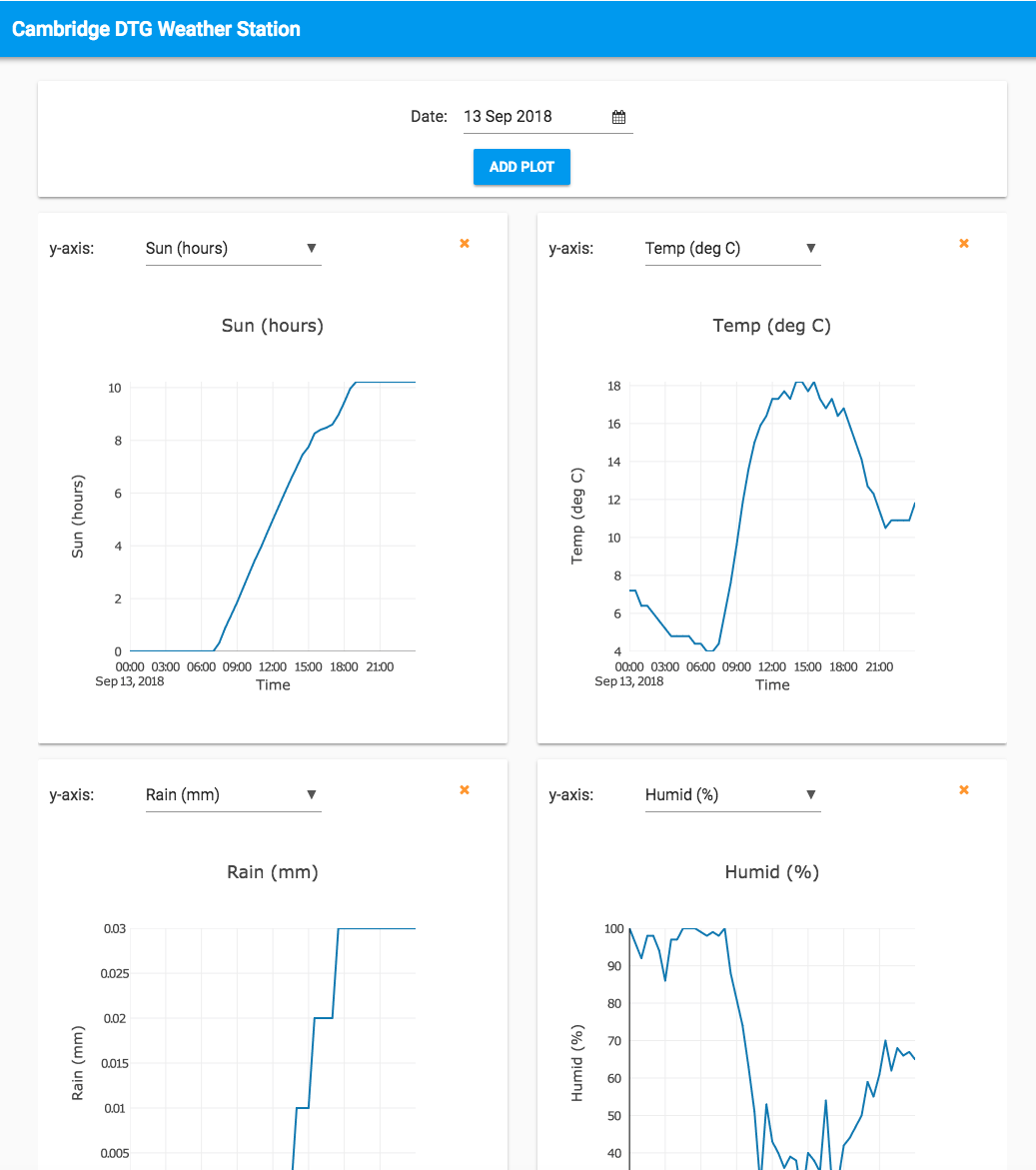
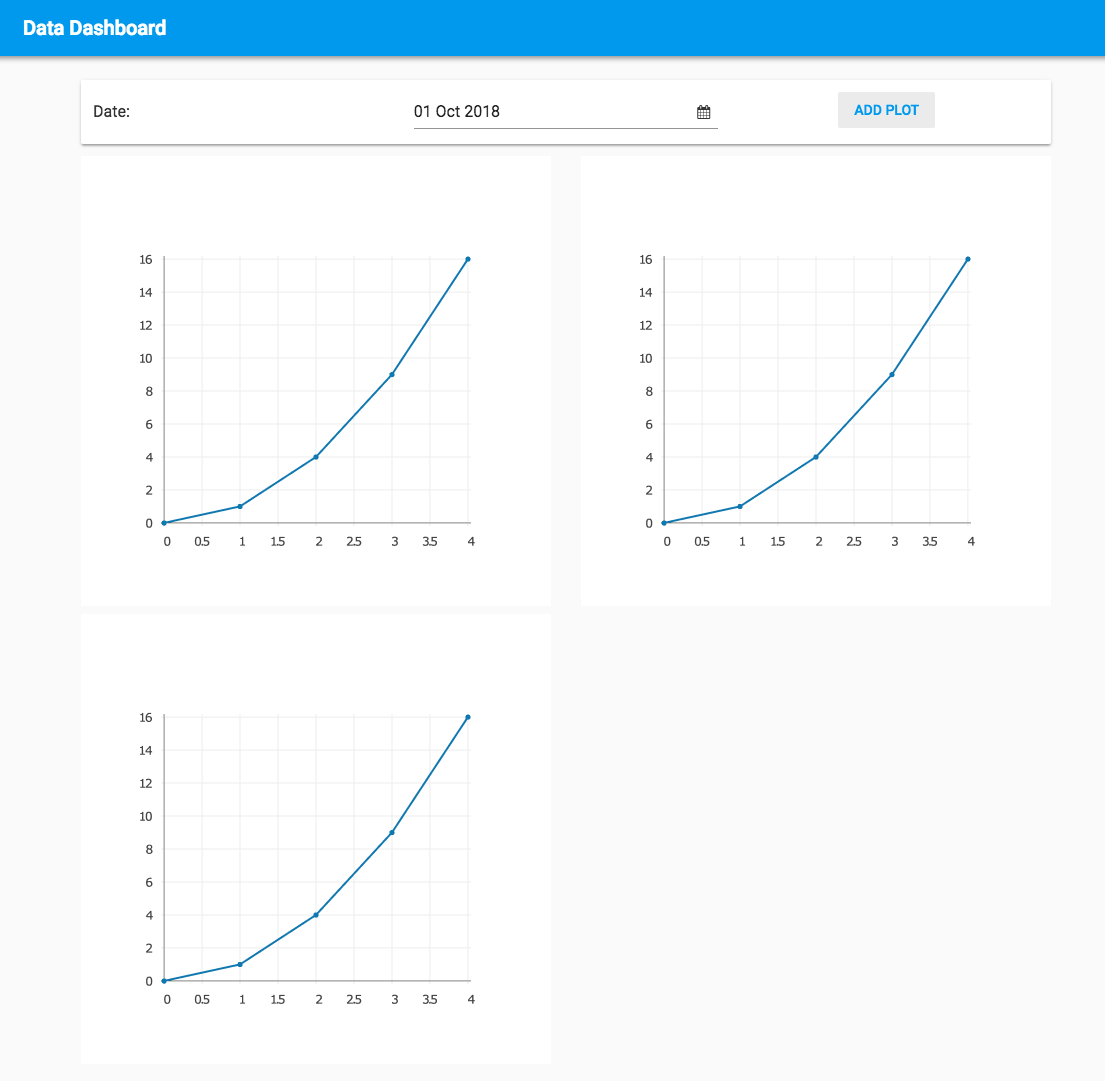
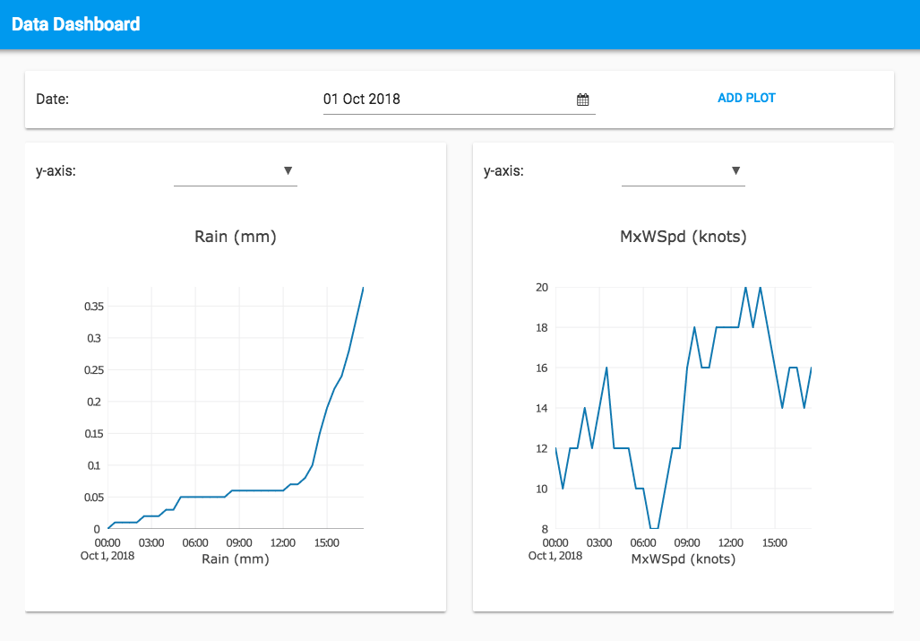
self.grid_panel_1.add_component(new_plot, width_xs=6)Run the app and click ‘Add plot’ a couple of times. Here’s what you get when you do that:
Step 5: Cache the data
We need to make the plots show up more quickly if we’re going to be able to change what they show at the touch of a button. We’ll write 9 lines of code that cache the data in the browser’s memory.
In the panel on the left, click on the + next to ‘Modules’ and create a module named ‘Data’.
Add the following code, which calls the get_weather_for_day method and stores the result in memory:
time_data = []
y_data = {}

def update(dt):
  global time_data
  global y_data
time_data, y_data = anvil.server.call_s('get_weather_for_day', dt)(anvil.server.call_s is the same as anvil.server.call but without the spinner.)
Now you only need to fetch the data when the app is started.
Go to the code of Form1. At the very top, import the Data module:
import DataRemove the anvil.server.call line from the add_btn method.
Write this line at the bottom of the __init__ method:
Data.update(self.date_picker_1.date)Now look at the add_btn method. Everywhere you see time_data and y_data, replace it with Data.time_data and Data.y_data.
Run your app again and try adding plots. It should work as before, except adding plots is a lot faster!
Step 6: Selecting what to plot
Let’s make it possible to select which variable each plot shows.
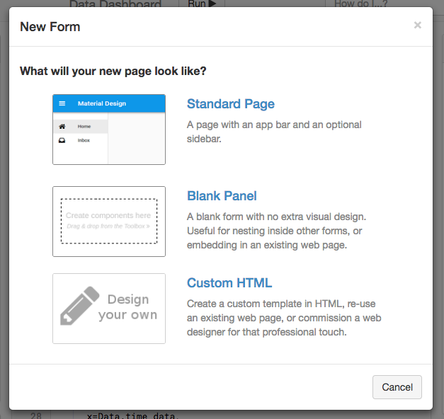
Create a new Form - select Blank Panel rather than Standard Page.
Rename the new Form to ‘TimePlot’.
Step 6a: Construct a UI
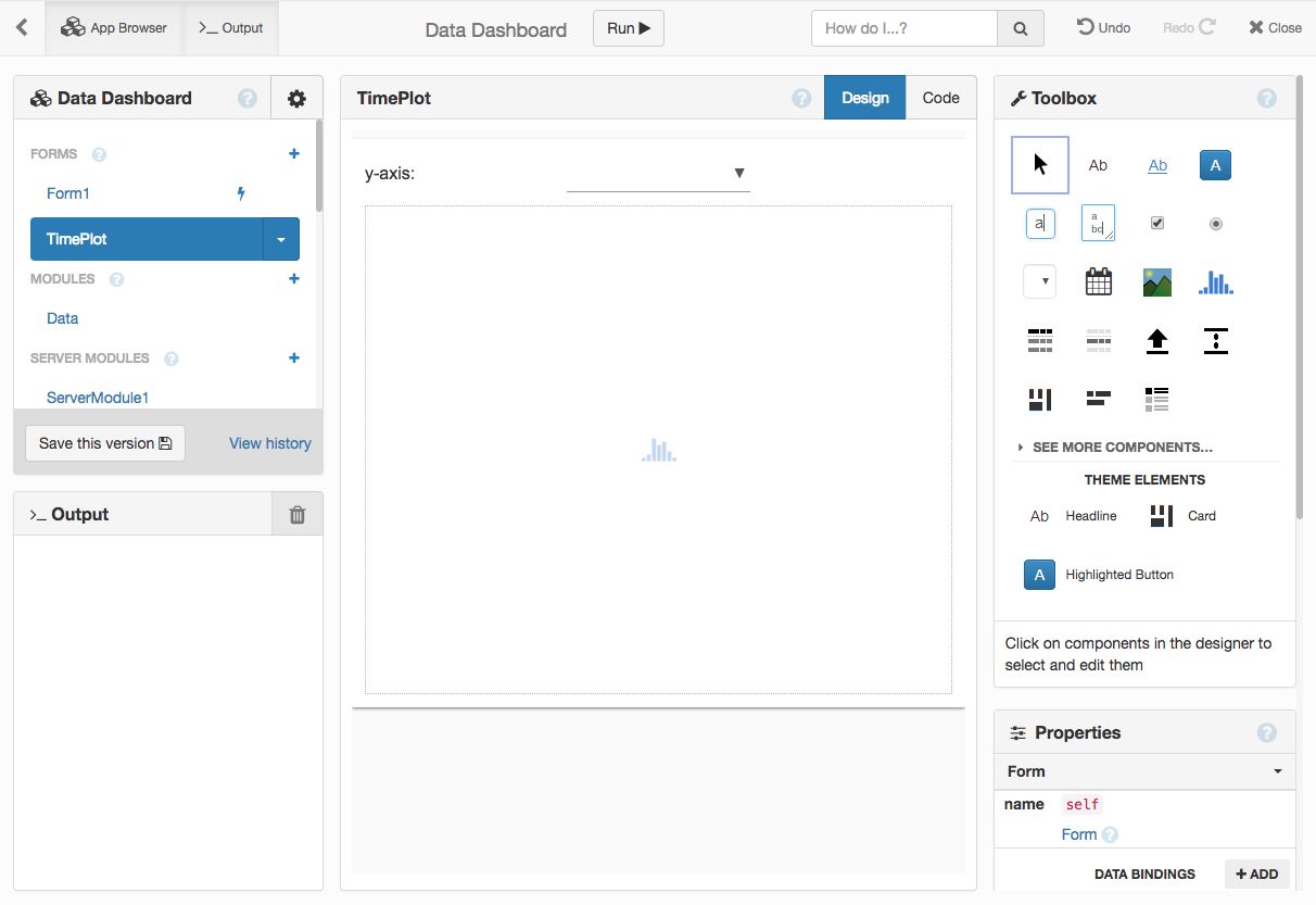
Drag-and-drop a Card into the new Form and add a Label, DropDown and Spacer.
Change the Label’s text to ‘y-axis:’.
Set the Label’s role to input-prompt and adjust the sizes of things to suit your aesthetic taste.
Now drag-and-drop a Plot object into the bottom of the card. Your UI should look something like this in the Design view:
Step 6b: Write a plotting function
Click on ‘Code’ to see the code for this Form.
Add some imports to the very top:
from plotly import graph_objects as go
import random
import Data
Inside the TimePlot class, write this method:
  def plot(self):
    variable = random.choice(Data.y_data.keys())
    self.plot_1.layout.xaxis.title = 'Time'
    self.plot_1.layout.yaxis.title = variable
    self.plot_1.layout.title = variable

    self.plot_1.data = go.Scattergl(
      x=Data.time_data,
      y=Data.y_data[variable],
    )
Call this method from the __init__ method of TimePlot:
class TimePlot(TimePlotTemplate):
  def __init__(self, **properties):
    # Set Form properties and Data Bindings.
    super().__init__(**properties)

    # Any code you write here will run before the form opens.
    self.plot()
Step 6c: Make click handler create TimePlots
The Button now just needs to create TimePlots when it is clicked.
Go to Form1 and open the Code view.
Import the TimePlot Form at the very top:
from TimePlot import TimePlotNow delete all the code inside add_btn_click and write these two lines in its place:
new_plot = TimePlot()
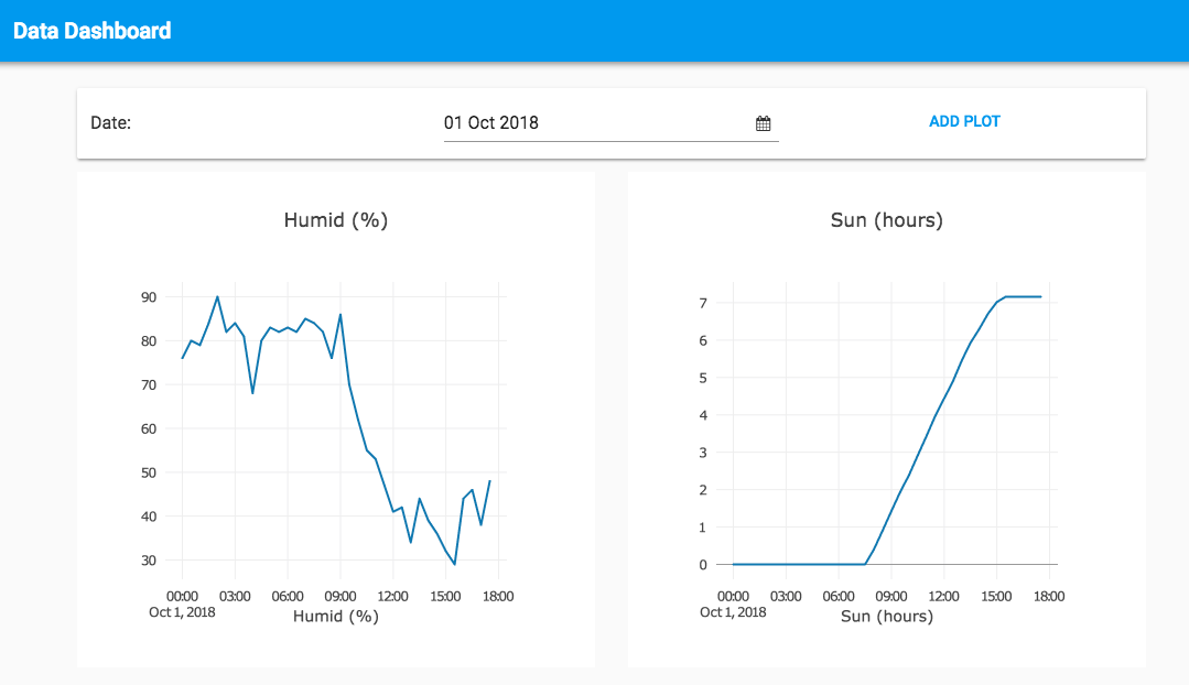
self.grid_panel_1.add_component(new_plot, width_xs=6)Your plots should now be appearing inside a Card, with an empty y-axis dropdown above them:
Step 6d: Selecting the y-axis variable
Let’s make that dropdown do something.
Go back to the TimePlot Form, and open its Code view.
In the __init__ method, add these lines before the call to self.plot():
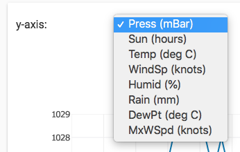
    self.drop_down_1.items = Data.y_data.keys()
    self.drop_down_1.selected_value = random.choice(self.drop_down_1.items)
And change the first line of the plot method like this:
def plot(self):
variable = self.drop_down_1.selected_value
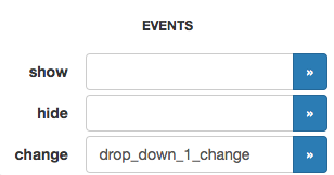
# ...Now bind an event handler to the DropDown’s ‘change’ event in the same way as you did for the Button’s ‘click’ event in section 1:
Now add a call to self.plot() inside drop_down_1_change :
  def drop_down_1_change(self, **event_args):
    """This method is called when an item is selected"""
    self.plot()
Run the app again. Each plot should now have a working DropDown that can select which variable is plotted on the y-axis.
Step 7: Remove plots from the page
Removing plots from the page is simple.
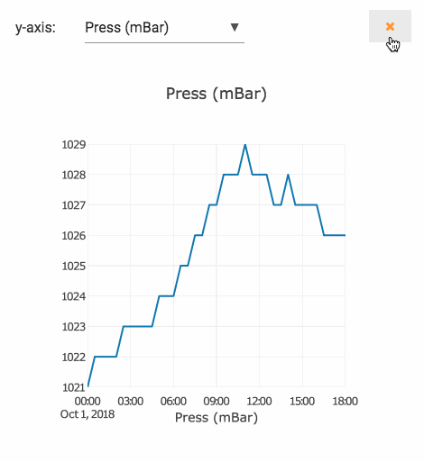
Add a button to the TimePlot Form and style it to look like a delete button.
Configure a click handler for the button.
Make the click handler call self.remove_from_parent().
That’s all there is to it!
Step 8: Display data for other days
One more thing remains. The data should get updated when the DatePicker on Form1 is changed.
Create an event handler for its change event.
Inside the date_picker_1_change method, add this line:
Data.update(self.date_picker_1.date)Followed by these lines:
for component in self.grid_panel_1.get_components():
  if isinstance(component, TimePlot):
    component.plot()
Run your app again - you’ll find you can select a date from the DatePicker and see all the plots update to show the data for that date.
Congratulations, you’ve just built a data dashboard in Anvil!

Clone the finished app
Every app in Anvil has a URL that allows it to be imported by another Anvil user.
Click the following link to clone the finished app from this workshop:
To share your app, click on ‘Share your app’ in the Gear Menu ![]() and
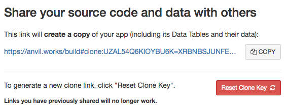
copy the link in the section headed “Share your source code and data with others”:
and
copy the link in the section headed “Share your source code and data with others”:
It’s also live on the internet already, see Publish App in the Gear Menu ![]() for details.
for details.
Extension: Real time data feed
A dashboard is much more useful if it can give you a live feed of the data as it comes in. If you’ve got this far, maybe you can figure out how to get the plots to refresh as new data is uploaded to the Digital Technology Group’s website.
Hint: There’s a Timer component that triggers a ’tick’ event after a given number of seconds.