Example App: Secure Download Portal
Overview
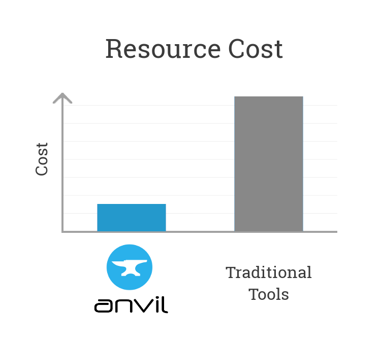
This example is a real, commercial application, built with Anvil. It was 7 times faster to build it with Anvil than with traditional tools, and this guide will show you how it is done.
This walk-through will discuss how the app works, and show you architectural patterns that will help you build better Anvil apps. We recommend you open the source code to each application in a separate tab, and refer to it as you read through this guide.
The Brief: Efficient Distribution of Updates and SDKs
An IP licensing company needs to distribute documentation, SDKs and marketing materials to its partners. Some of this material is confidential; some of it can be freely downloaded. The company requires a self-service download portal, where partners can sign up and download. The sales team should be able to manage who can access what material. For more information on these requirements, click here.
Demo
Here is a video tour of the final app:
Architecture
The system architecture is as follows:
-
Users are members of groups, and this is what determines access control. There is a table of groups, and user records can link to multiple groups. For example, there might be groups for “Users who have signed NDAs”, or “Software developers”, or “Marketing partners”. Sales staff should be able to edit users’ group membership.
-
Users can sign up with an email address, provided they fill out a form requesting phone numbers and
-
There is also a special “Public” group, to which all users automatically belong. This can be used to distribute non-critical documents (eg press packs).
-
Diles and folders are stored in Anvil data tables. Each file record is linked to a number of groups: if you’re a member of one of them, you can download the file.
-
The system comprises two apps:
-
The public portal app, which permits users to sign up, log in, and browse and download files.
-
An administration app, which permits the sales team to set which groups a user belongs to, add and remove groups, and add, remove and edit the downloadable files.
-
Data Model
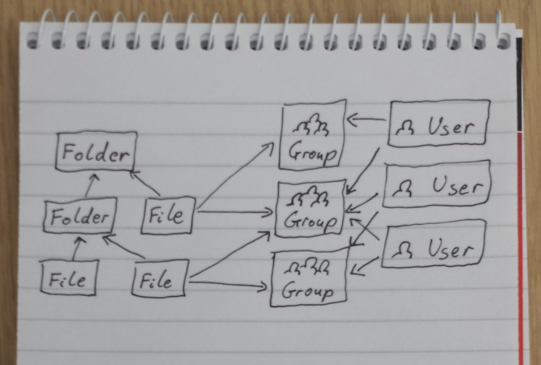
All data is stored in Anvil’s Data Tables.
- Each folder refers to its parent.
-
Each file refers to the folder that contains it, and to all the groups that have access to it.
-
Each user refers to all the groups of which it is a member.
Public Portal App
The public portal app consists of two screens. The first is the login/signup screen:
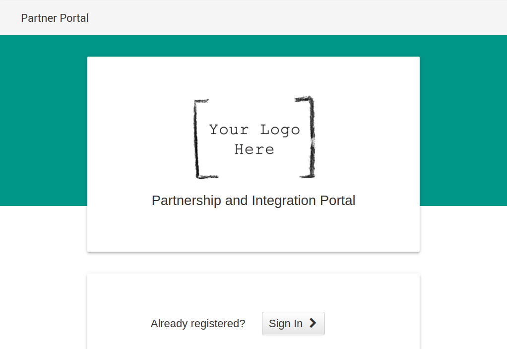
The login button uses the standard form provided by the Users service.
The sign-up section captures details such as company name and contact telephone. The sign-up button calls a server function which saves these details into the new user’s table row.
The main screen displays the content available for download:
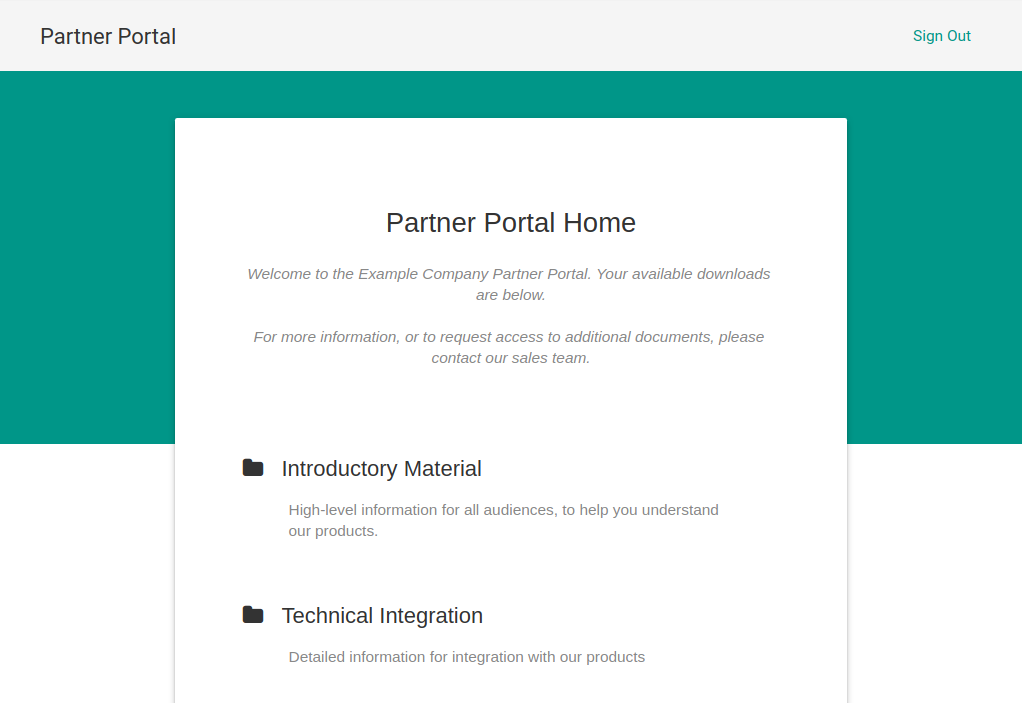
Access control is performed by server functions. After login, a server function loads the list of this user’s groups into the session state for faster lookup. It then returns the top-level folder.
To display a folder, the app calls a separate server function that returns all its files and subfolders to which this user has access. Returning a database row grants the client read access to it, so files can be downloaded directly from the Media column in the Files table.
The form uses Data Bindings to display the details of the current folder, and two RepeatingPanels for files and subfolders.
That’s all there is to the public half of this system. You can open a copy of these apps yourself in the Anvil editor:
Administration App
The app we’ve seen already - the public portal - is all we need to launch this system. If we were prototyping this service, that’s just what we’d do. However, at this point the only way to edit users, groups and downloads is through the Data Table editor in Anvil. Our specification required that the (non-technical) sales staff be able to do these tasks themselves – so we need an admin interface.
This will be a separate Anvil app, sharing the same data tables as the public portal app. It has screens for:
-
Creating and deleting groups
-
Adding users to groups (or removing them)
-
Editing the content that is available for download. This includes:
-
Creating folders, deleting them, and editing their descriptions
-
Creating files, deleting them, uploading new versions, editing their descriptions, and changing which groups can access which files
-
User authentication
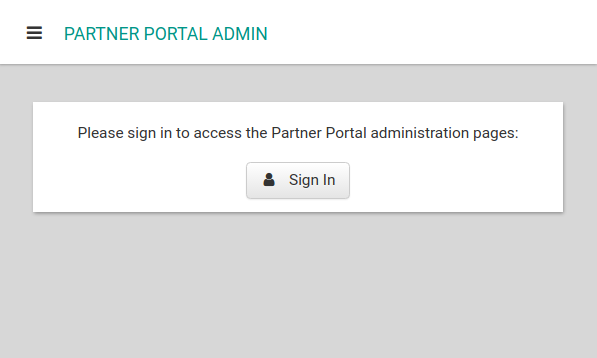
For simplicity, the admin app uses the same Users table as the portal app. A boolean administrator column in the table determines whether a user can access this app.
If an administrator is logged in, a server function (get_tables) will return a client-writable view of each of the Users, Groups, Folders and Files tables. These are stored in the Globals module.
Editing groups
The group editor has a RepeatingPanel displaying each row of the Groups table. A text box allows creation of a new group.
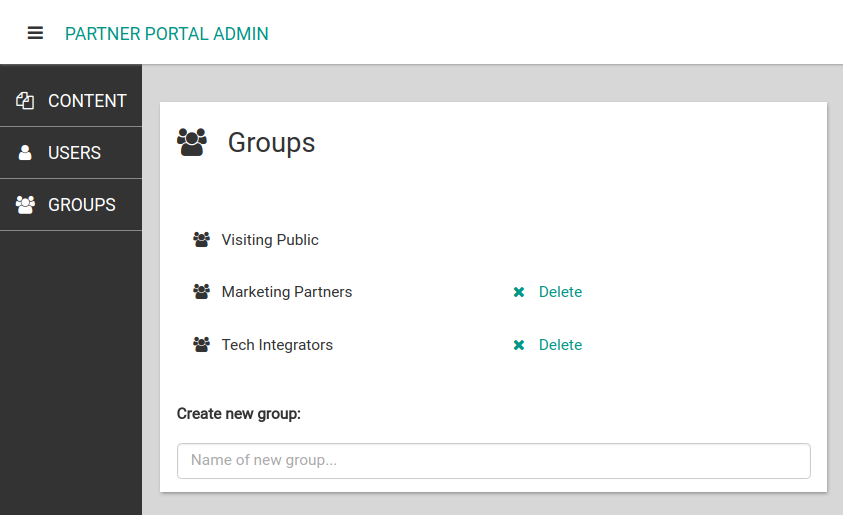
Each group is displayed with a “Delete” link (except for the “public” group, which should not be deleted). Deleting the group row directly would leave dangling references from other files and groups. Instead, we call a server function (delete_group), which removes all references to this group: from users who were members of the group, and from files that were accessible to this group. It then deletes the group itself.
The delete_group function runs in a table transaction, so these changes are protected against concurrent modification: If, for example, another administrator adds a new user to the group while we are deleting it, the delete_group function will be aborted and tried again so that user is removed too.
Editing users
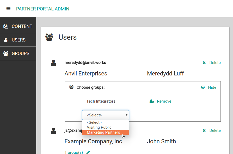
The user editor has the same basic structure as the group editor - a RepeatingPanel to display each user, complete with the contact information they supplied when they signed up.
For each user, we want to display a list of the groups they belong to, and allow the administrator to add and remove groups. This is something we will need again - we’ll need a similar interface to specify which groups can access a particular file. So, we created:
The Group Picker
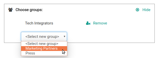
The group picker is a custom component that allows selecting a list of groups.
The groups property is set to the list of selected groups, which are then displayed on a RepeatingPanel. If the “Remove” link is clicked on group in this list, it raises an x-remove event on the template form. The group picker listens for the x-remove event on every component in the RepeatingPanel, and removes the relevant group from its groups property.
A DropDown is used to add new groups. It contains an option for every group that is not yet in the list - selecting that option adds the corresponding group to the list.
Whenever a group is selected or removed, the group picker raises the groups_changed event. This signals to its parent (eg the user editor) that the group list has changed and should be updated in the database.
Performance optimisation: Because the group picker searches the entire Groups table when it updates, the user editor does not set its groups property until the administrator opens the group picker for a particular user. This avoids initialising a group picker for every single registered user when the user editor opens.
Downloadable Content
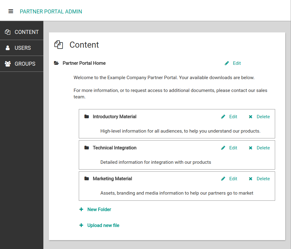
The content editor is the most complex screen of the admin app. It can:
-
Open and close folders to navigate the file structure
-
Edit the title and description of each folder
-
Create and delete folders
-
Edit the title, description, and content of each file
-
Create and delete files
Folder structure
The ContentEditFolder form represents a folder. It allows editing of the folder’s name and description. In addition, the user can click to open the folder and view its contents. Opening a folder adds a ContentEditFolderContents form to the page, which searches for files and subfolders, and displays them in RepeatingPanels.
Each subfolder is represented by another instance of ContentEditFolder, which can in turn be edited, or opened to display its contents.
To delete a folder, we call the transactional server function delete_folder, which deletes all subfolders and files as well.
Editing files
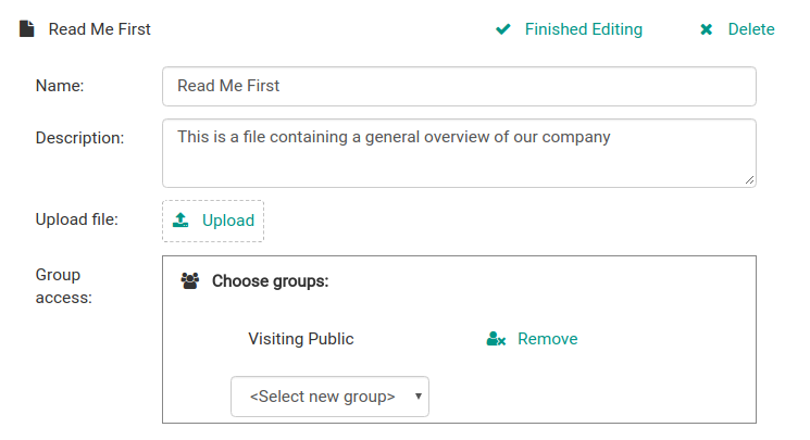
Each file in a folder is represented by an instance of ContentEditFile. When the administrator clicks the “Edit” link, this shows an instance of ContentEditFileDetails, which edits the file directly using Data Bindings. ContentEditFileDetails re-uses the group chooser to select which groups should have access to the file.
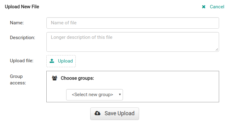
The “Upload File” option re-uses the same ContentEditFileDetails form. However, instead of setting its item property to a row from the Files table, the “Upload File” panel uses an empty dictionary. Then, when the administrator clicks the “Save Upload” button, the contents of that dictionary are passed to app_tables.files.add_row().
This is a common Anvil pattern, which allows us to re-use the same interface to create a new object and edit existing ones.
This concludes our walkthrough of the administration app. You can open a copy of this app yourself in the Anvil editor:
Training Courses
If you want to learn how to create apps like this, and meet your requirements five times faster than traditional tools, consider an Anvil training course. Our instructors will take you step by step from small apps to more complex software engineering practices. Anvil training courses are tailored to your requirements, and can be delivered remotely or on-site.
To discuss a training course, enter your contact information here:
Learn more about Anvil
Get in touch with us to learn more about how you can best use Anvil, and arrange a demonstration of what Anvil can do. Just leave your email address or phone number and we'll get back to you right away.
 By
By