The Anvil Editor
This is a picture of the Anvil Editor, with the most important parts labelled:
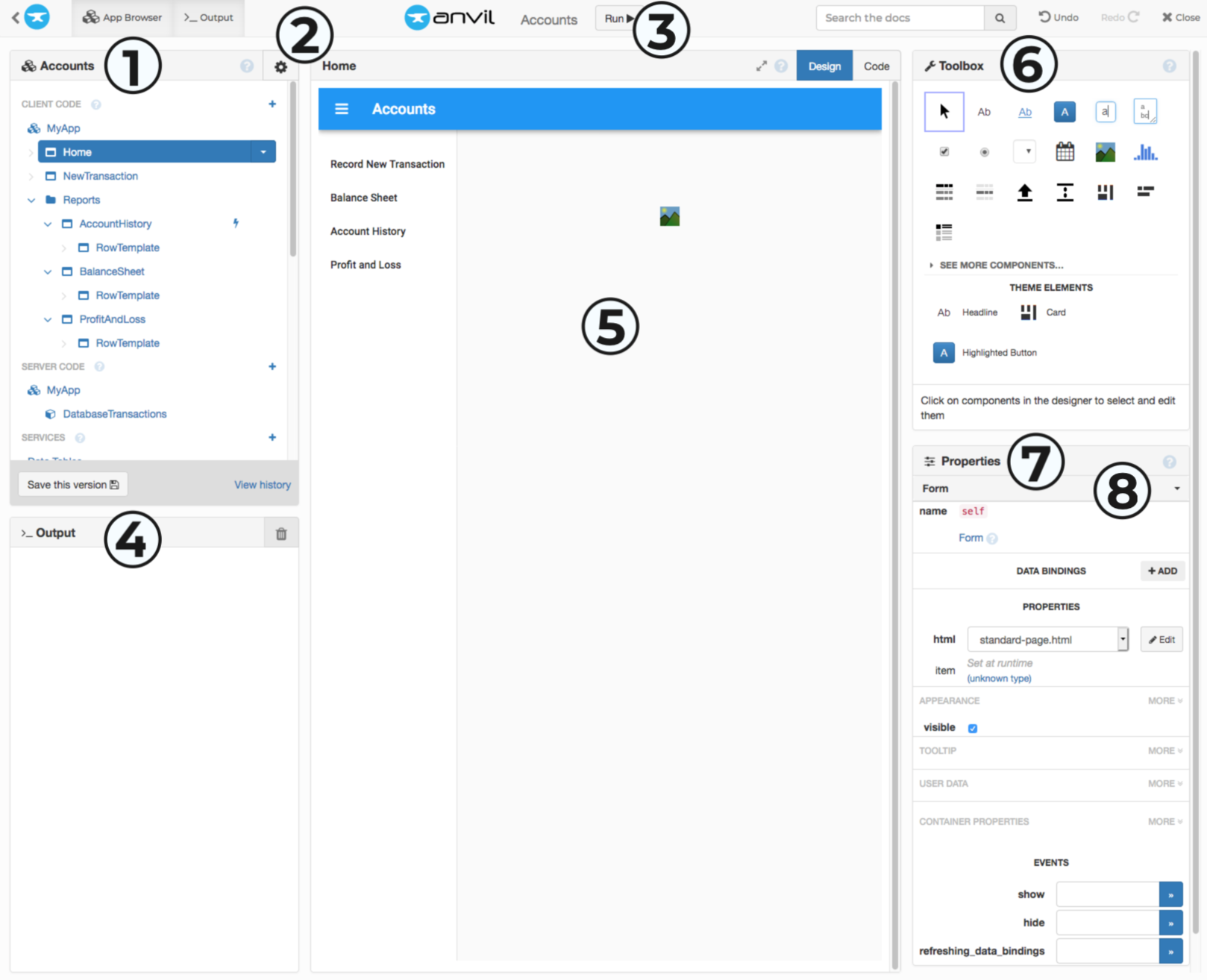
The Anvil Editor
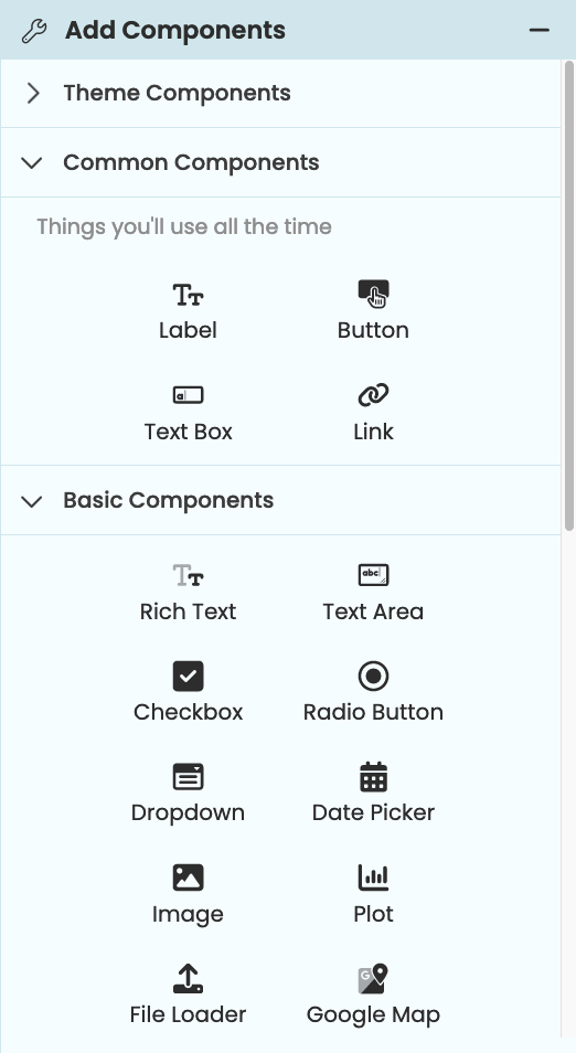
- The App Browser lets you select which part of your app you are editing. Your app can contain:
- Client code (user interfaces and Python code that runs in the web browser)
- Server code (code that runs in a server-side Python environment)
- Services (Pre-built libraries and integrations like Data Tables, User management, etc)
- The App Menu (aka the Gear Menu) is where you configure your application.
- The Run Button runs the app in the Editor and shows the Output Panel (shortcut:
Ctrl-Enter). - The Output Panel shows you everything that was
print()ed when you last ran your app. For older log records, look at the App Logs. - The Form Editor displays what your user interface will look like, and lets you drag and drop components to create your UI. The Form Editor has two modes:
- The Toolbox is where you pick new components to add to your UI.
- The Properties Panel lets you configure the component you have selected in the Form Editor. (You can select components by clicking on them.)
- The Component Tree shows you the hierarchical structure of the components in the current Form. (Click the dropdown to view the tree.)
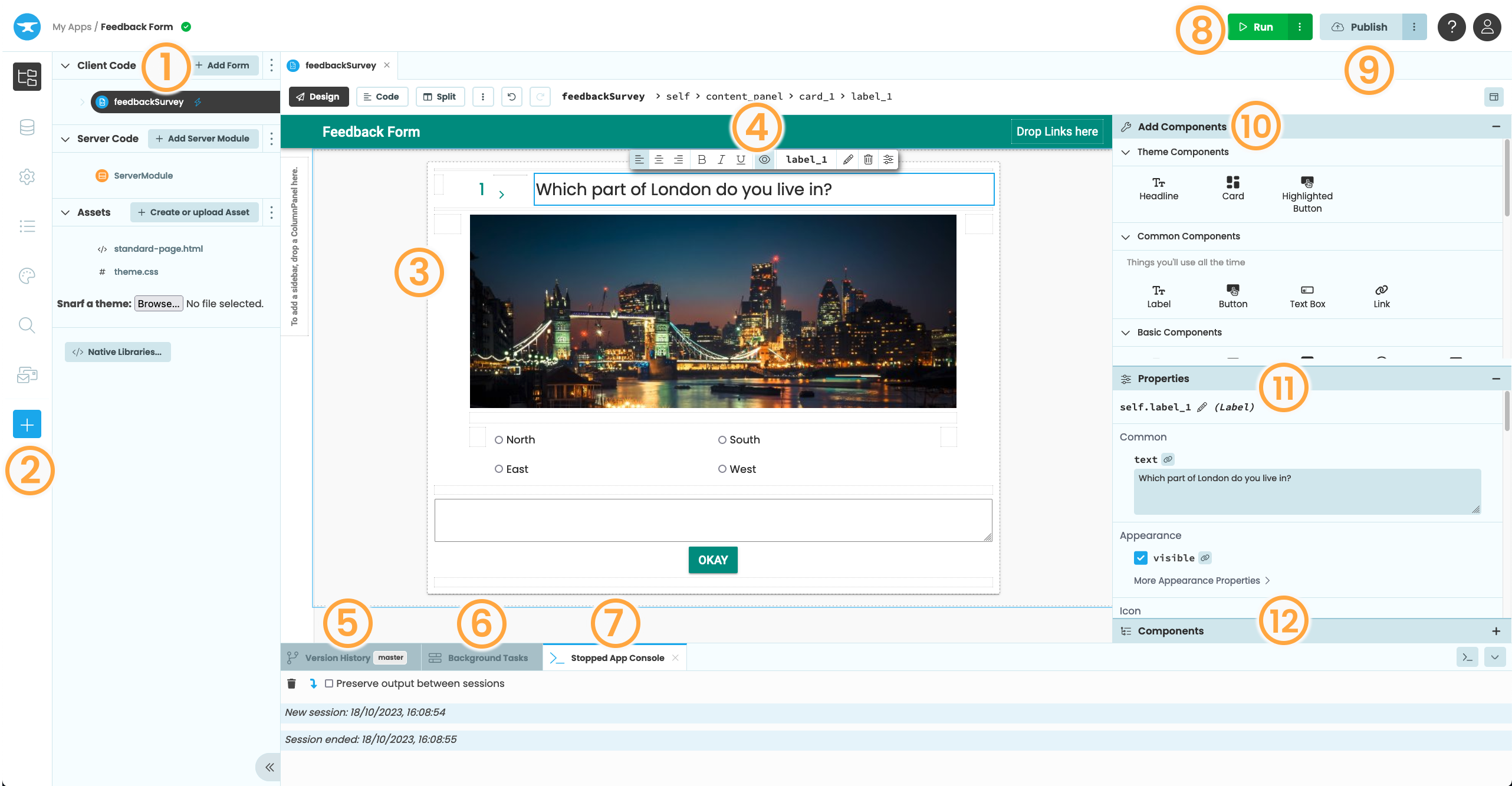
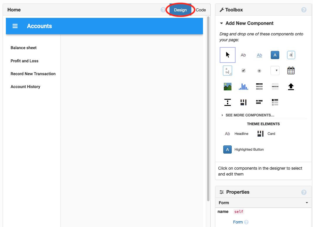
The Anvil Editor
- The App Browser is open by default and can be found by clicking the App button in the Sidebar Menu. It lets you select which part of your app you are editing:
- Client code (user interfaces and Python code that runs in the web browser)
- Server code (code that runs in a server-side Python environment)
- Assets (HTML, CSS and other uploaded files for your app. Editing these assets is entirely optional.)
- The Sidebar Menu is where you configure your application, find your apps logs, and add pre-built libraries and integrations like Data Tables, User management, etc.
- The Form Editor displays what your user interface will look like, and lets you drag and drop components to create your UI. The Form Editor has three modes:
- The Object Palette lets you quickly and easily edit your component’s most commonly edited properties
- The Version History Panel displays your app’s commit history and allows you to create new branches and clone your app with Git.
- The Background Tasks Panel shows any running background tasks.
- The App Console will appear after running your app. It shows the app’s output from
printstatements and exceptions. - The Run Button runs the app in the Editor and shows the App Console (shortcut:
Ctrl-Enter). Clicking the dots menu gives you the option to run the app in split view or in a new window. - The Publish Button allows you to publish your app pubically or privately. Here, you can add and configure environments for your app.
- The Toolbox is where you pick new components to add to your UI.
- The Properties Panel lets you configure the component you have selected in the Form Editor. (You can select components by clicking on them.)
- The Component Tree shows the hierarchy of components within the current Form and let’s you move components in the Form
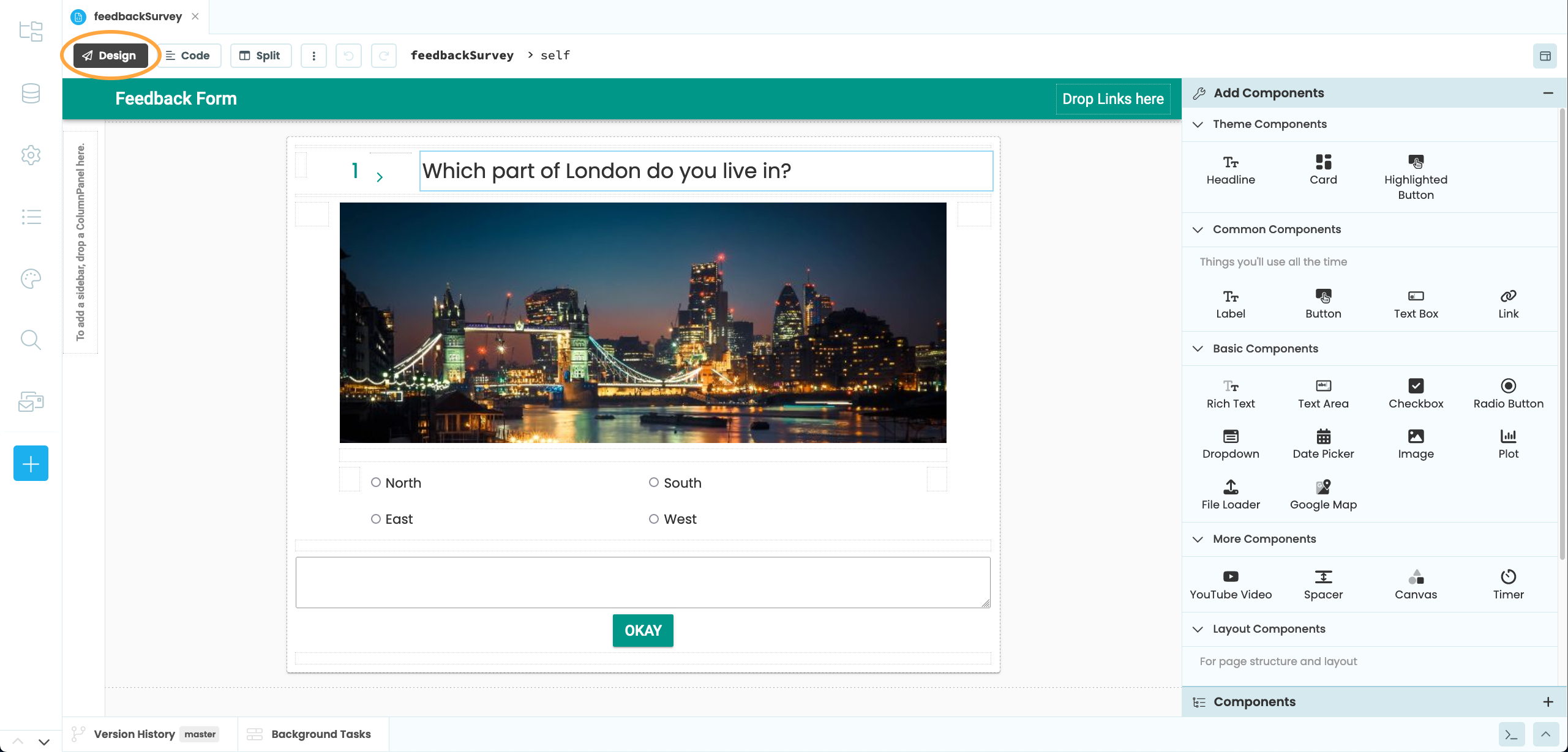
Toolbox
You construct your UI by dragging-and-dropping components onto your Forms from the Toolbox. (You can also create and add components using code.)
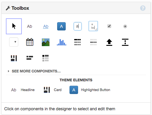
The Toolbox.
The Toolbox.
These components are always visible in the Toolbox:
Label
Link
Button
TextBox
TextArea
CheckBox
RadioButton
DropDown
DatePicker
Image
Plot
Data Grid
DataRowPanel
FileLoader
Spacer
ColumnPanel
FlowPanel
RepeatingPanel
Click ‘More components’ to see these components:


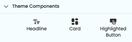
The Theme Elements part of the Toolbox contains components whose style is particular to the current app’s Theme. (This is not the complete list of theme-specific styles that can be applied to components. The Roles view shows you all of them.)
Object Palette
When you drop or select a component in the designer, you will see the Object Palette above the component.
The Object Palette
This lets you quickly and easily edit your component’s most commonly edited properties:
| Alignment | - | 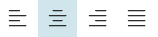 |
| Bold, italic and underline icons | - | 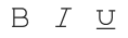 |
| Toggle visibility and toggle disabled icons | - |  |
| Component name | - |  |
| Edit text | - |  |
| Delete component | - |  |
| Open Properties Panel | - |  |
To edit the full list of properties for a selected component you can go to the Properties Panel or you can set them in code.
You can also use the Object Palette to set up event handlers. For components that have events, you’ll see a button that allows you to set up the event handler for the component’s most common event. For example, you can set up a click event for a Button component from the Object Palette.
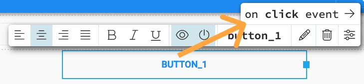
You can set up a click event
for a Button component using the Object Palette.
Properties Panel
To edit the initial properties of your components, use the Properties Panel.
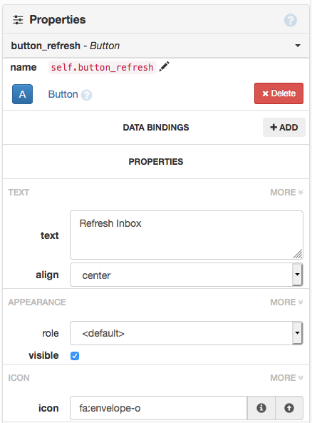
The top part of the Properties Panel for a Button.
For properties not included in the Object Palette, you can use the Properties Panel - this contains all properties for a selected component.
The top part of the Properties Panel for a Button.
Properties let you edit the styling and behaviour of your components such as:
- what text a component displays
- what icon a component displays
- the text colour
- spacing around the component
- input type of TextBoxes
- tooltip text
For full listings of each component’s properties, see the API Reference.
The Properties Panel is split into subsections; many properties are not shown until you click the ‘more’ button for the relevant subsection (this keeps the Properties Panel a manageable length).
Each Form has properties as well. You can modify the Form’s properties using the Properties Panel when no components are selected.
To modify what the component is called in the Python code, use the name property at the top of the Properties Panel.
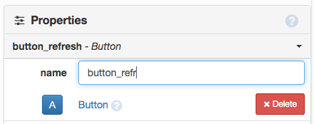
Renaming a component.
To modify what the component is called in your app’s Python code, use the edit button next to the name property at the top of the Properties Panel (or edit the name in the Object Palette).
Renaming a component.
Container Properties control the relationship between a component and the container it is in. For example, you can set the width, x-position and y-position of a component in an XYPanel .
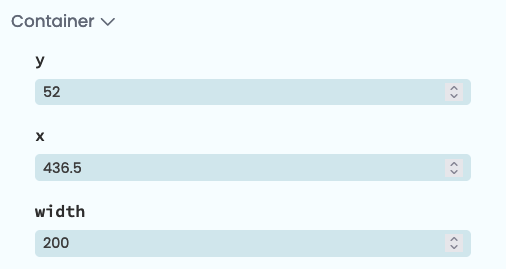
The Container Properties for a component inside an XYPanel.
You can set properties in code as well. Each component property is available as an attribute of the Python object:
self.button_refresh.text = "Check for messages"Container properties can be passed as keyword arguments when adding a component to a container in code:
self.xy_panel_1.add_component(my_button, x=42, y=128)When are the properties set?
Each Form contains this line of code:
# Set Form properties and Data Bindings.
self.init_components(**properties)
When this line of code runs (during Form initialisation), the properties you set in the Properties Panel are applied to your components.
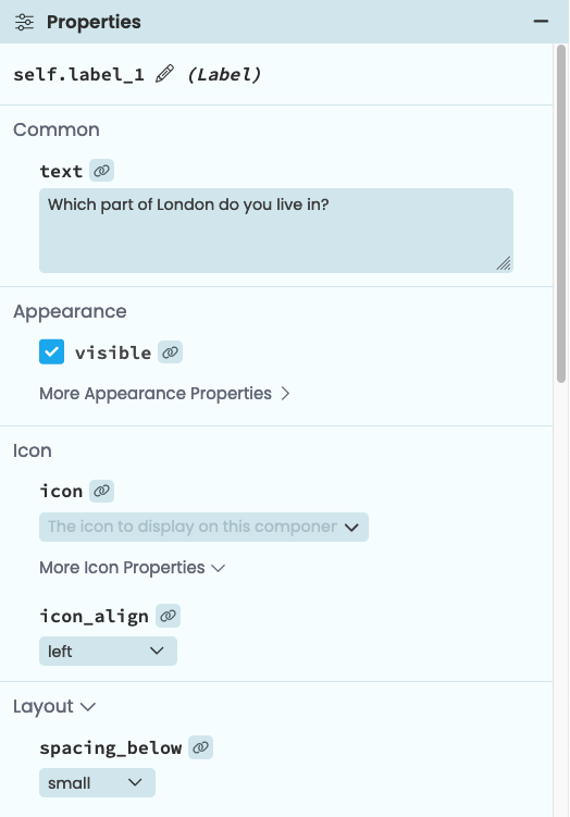
Events
You can also set up event handlers for your components in the Properties Panel.
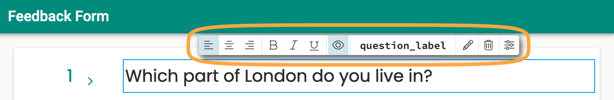
Each component’s events are shown at the bottom of the Properties Panel. You can enter the name of a Python method in the box, and that method will run when the event fires. This method must be a method of the Form that the component is on.
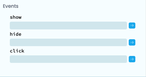
Events can be defined at the
bottom of the Properties Panel.
If you click the  button next to the event,
an empty method is automatically written for you (it contains a
button next to the event,
an empty method is automatically written for you (it contains a pass statement, which you can remove.)
def button_refresh_click(self, **event_args):
  """This method is called when the button is clicked"""
  pass
You can also set up event handlers in code using self.my_component.set_event_handler.
See Anvil Components for more detail on events.
Form Editor
The Form Editor has two modes: Design View and Code View. You choose your view using the tabs at the top of the Form Editor:
Choosing between Design view and Code view of the Form Editor.
The Form Editor has three modes: Design View, Code View and Split View. You choose your view using the buttons at the top of the Form Editor:
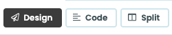
Choosing the view of the Form Editor.
Design view
Design view shows you how your Form will look when your app is running. This is where you drag and drop components to create your UI. It also displays the Toolbox and the Properties Panel.
Design view of the Form Editor.
Design view shows you how your Form will look when your app is running. This is where you drag and drop components to create your UI. It also displays the Object Palette, Toolbox, Properties Panel and Component Tree.
Design view of the Form Editor.
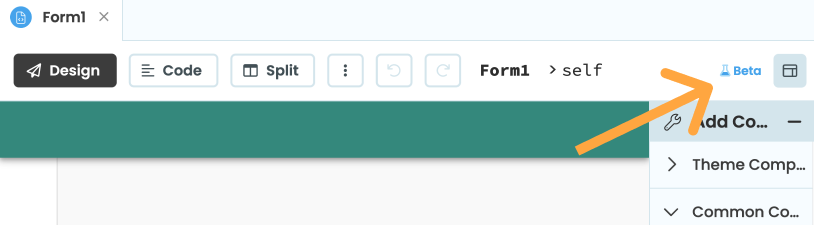
If you want to switch back to the Classic Designer, use the blue link in the top right of the Form Editor:
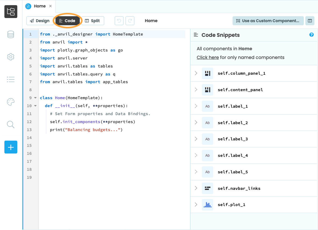
Code view
Code view shows you the Python class that describes how your Form behaves. This is where you write your client-side Python code that runs in the browser. It also displays the Code Snippets Panel.
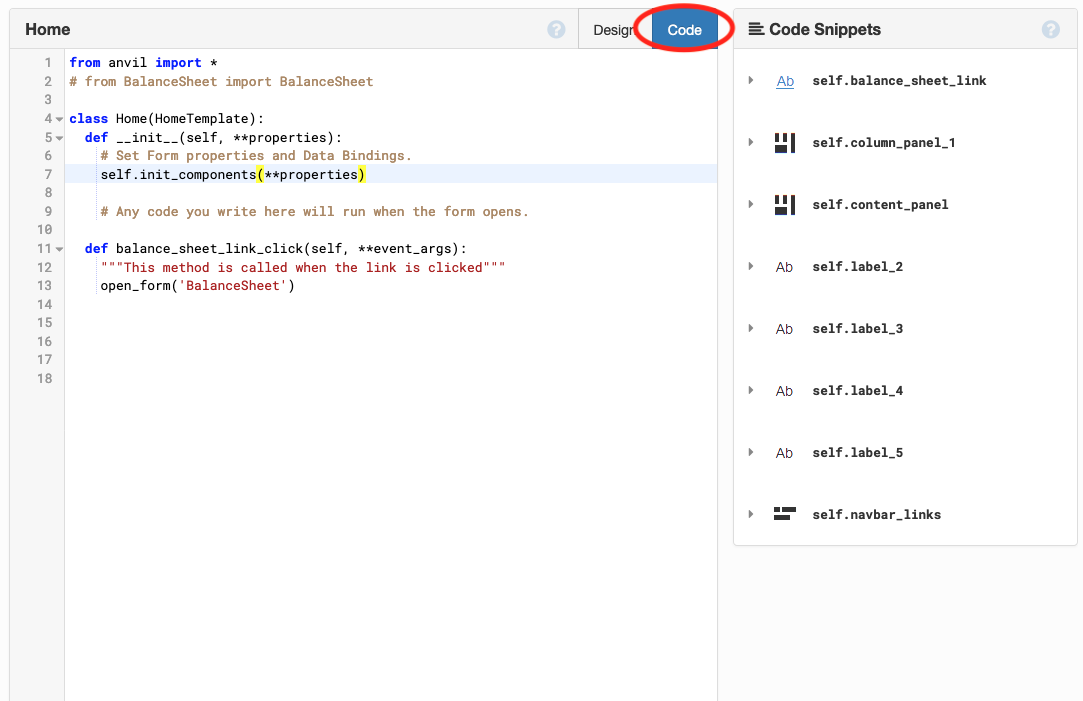
Code view of the Form Editor.
Code view of the Form Editor.
Split view
Split view shows you both how your Form will look when the app is run and the Python code for your Form.
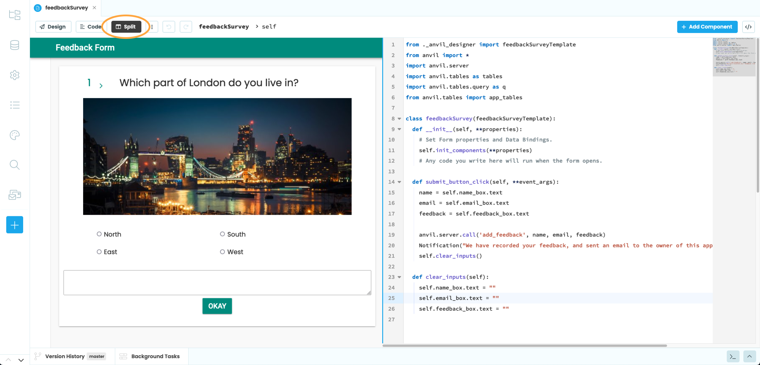
Split view of the Form Editor.
App Browser
The App Browser lists the main parts of your app:
- Client code - the Forms, Modules and Packages that define your app’s UI design and client-side behaviour.
- Services - configuration pages for features such as User management, Data storage and Email
- Theme - configuration of the overall look and feel of your app
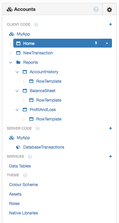
The App Browser
Sidebar Menu
The Sidebar Menu contains more options for building and configuring your app.
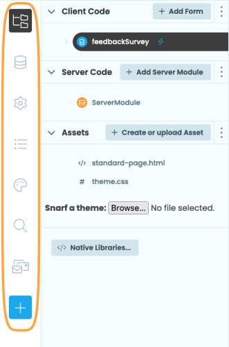
The Sidebar Menu
These are the options given in the Sidebar Menu:
- App: The default view. Shows the App Browser.
- Data: Add and configure Data Tables and Databases
- Settings: Configure settings for your app:
- General: Change the name, description and logo of your app
- Python versions: Choose the version of Python running on the client and on the server.
- Dependencies: Add other apps to use as libraries or configure your app to use as a library
- Data Tables: Configure settings for Data Tables
- Collaboration: Configure sharing and cloning of your app
- App logs: Get a log of exceptions and
print()ed output from your app, split by user session and a list of current and past background tasks - Theme: Change the app’s colour scheme and add CSS roles to style components
- Search: Search through your app
Clicking the blue plus button  brings up a menu to add more features to your app, including the Email service, the Users service, the Uplink, App Secrets and built-in integrations:
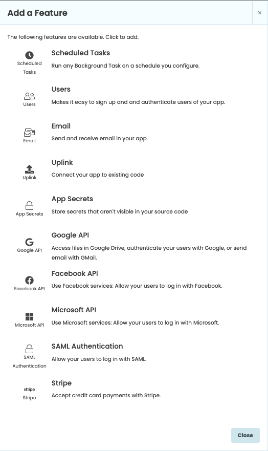
Add a Feature Menu
The App Browser
The App Browser can be found by clicking  . It lists the main parts of your app:
- Client code - the Forms, Modules and Packages that define your app’s UI design and client-side behaviour
- Server code - the Server Modules that run secure server-side Python
- Assets - the HTML, CSS and other uploaded files for your app
The App Browser
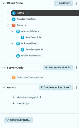
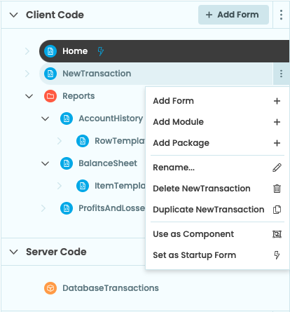
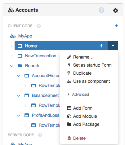
You can add Forms, Server Modules, Modules, Folders and Services to your app by clicking on + Add Form or the dots menu.
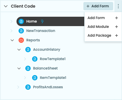
Click the … button to add more.
You can also use the dots next to existing Forms and Packages to add new ones as well as to delete and rename things. For Forms and Modules, this menu also allows to choose what runs when your app starts. Forms have a few other options: you can duplicate them, or click ‘use as component’ to make them appear in the Toolbox as Custom Components:
Click the … button for config.
You can add Forms, Server Modules, Modules, Folders and Services to your app by clicking on the plus buttons  .
.
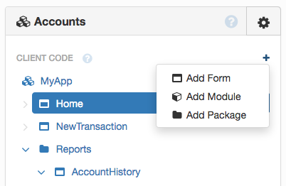
Click the plus buttons to add more.
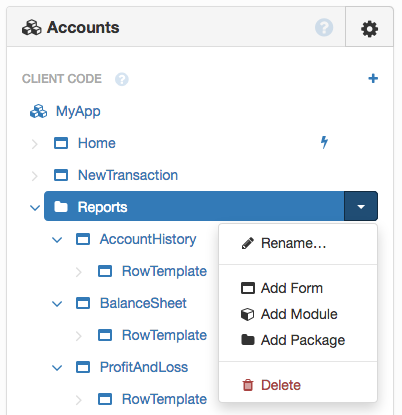
You can also use the down-arrows next to existing Forms and Packages:
Adding an entity inside a Form or Package.
To delete and rename things, use the down-arrow  next to existing Forms, Packages, Modules, Server Modules and Services.
For Forms and Modules, this menu also allows to choose what runs when your app starts.
Forms have a few other options: you can duplicate them, or click ‘use as component’ to make them appear in the Toolbox as Custom Components.
Click the down arrow for config.
App Menu 
The App Menu (aka Gear Menu) contains configuration and output relating to the entire app. Open it from the top of the App Browser:
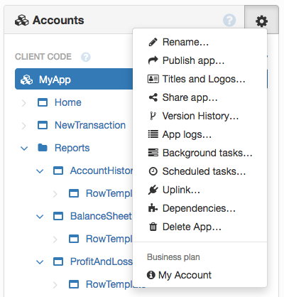
The App Menu (aka Gear Menu)
Here are the options given in the App Menu:
- Rename your app
- Publish app: Configure your app’s URLs and other hosting/deployment options
- Titles and Logos: Configure your app’s title, logo and description (useful for SEO and social media previews)
- Share app: Clone your app, copy the app’s URL, clone it with Git, and export it as a file
- Version history: save your app, revert to a previous version, publish a specific version, and clone it with Git
- App logs: get a log of
print()ed (and other) output from your app, split by user session - Background tasks: a record of all Background Tasks this app has run (including those running now)
- Scheduled tasks: set Background Tasks to run according to a schedule, e.g. every Thursday at 3pm (similar to Unix’s
cron) - Uplink: connect to code outside of your app (anywhere connected to the internet where you can write Python)
- Dependencies: use other apps within this app, and make this app available to other apps
- Delete your app
- My Account: see your account details, configure two-factor authentication, add developers to your account, and upgrade your plan
Output Panel
The Output Panel shows the output of print statements within your app. It also shows tracebacks from unhandled exceptions,
and (occasionally) messages from the Anvil system about your app.
Bottom Panel
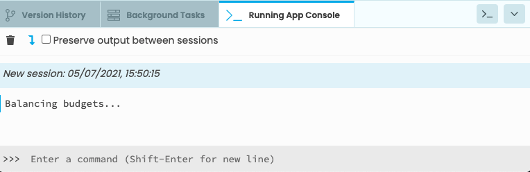
App Console
The App Console will appear after you run your app. It shows the output of print statements within your app. It also shows tracebacks from unhandled exceptions,
and (occasionally) messages from the Anvil system about your app.
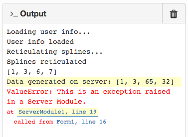
Output from Server Modules will appear with a yellow background.
Output from Server Modules will appear with an orange border on the left-hand margin, while output from Client Forms and Modules will appear with a blue border.
The App Console showing printed output from the client
Exceptions will show a traceback - if the exception occurred on the server, the traceback will still show the whole call stack as if the code ran on the same machine. Clicking a link in the traceback will take you to the problematic line of code in the Code View.
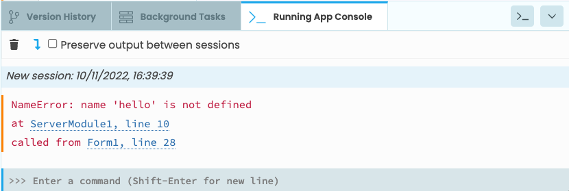
The App Console showing an exception traceback coming from the server
The Output Panel
When Background Tasks are running, their status is shown at the bottom of the Output Panel.
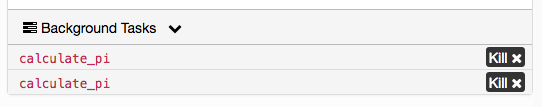
Background Tasks in the Output Panel.
You can show/hide the Output Panel by clicking the >_Output button in the top-left of the Editor:
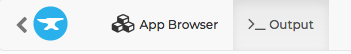
Click here to show/hide the Output Panel.
Background Tasks
Click on the Background Tasks tab to see the tasks that are currently running.
Background Tasks in the Bottom Panel
Version History
The Version History tab shows recent changes to your app and allows you to add and switch branches as well as clone your app with Git.
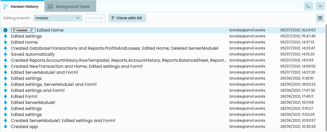
Version History in the Bottom Panel
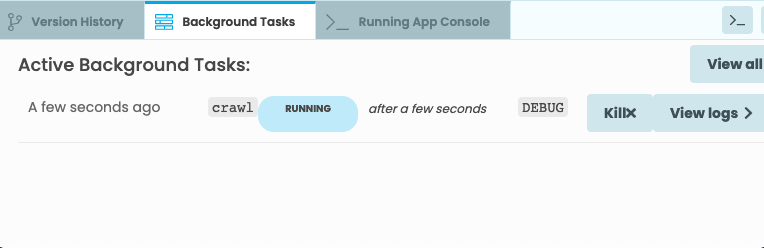
Designer Output
When in the design view, the Designer Output Console will appear if there are any component errors or a custom component prints something to the console.
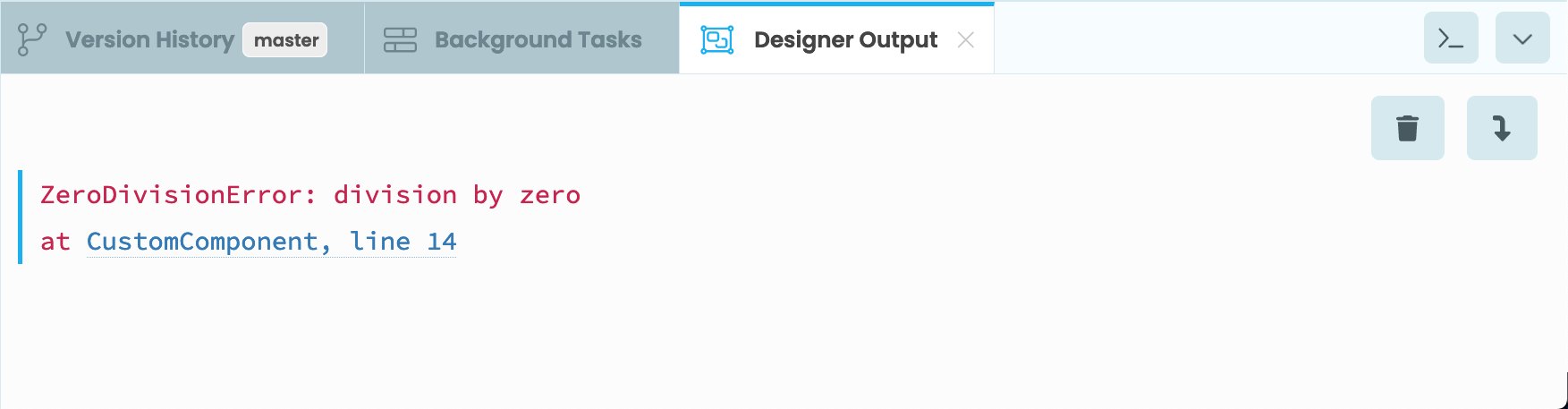
Designer Output in the Bottom Panel
Server Console
To launch a server console, click the button in the top right. This will bring up a REPL where you can connect directly to your chosen Python environment on the server.
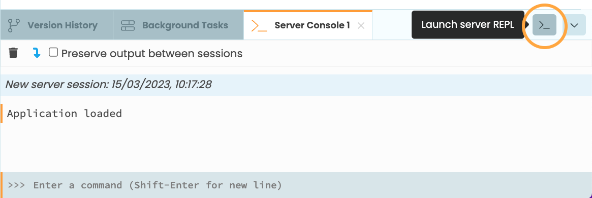
Launching a Server REPL
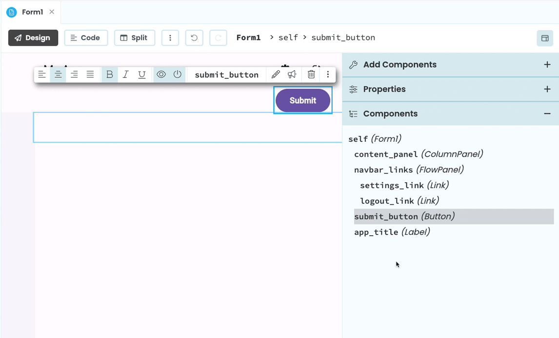
Component Tree
Here you can find all the components on your Form. Selecting a component from the tree will also select the component on the Form and bring up its Object Palette.
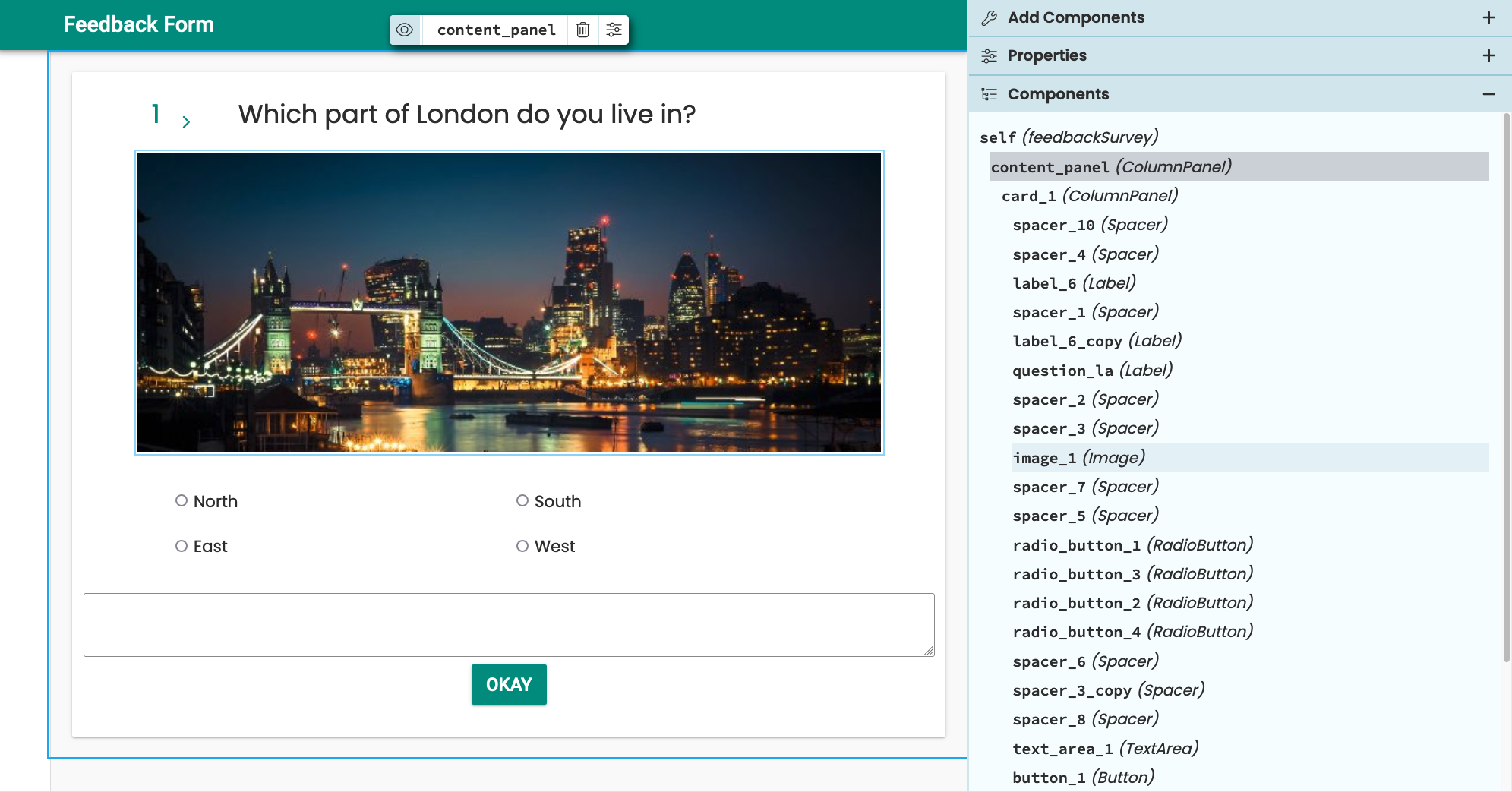
Component Tree for a form.
The currently-selected component is highlighted in context of the other components. You can select any of the other components to view and edit the properties of that component.
You can drag and drop components in the Component Tree to affect their placement on the Form. When dragging a component, blue lines will appear indicating where you can move the component to. You can also drag and drop components from the Toolbox into the Component Tree.
Dragging a Button component into a ColumnPanel from the Component Tree
Zen Mode and Quick Switcher
Activating Zen mode maximises an editor tab and simplifies the IDE view so that you can focus on your code. You can activate Zen mode by:
- Using
Alt+Shift+Zon Windows orOption+Shift+Zon Mac - Double clicking on a tab in the tab bar
- Right clicking on the active tab
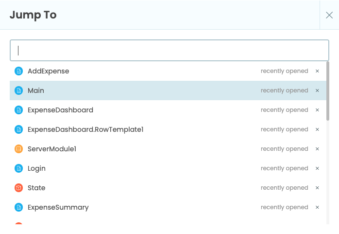
You can use the quick switcher to easily jump between tabs or files without using your mouse, which is particularly helpful while in Zen mode. Press Ctrl+P (or Cmd+P on Mac) to open it, then press it again to cycle through files.
The quick switcher
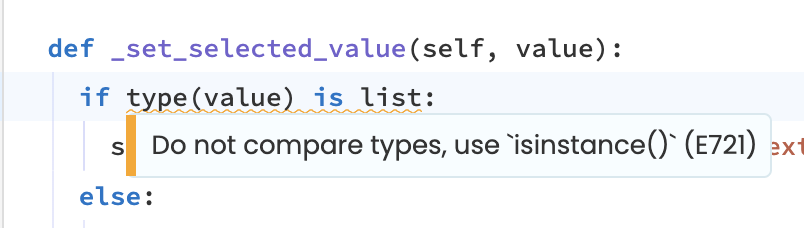
Linting and Formatting
The Anvil Editor has Ruff linting and formatting built in. The linter shows warnings in your code as a yellow squiggly line. If you hover over the highlighted code, you’ll see more information about the warning in a tooltip.
A warning from the Ruff linter
You can auto-format your code using Alt+Shift+F on Windows or Option+Shift+F on Mac.
The Ruff linter is also configurable. You can configure the linter per app by:
- Opening your app locally
- Creating a
pyproject.tomlorruff.tomlfile in the root directory - Adding your preferred configuration (see the Ruff documentation for details)
- Pushing your changes back to Anvil
Code Styles
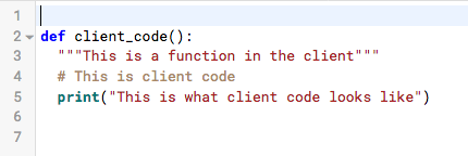
Anvil apps use Python code on client and server side. The Editor uses different visual styles for client and server code.
Client code.
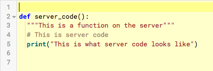
Server code.
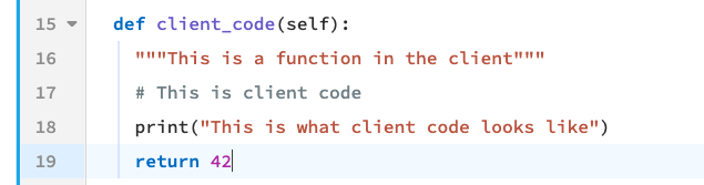
A function written on the client. The code editor has a blue bar on the left margin.
A function written on the server. The code editor has an orange bar on the left margin.
In Modules, code is styled like client code. Module code can be run on both client and server.
In this documentation, client and server code are styled as follows:
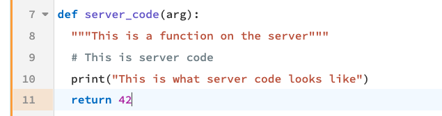
def client_code():
  """This is a function in the client"""
  # This is client code
  print("This is what client code looks like")
def server_code():
"""This is a function on the server"""
# This is server code
print("This is what server code looks like")Code Snippets
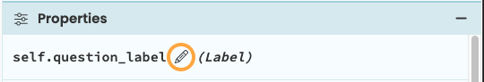
The Code Snippets Panel lists all the components on the current Form. It is visible in the Code View.
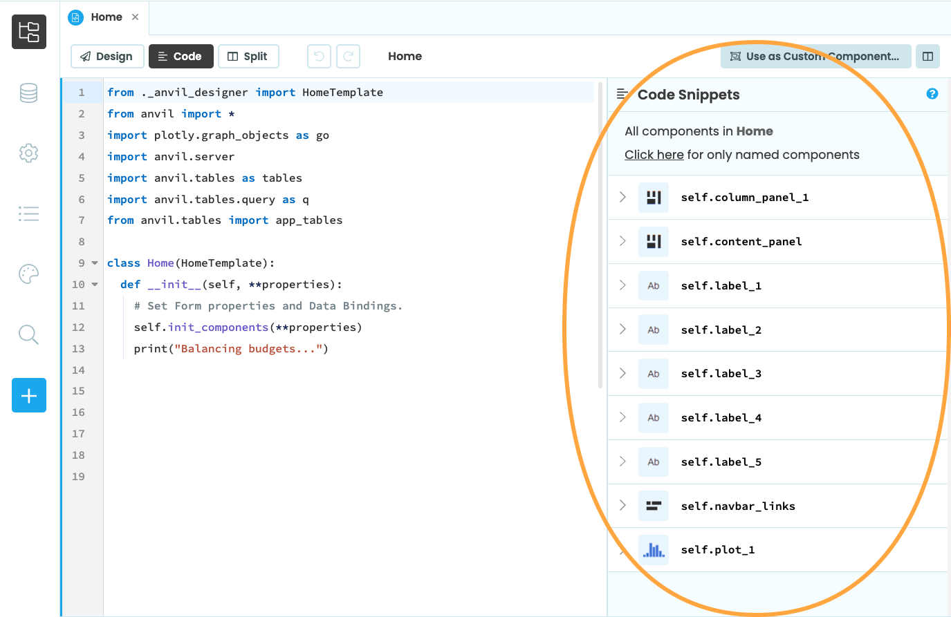
Code Snippets lists all the components in this Form.
Click on the arrow next to a component to see a list of all the component’s properties.
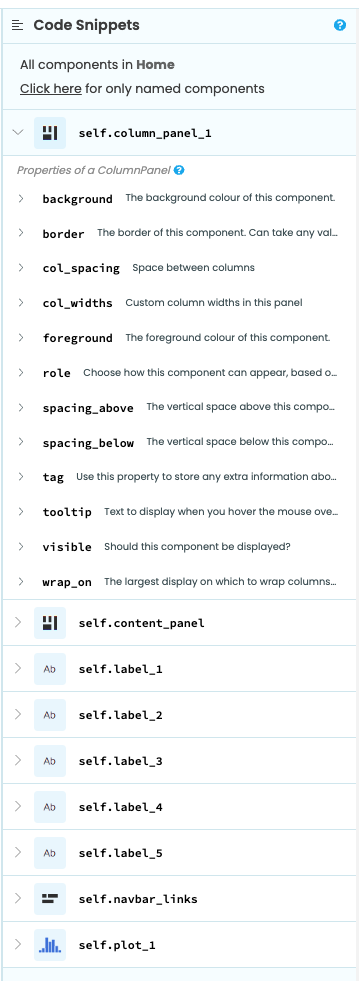
The properties of this Button.
Click on the question mark to get a dialog containing more documentation about that component type.
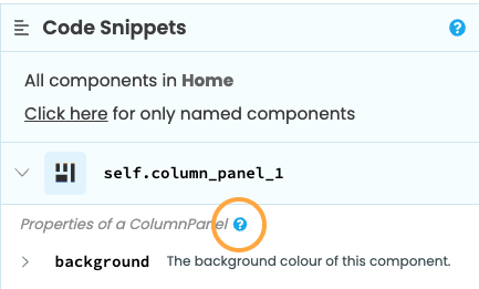
Click this question mark for detailed component docs.
Deleting Apps
To delete an app, access the App Menu by clicking on the gear icon on the top-right corner of the App Browser. At the end of it, you will see a Delete App… option. Once you click on it, this pop-up will appear:
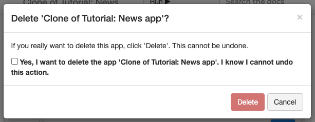
Delete App pop-up
All you need to do is click on the check box to confirm you want to delete your app, and press the delete button.
To delete an app, go to Settings, by pressing on the gear button of the Sidebar Menu. Click on Delete app, under the Manage this App section.
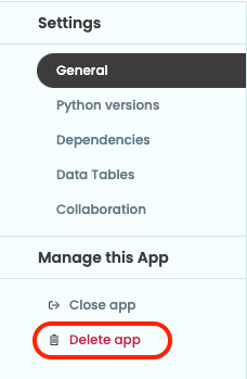
Delete app option
You can also delete an app from the Start Page. Find the app in the ‘My Apps’ list and hover over it to reveal the delete button.
Once you click on one of the delete buttons, this pop-up will appear:
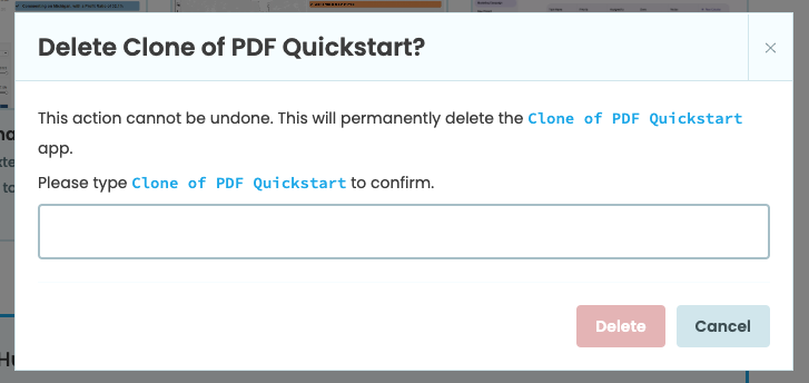
Delete App pop-up
You’ll need to type in the name of the app to confirm you want to delete your app then press the delete button. Once this is done, your app will be permanently deleted.
Do you still have questions?
Our Community Forum is full of helpful information and Anvil experts.