Expand and collapse sections using components
Components can be shown and hidden by setting their visible property to True or False. Showing or hiding a container such as a ColumnPanel shows or hides the components within it, allowing you to create expandable/collapsable sections of pages.
You can use this technique to make the contents of a Data Grid cell expandable/collapsable.
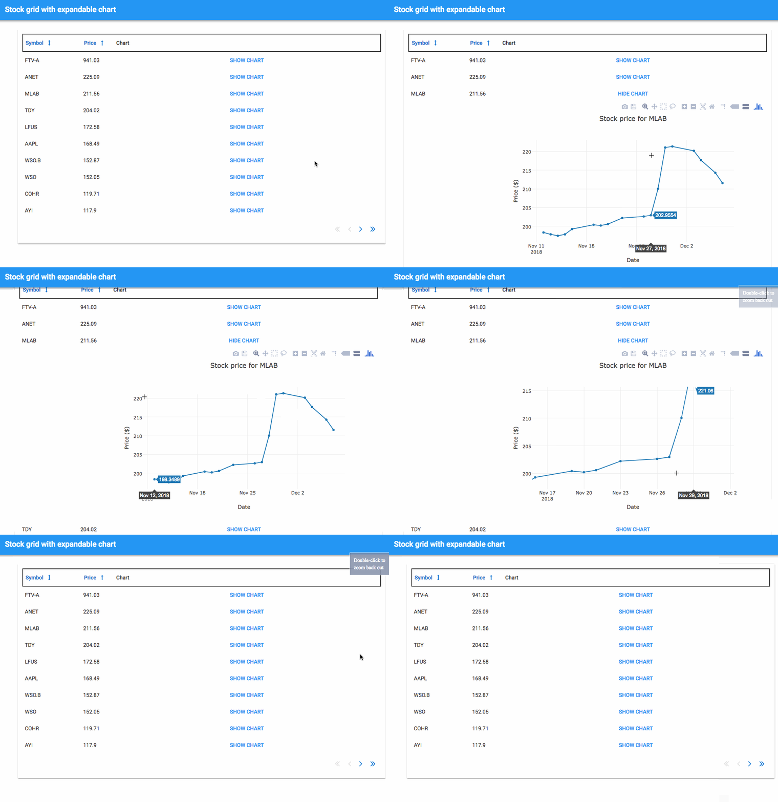
Here’s an example app showing a Data Grid full of stock data. There’s a column containing a time-series chart for the price of each stock. The chart is hidden by default, and it can be shown by clicking a Link.

Click here to clone the example app in the Anvil designer:
Do you still have questions?
Our Community Forum is full of helpful information and Anvil experts.

