Author: David Wylie
This library contains two useful UI components: a sliding toggle switch

and a progress bar

Each is a component that can be dragged onto the page from the Toolbox.
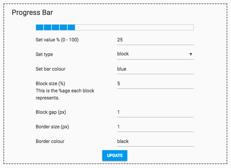
The progress bar is highly configurable; play with the settings in the example app to explore. Each of the TextBoxes configures a property of the ProgressBar component, so all of these settings can be controlled programmatically.
The bar’s style can be ‘smooth’:

Or ‘block’:

In ‘block’ style, the size of the blocks and the spacing between them can be configured.
This library is completely free to use, so click on the clone link and use it in your app!
You can use it from another app by using the App Dependencies dialog.
When you clone the library, you will also get an example app that shows you how to include it and make use of it.
How it works
Each component has a set of setters and getters for its properties. When each property is updated, an update method
is called, that draws the component on a Canvas.
The ToggleSwitch’s smooth sliding animation is accomplished using a Timer. The Timer’s period is 0 normally, meaning
it does not tick. But when the ToggleSwitch animation is running, the Timer’s period is set to 0.1. This is the time
between each frame of the animation. Every time the Timer’s tick event fires, the canvas is re-drawn with the
next frame of the animation.
 By
By