Material 3 Layouts
The Anvil Material 3 theme comes with two predefined layouts, based on two different styles of Material 3 navigation regions.
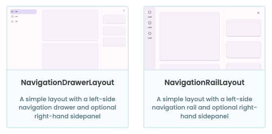
The two predefined layouts:
NavigationDrawerLayout and NavigationRailLayout
Layouts have properties that allow for greater interaction. These can be set from the Form that’s using the layout – either from code or from the Properties Panel. For example, both layouts have an optional side sheet, which can be controlled by setting the show_sidesheet property to True or False.
  def m3_button_click(self, **event_args):
    """This method is called when the component is clicked."""
    self.layout.show_sidesheet = True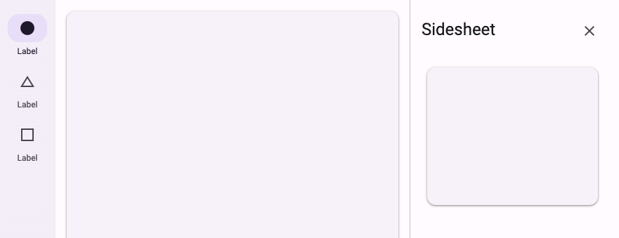
A Form with a side sheet
Navigation Rail Layout
The Navigation Rail Layout uses the Material 3 navigation rail. Navigation rails are meant for displaying a small number of app destinations (see the Material 3 usage guidelines for more information).
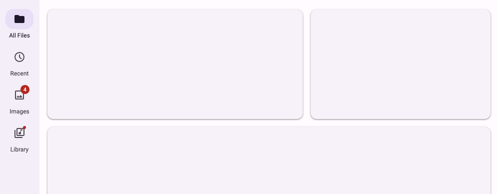
A Form using the Navigation Rail Layout
You can control the vertical alignment of the content of the navigation rail with the navigation_rail_vertical_align property.
self.layout.navigation_rail_vertical_align = "center"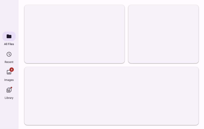
On smaller screens, the navigation rail can be collapsed into a modal drawer or an app bar. This can be controlled with the navigation_rail_collapse_to property.
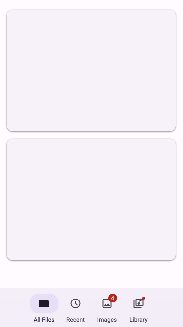
A Navigation Rail collapsed
into an App Bar on mobile
Visit the API documentation for more information about the Navigation Rail Layout.
Navigation Drawer Layout
The Navigation Drawer Layout uses the Material 3 navigation drawer. Navigation drawers are best suited when you want to display a longer list of app destinations. They’re also useful when you want to convey navigation hierarchys and groupings (see the Material 3 usage guidelines for more information).
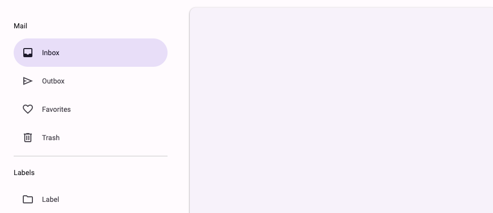
A Form using the Navigation Drawer Layout
On smaller screens, the navigation drawer will always collapse into a modal drawer.
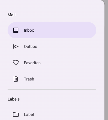
Navigation Drawers always
collapse into a modal drawer
Visit the API documentation for more information about the Navigation Drawer Layout.
Do you still have questions?
Our Community Forum is full of helpful information and Anvil experts.

