Material 3 Components
Similarly to Standard Anvil components, you can use Material 3 components in two ways: by dragging them from the Toolbox then dropping them onto a Form or by constructing them in client code.
If you want to construct a Material 3 component from client code, you’ll first need to import the component from the Material 3 theme. All Material 3 components can be imported from m3.components. For example, to add a Material 3 Button to your app, you would first need to add the following import statement:
import m3.components as m3You can then use this Button in client code:
m3_button = m3.Button(text="submit")However, the easiest way to use components is by dragging and dropping them from the Toolbox.
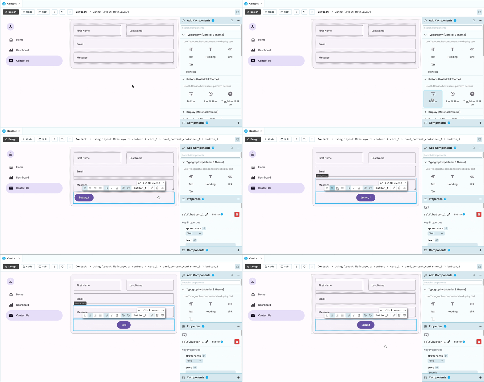
Dragging and dropping components from the Toolbox
Every component you add will have a Python name that will allow you to interact with the component in client code:
self.button_1.text = "submitted"The following is a list of all the components in the Material 3 theme.
Typography
Typography components are used for displaying text. There are three typography components in the Anvil Material 3 theme:
Text 
Text components are suitable for the text included in your app’s content. This is usually long passages of text or descriptive labels that accompany other components, like a Switch or a TextBox.
There are two styles of Text (body and label), which can be set to three different type scales (small, medium and large). As with the Text component, they can be set from the Properties Panel and from code.
m3_text = m3.Text(text="Enter your name:", style="label", scale="medium")Find a complete list of the Text component’s properties and events in the API documentation.
Heading 
Heading are useful for titles and high-emphasis text.
Headings can be set to three different styles (display, headline and title). Like Text components, they can be set to three different type scales. This can be done from code and from the Properties Panel.
m3_heading = m3.Heading(text="Expense Dashboard", style="headline", scale="large")Find a complete list of the Heading’s properties and events in the API documentation.
Link 
Links are typography components that can be clicked to trigger actions. They are useful for navigating to different parts of your app or to other websites entirely, for example.
When the component is clicked, it will open the target URL defined through its url property.
self.m3_link = m3.Link(text="Visit the Anvil docs", url="https://anvil.works/docs")A Link’s url can also be set to a Media object. In this case, clicking the Lin will download the Media object.
media = anvil.BlobMedia('text/plain', b'Hello, world!', name='hello.txt')
self.m3_link = m3.Link(text="Download text document", url=media)
Instead of using the url property, Links also have a click event that can run when the component is clicked.
def m3_link_click(self, **event_args):
  """This method is called when the link is clicked"""
  form1 = Form1()
  open_form(form1)
Find a complete list of the Link’s properties and events in the API documentation.
Buttons
Buttons are for performing actions.
Button 
A Button is a clickable component used for prompting actions. Buttons have five different pre-defined appearances that you can set from the Properties Panel or in code. You can also add icons to your Buttons or disable them.
self.m3_button = m3.Button(text="Submit", appearance="filled")In order for the Button to trigger an action when clicked, you’ll need to set a click event. The easiest way to do so is by clicking on click event in the Object Palette. You can then write code that will run when a user clicks the button.
  def m3_button_click(self, **event_args):
    """This method is called when the component is clicked."""
    anvil.server.call('submit_info')
    m3_button.text = "Submitted"
Find a complete list of the Button’s properties and events in the API documentation.
IconButton 
IconButtons are useful for performing actions that are understandable with just an icon. For example, logging out, favouriting a post or deleting a message can all be conveyed with an icon.
IconButtons have four different pre-set appearance options and by default, have a star icon.
self.m3_icon_button = m3.IconButton(icon="logout" appearance="outlined")Like Buttons, IconButtons have a click event that you can set up so that some code will run when the IconButton is clicked:
  def m3_icon_button_click(self, **event_args):
    """This method is called when the component is clicked."""
    anvil.users.logout()
Find a complete list of the IconButton’s properties and events in the API documentation.
ToggleIconButton 
ToggleIconButtons are the same as IconButtons except that they have a selected state. ToggleIconButtons are used to select or deselect a single choice, for example to favourite or un-favourite a post.
ToggleIconButtons have the same appearance options as IconButtons, just with an added selected state. Click on the ToggleIconButtons below to see the selected states:
self.m3_toggle_icon_button = m3.ToggleIconButton(icon="favorite" appearance="filled")Like Buttons and IconButtons, ToggleIconButtons have a click event that you can set up to run code when the component is clicked.
Find a complete list of the ToggleIconButton’s properties and events in the API documentation.
Display
Display components are designed to help display content on the page.
Card 
Cards are used to display and group related components together.
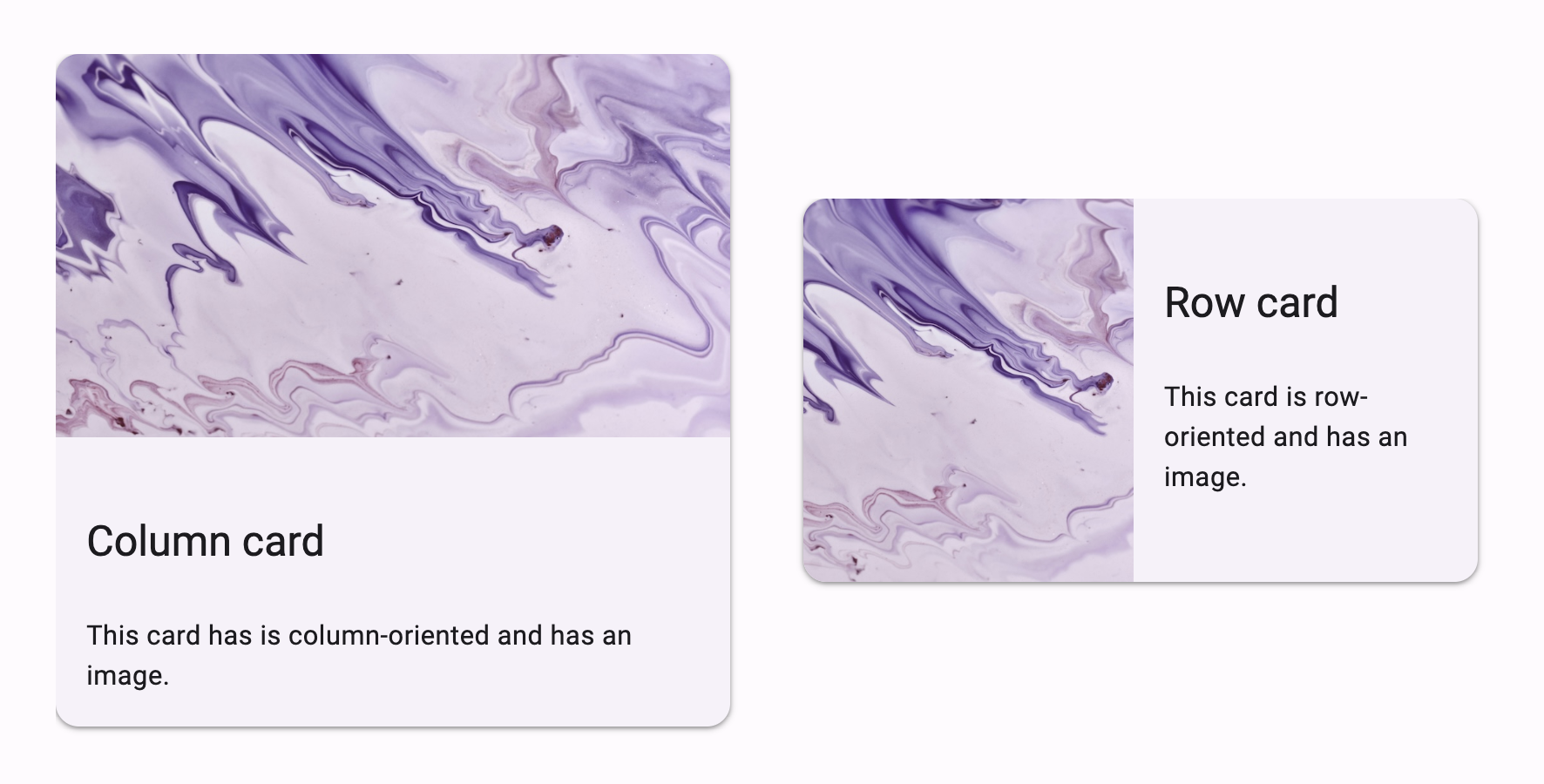
Cards have three predefined appearance options, elevated, filled, and outlined, that can be set from the Properties Panel or in code. Cards also have an orientation property that can be set to row or column. Setting the orientation changes the stacking direction of the components within the Card.

When you drag and drop a Card from the Toolbox, it will have a CardContentContainer component nested inside. A CardContentContainer is a simple container with a margin property, which defaults to 16px but can be adjusted. The CardContentContainer can always be deleted or re-added from the Toolbox.
You can add components to the CardContentContainer or outside of the CardContentContainer (but still within the Card). This is especially useful for adding images to a Card. Below are two Cards, both with Image components added outside of the CardContentContainer. Inside the CardContentContainer, there is a Heading component and a Text component. The display_mode of the Images is set to zoom_to_fill. Because the Images are not inside the CardContentContainer, they have no margin and extend to the edge of the Card.
InteractiveCard 
InteractiveCards are like standard Cards but clickable. They have the same appearance options as Cards: elevated, filled and outlined.
You can set up a click event for InteractiveCards from the Properties Panel or in code. Because InteractiveCards have a click event, they also have an enabled property that can be set to False to disable user interaction.
  def m3_interactive_card_click(self, **event_args):
    """This method is called when the component is clicked."""
    alert("You just clicked an InteractiveCard")
    self.m3_interactive_card.enabled = False
Find a complete list of the InteractiveCard’s properties and events in the API documentation.
Avatar 
An Avatar represents a user and can display an image, initials or a fallback icon.

Avatar components showing different configurations
Avatar components have an image property that can be used to display a user profile image. Avatars also have a user_name property, which you can use to associate the user’s name with the Avatar. If no image property is set but a user_name is set, the Avatar will display the user’s initials. If no image or user_name is set, the Avatar will instead display the fallback_icon. The fallback_icon defaults to the “person” Material Icon, but this can be set to a different icon.
Avatars have three appearance options: filled, tonal and outlined.
Divider 
Dividers are components used for visually grouping or separating components.
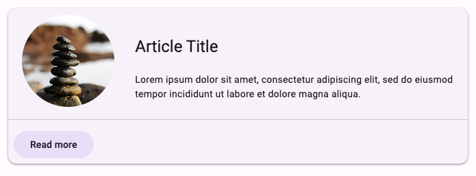
A divider separating components within a card
There are two types of Divider:
full-width, meant for separating large sections from one another.inset, meant for indicating separation within a section. These are useful for separating elements in a list, for example.
m3_divider = m3.Divider(type="inset")Find a complete list of the Heading’s properties and events in the API documentation.
Navigation
Navigation components are used to navigate between parts of your app.
NavigationLink 
NavigationLinks are components designed to work with the Material 3 Layouts to make it easy to navigate between Forms. NavigationLinks are meant to only be placed inside the Navigation Rail or Navigation Drawer sections of the Layouts. They have different styling depending on which one they’re placed into.
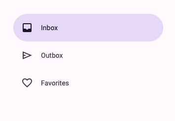
NavigationLinks inside
a Navigation Drawer
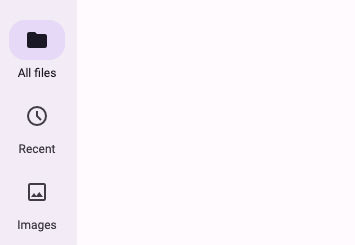
NavigationLinks inside
a Navigation Rail
NavigationLinks have a navigate_to property that can be set to any Form in your app. This is the Form that will be opened when the NavigationLink is clicked.
self.m3_navlink = m3.NavigationLink(text="Home", icon="home", navigate_to=Home())Alternatively, you can define your own click event handler.
def m3_navlink_click(self, **event_args):
    open_form(Home())
Note that Forms are not available to other Forms unless you explicitly import them. Each Form has its own module, which has the same name as the Form, so to import Form2 from inside Form1, you use from ..Form2 import Form2.
Material 3 NavigationLinks can have badges to visually indicate notifications or item counts.
self.m3_navlink.badge = True
self.m3_navlink.badge_count = 4
A NavigationLink with a badge
Find a complete list of the NavigationRail’s properties and events in the API documentation.
Menus
Menus hold other components as a list of options. MenuItem components are designed to populate Menus.
ButtonMenu 
A ButtonMenu component is a Button that opens a floating menu when clicked. The floating menu is designed to contain other components, namely MenuItems. Click on the ButtonMenus below to open up their floating menus, which have MenuItems inside.
You can click on the ButtonMenu in the Anvil Editor to open the floating menu, then drag and drop components inside the menu. You can also populate the menu in code using the menu_items property, which expects a list of components.
m3_button_menu = m3.ButtonMenu()

m3_menu_item_1 = m3.MenuItem(text="Undo", leading_icon="undo")
m3_menu_item_2 = m3.MenuItem(text="Redo", leading_icon="redo")

m3_button_menu.menu_items = [m3_menu_item_1, m3_menu_item_2]
Find a complete list of the ButtonMenu’s properties and events in the API documentation.
MenuItem 
MenuItem components are built to be nested inside a ButtonMenu’s floating menu.
Clicking on the ButtonMenu in the Anvil Editor will open the floating menu, where you can then drag and drop MenuItems inside. You can also instantiate MenuItems in code, then populate the ButtonMenu using its menu_items property.
m3_menu_item = m3.MenuItem(text="Settings", leading_icon="settings")A MenuItem can optionally have a leading icon, a trailing icon and/or trailing text. If you want to have multiple MenuItems in the same menu, but don’t want all of them to contain leading icons, you can set the add_icon_space property to be True. The add_icon_space property will add a space to MenuItems that don’t have a leading icon set so that the text of all the MenuItems will still line up.
Below is a ButtonMenu populated with MenuItems. Click on the Button to open the floating menu and see examples of MenuItems:
Here is the code for the above ButtonMenu:
m3_menu_item_1 = m3.MenuItem(text="No icons")
m3_menu_item_2 = m3.MenuItem(text="Both icons", leading_icon="visibility", trailing_icon="check")
m3_menu_item_3 = m3.MenuItem(text="Added icon space", add_icon_space=True)
m3_menu_item_4 = m3.MenuItem(text="Trailing text, icon", leading_icon="undo", trailing_text="Ctrl+Z")

menu_items = [m3_menu_item_1, m3_menu_item_2, m3_menu_item_3, m3_menu_item_4]

m3_button_menu = m3.ButtonMenu(text="Click to see MenuItems", menu_items=menu_items)
MenuItems also have a click event that can be set up so that code will run when the component is clicked:
def m3_menu_item_click(self, **event_args):
  """This method is called when the component is clicked"""
  open_form("SettingsPage")
Find a complete list of the MenuItems’s properties and events in the API documentation.
IconButtonMenu 
An IconButtonMenu is similar to a ButtonMenu, but uses an IconButton to open the floating menu. The floating menu is designed to contain other components, namely MenuItems. Click on the IconButtonMenus below to open up their floating menus, which have MenuItems inside.
Like ButtonMenus, IconButtonMenus have a menu_items property that can be used to populate the menu via code. See the ButtonMenu documentation for more information.
AvatarMenu 
AvatarMenu components are similar a ButtonMenus and IconButtons. Clicking on an AvatarMenu opens a floating menu, which is designed to contain other components, namely MenuItems. Click on the AvatarMenus below to open up their floating menus, which have MenuItems inside.
Just like the Avatar component, the AvatarMenu has image, user_name and fallback_icon properties.
AvatarMenus also have a menu_items property that can be used to populate the menu via code. See the ButtonMenu documentation for more information.
Form Input
Form Inputs are interactive components used to get data from the user.
Some Form Input components allow error states. When a component’s error property is set to True, their appearance will change to convey their state.
m3_checkbox = m3.Checkbox(text="I accept the terms an conditions*", error="True")
A Checkbox in the error state
Checkbox 
A Checkbox allows the user to input a boolean value - checked or unchecked.
m3_checkbox = m3.Checkbox(text="Remember my details", checked=False)Checkbox components also support a third state, indeterminate. In a group of nested Checkboxes, this state is used for the parent Checkbox, to indicate that at least one of the children is checked.
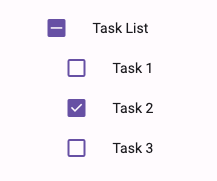
A Checkbox group
You can only set a Checkbox to indeterminate from code or with a data binding. You will need to set allow_indeterminate to True and checked to None.
m3_checkbox = m3.Checkbox(text="Indeterminate checkbox", allow_indeterminate=True, checked=None)Find a complete list of the Checkbox’s properties and events in the API documentation.
RadioButton  and RadioGroupPanel
RadioButtons allow users to select a single option from a list.
m3_radio_button = m3.RadioButton(text="Option 1", selected=True, value="Option 1")When RadioButtons are placed inside a RadioGroupPanel, they are grouped together, allowing users to select only one option from that group. If a RadioButton is added directly to the page without a RadioGroupPanel, it is automatically assigned to a global group.
RadioGroupPanels have a buttons property, through which you can access a list of all the RadioButtons contained within it.
for b in m3_radio_group_panel.buttons:
  print(b.value)
Material 3 RadioButtons have a select event that can be set up so that code will run when the component is selected (this event will not fire when the component gets de-selected):
  def option_1_select(self, **event_args):
    """This method is called when the component is selected."""
    print("Option 1 has been selected")
RadioGroupPanel components also have a change event which is triggered whenever one of the RadioButtons in the group changes.
  def m3_radio_group_panel_change(self, **event_args):
    """This method is called when the component is selected."""
    print("The group has changed")
You can access the currently selected RadioButton’s value in a group through the RadioGroupPanel’s selected_value property. Similarly, you can use the selected_button property to access the name of the currently selected RadioButton.
def m3_radio_group_panel_change(self, **event_args):
    print(m3_radio_group_panel.selected_value)
    print(m3_radio_group_panel.selected_button)
TextBox 
TextBox components allow users to input text into your app and are useful for building forms. They have two appearance options: filled and outlined.
self.m3_text_field = m3.TextBox(appearance="outlined")TextBoxes accept input text which can be set and accessed from the component’s text property.
A common way to use a TextBox is to set up a pressed_enter event handler that runs code after a user types in some text and presses enter. For example, the following code adds the text to a Data Table after the user presses enter:
  def m3_text_field_pressed_enter(self, **event_args):
    """This method is called when the user presses enter in this component."""
    entered_text = self.m3_text_field.text
    #first check if text has been entered
    if entered_text:
      #if true, call a server function to add the text to the data table
      anvil.server.call('add_to_data_table', entered_text)
TextBoxes also have a number of optional properties that can be set to make your form inputs more robust. Below is a list of some of the most useful properties:
label_text: Adds text to label what the TextBox is for (e.g. Email address). Thelabel_textacts as a placeholder (unlessplaceholderis set) and moves to the top of the TextBox when a user inputs text to the TextBox. If there is placeholder text, the label will always be at the top of the TextBox.placeholder: Adds placeholder text to the TextBox that is only present when the TextBox is empty.character_limit: Sets a maximum number of characters that can be entered into the TextBox. If present, the character limit will be displayed in small text below the component.supporting_text: Adds small text underneath the TextBox to convey additional information (e.g. *required).leading_icon: Adds a leading icon to the TextBox.trailing_icon: Adds a trailing icon to the TextBox. TextBoxes can also have atrailing_icon_clickevent that will run when this icon is clicked. For example, you could add acloseicon as the trailing icon that when clicked, clears thetextin the TextBox.
Below is a TextBox that has all of the above properties set:
Find a complete list of the TextBox’s properties and events in the API documentation.
TextArea 
TextAreas are similar to TextBoxes but they are expandable and allow the user to input more text. They have two appearance options: filled and outlined.
self.m3_text_area = m3.TextArea(appearance="outlined")TextAreas also have a number of optional properties that can be set to make your form inputs more robust. Below is a list of some of the most useful properties:
label_text: Adds text to label what the TextArea is for (e.g. Feedback). Thelabel_textacts as a placeholder (unlessplaceholderis set) and moves to the top of the TextArea when a user inputs text to the TextArea. If there is placeholder text, the label will always be at the top of the TextArea.placeholder: Adds placeholder text to the TextArea that is only there when the TextArea is empty.character_limit: Sets a maximum number of characters that can be entered into the TextArea. If present, the character limit will be displayed in small text below the component.supporting_text: Adds small text underneath the TextArea to convey additional information, for example, that inputing text into the component is required.
Below is a TextArea that has all of the above properties set:
Find a complete list of the TextArea’s properties and events in the API documentation.
DropdownMenu 
A DropdownMenu component allows users to choose one item from a menu of options. The chosen option is then displayed on the component. The DropdownMenu in Material 3 functions like the standard Anvil DropDown component.
DropdownMenu components have two appearance options: filled and outlined:
self.m3_dropdown_menu = m3.DropdownMenu(
  items=["Pink", "Blue", "Green", "Purple"],
  placeholder="What's your favourite color?")
A DropdownMenu has an items property that populates the menu. You can set the items property from the Properties Panel or in code. If you set items property from the Properties Panel, each item should be on a separate line:
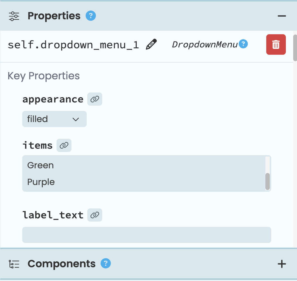
The DropdownMenu items property
can be set from the Properties Panel.
In code, the items property can be set to a list of strings (e.g. [“Yes”, “No”]) or to a list of 2-tuples (e.g. [(“Yes”, True), (“No”, False)]). You can access the item selected by the user from the selected_value property.
If you set the items property to be a list of 2-tuples, then the first element in the tuple is what gets displayed in the menu. When an item is selected, the second element in the tuple becomes the selected_value property. This is particularly useful if you want choose from a list of Data Table rows:
self.m3_dropdown.items = [(row["name"], row) for row in app_tables.people.search()]DropdownMenus have a number of other useful properties:
label_text: Adds text to inform of what the DropdownMenu is for (e.g. Country of residence). Thelabel_textacts as a placeholder (unlessplaceholderis set) and moves to the top of the component when a user selects a value from the menu. If there is placeholder text, the label will always be at the top of the component.placeholder: Adds placeholder text to the DropdownMenu that is only there when there is noselected_value.allow_none: IfTrue, then the user will be able to select an item from the menu that sets theselected_valuetoNone. Ifplaceholderis set, then the placeholder text will be added to the menu to represent theNoneitem. Otherwise, theNoneitem will be empty.supporting_text: Adds small text underneath the DropdownMenu to convey additional information, for example, that selecting a value is required.leading_icon: Adds a leading icon to the DrodownMenu.
Below is a Dropdown Menu that has all of the above properties set:
Find a complete list of the DropdownMenu’s properties and events in the API documentation.
Switch 
A Switch allows users to toggle a boolean value. They’re useful for controlling standalone, binary options, like turning a setting on or off.
m3_switch = m3.Switch(selected=True)Switch components have a change event that triggers whenever the switch is toggled on or off.
  def m3_switch_change(self, **event_args):
      """This method is called when the value of the component is changed"""
      self.text_area_1.visible = self.switch_1.selected
Find a complete list of the Switch’s properties and events in the API documentation.
FileLoader 
FileLoaders are used to load files from your device into your app. Similarly to Buttons, they have five pre-defined appearance options that you can set from the Properties Panel and from code.
self.m3_fileloader = m3.FileLoader(text="Submit", appearance="filled")You can access the currently selected file in a FileLoader through the file property. If the FileLoader allows loading multiple files, the files property will return a list of all the selected files. Any file loaded using a FileLoader will be a Media object.
self.my_image.source = self.m3_fileloader.fileFileLoader files are loaded into the user’s browser. You can pass them into a server function to get them into a Server Module (since they’re Media objects, they will be streamed).
anvil.server.call('image_classifier', self.m3_fileloader.file)FileLoaders have a change event that is raised when a user selects one or multiple files. Its file argument is a Media object containing the chosen file.
def m3_fileloader_change(self, file, **event_args):
    self.my_image.source = file
To reset the FileLoader after file uploading, call its clear() method.
self.m3_fileloader.clear()Find a complete list of the FileLoader’s properties and events in the API documentation.
Slider 
With a Slider, users can select a value from a range.
In order for the Slider component to work, a few key properties must be set:
max: The maximum value of the Slidermin: The minimum value of the Sliderstep: The stepping interval of the Slidervalue: The current value of the Slider
When you add a Slider to your app, it is initialised with a max of 10, a min of 0, a step of 1 and a value of 5.
If the show_label property is set to True, then a label with the current value of the Slider will be visible when the user drags the Slider thumb. Setting show_markers to True adds discrete markers to the track of the Slider.
Below are two sliders. The first has no label or track markers and the second has a label and track markers.
Sliders have a change event that triggers whenever the value of the Slider changes. For example, if a Slider has the following change event handler set up, then the text of the Text component would be updated every time the user releases the slider thumb and the value has changed:
  def slider_1_change(self, **event_args):
    """This method is called when the value of the component is changed"""
    self.text_1.text = self.slider_1.value
Find a complete list of the Slider’s properties and events in the API documentation.
Feedback
Use feedback components to show the status of a process.
LinearProgressIndicator 
LinearProgressIndicators are used to show the live status of a process. LinearProgressIndicators have a type property that can be set to determinate or indeterminate. If determinate, the progress is set using the component’s progress property. The progress property accepts a number that is then converted to a percentage to determine the progress. If the type is indeterminate, the LinearProgressIndicator will play an animation on a loop.
m3_linearprogressindicator_indeterminate = m3.LinearProgressIndicator(type="indeterminate")
m3_linearprogressindicator_determinate = m3.LinearProgressIndicator(type="determinate", progress="40")
CircularProgressIndicator 
Like LinearProgressIndicators, CircularProgressIndicators are used to show the live status of a process. CircularProgressIndicators have a type property that can be set to determinate or indeterminate. If determinate, the progress is set using the component’s progress property. The progress property accepts a number that is then converted to a percentage to determine the progress. If the type is indeterminate, the CircularProgressIndicator will play an animation on a loop.
m3_circularprogressindicator_indeterminate = m3.CircularProgressIndicator(type="indeterminate")
m3_circularprogressindicator_determinate = m3.CircularProgressIndicator(type="determinate", progress="40")
Do you still have questions?
Our Community Forum is full of helpful information and Anvil experts.

