 By
By New: Graphs and charts for your Anvil app
Python is the world’s favourite language for data processing and visualisation – and when you use Anvil, Python is all you need to build web apps. Today, we’re making it even easier to present your data on the web.
You can now offer interactive charts right inside your Anvil apps, built and customised in just a few lines of code. The new Plot component is powered by the Plotly Python API, so you have a wealth of examples already online to get you started.
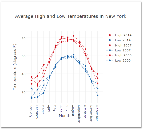
Plots like this are simple to create, and simple to customise:
You can open this example in Anvil right now, or read the docs to learn more.
You can also find more examples in the Plotly library docs.