 By
By Create a PDF with Python
So, you’re doing some data analysis in Python, and you want to generate a PDF report. If you Google around, you’ll find a bunch of jerry-rigged ways of doing it, by generating HTML. Working with HTML and CSS is a pain – wouldn’t it be easier if we could just design our PDFs with a drag-and-drop designer?
We’re going to do just that, using Anvil. Anvil is a platform for building web UIs, but today we’ll just be using it to make PDFs.
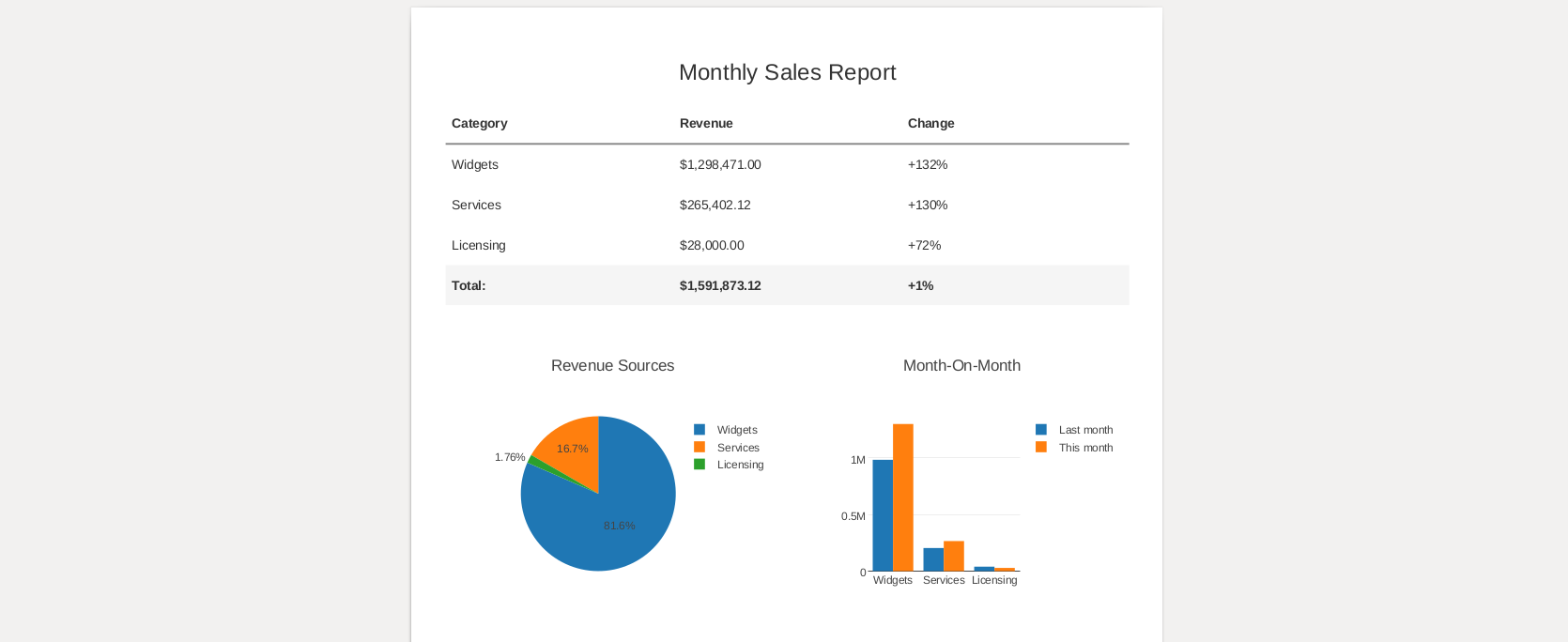
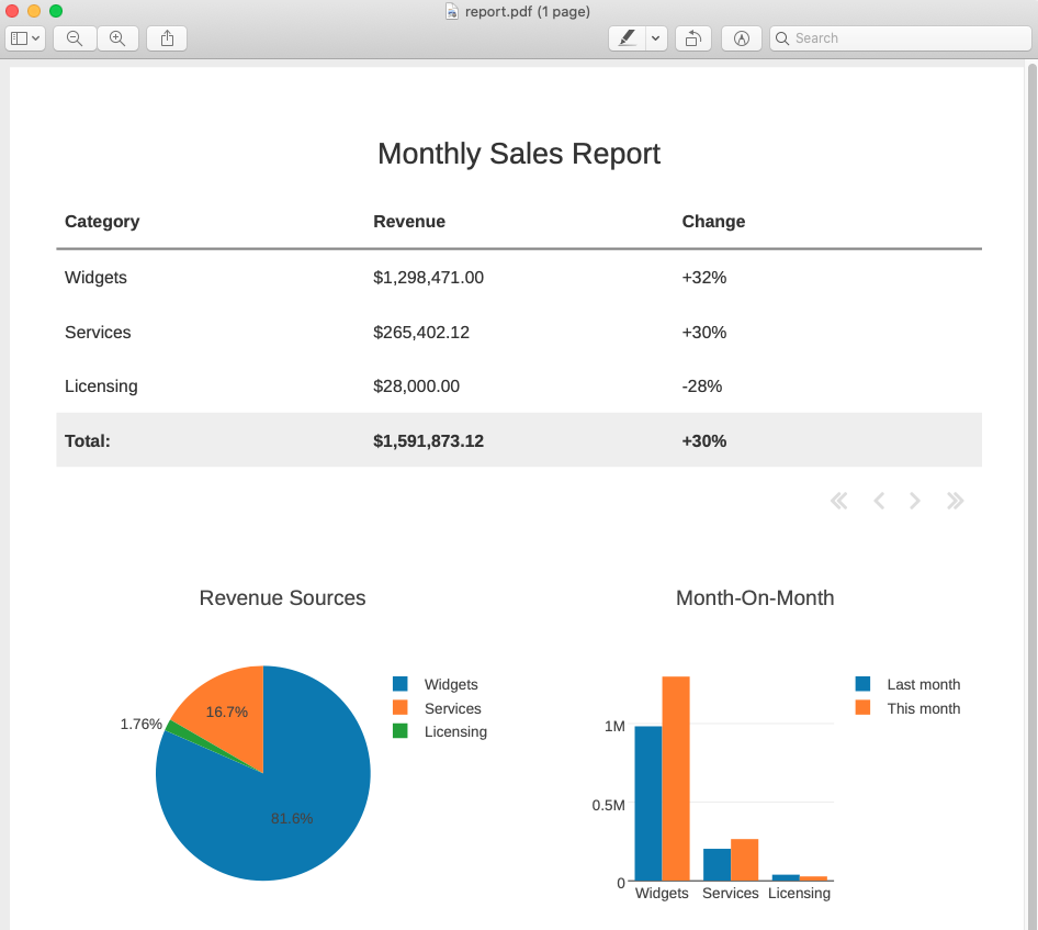
In this example, we’re going to take two CSVs, representing sales data from this month and last month, and create a PDF report that looks like this:
We’ll build up to this in a few stages:
- Preparing our data with Pandas
- Designing our first PDF with Anvil’s drag-and-drop designer
- Displaying data on our PDF by writing Python code
- Passing data into Anvil
- Displaying a table on our PDF
- Displaying a total in our PDF table
- Plotting graphs on our PDF using Python and Plotly
Follow along to build the app yourself, or you can open the full example app and script here:
And you can download our sample CSV files here:
Preparing our data
Let’s say we have two CSVs, describing our company’s revenue, by source, for this month and last month. They look like this:
category,revenue
Widgets,1298471
Services,265402.12
Licensing,28000
We can use pandas to load and join our two CSVs. (You’ll need this_month.csv and last_month.csv saved in your working directory):
import pandas as pd

this_month = pd.read_csv("this_month.csv")
last_month = pd.read_csv("last_month.csv")

combined = this_month.join(last_month.set_index("category"),
                           on="category", rsuffix="_last_month")

print(combined)
That will produce a data frame like this:
    category     revenue  revenue_last_month
0    Widgets  1298471.00           982305.00
1   Services   265402.12           203631.25
2  Licensing    28000.00            39000.00
Designing our first PDF
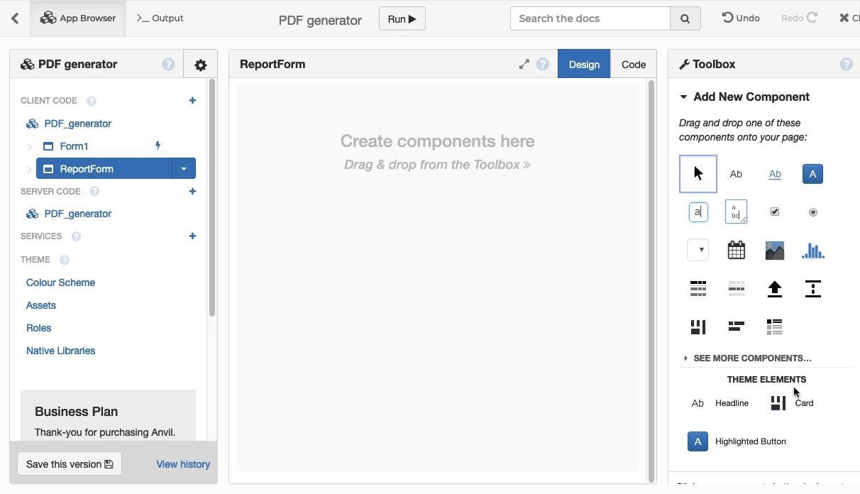
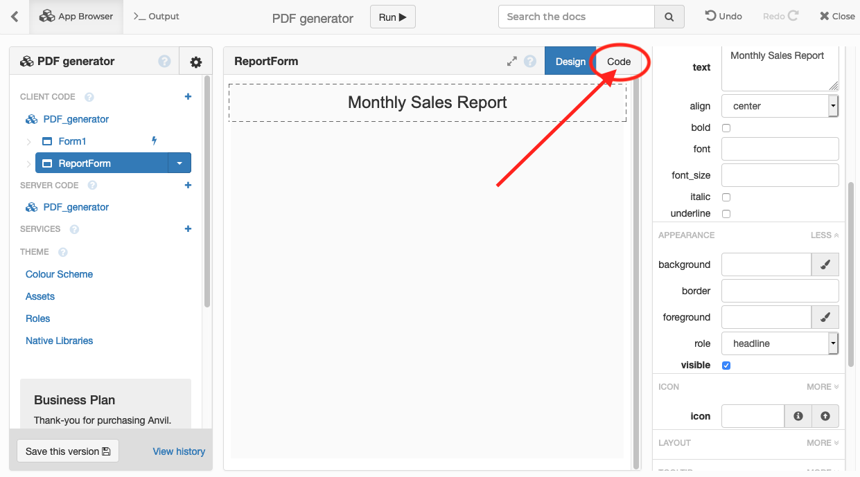
To design our PDF, we first open the Anvil cloud editor, and create a new app, choosing the ‘Material Design’ theme. We’ll want to create a “Form” - that’s a piece of web UI - which we will then turn into a PDF.
For our PDF, we don’t want any headers, or navigation, so we’ll create a new “Blank Panel” form, and call it ReportForm:
Note: This guide includes screenshots of the Classic Editor. Since we created this guide, we've released the new Anvil Editor, which is more powerful and easier to use.
All the code in this guide will work, but the Anvil Editor will look a little different to the screenshots you see here!
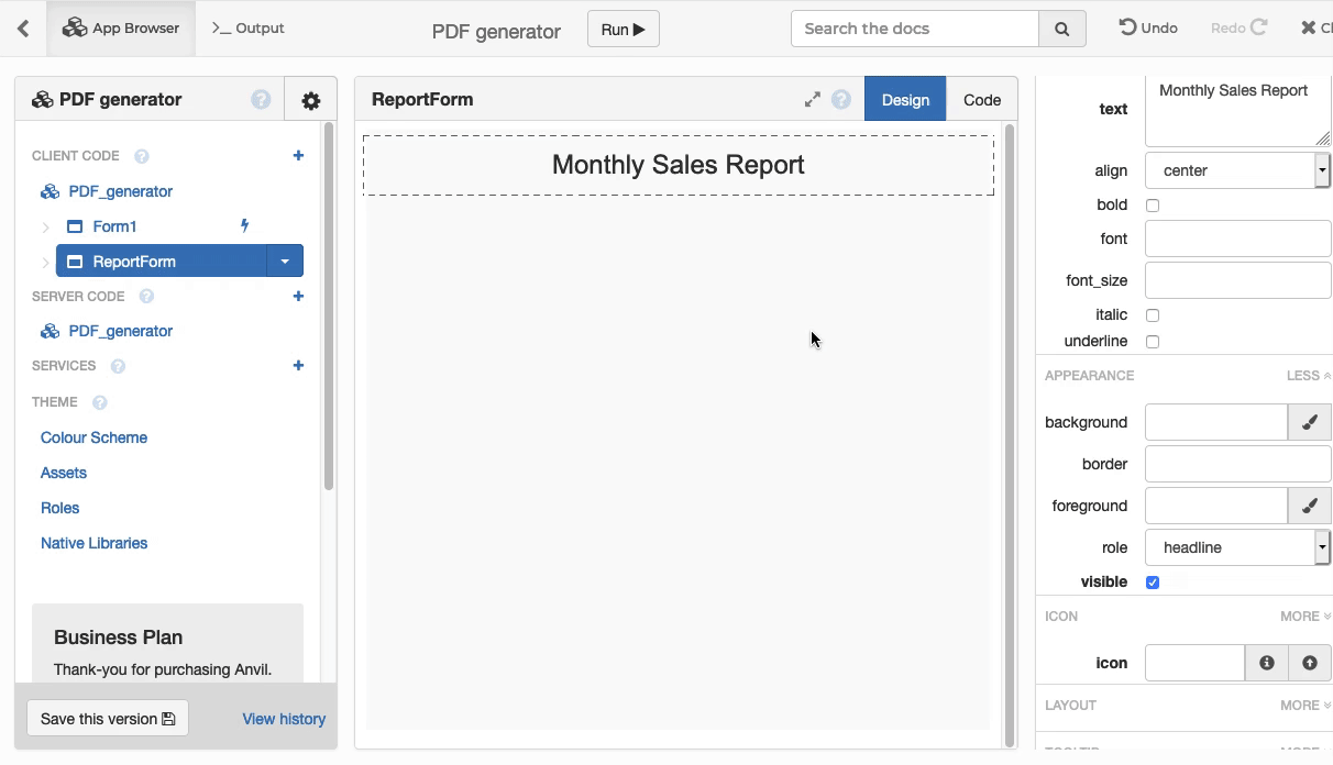
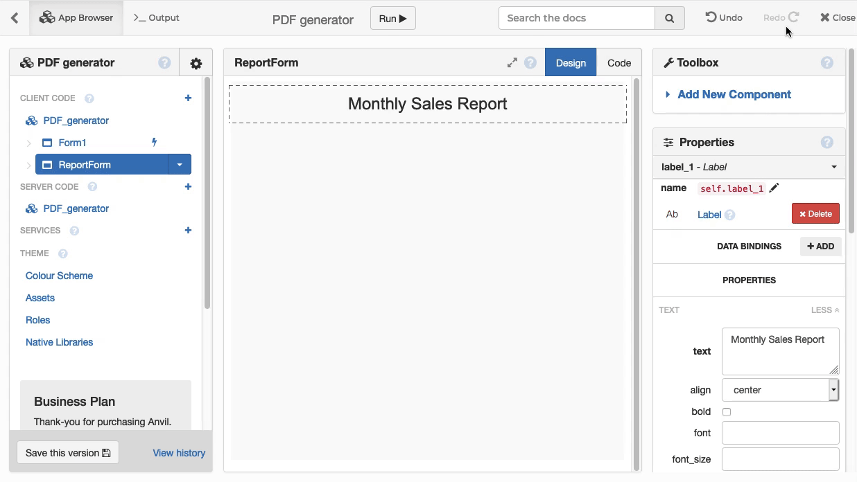
We can use the drag-and-drop editor to put a title on our page. We’ll use a Label component, then adjust its properties to display a centred title with large text:
Rendering it from Python
Before we go any further, let’s generate that PDF from Python. We’ll use the Uplink to connect our local code to this Anvil app.
Then we install the Uplink library:
pip install anvil-uplinkAnd then we paste that connection code into our script, and add code to create a PDF file:
import anvil.server
anvil.server.connect("[YOUR APP'S UPLINK KEY HERE]")
import anvil.pdf
import anvil.media
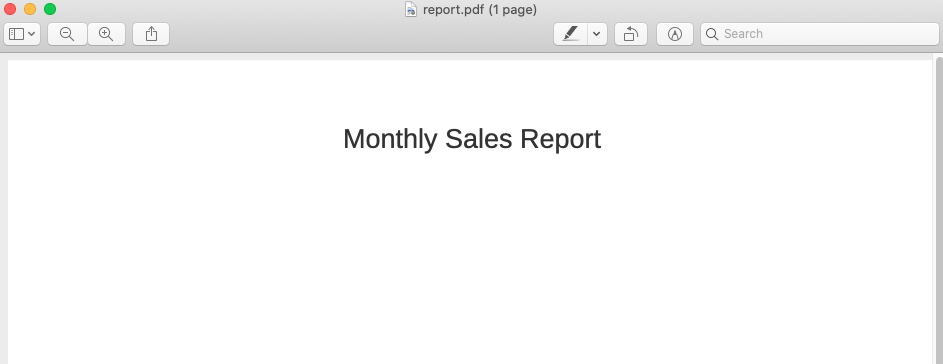
pdf = anvil.pdf.render_form("ReportForm")
anvil.media.write_to_file(pdf, "report.pdf")Now we run this code. Anvil will produce a PDF, containing just our title.
You’ve just created a PDF and written it to your local filesystem!
Displaying data on our PDF
Passing data into Anvil
We want to display more than just a title: We want to show our data! The first step is to pass our data into our Form’s code, that runs inside Anvil.
We can’t pass Pandas data frames directly to Anvil, so we turn our data into a list of dicts first:
records = combined.to_dict('records')
print(records)
Here’s what that looks like: It’s a list, with a dictionary for each row of the data frame:
[{'category': 'Widgets', 'revenue_last_month': 982305.0, 'revenue': 1298471.0}, {'category': 'Services', 'revenue_last_month': 203631.25, 'revenue': 265402.12}, {'category': 'Licensing', 'revenue_last_month': 39000.0, 'revenue': 28000.0}]We can pass this data as an extra argument to render_form(), which will in turn be passed into the __init__ function of our Anvil form.
We edit our script to say:
pdf = anvil.pdf.render_form("ReportForm", records)Displaying data on our form
Now, we’ll make ReportForm display this data. The first step is to go into the Code for the form, and add the extra argument to our __init__ function:
Edit the definition of the __init__ function to accept our data. It now looks like this:
  def __init__(self, records, **properties):

    # ... rest of code as before ...
Displaying a table
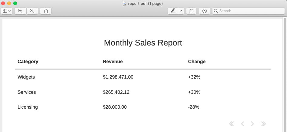
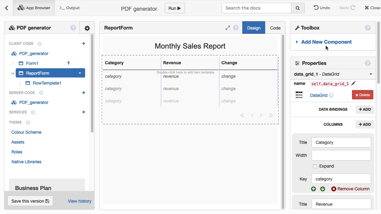
We want to display a table, with each category of revenue and its growth/decline since last month. So we drag a Data Grid onto our page, and give it three columns: Category, Revenue, and Change, displaying the dictionary keys category, revenue and change.
Inside this DataGrid is a RepeatingPanel, and we can display rows in our table by filling out its item property. Edit our ReportForm’s __init__ method as follows:
  def __init__(self, records, **properties):
    # Set Form properties and Data Bindings.
    super().__init__(**properties)

    # Any code you write here will run before the form opens.
    self.repeating_panel_1.items = [
      {'category': r['category'],
       'revenue': f"${r['revenue']:,.2f}",
       'change': f"{100.0*r['revenue']/r['revenue_last_month'] - 100:+.0f}%"
      }
      for r in records
]Now, when you run your script, it will generate a PDF with a table:
Displaying a total
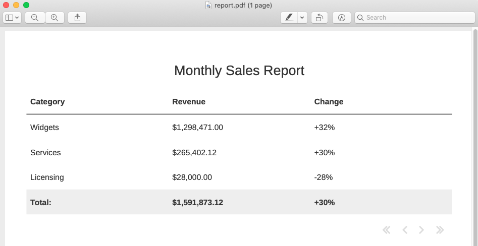
We want to display a “total” row for this table. So we add a new DataRowPanel to our grid, underneath the automatic rows from the RepeatingPanel, and display our totals there.
We can do this entirely in code, by adding this to our __init__ function:
    # Compute total revenue for this month and last month
    total_rev = sum(r['revenue'] for r in records)
    last_month_rev = sum(r['revenue_last_month'] for r in records)

    # Display this data as a new row in the
    total_row = DataRowPanel(bold=True, background="#eee")
    total_row.item = {
      'category': 'Total:',
      'revenue': f"${total_rev:,.2f}",
      'change': f"{100.0*total_rev/last_month_rev - 100:+.0f}%"
    }
    self.data_grid_1.add_component(total_row)
Voila! Our table is looking spiffy. If we run our script, we get this PDF:
Plotting graphs
The final piece is to display a graph! We’ll be summarising our data with two graphs: a pie chart displaying the proportion of revenue from each source, and a bar chart comparing each category’s performance with last month.
First, we go back to Design view on our form, and add two ![]() Plot components, next to each other:
Plot components, next to each other:
We then use the popular Plotly API to plot our data on these components. We add the following code to our __init__ function:
    # Build a pie chart breaking down revenue sources
    self.plot_1.layout.title="Revenue Sources"
    self.plot_1.data = go.Pie(labels=[r['category'] for r in records],
                              values=[r['revenue'] for r in records])

    # Build a graph chart with last month and this month's revenue
    # for each category
    self.plot_2.layout.title = "Month-On-Month"
    self.plot_2.data = [go.Bar(x=[r['category'] for r in records],
                               y=[r['revenue_last_month'] for r in records],
                               name="Last month"),
                        go.Bar(x=[r['category'] for r in records],
                               y=[r['revenue'] for r in records],
                               name="This month")]
If we run our script, we have created a complete sales report in PDF form!
That’s all, folks!
You now have a Python script that will generate a beautiful PDF report – and you know how to design more!
Again, you can open the full example app and script here:
And you can download our sample CSV files here: