 By
By In this step-by-step guide, I’ll show you how to build a business dashboard in just a few minutes, using nothing but Python. We’ll plot data from four different sources, and highlight key statistics from each of these plots.
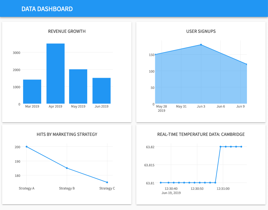
The finished dashboard will look something like this:
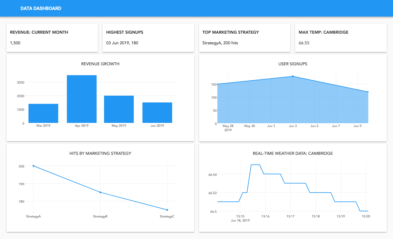
Table of contents:
Click the following link to clone the finished app and explore it yourself, or read on as we take a step-by-step guide to creating your own business dashboard with nothing but Python.
Introduction
A simple dashboard is a great way to measure how your business is performing in real time. Monitoring KPIs like revenue growth can help you to stay on track, and presenting a few key metrics in data visualisations helps you focus on the data that matters the most.
Building a business dashboard can be a complex and lengthy process. Data comes in a range of shapes and sizes, and from a number of different sources. You might have data stored in an SQL database somewhere, being aggregated by a script that’s only available inside your company network and coming from an external analytics API. Aggregating this data and displaying it in a simple, effective way takes time using traditional web development tools.
With Anvil, it takes minutes to build a business dashboard with Python and display it on the web. Anvil gives us a range of tools for accessing and aggregating data from a range of sources to create comprehensive and informative data visualisations. The visual designer makes it easy to build your UI display your data on the web.
Keep reading to learn how to create your own business dashboard with nothing but Python.
Building your UI
Open the Anvil Editor to get started.
Click the ‘Create New App’ button and select the Material Design theme. You are now in the Anvil Editor.
First, name the app. Click on the name at the top of the screen and give it a name.
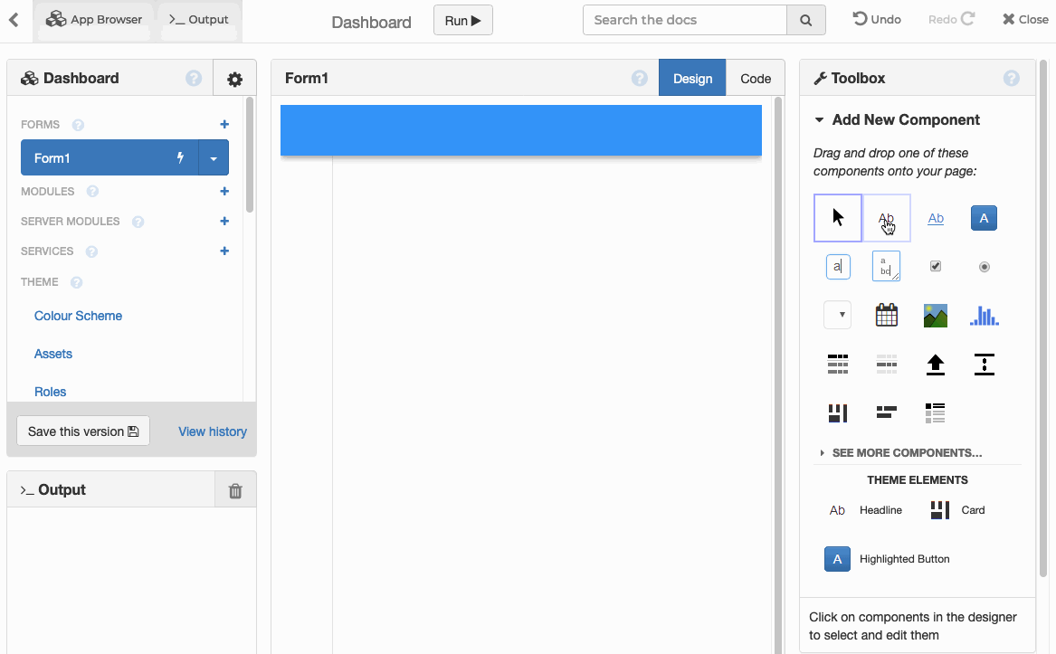
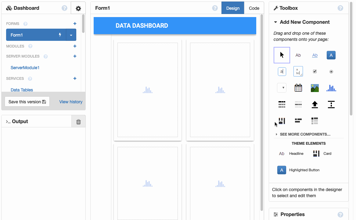
The toolbox on the right contains components that you can drag-and-drop onto the Design view in the centre.
Drop a Label into the blue bar at the top, where it says ‘Drop title here’. In the Properties panel on the right, enter a title into the text section.
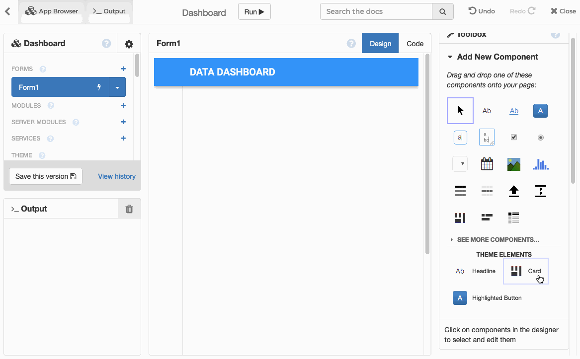
Next, drag and drop a Card onto the page. In the Properties pane on the right hand side, click the ‘MORE’ button to the right of ‘Container Properties’, and select full_width_row. This will make our card stretch to fill the width of the page.
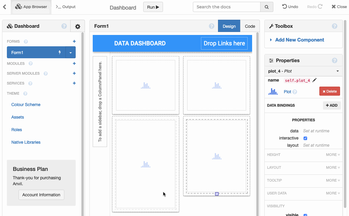
Next, drop a plot component inside the card.
Add three more cards and plots to your app in a 2 x 2 grid-style layout, and make sure all of your cards have the full_width_row property. You can resize your plots by dragging the resizer.
Plotting the data
We’ve built the basic structure of our UI. Let’s go ahead and plot some data.
We’ll use Plotly to create the plots. Click on the ‘Code’ tab to go to Code view. This is the Python class that describes the Form you’ve just created.
You’ll notice that Plotly is already imported:
import plotly.graph_objects as goLet’s write a Python function to plot our first Bar chart. Edit your code view to look like this (make sure your build_revenue_graph function isn’t inside the __init__ function):
from anvil import *
import plotly.graph_objects as go

class Form1(Form1Template):

  def __init__(self, **properties):
    # Set Form properties and Data Bindings.
    super().__init__(**properties)

    # Any code you write here will run before the form opens.

  def build_revenue_graph(self):
    self.plot_1.data = go.Bar(y=[100,400,200,300,500])
We want to show this graph when our app first opens, so let’s call the build_revenue_graph function in the __init__ method of our form:
def __init__(self, **properties):
  # Set Form properties and Data Bindings.
  super().__init__(**properties)

  # Any code you write here will run before the form opens.
  self.build_revenue_graph() #<-------------- ADD THIS LINE
Click Run and you’ll see that you’ve plotted your first Bar Chart.
We’ve seen how to construct the UI and plot some data. Now let’s look at plotting real data from a range of data sources.
We’ll plot data from four different sources:
- Anvil’s built-in database
- An external SQL database (PostgreSQL in this example)
- A private SQL database (Say, for example, you have a database that can only be accessed from within your corporate network)
- An external REST API
Using data from:
1. Anvil’s built-in database
Let’s say one of our main KPIs is revenue growth – and our revenue data is stored in Anvil’s built-in database. I’ll show you how to create a table, add some data to it, and display this on your dashboard.
Create the database table
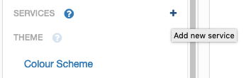
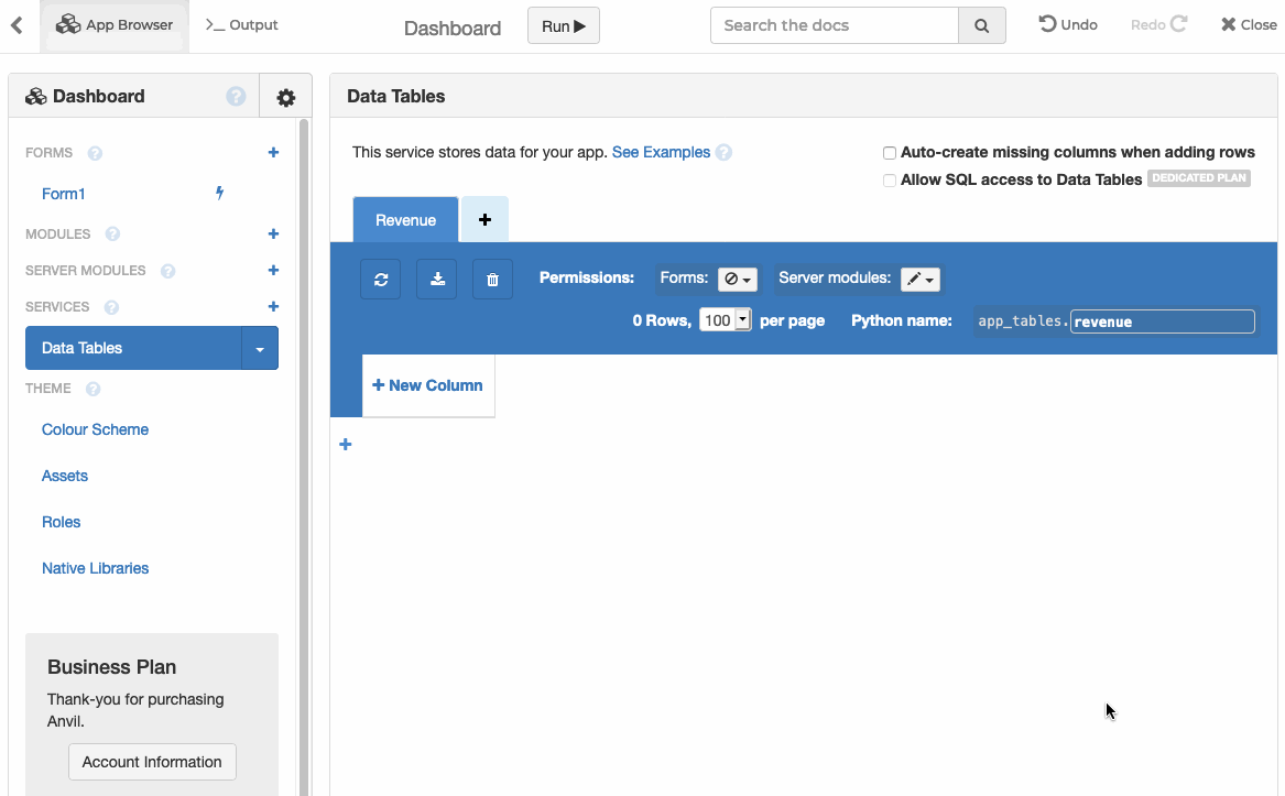
Click the ‘+’ next to ‘Services’ in the panel on the left.
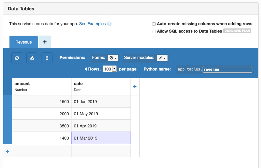
Click on ‘Data Tables’, then click ‘Add a table’ in the light blue box at the top, then ‘Create new table’. You’ll be prompted to give your table a name - let’s call it ‘Revenue’ for this example. Then add a ‘number’ column - let’s call this ‘amount’, and a ‘date’ column - let’s call this ‘date’.
Double click the cells to add some data to your table - it should look something like this:
Get the data
Click on the + next to ‘Server Modules’ in the panel on the left. You’ll see some code with a yellow background. This is the Python code that runs on the server. We’ll define a function that requests data from the ‘Revenue’ data table we just created. Copy and paste this into the bottom of your Server Module:
@anvil.server.callable
def get_revenue():
  return app_tables.revenue.search()
We’ve marked the function @anvil.server.callable. That’s all we need to make it accessible from client-side code when we build our web page. (No web server required!)
Plot the data
All that’s left is to display this data as a graph in our web app. When the app opens, we call the query function we’ve just defined, and construct a bar graph with the data.
Go back to Form1 and change your build_revenue_graph function to look like this:
def build_revenue_graph(self):
  db_data = anvil.server.call('get_revenue')
  revenue_data = [x['amount'] for x in db_data]
  date_data = [x['date'] for x in db_data]
  self.plot_1.data = go.Bar(y=revenue_data, x=date_data, marker=dict(color='#2196f3'))
Click run and you’ll see that your bar graph is now being populated with data from Anvil’s database.
Next, I’ll show you how to populate a graph with data from an external SQL database.
2. Data from an External SQL database
Let’s say one of our primary business concerns is user acquisition. But our user records live in an SQL database. We want to connect to this database, query it, and show this data on our dashboard.
Get the data
Anvil apps are just Python, so we can use the standard Python tools to query our database!
In this case, our database is PostgreSQL, so we’ll use the standard Psycopg2 library. Add this line to the top of your Server Module:
import psycopg2psycopg2 requires an individual plan or higher
Now write a function in your Server Module to query the database, and return the results. Here’s an example query you might perform to track user acquisition, if your database has a users table with a signup_date field:
@anvil.server.callable
def get_user_signups():
  # Connect and retrieve data from your existing database - example code below
  conn = psycopg2.connect("host=db.myapp.com dbname=my_app user=postgres password=secret")
  cur = conn.cursor()
  cur.execute("""
     SELECT COUNT(${html`*`}), DATE_TRUNC('week', signup_date) AS d
          FROM users
          WHERE signup_date > NOW() - INTERVAL '3 months'
          GROUP BY DATE_TRUNC('week', signup_date)
          ORDER BY d;
  """)
  return list(cur)
For more information on using SQL databases with Anvil, click here.
If you don’t have an SQL database available, you can use some dummy data for now. Remove the import psycopg2 statement, and copy and paste this into the bottom of your Server Module:
@anvil.server.callable
def get_user_signups():
# Here's some dummy data that you might return from your database, as an example
  return [(120, datetime(2019, 6, 10, 0, 0)),
          (180, datetime(2019, 6, 3, 0, 0)),
          (150, datetime(2019, 5, 27, 0, 0))]
We’re returning datetime objects so you’ll also need to import datetime in your Server Module:
from datetime import datetimePlot the data
All that’s left is to display this data as a graph in our web app.
Go to Form1 and add a build_signups_graph function which looks like this:
def build_signups_graph(self):
    signups = anvil.server.call('get_user_signups')
    scatter = go.Scatter(x = [signup_time for (count,signup_time) in signups],
                         y = [count for (count,signup_time) in signups],
                         fill = 'tozeroy',
                         line=dict(color='#2196f3'))
    self.plot_2.data = scatter
Add this to the __init__ method of Form1:
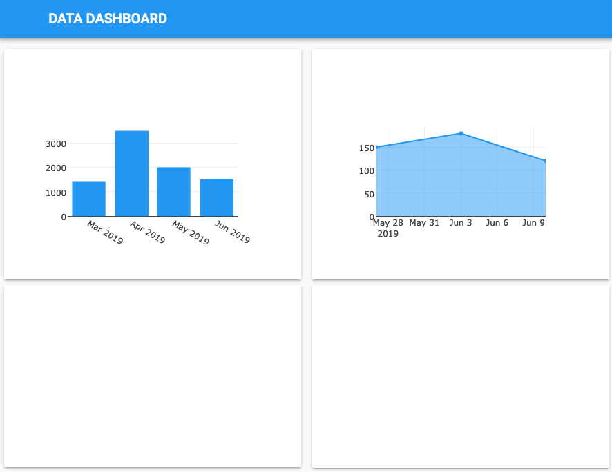
self.build_signups_graph()Click run and your dashboard should look something like this:
Next, I’ll show you how to populate a graph with data from a private SQL database.
3. Private SQL database
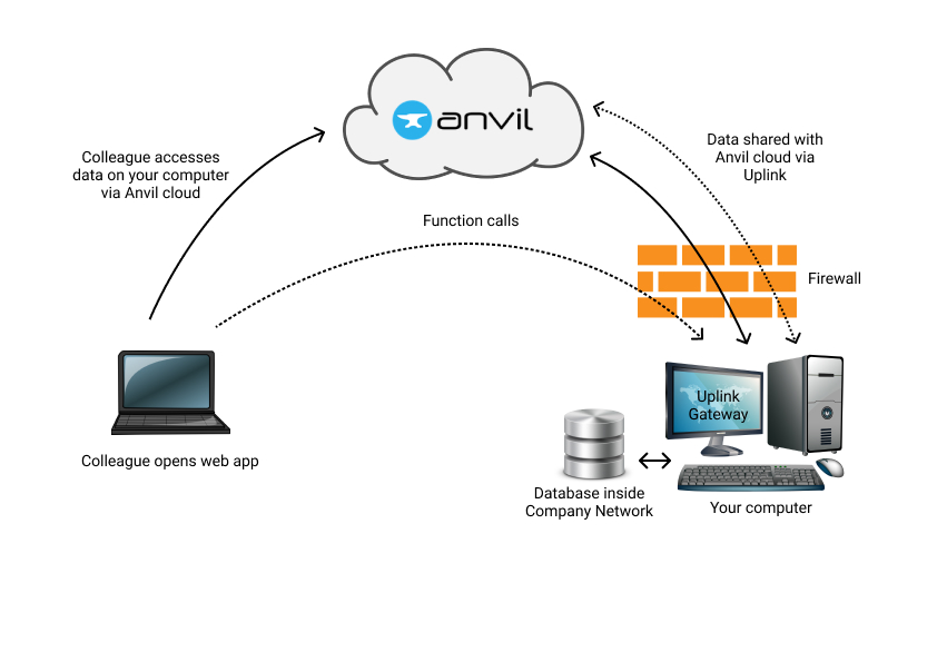
Let’s imagine we’ve been testing some marketing strategies, and have collected data on the number of visits to our page for each strategy. But this data is held in a private SQL database that can only be accessed from within our company network.
You can connect code running anywhere to your Anvil app, using the Anvil Uplink. You can write code to query your private database, run it inside your company network, then use the Uplink to connect to your app – so now you can call it from the cloud!
Here’s how it works:
Use the Anvil uplink
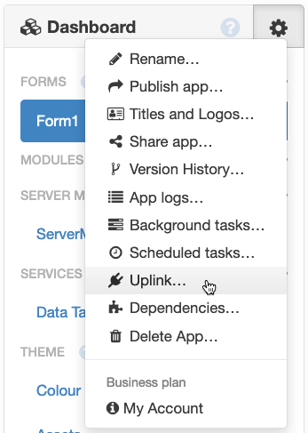
Start by selecting the Anvil Uplink in your app menu.
Click ‘Enable the Anvil Server Uplink for this app’, and you’ll see an authentication key that you will use to connect your code to your app:
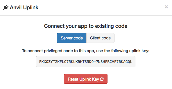
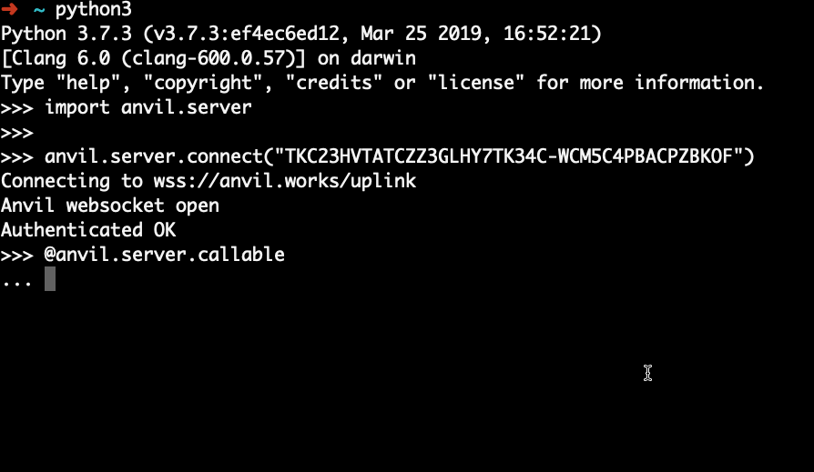
To use the Anvil uplink library in your Python project, first run pip install anvil-uplink on your machine. Then copy and paste these lines into your terminal window to connect to the Anvil cloud, using your app’s authentication key:
import anvil.server
anvil.server.connect("your-app-key-here")
Once you’re connected, write a function to return your data – let’s call it get_marketing_data – and decorate it with @anvil.server.callable to make it available inside your Anvil app. This code can query a database and return the results, just like the example in the previous section.
If you don’t have a local database to hand, have a go with this example:
@anvil.server.callable
def get_marketing_data():
# access data on your local machine and return as a Python list
 return [('Strategy A', 200),
          ('Strategy B', 185),
          ('Strategy C', 175)]
Now run this code on your local computer:
Plot the data
All that’s left is to display this data as a graph in your web app.
Go back to Form1 and define a new function to plot this data:
def build_marketing_graph(self):
  # We’re calling a function on your local machine from the web!
  marketing_data = anvil.server.call('get_marketing_data')
  self.plot_3.data = go.Scatter(x = [strategy for (strategy,count) in marketing_data],
                             y = [count for (strategy,count) in marketing_data],
                             mode='lines+markers',
                             line=dict(color='#2196f3'))
We want to build this graph when the web app is opened, so add this line to the __init__ method of Form1:
self.build_marketing_graph()We’ve populated three of our four graphs. Click run to see this in action.
Next, I’ll show you how to populate a graph with data from a REST API.
4. REST API
Let’s say you’re receiving real-time data from an external analytics provider via their REST API. Keeping track of this data is something you’d want to do with your dashboard.
You can integrate against REST APIs using Anvil’s http module. To make a GET request, you can run:
anvil.http.request("https://your-url-here")Click here to read more about HTTP and REST APIs with Anvil.
If you’d prefer to use the standard python requests library, you can do this from your ServerModule, like so:
import requests

requests.get("https://your-url-here")
For illustrative purposes, we’ll get our data from the Dark Sky weather API. This gives real-time weather data in JSON format.
Get the data
First, let’s import Anvil’s http module. Add this line to the top of ServerModule1:
import anvil.httpDefine a server function in your ServerModule to return data from the API:
@anvil.server.callable
def get_weather_data(latitude, longitude):
  resp = anvil.http.request("https://api.darksky.net/forecast/a2666092e36a5888c01e9f3b829fc332/%s,%s" % (latitude,longitude), json=True)
  # convert timestamp to datetime object
  time = datetime.fromtimestamp(resp['currently']['time'])
  # return time and temperature data
  return (time, resp['currently']['temperature'])
Plot the data
Our api is providing real-time temperature data, so we’ll want to store these values as we retrieve them. Go back to Form1, and create a local variable in the __init__ method:
# Initialise empty list to store real-time temperature data
self.temp_data = []
Next, add a function to Form1 to plot the data:
def build_weather_graph(self):
  # Retrieve data from api. We'll use latitude and longitude for Cambridge for this example.
  time, temp = anvil.server.call('get_weather_data', 52.2053, 0.1218)
  # Add time and temperature data from api to our temp_data variable.
  self.temp_data.append((time, temp))
  self.plot_4.data = go.Scatter(y=[temp for (date, temp) in self.temp_data],
                                x=[date for (date, temp) in self.temp_data],
                                line=dict(color='#2196f3'))
Then, let’s build the graph when the app is opened by adding build_weather_graph it to the __init__ method of Form1. Your temp_data variable is used in the build_weather_graph function, so make sure you initialise the variable before you call self.build_weather_graph, like so:
# Any code you write here will run before the form opens.
self.temp_data = []
self.build_revenue_graph()
self.build_signups_graph()
self.build_marketing_graph()
self.build_weather_graph()
Make it real-time
We want to update our weather graph in real time, to see how the temperature is changing during the day. To do this, go to the Design view of your Form and add a ‘Timer’ component to the page.
We can set the ‘tick’ interval of our timer – that’s how often we’ll run the function that builds our temperature graph. The default interval is 0.5 seconds – let’s slow that down to 2 seconds. Click on the timer, and in the Properties panel on the right, change the interval from 0.5 to 2 seconds.
Next, we need to refresh our temperature graph when the timer ticks. Double click the timer to access the Python code that runs when the timer ’ticks’, and change it to look like this:
def timer_1_tick(self, **event_args):
  """This method is called every [interval] seconds. Does not trigger if [interval] is 0."""
  with anvil.server.no_loading_indicator:
    self.build_weather_graph()
Click the Run button, and you’ll see that your temperature graph is displaying real-time data from dark sky’s REST API.
We’ve built a dashboard with data from four different sources and displayed on the web, all with nothing but Python.
Styling your dashboard
Anvil lets you customise the visual appearance of your app completely. Let’s tweak the styling of our dashboard a little bit.
We can style our Plotly graphs by modifying their Layout property. We do this by setting it to a dictionary describing the layout of the plot. Go back to Form1 and add this function:
def style_plot(self, plot):
  plot.layout = go.Layout(
                          # expand the graphs
                          margin=dict(
                              l=50, #left margin
                              r=50, #right margin
                              b=50, #bottom margin
                              t=50, #top margin
                          ),
                          font=dict(family='Noto Sans', size=10),
                          # Format x-axis
                          xaxis=dict(
                            zeroline=False,
                            tickfont=dict(
                                family='Noto Sans',
                                size=11,
                                color='#808080'
                            ),
                          ),
                          # Format y-axis
                          yaxis=dict(
                              zeroline=False,
                              tickfont=dict(
                                  family='Noto Sans',
                                  size=11,
                                  color='#808080'
                              ),
                          )
                        )
We’ve specified a nonstandard font (Noto Sans), so we’ll need to import it from Google Fonts. Scroll down to ‘Theme’ in the panel on the left, and click on ‘Assets’. In the dropdown at the top, select theme.css, and add this line to the top of your css:
@import url('https://fonts.googleapis.com/css?family=Noto+Sans&display=swap');While we’re at it, let’s use Noto Sans for all of our app’s text, not just the plots. Scroll down to the ‘Typography’ section of theme.css (around line 83), and modify the css that styles the body of our app to look like this:
body {
  font-family: 'Noto Sans', sans-serif;
  font-size: 14px;
  line-height: 1.4286;
  background-color: #fafafa;
}
Finally, we need to pass each of our four graphs to the style_plot function to apply our changes. We’ll also add some titles to our graphs at the same time.
For example, to style our revenue graph and add a title, we add two lines to the end of our build_revenue_graph function so that it looks like this:
def build_revenue_graph(self):
  revenue_data = [x['amount'] for x in anvil.server.call('get_revenue')]
  date_data = [x['date'] for x in anvil.server.call('get_revenue')]
  self.plot_1.data = go.Bar(y=revenue_data,
                            x=date_data,
                           marker=dict(color='#2196f3')
                           )
  self.style_plot(self.plot_1) # <----------------- ADD THIS LINE
  self.plot_1.layout.title = "REVENUE GROWTH" # <---ADD THIS LINE
Do this for all four graphs and your dashboard will look something like this:
Adding numerical statistics
Finally, we’ll add some headline numerical statistics to the top of our dashboard.
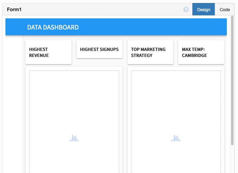
Drag and drop four cards along the top of your dashboard, and set the container property of each of these to full_width_row.
Drop a label into each of the four cards. Add text to each of the labels using the Properties panel on the right hand side, and make each of them bold. Your dashboard should look something like this:
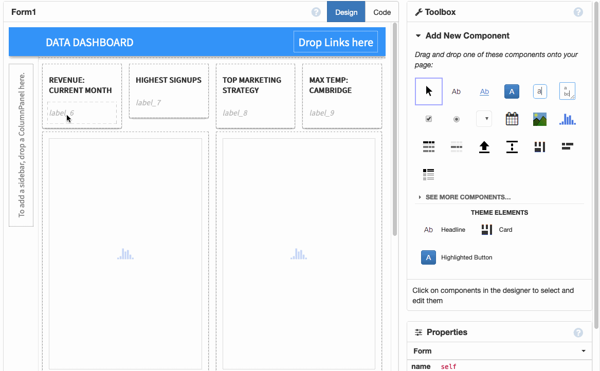
Then, drop another label into each card, and give each label a name. We’ll call them revenue_label, signups_label, marketing_label, and weather_label for our example:
Now, let’s populate those labels with our headline numerical statistics.
Let’s amend our graph functions to also populate our headline statistics.
First, add these lines to your build_revenue_graph function:
max_revenue = sorted(db_data, key=lambda x: x['amount'], reverse=True)[0]
self.revenue_label.text = "{}, {:,}".format(max_revenue['date'].strftime("%d %b %Y"), max_revenue['amount'])
Add these lines to your build_signups_graph function:
max_signups = sorted(signups, key=lambda x: x[0], reverse=True)[0]
self.signups_label.text = "%s, %d" % (max_signups[1].strftime("%d %b %Y"), max_signups[0])
Add these lines to your build_marketing_graph function:
max_hits = sorted(marketing_data, key=lambda x: x[1], reverse=True)[0]
self.marketing_label.text = "%s, %d hits" % (max_hits[0], max_hits[1])
And finally, add these lines to your build_weather_graph function:
max_temp = sorted(self.temp_data, key=lambda x: x[1], reverse=True)[0]
self.weather_label.text = max_temp[1]
Click run and you’ll see your headline numerical statistics populated along the top of your dashboard!
Conclusion
And that’s it. You have a working business dashboard built with nothing but Python. It’s fetching data from Anvil’s built-in database, from an external SQL database, from a private database, and from a REST API.
Your dashboard is already live on the internet. Go to Publish App in the Gear Menu ![]() for details.
for details.
You can also use the following link to clone the finished app and explore it yourself:
Happy dashboarding!