 By
By Day 18 of the Anvil Advent Calendar
Build a web app every day until Christmas, with nothing but Python!
Christmas Finances
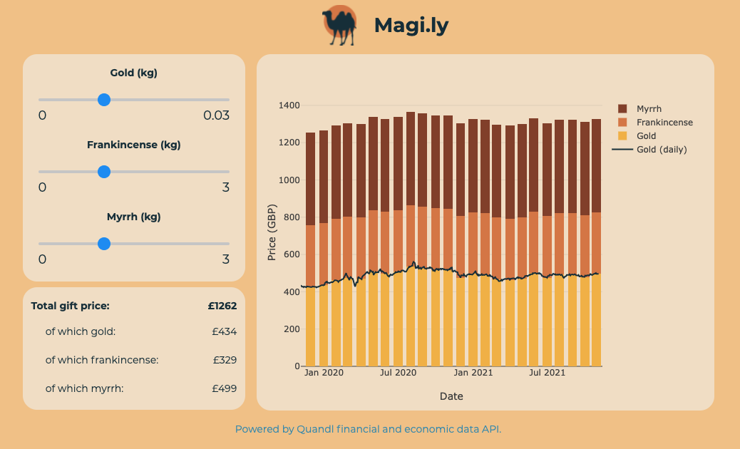
On last year’s advent calendar, we had an app that visualised the prices of gold, frankincense and myrrh, which allowed us to get incredibly valuable financial insights. For this year I decided to give the app a facelift and, while at it, I also updated the prices of frankincense and myrrh, to see how the market of Christmas’s three hottest commodities has evolved in a post-Brexit UK.
You can check out the app by following the link below.
https://gold-frankincense-myrrh-v2.anvil.app/
How it works
As with last year’s app, there are three sliders with which you can set to the amount of gold, frankincense and myrrh you want to buy. The app then calculates the total price of the bundle, and presents it broken down by item. That way you can plan your purchase accordingly, whether it’s for yourself, a loved one, or a newborn baby in a shed in Bethlehem.
We use Quandl’s API to get the price of gold. We can’t do this with frankincense or myrrh, because for some reason financial markets do not find tree resin interesting enough to consider it a commodity worth trading, so the those prices are hard-coded.
We have our API key stored in an Anvil Secret, which we call from our server code. We call data from the last two years, so we can see how the prices behaved pre- and post-Brexit.
@anvil.server.callable
def get_gold_chart():
    # Date strings for the API request
    now = datetime.now()
    today = now.strftime('%Y-%m-%d')
    two_years_ago = (now - timedelta(days=730)).strftime('%Y-%m-%d')

    # Get our key, construct URL, and make the request
    api_key = anvil.secrets.get_secret("quandl_key")
    url = f'https://www.quandl.com/api/v3/datasets/LBMA/GOLD/data.json?api_key={api_key}&start_date={two_years_ago}&end_date={today}'
    response = anvil.http.request(url, json=True)

    # Get the afternoon price
    return [{'date': x[0], 'afternoon_price': x[5]} for x in response['dataset_data']['data']]
Now we can visualize our data. Let’s create a Plotly plot on the client side.
self.gold_chart = anvil.server.call('get_gold_chart')

self.plot_1.data = [
    go.Scatter(
        x=[p['date'] for p in self.gold_chart],
        y=[gold_kg*p['afternoon_price']/TROY_OUNCE_TO_KG for p in self.gold_chart],
        name='Gold (daily)',
        marker= dict(color= '#163440')
    ),
    go.Bar(
        name='Gold',
        x=[p['date'] for p in bars[1:]],
        y=[gold_kg*p['afternoon_price']/TROY_OUNCE_TO_KG for p in bars[1:]],
        marker= dict(color='#F2B950')
    )]
We can now see how the price of our gift basket has changed over time! I hope looking at these trends will help you make a decision on when it is best to stock up on gold, frankincense and myrrh.
You can check out the entire source code by cloning the app using the following link:
Give the Gift of Python
Share this post: