New Material 3 Theme
Anvil’s Material 3 theme is a set of custom components and layouts that implement Google’s Material 3 design system.
Not every Material 3 component is supported (yet!), and any Anvil components that don’t have a Material 3 counterpart have been styled to match the Material 3 specs as best as possible. The Material 3 theme components can be used with other Anvil components and containers.
How to use the Material 3 theme
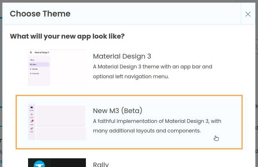
When creating an app, choose New M3 (Beta):

Adding the Material 3 theme to an existing app
If you already have an app and want to use components or layouts from the Material Design 3 theme, you can add the dependency manually. Just go to Settings -> Dependencies, choose Third Party and enter the dependency ID 4UK6WHQ6UX7AKELK.
Component index
Material 3 includes a large number of components. See the documentation for all components, or browse through them by type:
Typography
There are three typography components for displaying text in Material 3:
Buttons
Buttons are for performing actions. The ButtonMenu component displays a floating menu when clicked.
Display
Display components are designed to help display content on the page.
Navigation
The NavigationLink is designed to work with the Material 3 Layouts to make it easy to navigate between Forms.
Menus
Menus hold other components as a list of options. MenuItems are designed to populate Menus.
Form Input
Form Input components are interactive components used to get data from the user.
Feedback
Use feedback components to show the status of a process.
Layout index
The Material 3 theme has two layouts designed for page navigation:
Do you still have questions?
Our Community Forum is full of helpful information and Anvil experts.
