Good evening all,
I’m trying to plot more than one column from a data table as my Y variable in a line plot. I have a log of dates, temperature and humidity stored in a Data Table which I would like to plot. I’ve had a look at the tutorial docs and examples and can easily plot dates on the X axis with temperature or humidity on the Y axis. But as yet, I’ve not been able to plot both. Here is the code I’m using to plot. db_data is returned by a server function that accesses the data table.
    self.plot_latest.data = go.Scatter(
      x = [x['record_date'] for x in db_data],
      y = [x['temperature'] for x in db_data]
    )
Is there a simple way to add another trace to this plot, with a secondary Y axis on the right?
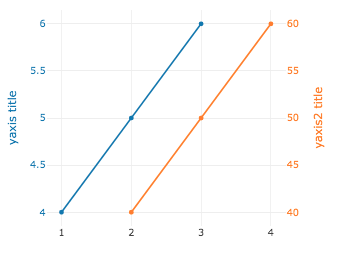
Something like this, which I plotted in a Datalore notebook with plotly:

Unfortunately, to do this in plotly relies on libraries not available on the Anvil Free Tier. I also tried doing to do the plotting work on a Raspberry Pi using Uplink, but encountered all sorts of errors when trying to return a figure object.
Any pointers would be welcome.
Many thanks
Jon