I’m a newbie to Anvil.Works and am trying to figure out how the UI elements stack responsively.
I’ve used bootstrap on my other websites, so am familiar with the grid system. So would appreciate any help from anyone who knows Boostrap and Anvil well, to help me get my head round it.
This is the page I created
And Anvil, clearly has bootstrap as it recognises my custom html, but its not my project its my daughters and its a big enough ask for her to do it, without her having to learn how to do all the CSS so its better if she can use Anvils UI drag and drop elements.
But if you put the test page in responsive design mode in the browser, the overflow is getting hidden, only the bit of custom html I put in, is responsive.
So here is my actual question after all that?
So if I put a full width column, then inside that 3 columns that were not full width, does that act like this ?
If not, how does it handle the responsive part? I’ve tried adding the columns that way and also removing them and putting only one as it is now, but in both cases any overflow is simply hidden, which is not what I want.
Generally responsiveness in anvil is handled using a ColumnPanel.
You can decide when you want the ColumnPanel to wrap by setting the wrap_on property (the default value is "mobile")
here’s a linked thread that might help.
If you need more control you can escape to html/css.
I have now added 3 (not full width) columns color coded (red, green, blue), inside a full width outer column (pink) and the inner ones automatically stack on top of one another, if I try to move them side by side, it doesnt want me to.
Also, these are not full width boxes, yet the colour is extending right the way across the page.
I need them as follows
1st Column - 2nd Column - 3rd Column
Its still not responsive though. the only way I can get responsiveness and see elements, is to unset the overflow (overflow:unset!important) in CSS, I did that along with float:left on the orange button and although its still not placed correctly, I can see it on a responsive test.
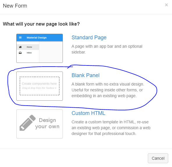
From the provided link, It seems that you are using Blank Panel? Then, I guess Anvil UI is not used any more and the issue is with the UI / Front End Framework I are using.
Hi, thanks for the reply, I can see all the CSS elements applied on the UI parts, but you are right about the drag and drop, I just tested it on the Material Design, it did put the elements side by side. Weird. since even the blank page gives you the option of using the UI elements.
So, at least I have a workaround, because I can still use my custom html in the material design.