I think this is one place where the anvil editor has some improvement to do since it has no option of changing the viewport… and so is misleading when it comes to mobile development.
You have some choices:
- Do you want your app to look the same on all devices?
- Do you want your app to change and be responsive on a mobile?
If 1 then all containers that might wrap should have wrap_on set to never - this will mean that what you see in the design view is what you get*:
*sort of what you get - you have to be a little careful that things don’t shrink too much and become unreadable on mobile…
If 2 then think carefully about how you want it to wrap.
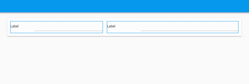
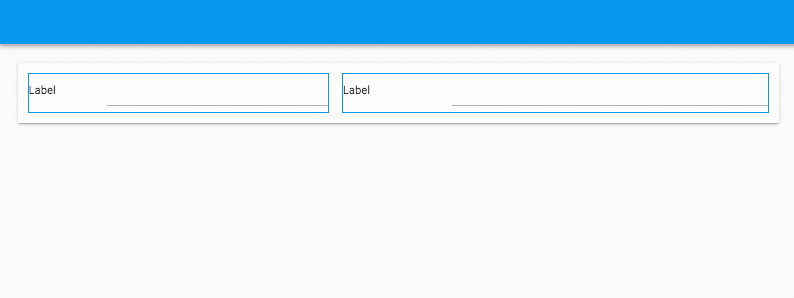
In your example it looks like you have: phone_label, phone_box, email_label, email_box inside a card on one row in the design view with wrap_on set to mobile.
Keep this set up but instead put two ColumnPanels side by side knowing that these will later become 2 rows on mobile (as below with blue borders). You can then decide how you want the ColumnPanels to wrap.
ColumnPanels with wrap_on set to mobile.
ColumnPanels with wrap_on set to never.
Features that would be useful:
- Switch the design view to show an accurate mobile look.
- Have the ability to switch the default
wrap_ontonever.