What is the best practice to make anvil app looks good on mobile device?

Hi all,

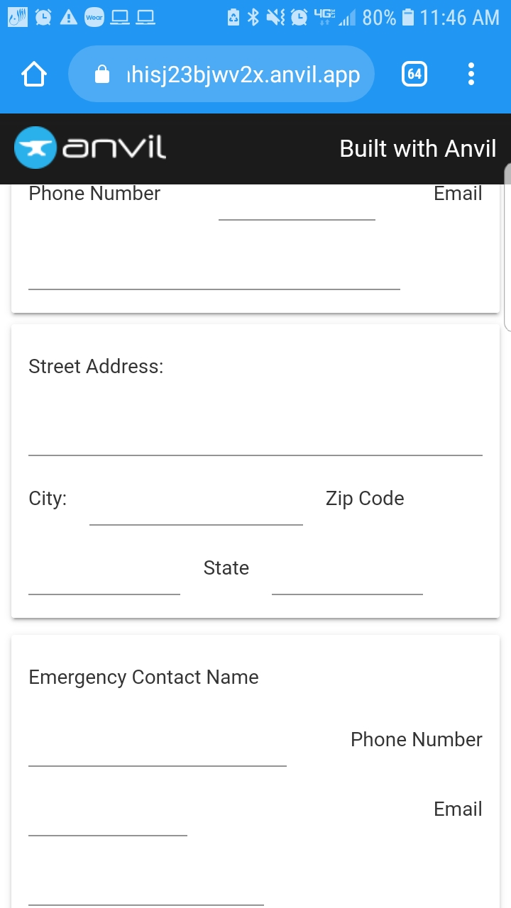
It may sound like a vague question. But, my issue is after making the app look nice on the PC and then traying it on mobile devices, everything gets pushed and I lose the organized design I made on the web page!

Here is an example for a app: https://anvil.works/build#clone:S37NHISJ23BJWV2X=RJOHHS5L73IMIWO7QIZXY74D

and here how it looks like on the phone

Thank you for your help

3 Likes

I think this is one place where the anvil editor has some improvement to do since it has no option of changing the viewport… and so is misleading when it comes to mobile development.

You have some choices:

  1. Do you want your app to look the same on all devices?
  2. Do you want your app to change and be responsive on a mobile?

If 1 then all containers that might wrap should have wrap_on set to never - this will mean that what you see in the design view is what you get*:

How do I make my apps look nice on my mobile display?

*sort of what you get - you have to be a little careful that things don’t shrink too much and become unreadable on mobile…


If 2 then think carefully about how you want it to wrap.

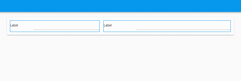
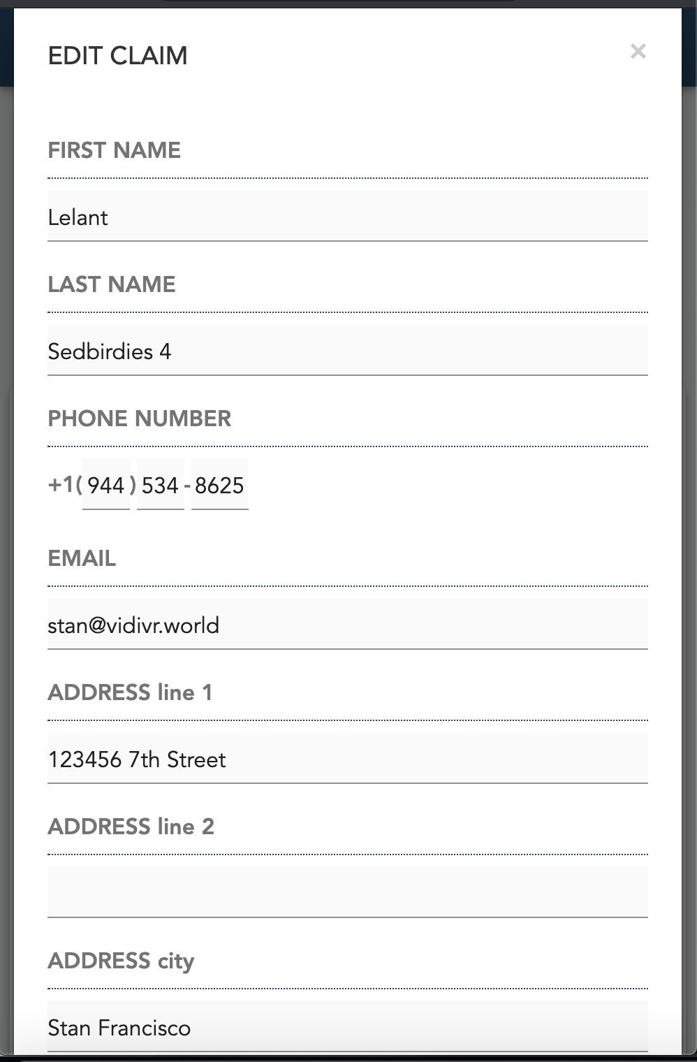
In your example it looks like you have: phone_label, phone_box, email_label, email_box inside a card on one row in the design view with wrap_on set to mobile.

Keep this set up but instead put two ColumnPanels side by side knowing that these will later become 2 rows on mobile (as below with blue borders). You can then decide how you want the ColumnPanels to wrap.

ColumnPanels with wrap_on set to mobile.

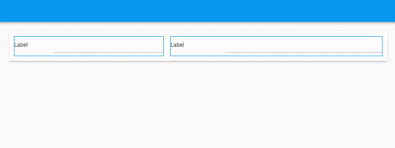
ColumnPanels with wrap_on set to never.


Features that would be useful:

  • Switch the design view to show an accurate mobile look.
  • Have the ability to switch the default wrap_on to never.
5 Likes

Thank you, I can work with that.

for mobile display, grouping components vertically in Column Panels scales to fit any screen nicely, but can sometimes look awkwardly wide on PC. A way to get around this is to place components that should be next to eachother on a wide screen side by side in a column panel, so if screen is wide they appear properly but if screen is narrow the one on the right goes underneath the one on the left. For example:

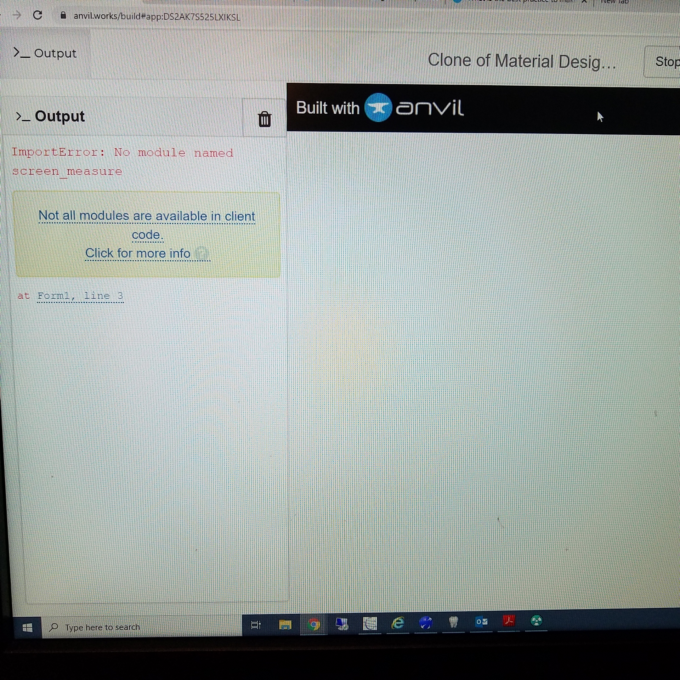
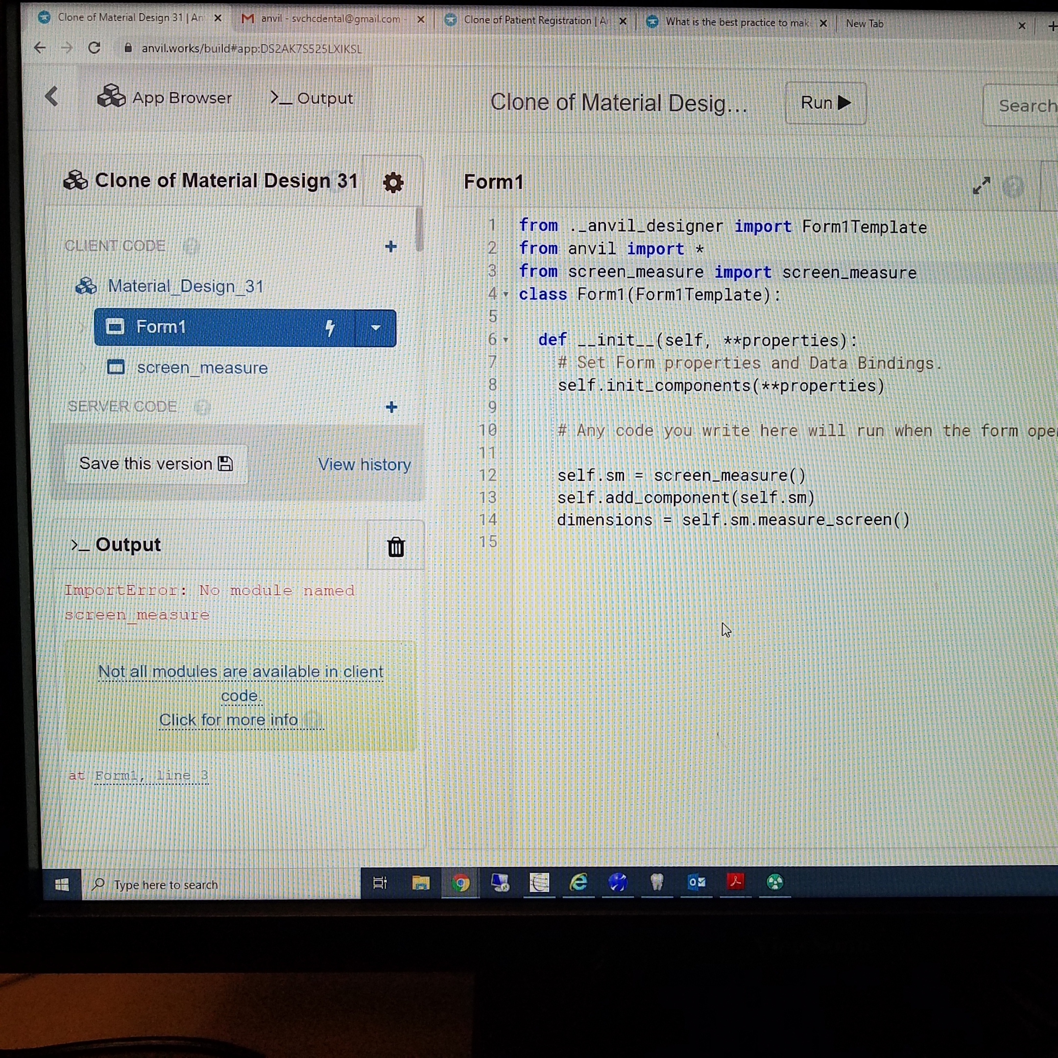
If you want to have one design for mobile and one design for desktop, you could measure the screen and available space by putting this into a custom html component and calling the function with self.call_js(‘measure_screen’). If w<h, display the mobile optimized forms. if w>h display desktop optimized forms.

<script>

  function measure_screen(){
  var w = screen.width
  var h = screen.height
  var aw = screen.availWidth
  var ah = screen.availHeight
  return {
        w: w,
        h: h,
    	aw:aw,
    	ah:ah
    };
  
  };

</script>
3 Likes

That’s sounds promising, however I don’t have much experience with html, would you be able to give an app example where I can see how and where to use this script.

Thank you.

  1. New Form > custom html > name it ‘screen_measure’
  2. go to ‘screen measure’ click ‘Custom HTML’ on form properties panel on right
  3. paste that code in there
  4. go to python code section of ‘screen_measure’
  5. create function:
    def measure_screen(self): return self.call_js('measure_screen')

now you can import and add the screen_measure form to any other form and measure the screen as needed by using:

self.sm = screen_measure()
self.add_component(self.sm)
dimensions = self.sm.measure_screen()

where dimensions will look like:

dimensions = {‘w’:1600, ‘h’:900, ‘aw’:1400, ‘ah’:700)

3 Likes

It seems like I am missing something
https://anvil.works/build#clone:DS2AK7S525LXIKSL=32OGVWD6MA4LHRJYAUQCHFKF

might need to be:

from .screen_measure import screen_measure

Still not working, I tried to add the “.” and “…” both didn’t work.

@joinlook can you please look into it again, I tried different approaches and it is still not working.

Thank you for your help

1 Like

figured it out

https://anvil.works/build#clone:ASEW3XOVAVZRDN3C=R27YTBS77DWE4CCB6BDB4DJJ

1 Like

Thank you, it is working now.

one other thing to note, you can’t do self.call_js() in init. thats why I moved it to form_show()

I noticed, but I am not sure how the “form_show” method called?

@adhamfaisal the form show is an event that is triggered when the form is visible on the screen.

if the form is not visible then:

  • it doesn’t have it’s html loaded, and so
  • it doesn’t have it’s <script> tags loaded, and so
  • it can’t call it’s js function(s).

As a similar alternative approach:

  • you could put @joinlook’s function in native libraries:
    (this will insert the function into the <head> tags of the app)
  • This way you can access the function anywhere at anytime from any form.
  • just call js.call_js('measure_this') instead of self.call_js

https://anvil.works/build#clone:VPLZWVEU2CEDMQW5=XSS6HNCKZARSFYRD6YCVLNW3

4 Likes

Thank you for the explanation and the example. that is very helpful!

A post was split to a new topic: How to use wrap_on