Hi
I am trying to get the years on the x-axis grouped for my graph object axis plot on the client side.
The thing is that the plot behaves differently on the Client side vs the Server side. I would like only the data I am passing to the bar chart to be plotted, not the empty data.
My data looks like this:
years_str = ['2021', '2025', '2030']
y_data = [1,2,3]
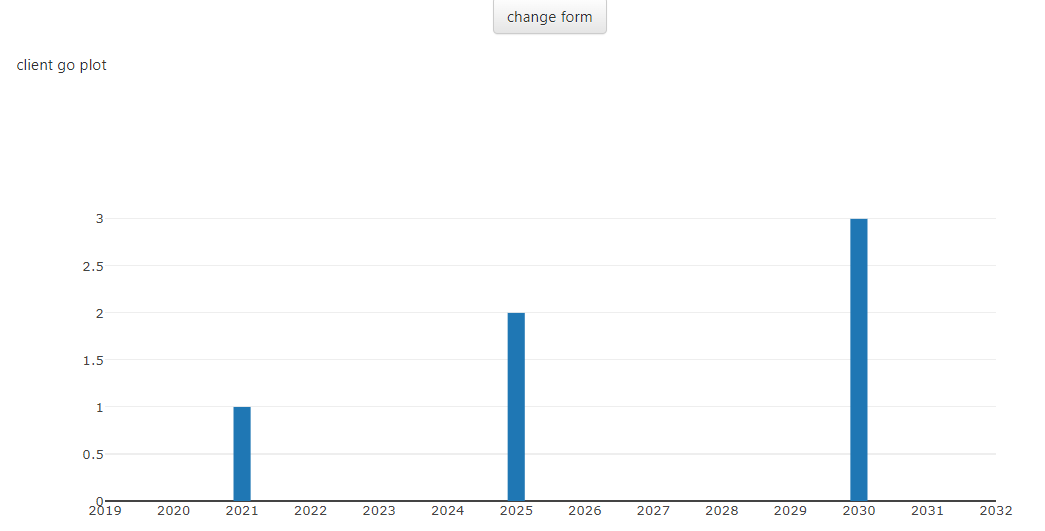
Here is my plot on the Client side. Note the display of the x-axis data from 2019 to 2032 with data available only for years 2021, 2025 and 2030.
Code for client side:
        years_str = ['2021', '2025', '2030']
        y_data = [1,2,3]
        self.client_go_plot.data = go.Bar(
                x = years_str,
                y = y_data,
                name = 'Bar Chart Example',
                width=0.25,
            )

        self.client_go_plot.layout = {
            'xaxis': {'dtick': 1,}}
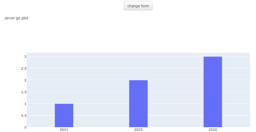
Here is my plot passing a figure from the Server side. The data is now grouped as I would like, showing only data for the three years.
Code for server side:
## Server module
import plotly.graph_objects as go

@anvil.server.callable
def create_fig():
    years_str = ['2021', '2025', '2030']
    y_data = [1,2,3]
    fig = go.Figure()
    fig.add_trace(go.Bar(x=years_str, y=y_data, width=0.25, name = 'Bar Chart Example',))
    return fig

## Client module
import plotly.graph_objects as go

class server_go_plot(server_go_plotTemplate):
    def __init__(self, **properties):
        # Set Form properties and Data Bindings.
        self.init_components(**properties)

        self.plotly_go_plot()

    def plotly_go_plot(self):
        fig = anvil.server.call('create_fig')
        self.server_go_plot.figure = fig
How can I get the same result on the Client code as with the server code? The recommended way to make plots in Anvil is to use Anvil’s Plot component.
Anvil Docs | Making plots. But now I have to use the server side plot because of the different behavior. Any ideas?
Anvil clone link: