DataGridJson - A DataGrid with quick simple setup

If you have ever created a DataGrid with its DataRowTemplate on a form, then tried to duplicate them to do something similar on another form, then you did it more than a few times and you found the process tedious, then you may find this custom component useful.

DataGrids are very flexible and powerful, and it is possible to refine all details of their behavior and the behavior of the template form and all the events that link the components on the form with the DataGrid and the form that contains the DataGrid and… TLDR

But DataGrids can be tedious to work with when working on a rapid prototype of an app with many similar DataGrids.

So I created this simple custom component that allows to:

  • use a DataGrid without creating a row template form
  • define an event callable and have clickable rows
  • define an event callable for each column
  • have all the event callables on the form containing the custom component, without setting up any custom event
  • setup it with three parameters:
    • columns - an extended version of the DataGrid.columns property
    • settings - a subset of the settings available with a DataGrid
    • items - the usual list of dictionary-like objects

Here is the clone link: Anvil | Login

The cloned app contains both the DataGridJson custom component definition and a test form that instantiates one DataGridJson from the IDE and one from code.
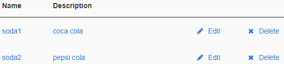
An example of use:

columns = [
    {'title': 'Name', 'data_key': 'name', 'width': 100, 'on_click': self.name_click},
    {'title': 'Description', 'data_key': 'description'},
    {'width': 100, 'on_click': self.row_edit, 'icon': 'fa:pencil', 'text': 'Edit'},
    {'width': 100, 'on_click': self.row_delete, 'icon': 'fa:times', 'text': 'Delete'},
]

settings = {
    'auto_header': True,
    'rows_per_page': 0,
    'show_page_controls': False,
    'on_click': self.row_click,
}

items = [
    {'name': 'soda1', 'description': 'coca cola'},
    {'name': 'soda2', 'description': 'pepsi cola'}
]

self.add_component(DataGridJson(columns, settings, items))

image

Here are a few notes:

  • The resulting DataGrid is not as flexible as the real one, but it’s great for rapid prototyping and, if you are lucky and don’t need much customization, you can use it in production too
  • If column['data_key'] is defined, then the column is populated with the usual databinding
  • If column['on_click'] is defined, then a Link is inserted and its click event will call the callable
  • If column['icon'] is defined, then a Link is inserted and its icon is set
  • If column['text'] is defined, then a Link is inserted and its text is set (useful when no column['data_key'] is defined)
  • If settings['on_click'] is defined, then the DataRowTemplate is inside a Link, so clicking on the whole row (outside of any Links with on_click defined) will call the callable
  • items is assigned to the DataGridJson component itself, not to its repeating panel (because it’s more convenient and because the repeating panel is not visible from outside)
11 Likes

I added a little big improvement: now column header can be clickable.

Adding header_sort_on_click to the dictionaries in columns, makes the headers clickable and sort automatically.

Adding header_on_click, makes the headers clickable and execute a callable, to perform custom sorting or other actions.

Here is the comment that describes the 3 arguments:

    #    ------ columns ------
    # array of dictionaries containing the following keys:
    #   title     text displayed on the column header - if missing then no header
    #             (useful for example on a column of buttons)
    #   data_key  key used for the databinding - if missing then no databinding
    #   width     column width - if missing then the column will auto-expand
    #   icon      icon shown on the left of the link
    #   text      text shown on the link (useful without databinding, for example
    #             with a column of buttons)
    #   tooltip   tooltip for the column header
    #   on_click  callable executed when an item in the column is clicked, three
    #             arguments are passed to the caller: sender, item and column -
    #             if missing then it's a non clickable Label
    #   header_on_click       callable executed when the column header is clicked,
    #             two arguments are passed to the caller: column and sender - if
    #             missing then the header is a non clickable Label
    #   header_sort_on_click  clicking the header sorts the items by the clicked
    #             column
    # 
    # if header_on_click is missing and header_sort_on_click is provided then the
    #             component will sort the items by the clicked column and update
    #             the up/down triangle accordingly
    # if header_on_click is provided and header_sort_on_click is missing
    #             then the the callable is executed and the up/down triangle is
    #             not visible
    # if both header_on_click and header_sort_on_click are provided then the
    #             component will update the up/down triangle accordingly, but the
    #             sorting is not done and the callable is executed
    #    ------ settings ------
    # array of dictionaries containing the following keys:
    #   rows_per_page       number of rows per page - 0 to show all the rows
    #   show_page_controls  show the page controls at the bottom of the control
    #   on_click            callable executed when any item in the row without its
    #             own click callable is clicked, two arguments are passed to the
    #             caller: sender and item - if not None the whole DataGridRow is
    #             inside a clickable link
    #    ------ items ------
    # array of dictionaries containing the keys used by the data_key element of
    #             the dictionaries in columns
6 Likes

A little improvement (and a few bug fixes): last_row_has_summary keeps the row at the bottom when clicking on a column header and sorting.

Here is the demo: https://datagridjson-demo.anvil.app/

EDIT
Another little improvement: it is possible to add columns with checkboxes (see the demo link above for an example).

4 Likes

Awesome, @stefano.menci ! Just what I am looking for!