Thought I’d try this out - I know there’s a couple of toggle components already knocking about on the forum and in the component library
I wanted to see if I could do it with some CSS and roles since a toggle/switch is really just a checkbox.
Here’s what I did:
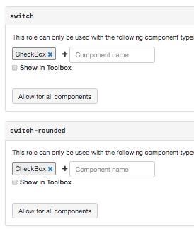
Create 2 Anvil Roles - switch and switch-rounded for the CheckBox component
Copy and paste this css into theme.css
.anvil-role-switch label,
.anvil-role-switch-rounded label {
   position: relative;
   width: 1.8em;
   padding-left: 1em !important;

}
.anvil-role-switch input,
.anvil-role-switch-rounded input {
 opacity: 0;
 height: 0;
}

.anvil-role-switch span,
.anvil-role-switch-rounded span {
   position: relative;
   display: block !important;
   font-size: ineherit;
   padding-left: calc(1em + .5rem);
}


.anvil-role-switch span::before,
.anvil-role-switch-rounded span::before {
   content: "";
   position: absolute;
   cursor: pointer;
   top: 0.1em;
   bottom: 0;
   left: -1em;
   width: 1.8em;
   height: 1em;
   background-color: #ccc;
   -webkit-transition: .4s;
   transition: .4s;
}

.anvil-role-switch span::after,
.anvil-role-switch-rounded span::after {
   position: absolute;
   cursor: pointer;
   content: "";
   height: .8em;
   width: .8em;
   left: -.88em;
   top: .2em;
   bottom: 0;
   background-color: white;
   -webkit-transition: .4s;
   transition: .4s;
}
.anvil-role-switch input:checked + span::before,
.anvil-role-switch-rounded input:checked + span::before {
 background-color: %color:Primary 500%;
}

.anvil-role-switch input:focus + span::before,
.anvil-role-switch-rounded input:focus + span::before {
 box-shadow: 0 0 1px %color:Primary 500%;
}

.anvil-role-switch input:checked + span::after,
.anvil-role-switch-rounded input:checked + span::after {
 -webkit-transform: translateX(.8em);
 -ms-transform: translateX(.8em);
 transform: translateX(.8em);
}

.anvil-role-switch-rounded span::after {
 border-radius: 50%;
}
.anvil-role-switch-rounded span::before {
 border-radius: .5em;
}
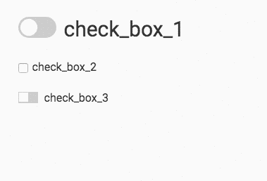
Now it’s easy to create toggles - just add the role switch or switch-rounded to any checkbox.
p.s. I tried to make it scale with the font size of the component - my CSS skills are basic so any comments about improvements welcome.