Version History : v0.2 - fixed CSS so non-toggleswitch checkboxes were not affected by the pseudo-classes. v0.5 - now has square and rounded switches. v0.6 - now a custom component!
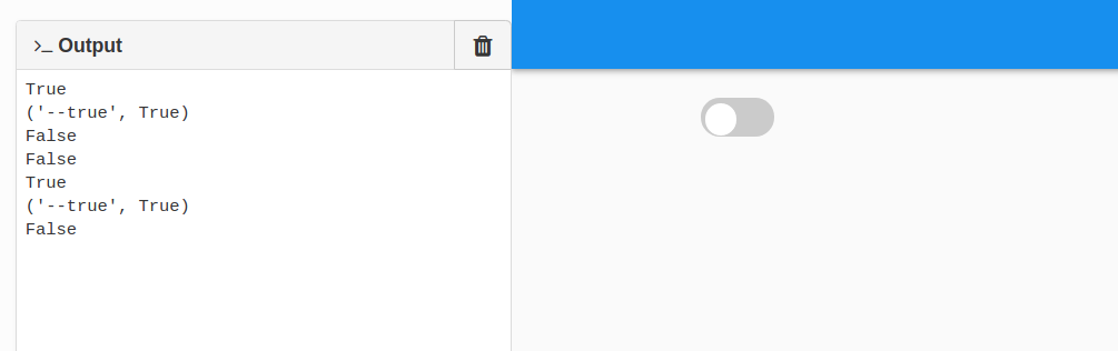
Here’s a demo of an animated toggle switch, made using CSS & custom HTML forms and wrapped around with a demo project.
To use it you can drag the “Toggleswitch” form onto your project form. Hopefully the demo project will show you most of the functionality.
Keep an eye on the version numbers in the revision history in the original post.
If your cloned demo project form disagrees with it then please re-clone.
Hmm, I’m having trouble getting this to work. I have it as a dependency and the custom component shows up in the design IDE. But when I add one to the form and run the app, it just displays as a normal checkbox. Any idea what I could be doing wrong?
All I did was add an unchanged clone of the Toggle Switch Demo v0.6 above as a dependency, and then drag a Toggleswitch custom component onto the form.
But doesn’t it seem like custom components shouldn’t require this manual copying of assets? The custom css I can see, I guess, but the custom component itself is a custom html form, so it seems odd that I would need to manually copy that html file to use it, no? Would this make sense as a feature request?
In an unrelated issue, I was surprised that setting the “checked” property programmatically would trigger the “x_change” event the same way that clicking on the toggle does. That is not how plain checkboxes behave. So I changed that to the behavior I expected by editing the following method of the Toggleswitch class, commenting out the line that triggers the event when “checked” is set programmatically:
  @checked.setter
  def checked(self,value):
    if type(value) is bool:
      self._checked=value
      self.update()
      #self.check_box_1_change()