Custom HTML Forms and Templates
This feature is optional - you do not need to know HTML to use Anvil!
However, if you do know HTML, or employ a web designer who does, this reference will allow you or them to create a beautiful template into which you can easily drag-and-drop your Anvil components.
When adding a Form to your Anvil app, you have a choice of styles to choose from. The exact choices depend on which theme you chose, but there is always the option to add a Custom HTML Form:
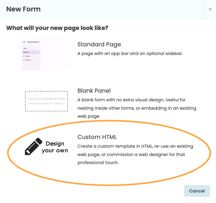
Create a new form
Editing a Custom HTML Form
You can set the raw HTML of a Custom HTML form to anything you like by clicking the ‘Edit’ button in the Properties Panel:
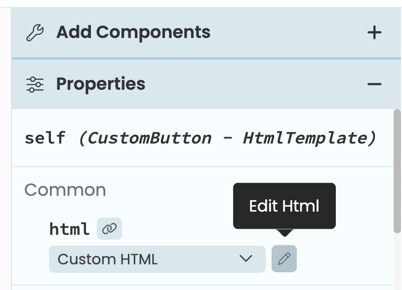
How to open the HTML Form Editor
from the Properties Panel
You can also open the HTML editor by choosing ‘Edit HTML’ from the three dots menu at the top of the Form Editor.
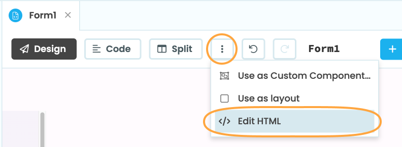
How to open the HTML Form Editor from the three dots menu
This will open the HTML Editor at the bottom of the Form Editor, and you can expand the panel by clicking the separator bar:
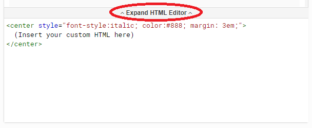
Edit custom HTML
This will open the HTML Editor to the right of the Form Editor:
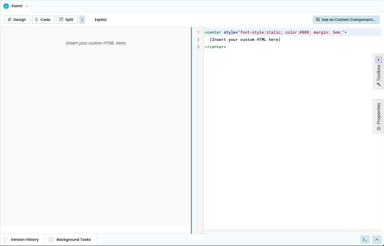
Edit custom HTML
As you edit the HTML, you will see the changes appear live in the Form Editor. You can designate slots in the HTML to support dragging and dropping new components into your custom Form - see slots and templating for details.
Accessing elements
Any element in your Form’s HTML can be accessed from your Form’s Python code. To access an element, you’ll first need to give it the anvil-name=<name> attribute. Then, in Python, you can look up the element in the Form’s dom_nodes dictionary.
For example, if you have the following element in your HTML…
<div anvil-name="my-element">
</div>
…you can then find that element in Python:
my_element = self.dom_nodes["my-element"]These objects are real JavaScript HTMLElement objects, and you can access their properties and methods over Anvil’s Javascript-to-Python bridge. For example, you can add a class to the my-element element:
self.dom_nodes["my-element"].classList.add("my-class")Slots and templating
An Anvil HTML template has one or more areas into which components can be dropped, called “slots”. HTML slots are created by adding anvil-slot or anvil-slot-repeat as an attribute to any element of your HTML.
Anvil themes use “slots” to create templates for your Forms. For instance, the Anvil Material Design 3 theme has a slot called title where you can drag and drop a Label component to use as the title for your app. You can create your own HTML templates using slots.
Old HTML templates made use of explicit drop zones, along with HTML slots, to define where components would land. However, drop zones are no longer necessary and we advise against using them anymore.
If you want to read more about how explicit drop zones worked, visit the Classic Editor docs.
Creating slots
The simplest way to create an HTML slot is by adding the anvil-slot attribute on an HTML element. Every time a component is dropped into a slot created with the anvil-slot attribute, it will get added inside that HTML element.
<!-- Each component added to the "default" HTML slot will be inside the same div with a lightblue border -->
  <div anvil-slot="default"
    style="border: 2px solid lightblue">
  </div>
A label and a button inside the ‘default’ slot
When a component is dropped into an HTML slot, that component will automatically get a slot container property indicating in which component it is nested:

The slot container property for a component
inside the default HTML slot
Another way to create HTML slots is to use the anvil-slot-repeat. When anvil-slot-repeat is added to an element, this element will not appear on your page when the form is blank, but for every component added to that slot, a new copy of that element will be created, and the component will be added to the end of it:
<!-- Each component you drag and drop onto this "default" slot
     goes in a new div with a pink border -->
<div anvil-slot-repeat="default"
    style="border: 2px solid pink">
  </div>
Every component dropped into here
ends up in a new pink-bordered div.
If you don’t want your components to be added to the end of your anvil-slot-repeat element, you can also specify deeper wrapping. If there is an element with the attribute anvil-component-here inside your anvil-slot-repeat element, the component will go there rather than at the outside of the repeat.
In the example below, we create a box with a pink border for each element, inside which is a box with a blue border, inside which is our component:
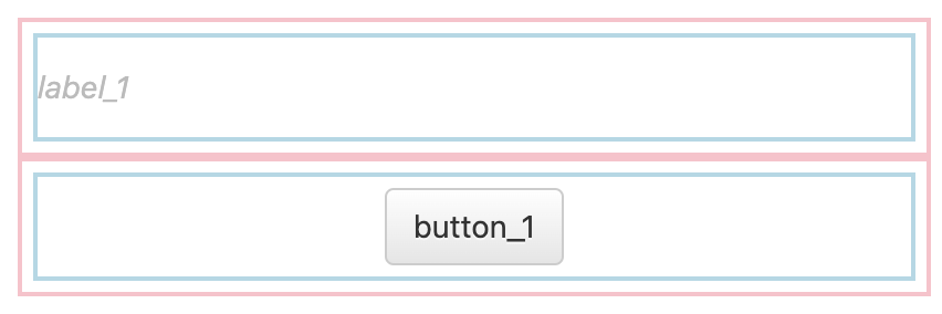
Every component dropped into here ends up in
a blue-bordered div inside a pink-bordered div.
Designer prompts and placeholders
You can use anvil-designer-only to include prompts to the designer that will not appear in the final app. Adding the anvil-designer-only class to an element makes it invisible when the app is run.
<!-- The first div will only be visible while editing your app in the designer -->
<div class="anvil-designer-only" style="color: gray; font-style: italic;">
     Drop components below
</div>
<div anvil-slot="default" style="border: 2px solid lightblue; padding: 5px"></div>
You can also add placeholders that will show up if nothing is added to a slot. You just need to add anvil-if-slot-empty=<name-of-empty-slot> to the placeholder element. For example, in the code block below, we’ve created a placeholder element that will show up only if the title slot is empty.
<div anvil-slot="title">
    <div anvil-if-slot-empty="title">Drop a title here!</div>
</div>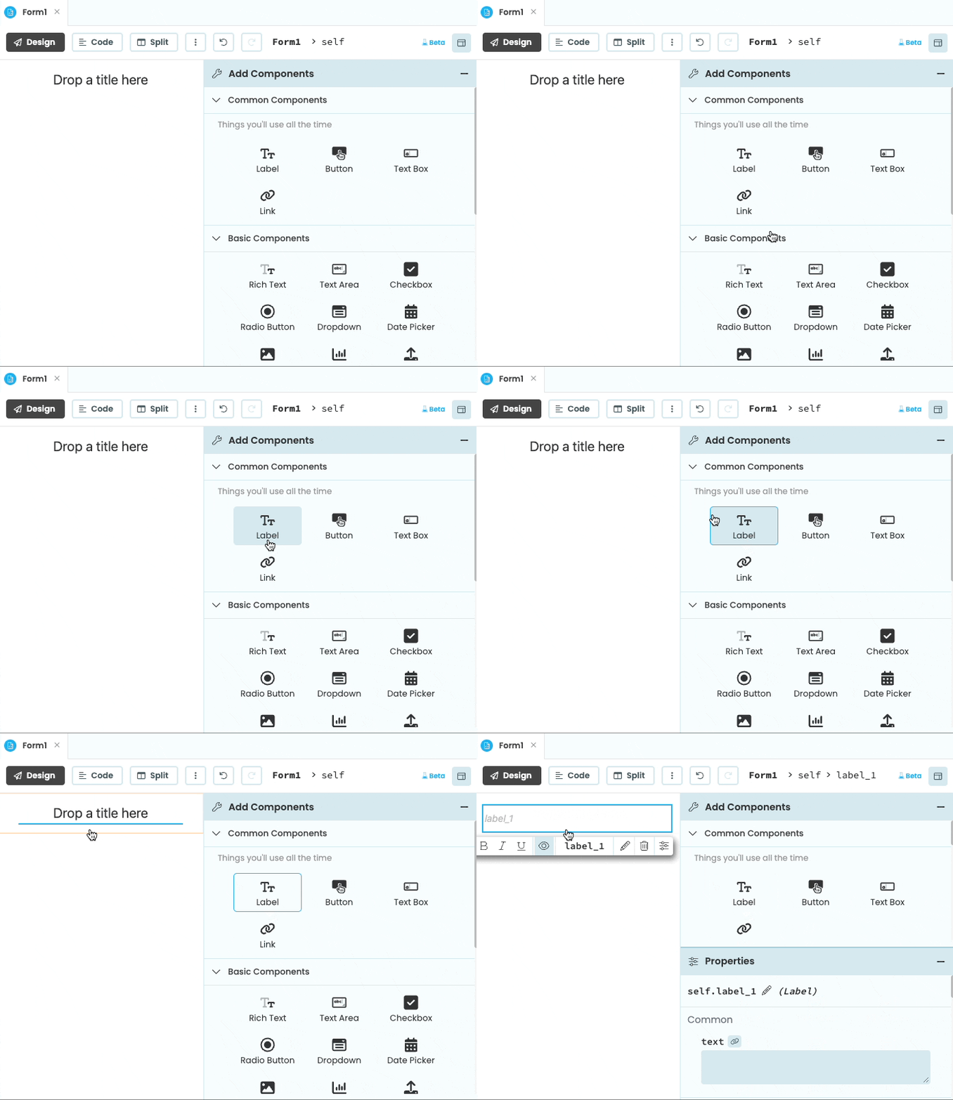
The placeholder disappears when a component is dropped inside the slot.
Do you still have questions?
Our Community Forum is full of helpful information and Anvil experts.
