I have a flow panel with 3 linear panels inside it. When I use flow_panel.width the result is <anvil.Component object> default.
What is the easiest way to measure this (in pixels) so I can size the linear panels accordingly?
I have a flow panel with 3 linear panels inside it. When I use flow_panel.width the result is <anvil.Component object> default.
What is the easiest way to measure this (in pixels) so I can size the linear panels accordingly?
Can you just set the width to a percentage?
I tried that but it makes it that percentage of the width it is currently.
I also tried setting it default first and then 30% but it doesn’t work… 
Oh i see the problem. A FlowPanel wraps a div element around each of its contents so when you say "30%" you’re saying 30% of the parent which in this case is not the flow panel… I guess that’s not how flow panels are meant to be used…
The method does works fine for LinearPanels inside ColumnPanels - is that a possible approach?
Sorry my reply wasn’t clear. I tried to apply the “30%“ to the nested linear panels which didn’t work.
When the linear panels are dropped into the flow panel they have a width handle… I am not sure if this changes the “parent” width reference?
I don’t think you can nest linear panels in column panels either
so what I think happens:
in code when you adjust the width you are adjusting the parent width. Since a linear panel inside a flow panel has a parent that is not the flow panel you can’t adjust to the flow panel width in code.
I think linear panel in column panel works fine… it’s just dragging the linear panels inside that’s the issue!!! put a button in first…
I did not think of that!!! Seems odd.
Ok that all makes sense, I’ll try swapping over to the col panel and see what happens.
Thanks @stucork
Thanks for the suggestions @stucork . The Column Panel does work but as I can see it lacks the left alignment feature. The reason I wanted the Flow Panel is that if you hide the left most Linear Panel, the other two will re-position themselves to the left, this does not happen with a Column Panel.
I ended up abandoning this idea of using an XY Panel and used a Grid Panel and then programmatically set the position of the panels if one of the panels was hidden. It seems to work pretty well with cards of different lengths and using multiple filters…
Grid Panel for the win!!
why didn’t you say!
Linked topic:
I think the best option for simpler code is to use the items property of a RepeatingPanel and change it’s role to make it a grid rather than a single column…:
create a role restricted to RepeatingPanel called 3-cols
theme.css
.anvil-role-3-cols > div {
  display: grid;
  grid-template-columns: repeat(3, 1fr);
  column-gap: 3%; /*adjust as needed*/
}
Then just do the usual thing with repeating panels:
def drop_down_2_change(self, **event_args):
   self.repeating_panel.items = stuff...
It’ll look a bit funny in the design view @meredydd (the extra div only seems to get added at runtime?)
But when you run the app you’ll have the 3 column grid…
I had a look at this post but I didn’t think it will handle components of different height being added with out making the entire row the same height? Admittedly, I have not tested it.
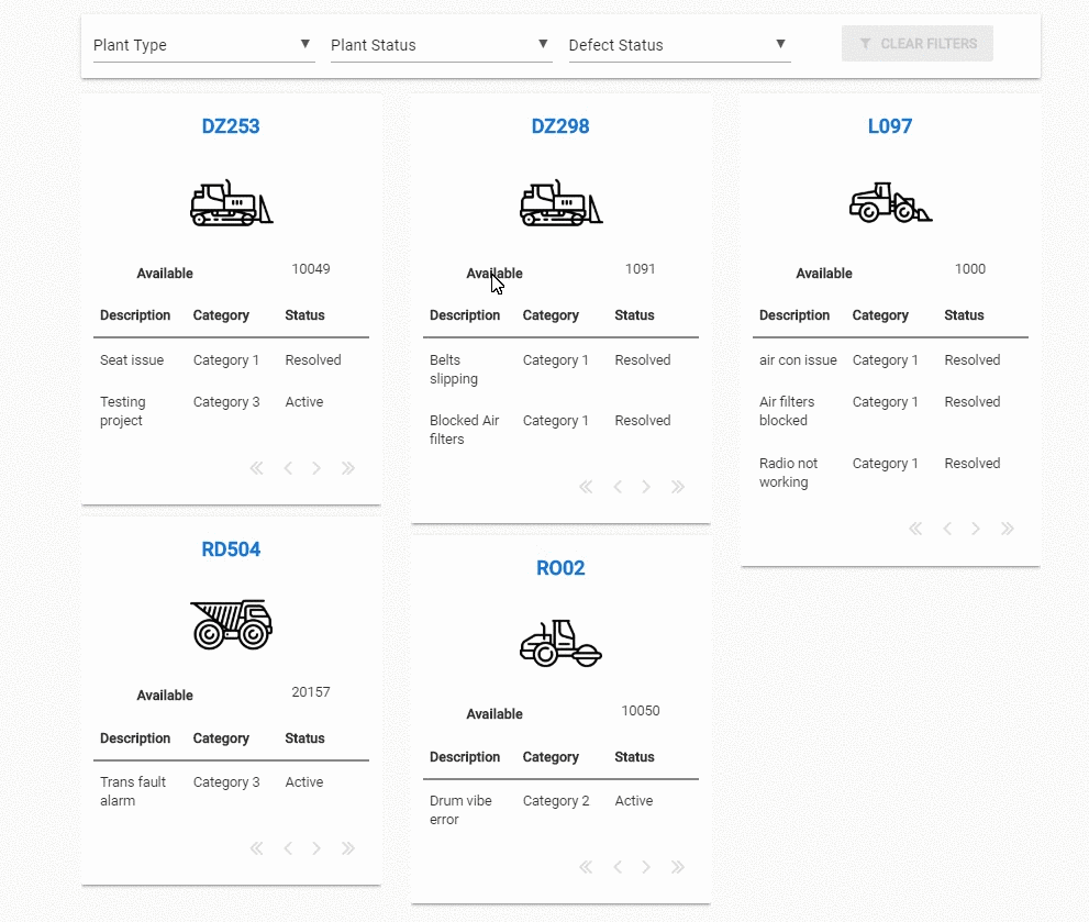
What I was after is a Pinterest style layout that will keep the width and gaps of the components consistent but allow different heights. Hence the need for three individual Linear Panels. You can kind of see this in the first frame of the GIF.
Yeah - it’ll make them the same height… re-wind… re-think
The current implementation with three linear panels in the grid works really well, but it definitely needs some tweaks. For example, when you filter the items, they probably should be added again to the linear panels so there is an even distribution otherwise you could end up with more than one in a column.
I will have a go at it over the weekend and see what it looks like.
Thanks again Stu.
Well that opened up the minefield of css masonry layout…
if you don’t mind vertical ordering
item 0  item 3  item 6

item 1  item 4  item 7

item 2  item 5
then the same approach with this…
.anvil-role-3-cols>div {
  column-count: 3;
  -webkit-column-count: 3;
  column-gap: 3%;
  -webkit-column-gap: 3%;
}
.anvil-role-3-cols>div>div {
  break-inside: avoid;
  -webkit-column-break-inside: avoid;
  display: inline-block;
  width: 100%;
}