i am trying to set a max width (max-width: 500px) of a column panel on desktop and keep the column panel center on the screen.
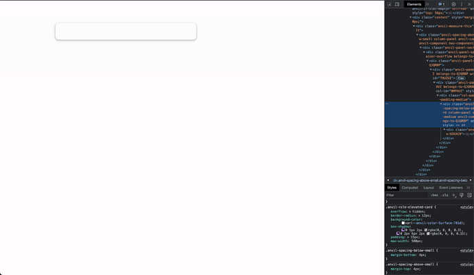
the first image below shows the applied max with of 500, but i cannot center the container.
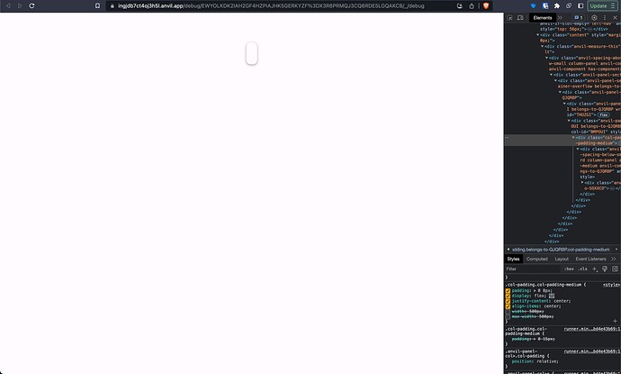
this image still has the applied max-width: 500px but when i try to center the parent container i get this result. i have tried to apply this on other parent containers with same result
the “best” result so far has been to add spacers on the right and left side to the column panel to shrink it. but it does not guarantee 500px and i the spacers does not hide on mobile.
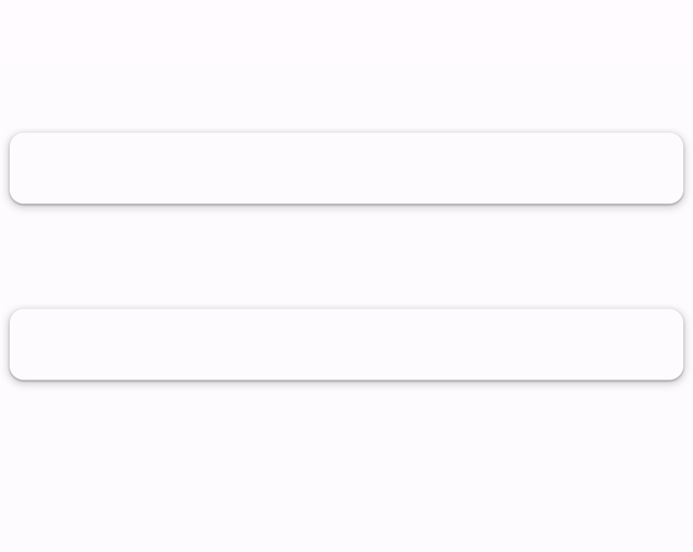
this image show the issue with using spacers on “mobile view”. i want the full width of the containers, which is correct. but they should be shown below each other, like on desktop.
i must be missing something fundamental. this task should not be that hard ![]()
thanks!


