Tabulator - with anvil components

UPDATE Jul 2021: This app is available as a third party dependency using the token TGQCF3WT6FVL2EM2


https://anvil.works/build#clone:JVL5ORAAPZ6SVWDU=JA27THWRHTGHH7XK4U36PRN4

Since a previous post on tabulator i’ve been working on some features to use anvil components within tabulator cells, which I thought might deserve it’s own post.

Tabulator Javascript Datagrid Integration - #9 by stucork

Tabulator is a javascript library - similar to the anvil datagrid - it’s been around longer than the anvil datagrid so has a few bonus features and advantages

tabulator advantages

  • it seems faster to render
  • it has great out of the box features (filtering, sorting, grouping, pagination size selector, current page)
  • dynamically add and delete rows

disadvantages:

  • cell components are limited to the available formatters/editors provided by tabulator (unless you fancy writing your own in javascript :face_with_raised_eyebrow:
  • whereas anvil datagrid rows allow for custom components and python workflow :trophy:

so I figured It would be nice to be able to combine the advantages that come with tabulator with custom components from Anvil. :exploding_head:


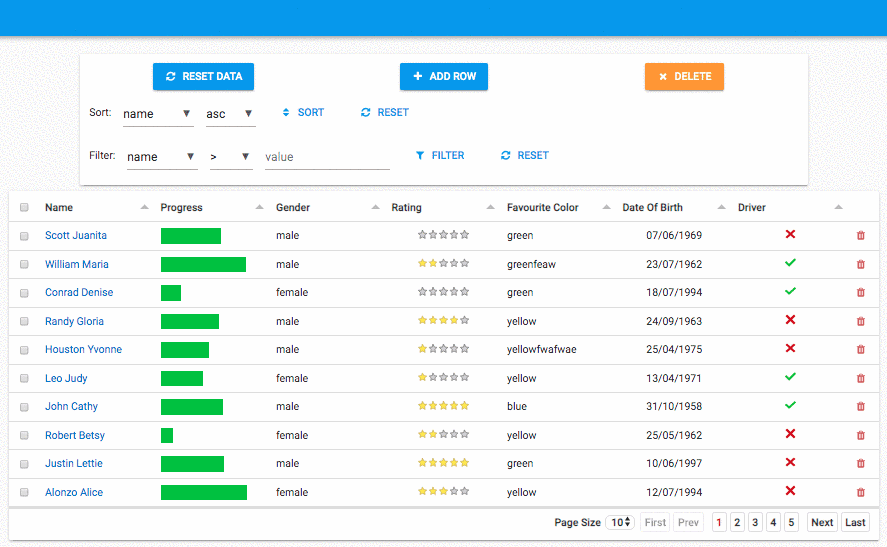
Below you can see 3 custom cell components which are anvil components and forms!


How does it work:

  • when you set up a tabulator you provide column details as a list of dicts

column keys can be found in the tabulator docs but some include:

  • field
  • title
  • formatter (the component to display)
  • editor (the component to display when the cell is clicked)
    from ..DOB import DOB
    from ..FavColor import FavColor
    
    self.tabulator.columns = [
...
      {'title':"Favourite Color", 'field':"col", 'editor':FavColor},
      {'title':"Date Of Birth", 'field':"dob",  'editor': DOB,   'align':"center", 'sorter':"date"},
...
      {'field':'delete', 'formatter': Link, 'formatterParams':{'icon':'fa:trash', 
                                                               'foreground':'indianred', 
                                                               'spacing_above': 'none', 
                                                               'spacing_below':'none'} , 'width': 40, 'headerSort':False}
    ]
    

Above are the columns that have custom Anvil Components…


the delete Link component doesn’t really do anything apart from look like a trash icon
the tabulator has an event cell_clicked and the code is as follows:

  def tabulator_cell_click(self, **event_args):
    """This method is called when a cell is clicked - event_args include field and row"""
    if event_args['field'] == 'delete':
        c = confirm('are you sure you want to delete this row?')
        if c:
          self.tabulator.delete_row(event_args['row']['id'])

The DOB form is more interesting

  • DOB form is a blank panel with a datepicker component
  • its item property is set to the row data.
  • it sets the datepicker.date attribute based on self.item['dob'] using a databinding.
  • on change it:
    • calls self.parent.update_row (the parent is the tabulator component)
    • raises the event 'x-close-editor'

Here’s the Dependency and the Example if you want to explore the code more…

https://anvil.works/build#clone:JVL5ORAAPZ6SVWDU=JA27THWRHTGHH7XK4U36PRN4

https://example-tabulator.anvil.app # live example

@david.wylie and I have been using it in our own projects.

If you have end up using it - Feel free to request any features or ask any questions…


19 Likes

I will vouch for this project as a top notch piece of work.

3 Likes

This is awesome! Thanks so much for sharing!

1 Like

As I fix bugs etc i’ll be updating the clone link above.

you can also find any updates here:

(i’ve already had to fix a couple of bugs since I posted! :roll_eyes:)

2 Likes

This looks amazing and when I have more time I look forward to seeing if I can incorporate this in my WGACA app.

Can this be cemented into Anvil as a default component or at least in the Anvil library?

4 Likes

A small update on this since i’ve been using it on a project and have enhanced the custom formatters feature - you can now use a function that returns a component…


inspired by @meredydd original datagrid show and tell (before data grids existed in anvil…)


simple example

set the column formatter to a function that returns a link with a click_event.

self.columns = [
...
    {'title':"Name", 'field':'name', 'formatter': self.name_foramtter}

...
]

# must include a row argument and **kwargs
def name_formatter(self, row, **params):
  def link_click(**event_args):
    print(row)
  link = Link(text = row['name'])
  link.set_event_handler('click', link_click)
  # return a component
  return link


more in-depth

My use case was a cell that had 5 status icons.
when the status icon was clicked it would then update the database and change color accordingly…

class Form(FormTemplate):
  def __init__(self, **properties):
    self.columns = [
        ...
        {'title':"Status", 'field':'status', 'formatter': self.status}
        ...
    ]

self.status is a function that returns a flow_panel with links


  icons    = ['fa:ban', 'fa:exchange',  'fa:database',   'fa:envelope', 'fa:check']
  spacing = dict(spacing_above='none', spacing_below='none')
  
  def status(self, row, **kwargs):

    def status_clicked(sender, **event_args):
      for link in links[sender.tag+1:]:
        link.foreground = "theme:Gray 300"
      for link in links[:sender.tag+1]:
        color = f"theme:{sender.tag}" # colors defined in theme
        link.foreground = color
      if row['status'] != sender.tag:
        row['status'] = sender.tag
        self.tabulator.update_row(row['id'], row)
        anvil.server.call_s('update_row', row)

      
    panel = FlowPanel(**self.spacing)
    links = []
    current_status = row['status']
    current_link = None
    for i,icon in enumerate(self.icons):
      link = Link(icon=icon, tag=i, **self.spacing)
      panel.add_component(link)
      links.append(link)
      link.set_event_handler('click', status_clicked)
      if current_status == i:
        current_link = link
    status_clicked(sender=current_link)
    
    # return a component to be rendered for the cell
    return panel


This could also be down with a form and databindings - but sometimes I find databindings a little slow and it can be nice to just do something in code…

The result:

Kcc1bWu6Kd

6 Likes

Hi @stucork,

This is amazing, thank you!

Just tried it out and it seems to be working really well. I have a couple of questions just related to appearance tweaks. Firstly, it looks to me like the background colour of the Tabulator component is white even when the background colour of the rest of the app is not white. Is there any css selector I could set to easily fix this?

Also, is there a border property? I think the answer is no, which is fine - I can just wrap it in another component.

Actually, one extra question: can tabulator allow the user to turn pagination on and off? I know the user can select the number of rows per page, but not sure if they can turn pagination off completely. I know there is a pagination on/off property, so I can always add my own button elsewhere to allow the user to set this property, but I’m wondering if there’s built-in functionality I ought to use instead.

Thanks!

Sure - I put the bootstrap3 theme in as the default css style sheet - which comes with tabulator.

But you can find more info about styling here:

http://tabulator.info/examples/4.6#theming

You can customize the css as you like. The Tabulator docs are pretty good and you can infer most of the classes from the documentation or by inspecting the table in dev tools.

The best place to inject the styles might be in the Native libraries of your app that uses tabulator.
(The theme.css isn’t the best place for this because of the order that the style sheets get added)

e.g.

<style>
  .tabulator, .tabulator .tabulator-header, .tabulator .tabulator-header .tabulator-col, .tabulator-row {
    background-color: red;
  }
</style>

<!-- or as a css file in your theme attributes-->
<link href="_/theme/custom_tabulator.css" rel="stylesheet">

link to the stylesheet - i’m using which might help you to override it:
https://unpkg.com/tabulator-tables@4.6.3/dist/css/bootstrap/tabulator_bootstrap.css

2 Likes

This is great, will definitely be using this for my projects. One small question, I noticed that the delete row link does not work when you click on the icon. Instead you have to place your cursor between the icon and the cell borders. Is there a nice way to fix that?

Edit: I replaced Link with Label and that solved it for me!

1 Like

thanks for spotting. Someone reported it on github - and a fix for that should go live soon.
I like the label idea. I might just change the example to use that!

2 Likes

Tabulator is AMAZING. thank you!

2 Likes

A post was split to a new topic: Tabulator header right align

A post was split to a new topic: Images in tabulator component

2 posts were split to a new topic: Using getIndex with Tabulator

A post was split to a new topic: Tabulator - download to csv