Superimposed matplotlib figures

What I’m trying to do:
Im trying to display a different graph in each image/card
What I’ve tried and what’s not working:
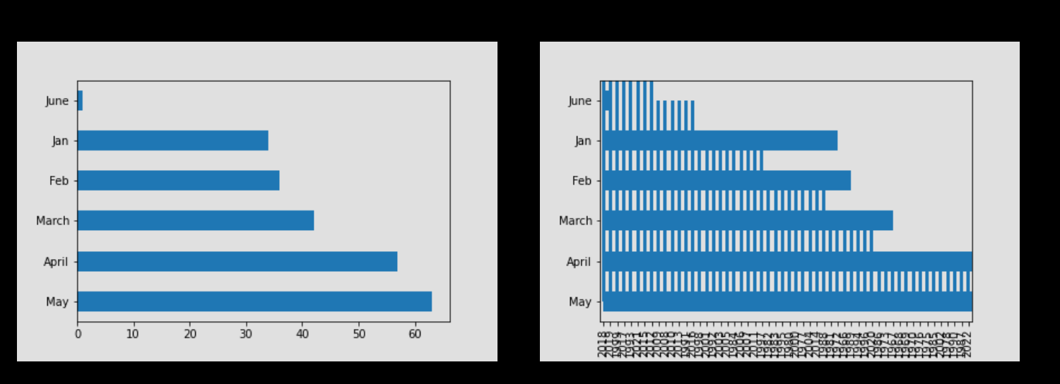
when I load the second graph, the first graph is superimposed on it.

Code Sample:
Client side:
def init(self, **properties):
# Set Form properties and Data Bindings.
self.init_components(**properties)
media_obj = anvil.server.call(‘data_counts’)
self.image_1.source = media_obj
self.image_2.source = anvil.server.call(’ other_data’)

server side:
@anvil.server.callable
def other_data():
vp_data = pd.read_excel(path)
year = vp_data[‘Year’].value_counts()
year.plot(kind = ‘bar’)
year_plot = anvil.plot_image()
return year_plot

@anvil.server.callable
def data_counts():
data = pd.read_csv(path)
state = data[‘Month’].value_counts()
state.plot(kind = ‘barh’)
return anvil.plot_image()

I tried a few different things.  My goal is to have other_data load in image_1 and data_counts in image_2

Thanks for the assist
**Clone link:**
*share a copy of your app*

The image_1 might be accidently laid into the image_2 in the designer?

I tried mimicing your code (minus the data) and put it in an example below:

Thank you. Ill give that a try.

AttributeError: module ‘anvil’ has no attribute ‘mpl_util’

I get this error.

hmmm, I copied the documentation, so it should be fine.

did you include the following:


import anvil.mpl_util

import numpy as np
import matplotlib.pyplot as plt

I was following this page:

theres a clone to my app. so you can see what its doing.
I have imported mpl_util now. (Makes sense)

Thanks for the help. I do appreciate it.

1 Like

https://anvil.works/build#clone:2SKFYVN7SCU6P6JD=TC6K5CAGV4CXJMJTGBF762ZR

Of course! happy to help :slight_smile:

For some reason the server-side are not being copied (in both links), so I cant see the plots. weird…

The home page looks nice and love the mission!

Thank you. ill post it here… if that’s ok

@anvil.server.callable
def ms_data_counts():
ms_data = pd.read_csv(path)
state = ms_data[‘Month’].value_counts()
state.plot(kind = ‘barh’)
return anvil.mpl_util.plot_image()

@anvil.server.callable
def ms_as_data():
vp_data = pd.read_excel(path)
year = vp_data[‘Year’].value_counts()
year.plot(kind = ‘bar’)
return anvil.mpl_util.plot_image()

dataportfolio.anvil.app (is the live version)

Looks Great! Love the rail road layout.

I would look into adding axis labels on your mass shooting charts ( if you want input :sweat_smile: , else ignore me.)

Thanks. Its definintely not finished yet. Just need to get the graphs working correctly and then add a few more things… then on to the next one

They are there when the image loads correctly

1 Like

and this is also the problem lol

1 Like

Its showing up now :sweat_smile:

So Im going to say to ignore me.

1 Like

LOL. I still would like your help fixing the underlying problem though

It happens when you go between creative python and gun dashboard, so it has to be something there.

I’m going to have to leave it at that. :slight_smile: Happy debugging!