What I’m trying to do:
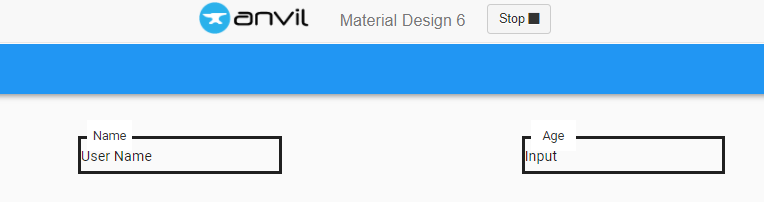
I’m trying to create a design for an input field with the label on top of the border of the input field, like this:

What I’ve tried and what’s not working:
I thought of using roles, however, this is how I know to do this in normal css:
<style>

    .form-group{

    padding:10px;

    border:2px solid;

    margin:10px;

  }

  .form-group>label{

    position:absolute;

    top:-1px;

    left:20px;

    background-color:white;

  }

  .form-group>input{

    border:none;

  }

  </style>

  <form id="first_name">

      <div class="form-group">

           <label>First name</label>

           <input type="text" class="form-control input-lg" />

      </div>

  </form>
First approach
So it needs a parent (?) component - form-group in this situation, and then the position of the input field and label are specified in relation with this form-group. I tried creating 3 Roles: form-input, form-input-label and form-input-field, and specify them in the Assets file as:
.anvil-role-form-input{
  padding:10px;
  border:2px solid;
  margin:10px;
}
.anvil-role-form-input>.anvil-role-form-input-label{
  position:absolute;
  top:-1px;
  left:20px;
  background-color:white;
}

.anvil-role-form-input>.anvil-role-form-input-field{
  border:none;
}
And then I assigned a container with role form-input, a label in it as form-input-label and a text field as form-input-field. It does not work: https://anvil.works/build#clone:XKRYPJBIV5CVPCY5=H6FQR3VNCST5RQ4N3CTTVFFI
Besides this, I cannot find a way to specify a child element working with Roles, is there a way with this approach?
Second approach
I tried to create a custom html component, with the code above. In combination with this answer How to refer to a div in custom html from python and vice-versa - #2 by stucork, I wanted to make create a component that retains the above-mentioned design, bit interactive and changeable. However, the component is no longer interactive when I use it in another form. This is the clone of the app in the answer, showing that its no longer interactive when used in Form1:
https://anvil.works/build#clone:BGZWZMEOPTMPWC4G=YBY7XKBWVHVBL46BQ2VOQYRQ
Is there a solution for either of these approaches? Or is there a third option? Thanks a lot!