Hi
I am trying to copy the side menu bar from google search console and i am getting pretty close without any major changes to themes.css.
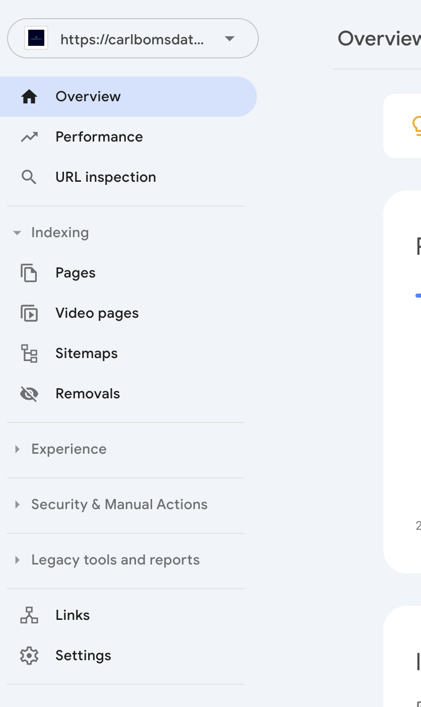
GSC
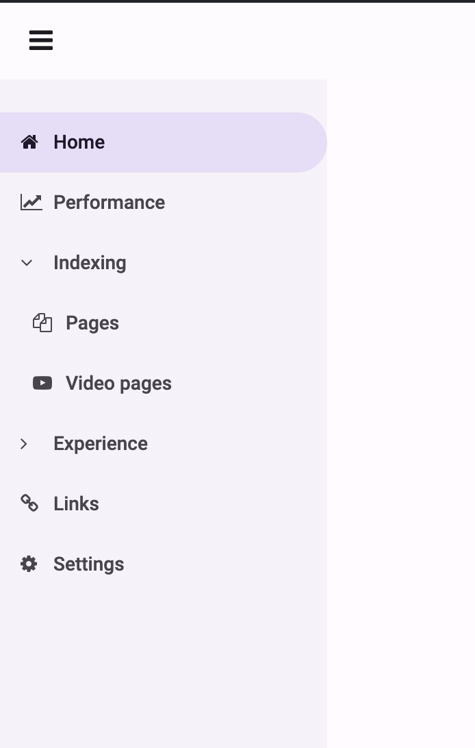
Anvil
Question 1:
Whats the best way of creating a “line separator”, like having a separating line between “URL inspection” and “Indexing”, shown in the first image?
Question 2:
Since all items in the sidebar menu is Links the navbar collapes on mobile if i click on eg “Indexing” or “Experience” (not on desktop). Is there a way to prevent that?
When i click on “Indexing” or “Experience” i expect the drop down to show or hide.
Live project:
Clone link:
You could use the css selector of the element above/below the line and use the css pseudo-selector of ::after/::before and its content property like so:
css-selector::after {
    content: "------------------------";
}
1 Like
For the separator, I use a form with a custom html template that creates a simple div with a defined class:
<div class="menu-separator"></div>
and then, I have a role in the css to style that:
.menu-separator {
    margin: 5px;
    height: 1px;
    background-color: <a colour of your choice>;
}
1 Like
The logic for showing or hiding the sidebar is in a script in the standard page html. You’d need to muck around in there to alter its behaviour.
1 Like
Thanks 
I Think i found a solution.
I made some changes to standard-page.html, starting from line 68. Hopefully this is useful for someone else.
$('.left-nav').off('click').on('click', 'a, button', function() {
    // ADD RETURN STATEMENT HERE IF YOU WANT TO DO NOTHING
    // WHILE PRESSING A SUBMENU ITEM ON MOBILE
    return;

    /* ORGINAL ANVIL CODE
    if ($('.nav-shield').is(":visible")) {
      $('.nav-shield').trigger('click');
    }*/

    /* USE THIS TO BE ABLE TO TOGGLE SUBMENU GROUP ITEMS WHILE IN MOBILE VIEW
     * IT REQUIRES THAT THE GROUP ITEMS HAS THE FOLLOWING ASSIGNED ROLE .anvil-role-submenu-group-item
     * eg self.my_sub_menu_link.role = "submenu-group-item"
    // Check if the clicked element or its parents have the 'submenu-group-item' class
    if (!$(this).closest('.anvil-role-submenu-group-item').length) {
        // If they do not have the 'submenu-group-item' class, proceed to hide the sidebar
        if ($('.nav-shield').is(":visible")) {
            $('.nav-shield').trigger('click');
        }
        // Otherwise, do nothing (the submenu-group-item click handler will take care of its behavior)
    }*/
  });
1 Like
Awesome 
Dont know why i didnt thought of this. I just added some opacity and created a custom component. Worked like a charm
1 Like
now the sidebar menu is completely isolated from themes.css and can be used as a component
1 Like